Using Advanced Colors
Use advanced colors to optimize your style profile by configuring colors for items such as text styles, sliders, uploaders, tooltips, buttons, menus, charts, and more.
See the following resources for more information:
- See How To: Create a Basic Style Profile for an example of creating a basic style profile.
- See How To: Create an Advanced Style Profile for an example of configuring advanced colors on your form.
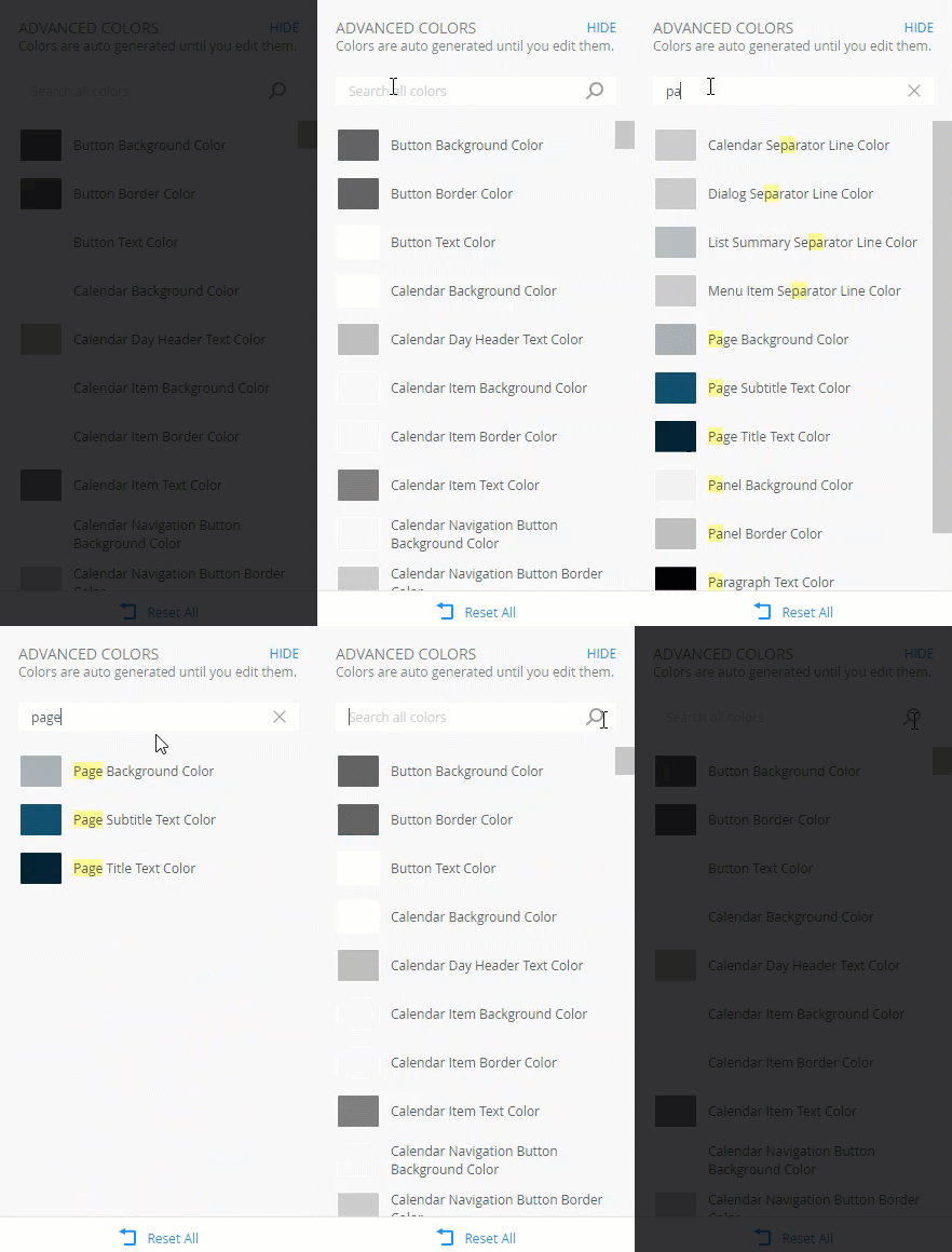
When you click the Advanced link on the canvas, you see a list of advanced colors that are automatically generated based on the main colors. When you change any of the three main colors, the advanced colors are automatically regenerated to support and blend with the new color palette.
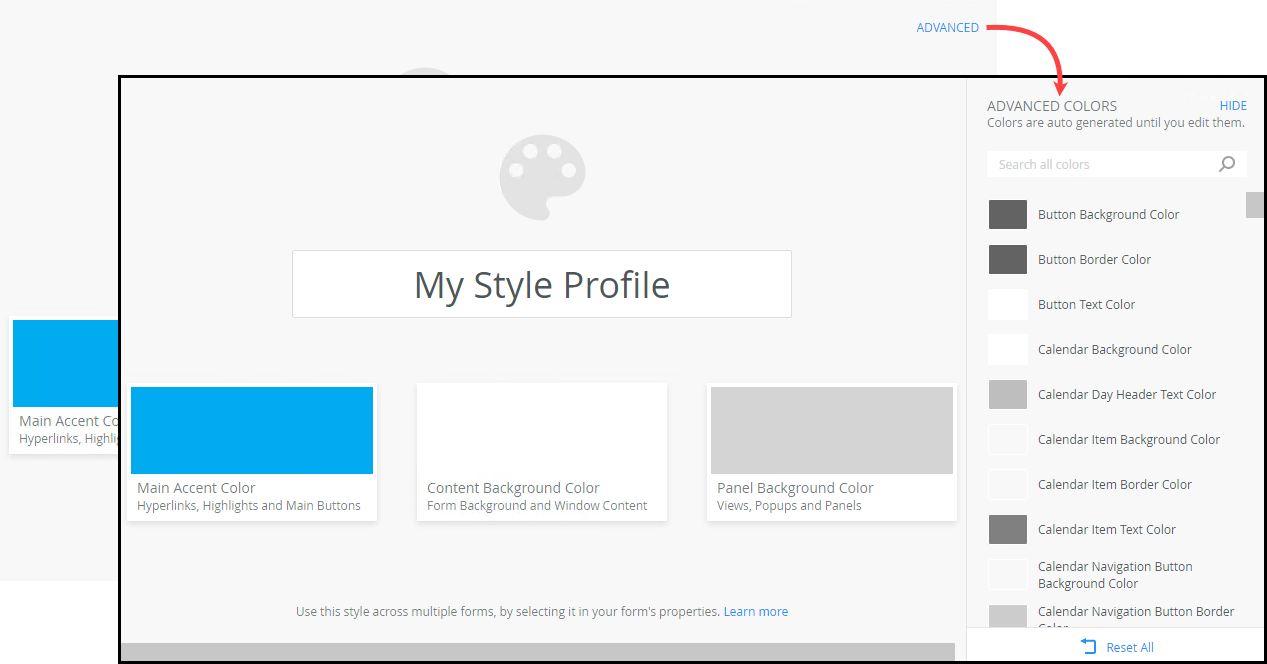
Advanced colors are grouped to support the related main color. For example, the Calendar Background Color is white to be clearly visible when you open the Calendar on a view that has a gray background. Similarly, the rest of the Calendar group colors blend with the group and main colors. When you change an advanced color in a group, the related group colors automatically regenerate. For example if you change the Button Background Color, the Button Border Color and Button Text Color automatically change to blend with the rest of the color palette to ensure the style looks natural. The generated color depends on the layout of your form, for example where the view or control is on the screen, or whether a control is on a view, form or dialog.
Configuring an advanced color
If you want more control over your colors, you can configure the advanced colors to override the automatically generated color. Click the color you want to change,
then select a color from the color wheel by clicking and dragging your cursor inside the picker area to highlight
a color. You can also change the brightness and transparency of the color, or type a named web color such as red, white, or yellow, or
type a HEX, HEX8, RGB, RGBA, HSL, or HSLA value in the field below the color wheel to specify a particular color.
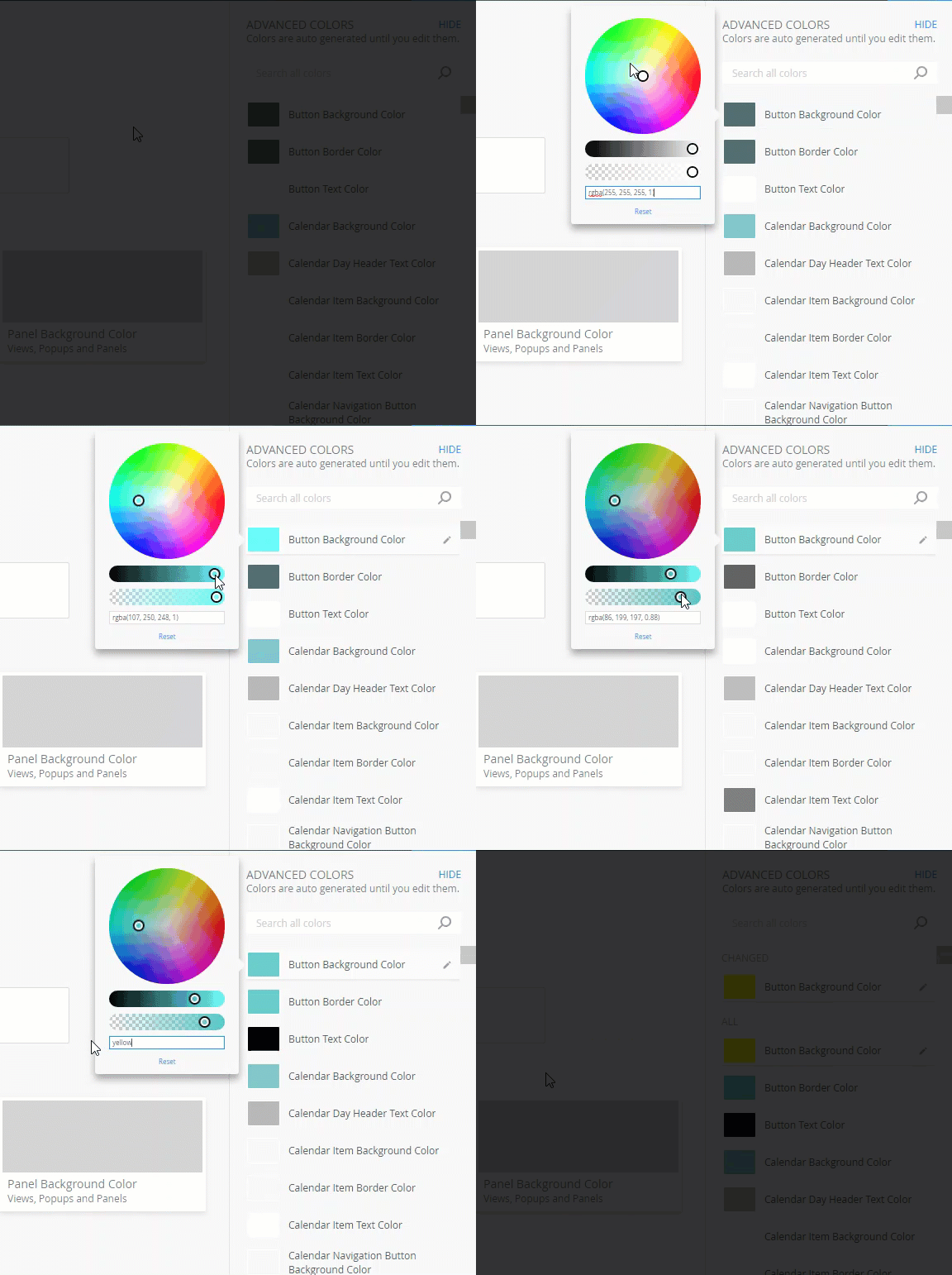
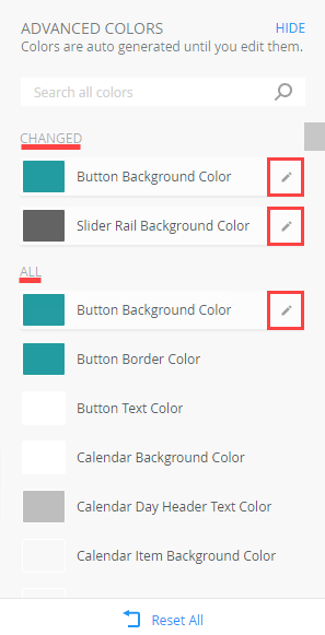
When you change a color, an edit icon shows the color as edited. All colors that are changed are listed in the Changed section, allowing you to easily see the updated colors. Edited colors are also shown in the All section with the related group colors.
You can reset a specific color by clicking Reset next to the color, or you can reset all the colors that you changed by clicking Reset All. When you reset, the color and related group colors are automatically regenerated based on the three main colors.
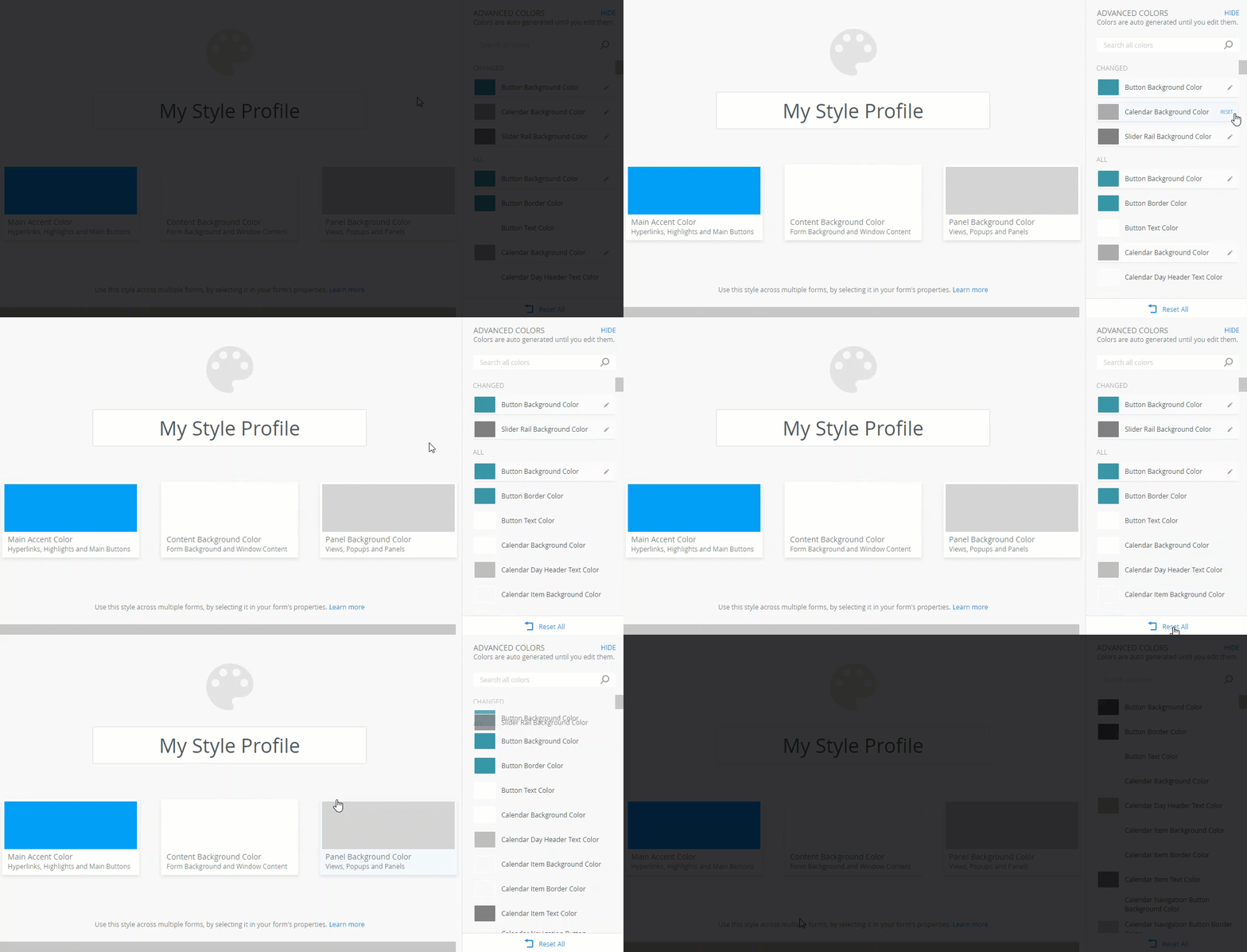
To search for a specific color item or group, type a letter or word to refine the search. Click the X to clear the search.
Advanced Color Groups
Use the table below to explore the different advanced color groups and which areas each group affects.
| Advanced color group | What is affected by this group? | Example | What happens with the automatic generation? |
|---|---|---|---|
| Text Styles |
|

Click to enlarge |
A little bit of your Main Accent Color is mixed in to make these headings fit in with your style profile by default. |
| Sliders |
Any slider user interface within controls, for example:
|
 Click to enlarge |
|
| Uploaders |
Any user interface that allows dropping of a file for upload, or dropping of other content, either within a control, or as a dedicated control, for example: |
 Click to enlarge |
|
| Tooltips |
|
 Click to enlarge |
|
| Tree items |
Any expand or collapse tree user interface, for example: |
 Click to enlarge |
|
| Buttons |
All styles of the Button control:
|
 Click to enlarge |
The Main action uses the color of the Main Accent Color. The rest of the colors are automatically generated based on the three main colors. |
| Help Buttons | The "i" buttons often found at the bottom of dialogs | 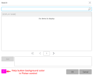 Click to enlarge |
|
| Hyperlinks |
Hyperlinks found within other controls, or as separate controls, for example:
|
 Click to enlarge |
|
| Lists | Any list or grid control such as tile lists, table lists, and list boxes. It can be single or multi-select. Examples are:
Specific applications:
|
 Click to enlarge |
|
| Inputs | Any single or multiline inputs which is typically a white input control with grey border, for example: Any of the above found in a List view, Editable List view, or search and filter toolbars |  Click to enlarge |
Will fit in and be legible on the form, view, dialog, or list item these inputs are placed within. |
| Input buttons | The buttons that appear within the input, typically at the end.
For example:
|
 Click to enlarge |
|
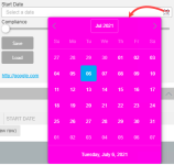
| Calendar | Calendar control (Date, Time, and DateTime)
|
 Click to enlarge |
Uses the Main Accent Color for key highlights, and aims to fit in well with the Form Background Color. |
| Menus | Any popup or context menu that is a single select list, for example:
|
 Click to enlarge |
|
| Charts | Any chart or graph with series, axis, and legends, for example Reporting control charts | 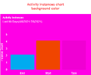 Click to enlarge |
|
| SmartFields | List view filter dialogs - When you drag in a SmartField from the context browser into an advanced filter |  Click to enlarge |
|
| Pills | In an input, these are the resolved items you type in. For example typing in a set of users into a "to" field, and seeing them resolve to users within the input.
These pills are used in:
|
 Click to enlarge |
|
| Form |
|
 Click to enlarge |
If you set your form to a dark color, the controls inside the form will make themselves lighter to be legible on a dark background (unless you override the colors for those controls using the other advanced colors). Dialogs and popups will automatically fit with this background color (unless Dialog Background Color, or Popup Background Color is changed), to keep your dark theme looking consistent, or light theme feeling clean. |
| Page | The outermost background color on a form. Note that this does not affect standalone views |  Click to enlarge |
Based on the Form Background Color, this color will contrast subtly with the form color you have chosen, for a professional look. |
| View | Only affects view instances on a form, for example the header, header expand and collapse button, and the surrounding background of the view content which makes it feel like a block or panel on top of the form. The Toggle On colors refer to buttons that are switched on by clicking, and switched off by clicking again | 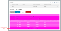 Click to enlarge |
|
| Toolbar |
|
 Click to enlarge |
Input background colors in a toolbar are ignored to soften the look of the toolbar. |
| Loaders | Progress or spinner loading indicators such as loading the following controls: |  Click to enlarge |
|
| Panel | Only affects the Report Header control | 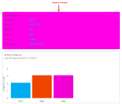 Click to enlarge |
|
| Tabs |
|
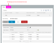 Click to enlarge |
|
| Main tab | Form tabs. This is the selected tab on the form and by default matches the color of your form | 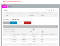 Click to enlarge |
|
| Segmented tab | The Design and HTML tabs at the bottom of the Rich Text control. | 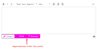 Click to enlarge |
|
| Required indicator | Required indicators such as in the List view filter dialog | 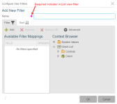 Click to enlarge |
|
| Error | All errors including validation of controls |  Click to enlarge |
|
| Dialog | All dialogs such as Picker control search dialog | 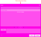 Click to enlarge |
|
| Search | Search dialogs such as Out of Office configuration dialog | 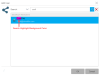 Click to enlarge |