Rich Text Control
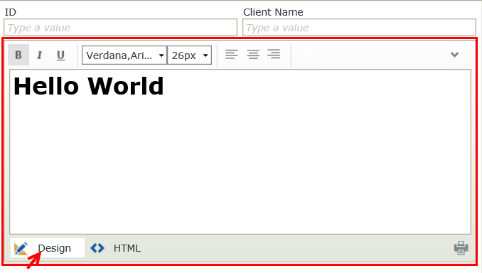
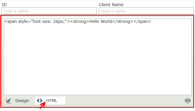
The Rich Text control allows you to insert text and graphics on a view or form. It is an editable content control which converts the content to HTML. 

Try it yourself!
- Create a view.
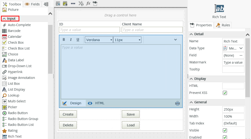
- Drag the control onto the canvas. You can find the control in the Input section of the Toolbox.
- Configure the rest of the properties as necessary.
- Run the view.
You can find the control in the Input section of the Toolbox.
| Property | Description | Can be set in runtime using rules? |
|---|---|---|
| Detail | ||
| Name | A unique identifier for the control. This property is required and defaults to the name of the control. | Yes, see Configure the Set a Control's Properties Action for more information. |
| Data Type | A drop-down list containing the types of values that the control can accept. | No |
| Field | The field bound to the control. See the Binding Fields to Controls section for more information on how to use it. | No |
| Watermark | Specify the text to display when the control is empty. | Yes, see Configure the Set a Control's Properties Action for more information. |
| Tooltip |
The value to display when the cursor hovers over the control. |
Yes, see Configure the Set a Control's Properties Action for more information. |
| Display | ||
| HTML | Type text or HTML text to populate the control. | Yes, see Configure the Set a Control's Properties Action for more information. |
| Prevent XSS |
Sanitizes the value of the control's HTML to strip out all potentially malicious HTML and JavaScript that can cause cross-site scripting (XSS). The sanitization happens when values are transferred to and from the control, and also when you switch between the Design, HTML and Preview views. If you want to allow more advanced HTML and JavaScript in the control, deselect this option. Cross-site scripting (XSS) is a type of computer security vulnerability sometimes found in web applications. XSS enables attackers to inject client-side scripts into web pages. Cross-site scripting vulnerability may be used by attackers to bypass access controls such as the same-origin policy.
An example XSS value: |
No |
| General | ||
| Height | Adjusts the height of the control. You can enter any whole number or pixel value between 1px and 32767px. | Yes, see Configure the Set a Control's Properties Action for more information. |
| Width | Adjusts the width of the control. You can enter any whole percentage up to 100%, whole number or pixel value to a maximum of 32767px. Type the dimension. | Yes, see Configure the Set a Control's Properties Action for more information. |
| Tab Index | Defines a sequence that users follow when they use the Tab key to navigate through a page at runtime. | Yes, see Configure the Set a Control's Properties Action for more information. |
| Visible | Shows or hides the control. | Yes, see Configure the Set a Control's Properties Action for more information. |
| Enabled | Enables or disables the control. If the control is disabled, you won't be able to use it. | Yes, see Configure the Set a Control's Properties Action for more information. |
| Read-Only | Shows the control as read-only. | Yes, see Configure the Set a Control's Properties Action for more information. |
| Expression | Opens the Expression Builder to configure expressions to populate the control with dynamically calculated values. | Yes, see Configure the Set a Control's Properties Action for more information. |
| Format | Opens the Format page where you can configure formatting and style features such as format, font, borders, padding and margins. See the Format topic for more information. | No |
| Conditional Format | Opens the Conditional Formatting page. You can add conditional formatting to apply a specific format or style when a condition you set is True. Use conditional format on its own or with the Format feature. See Conditional Format for more information. Click the ellipsis to open the Conditional Formatting page. | No |
| Settings | ||
| Show Toolbar | Shows or hides the toolbar of the control. | Yes, see Configure the Set a Control's Properties Action for more information. |
| Toolbar Items | The items to include in the toolbar. Click the ellipsis to select or deselect items. | No |
| Edit Mode | ||
| Design View | Shows or hides the Design tab. | Yes, see Configure the Set a Control's Properties Action for more information. |
| HTML View | Shows or hides the HTML tab. | Yes, see Configure the Set a Control's Properties Action for more information. |
| Preview | Shows or hides the Preview tab. This property is disabled by default. | Yes, see Configure the Set a Control's Properties Action for more information. |
The control interacts with other controls through rules. When you bind properties between different controls, you can use the data to populate properties or set values. Use the following examples for when to use the control with other controls through rules:
- Set a control’s properties: You can configure the settable properties of the control with this action
- Show/Hide: The Visible property allows you to show or hide the control through rules
- Enable/Disable: The Enabled property allows you to enable or disable the control through rules
- Data Transfer: You can transfer data from items listed in the context browser to the control
- The control is also available when you use forms
- If you generate HTML using the HTML View, it is best to use Google Chrome as your web browser to ensure a close resemblance to the Design View.
- At runtime, if you want to use the < (less than character) in your Rich Text control, make sure to add a space before and after the character. Example: " < ". If you don't, any text added after the < character disappears and data gets overwritten.
- If you save data from the Design tab to a SmartObject or database and the data is not saved correctly such as with line breaks, you must switch to the HTML tab before saving the data to get the correct results.
- When you use multiple Rich Text controls on the same form, your form may experience slow performance. If you experience slow performance, try to limit the number of Rich Text controls and, if you can, switch to using Google Chrome.
- You can use the control with forms saved as a draft in the K2 Workspace (Mobile) app to save the data on the form to resume at a later point or to work on the form while offline. See How To: Configure Forms with Draft Functionality, Drafts in Android and Building SmartForms for Mobile Devices for more information on saving a form as a draft in the K2 Workspace (Mobile) apps.
- You can use the Style, Format, and Conditional Format properties of Label and Data Label controls, and the Theme property of a form, to change the text style of your controls on a form. See Understanding the Impact of the New SmartForms Text Styles for more information about styling options and how they impact each other.