Format
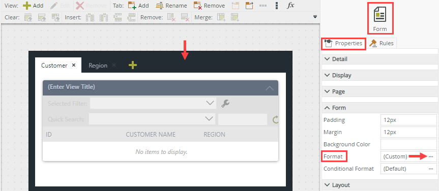
When you click the ellipsis next to the Format property of a cell,
If you apply a style profile to your form, and you configure styling using the Format property, your style profile may not behave as expected. See Style Profile for information about using a style profile and Style Profile Considerations and Best Practices for information about the style behavior.
See the following sections for more information about the format options and how to use them.
Use the Format tab to apply formatting such as
Number, Currency, and Date and Time to a control. When you apply formatting to a control, the display value of that control changes to the format you specify. For example, if you apply a Percentage to a text box control, and you enter a value of 0.64, the display value shows as 64% but the value remains 0.64.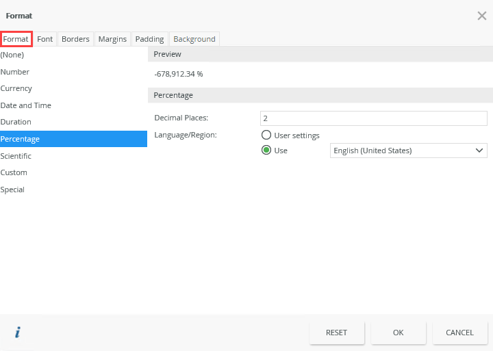
| Format | Description |
|---|---|
| None | No format applies. |
| Number | Applies number formatting to the control. You can specify a Language/Region, the number of decimal places, and how to display negative numbers. |
| Currency | Applies currency formatting to the control. You can specify a Language/Region, the number of decimal places, and the currency symbol. |
| Date and Time | Applies date and time formatting to the control. You can specify a Language/Region and data and time formats. |
| Duration | Applies duration formatting to the control. You can specify a Language/Region, source units to convert from, and the duration format. |
| Percentage | Applies percentage formatting to the control. You can specify a Language/Region and the number of decimal places. |
| Scientific | Applies scientific formatting to the control. You can specify a Language/Region and the number of decimal places. |
| Custom |
Applies custom formatting to the control. You can specify a Language/Region and type. |
| Special | Applies special formatting to the control. You can specify a Language/Region and type. |
| Preview | Shows a preview of the changes you made to the format of the control. |
| Language/Region | This is the language to use when displaying information in a web browser. User settings - Use this if you want to use the user's browser culture to display the information in a browser Use - Use this if you want to select a culture such as English (United States) or French (Belgium) to display the information in a browser |
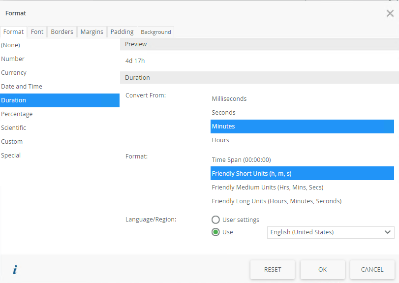
Use the Duration format to format the display of numerical data as a duration of time, such as 4 Days and 17 Hours.
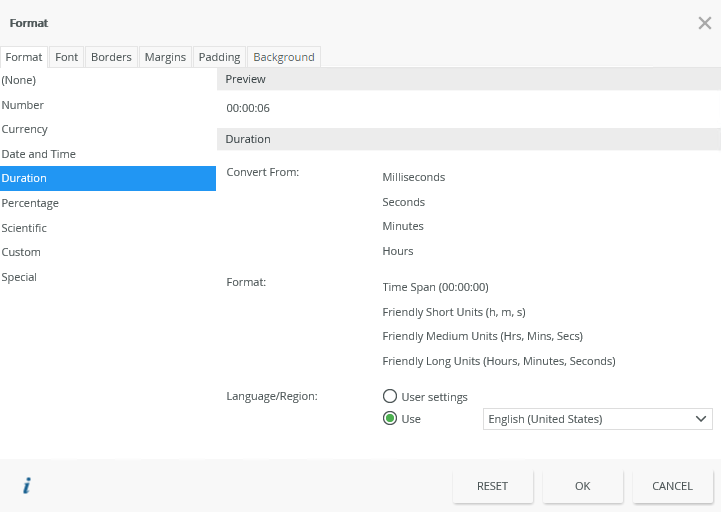
The Convert From takes a number and formats it according to what you specify. Convert From options include:
- Milliseconds
- Seconds
- Minutes
- Hours
The available duration formats include:
- Time Span (00:00:00)
- Friendly Short Units (h, m, s)
- Friendly Medium Units (Hrs, Mins, Secs)
- Friendly Long Units (Hours, Minutes, Seconds)
The following controls support the duration format:
- Data Label
- Label
- Text Box
- Text Area
Configuring the Control with Duration Format
The following is an example of how to use the Duration format on a control.
- Add a text box control to a view.
- Select the control and then click the ellipses (...) next to the Format property as shown below.
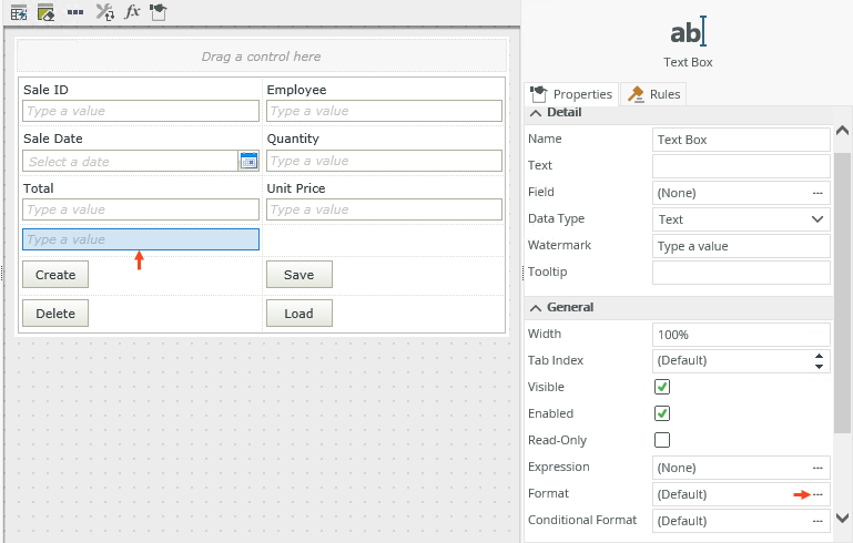
- On the Format page, select the Duration option on the Format tab. Choose a Convert From and Format option. This example uses Minutes and Friendly Short Units.
- Click OK, then Save and Finish the view.
- Run the view.
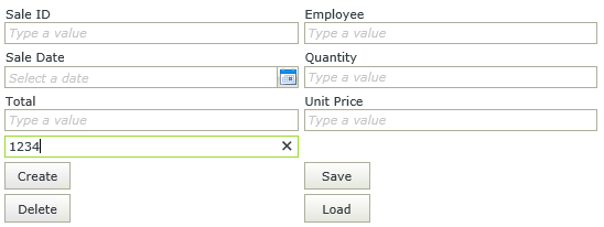
- Enter a number value in the text box.
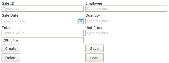
- The numerical value changes to the Duration format.
Considerations
- You can only format whole numbers.
- If you enter a value that is not a number, the value is ignored.
- The list of Duration formats depends on the browser culture (User settings) or the selected culture (Use option) you configure as the Language/Region.
Use the Special format to format numbers as shown in the image below.
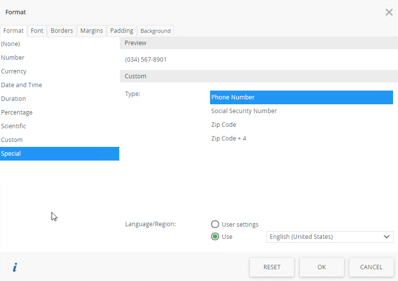
Four default special formats are available for the English (United States) culture:
- Phone Number
- Social Security Number
- Zip code
- Zip code + 4
Examples
The following examples indicate how the patterns apply to the text entered in runtime:
| Text entered | Pattern | Result |
|---|---|---|
| Phone Number | ||
| 1234567890 | (###) ###-#### | (123) 456-7890 |
| Social Security Number | ||
| 123456789 | ###-##-#### | 123-45-6789 |
| Zip code | ||
| 12345 | ##### | 12345 |
| Zip code + 4 | ||
| 123456789 | #####-#### | 12345-6789 |
Creating Custom Special Formats
You can also create a custom special format. See the following link in the Developer Reference for more detail: Adding and Using a Custom Special Format
Considerations
The following principles apply when you use Special formatting:
- Formatting applies to numbers that you enter into the control at runtime.
- If you enter a value that is not a number, the value is ignored.
- A “#” in the pattern is replaced with the number corresponding to the position in the value that you enter.
- When you use another symbol or character in the pattern, they appear in the result.
- A 0 (zero) in the pattern represents either the number corresponding to the position in the value that you enter, or pads the result. For example, if you specify a 4 digit number and your pattern is five zeros (00000), the result starts with a zero followed by the 4 digit number.
- The list of Special formats depends on the browser culture (User settings) or the selected culture (Use option) you configure as the Language/Region.
- The pattern applies to the display at runtime, the underlying value remains the same as what you enter.
Apply font features such as style, size, effects and more to a control using the Font tab. You can also apply background color to a cell or form. 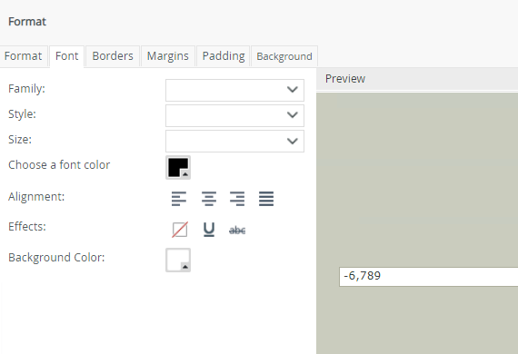
| Font | Description |
|---|---|
| Family | Changes the type of font |
| Style | Changes the font style of the object |
| Size | Changes the font size |
| Choose a font color | Changes the font color |
| Alignment | Aligns the text in respect of the control |
| Effects | Underlines the text or draws a line through the text, or no effect |
| Background color | Changes the background color of the control |
| Preview | Shows a preview of the changes you made to the font of the control |
Apply border features such as style, color, width and borders to a control or table using the Borders tab. 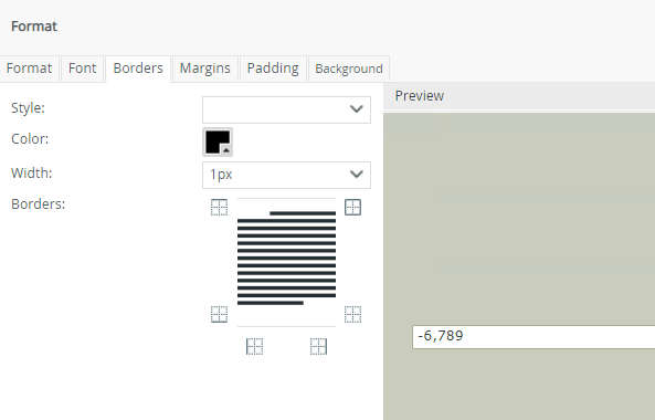
| Borders | Description |
|---|---|
| Style | The style of the left, right, top, and bottom borders |
| Color | The color of all four borders of a range |
| Width | Changes the width of the top, right, bottom, and left borders |
| Borders | Allows you to specify the appearance of the table cells |
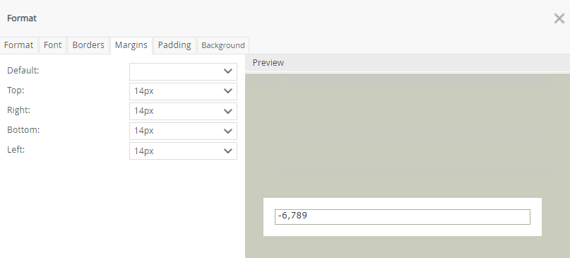
You can adjust each label or cell margin by setting left and right indents and spacing before and after the text. The example below shows an indent of 14 pixels applied to the top, right, bottom and left of the cell:
| Margins | Description |
|---|---|
| Default | The default value to apply to the top, right, bottom and left settings. |
| Top | Height of the top border that retains its size. Adjusts the spacing before the cell |
| Right | Width of the right border that retains its size. Adjusts the indent to the right of the cell |
| Bottom | Height of the bottom border that retains its size. Adjusts the spacing after the cell |
| Left | Width of the left border that retains its size. Adjusts the indent to the left of the cell |
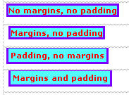
Padding controls the spacing between the contents of a cell and the cell's border. You can also apply padding to a table, view on a form, and a form. Following is a visual illustration of the difference between applying margins and padding:
| Padding | Description |
|---|---|
| Default |
The default value to apply to the top, right, bottom and left settings. |
| Top | Spacing between the contents of a cell and the cell's border at the top |
| Right | Spacing between the contents of a cell and the cell's border on the right |
| Bottom | Spacing between the contents of a cell and the cell's border at the bottom |
| Left | Spacing between the contents of a cell and the cell's border on the left |
Background controls configure the background CSS properties of a table or form. You can configure the background color, background image, shadow, and rounded corner properties.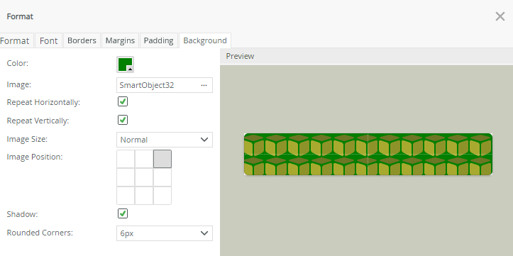
| Background | Description | |
|---|---|---|
| Color |
Sets the background color for this table or form. Use the color picker dialogue to select the color. You can use standard HEX and RGB values |
|
| Image |
Allows you to select a background image for this table. Styled by the following four properties: |
|
| Repeat Horizontally |
Sets the background-repeat CSS property:
|
|
| Repeat Vertically | ||
| Image Size |
Sets the background-size CSS of the image through three possible definitions:
|
|
| Image Position |
Sets the background-position CSS property :
|
|
| Shadow | Sets the box-shadow CSS property for the table or form | |
| Rounded Corners | Sets the border-radius CSS property for the table or form. Equally sets all four border-radius values to the value selected in the drop down | |
When you configure the format of views, a view on a form, and on a form, you access the Format feature in the following ways:
Item View
Select a cell, table, or control on the view and click the Format ellipsis in the Properties tab on the right. Alternatively click the Edit Format icon in the toolbar when you select a control as shown below. 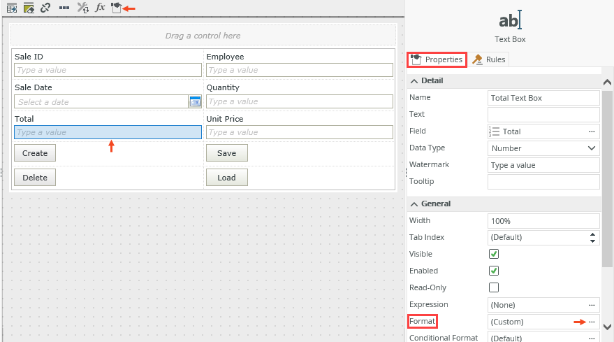
List View
Select a column on the view and click the ellipsis next to Format in the Body tab on the right, or click the Edit Format icon in the toolbar as shown below. 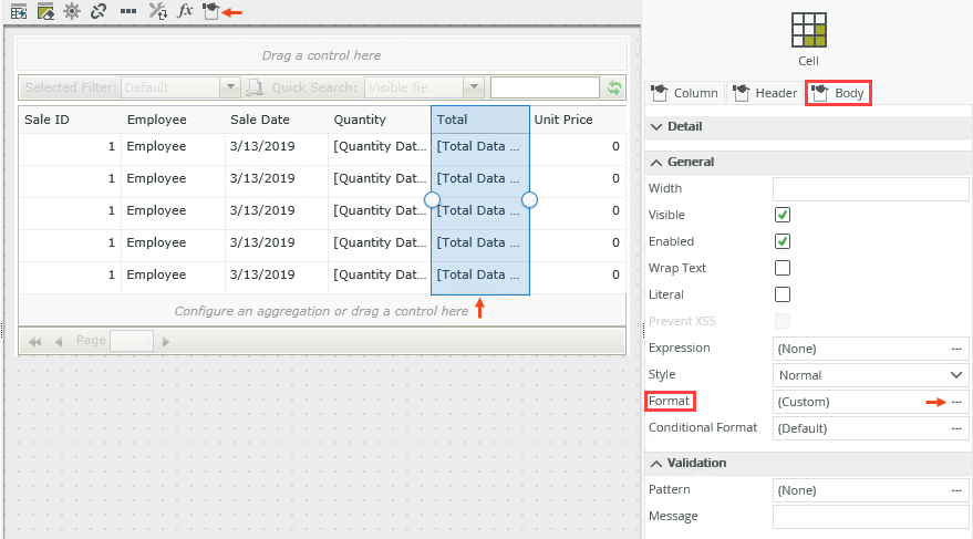
Editable List View
Select a control on the view in the Add/Edit Item section on the canvas and click the ellipsis next to Format in the Properties tab on the right, or click the Edit Format icon in the toolbar as shown below. 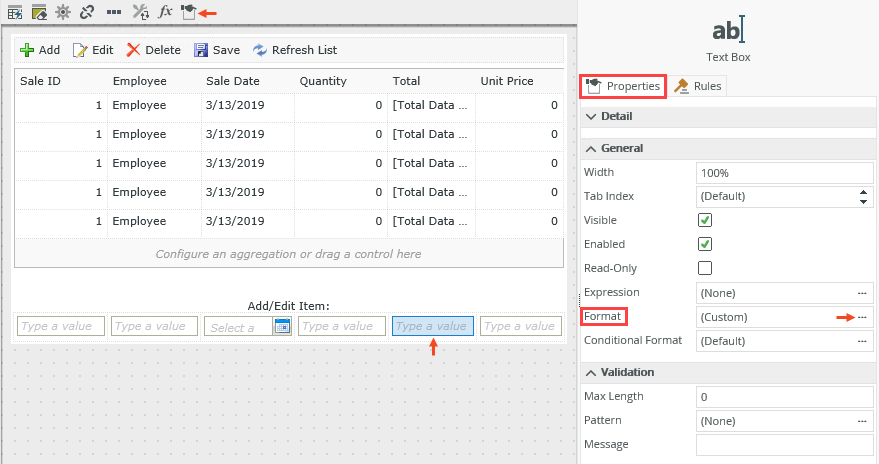
Form
To configure the format of a view on a form, select a view and click the Format ellipsis in the Properties tab on the right. Note the View icon as shown in the image below. 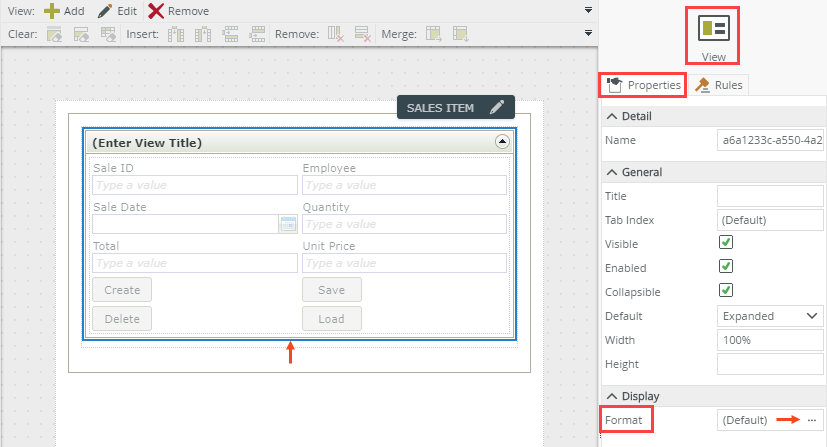
To configure the format of a form, click the blank canvas on the form and then click the Format ellipsis in the Properties tab on the right. Note the Form icon as shown in the image below. 