Picker Control
Please Read This First - If you use the Picker control on a view or form and it does not behave as expected, or you have trouble using the control, see Using the Picker Control for more information. The information in this topic is about configuring the control in the K2 Designer.
The Picker control allows you to pick (select) an item from a list of items. You can enter a character or phrase to search for and use the resolve or search function to return values according to the property you select to filter your values. The control is similar to using a Lookup control but also allows you to select multiple values and search for values.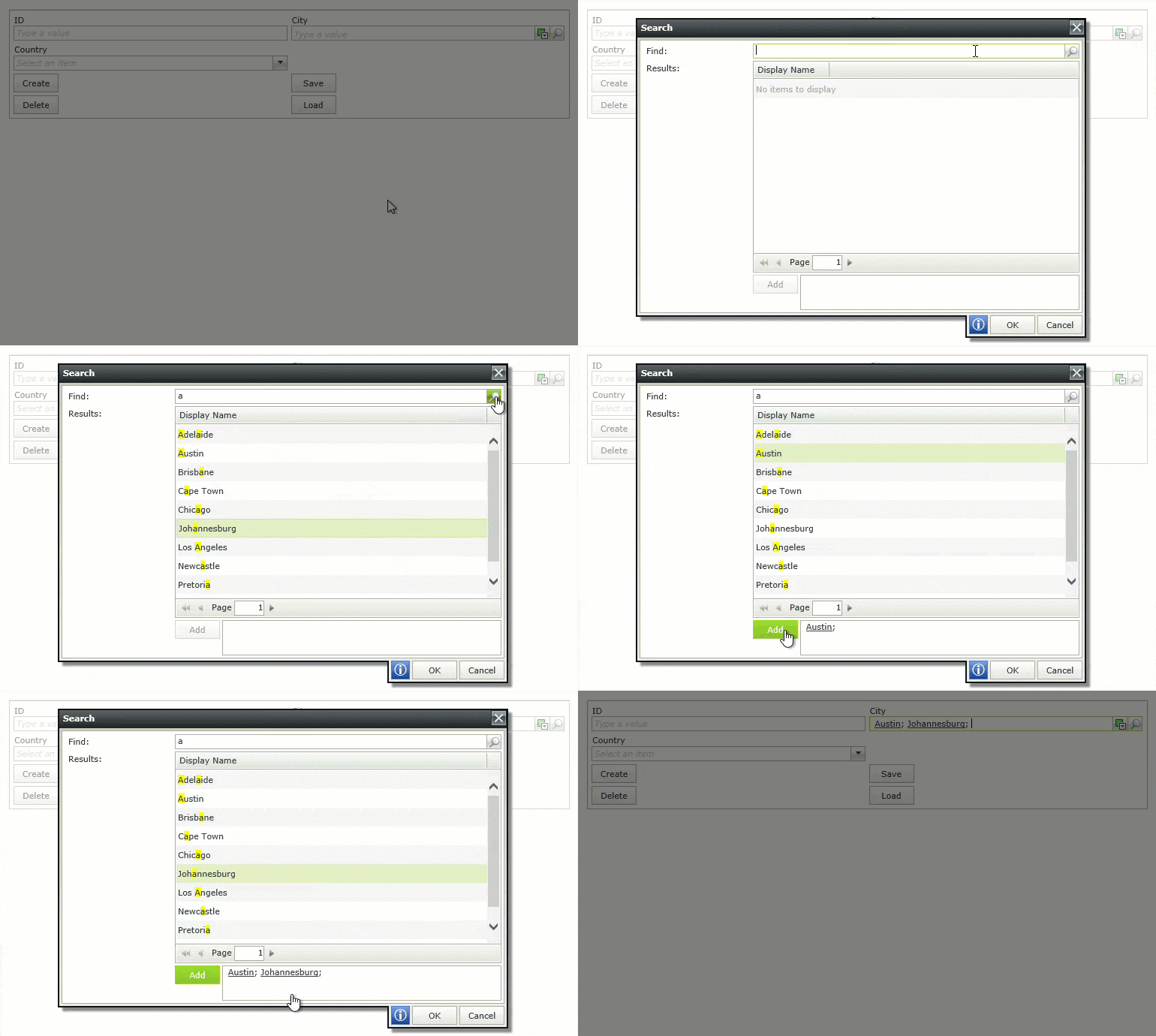
Try it yourself!
See the following resources for more information:
- See Configuring a Data Source for the Control for more information about configuring the control and using filter properties to limit the search
- See How To: Configure the Picker control to display a list of employees using a security provider for information about configuring the control to use a security provider such as the URM (User Role Manager) service
- See How To: Configure the Picker control to use another control's data to filter the results for information about configuring the control to use another control's data to filter results displayed in the picker.
- See How to: retrieve user details in a form and a workflow for an example of creating and using a SmartObject to retrieve user information from a URM-based SmartObject using a Picker control.
- See Configure the Initialized Event for more information about using the control with the Initialized event to improve the user experience when a view or form is loaded, for example to populate a drop-down list with data in the background while the rest of the view is available for data entry.
- Create a view.
- Drag the control onto the canvas. You can find the control in the Input section of the Toolbox.
- Add a data source to your control. To do this, configure the Type under the Data Source of the Properties section.
- Configure the rest of the properties as required.
- Run the view.
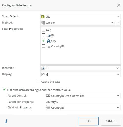
When you click on the ellipsis next to Data Source > Type in the control's Properties, the Configure Data Source page opens. You can use a SmartObject and specify on which items to allow searching using the Filter Properties such as city name. You can also filter the data according to another control's value. See the Input Mappings, Filters and Sorting section for more detail.
| Fields | Description |
|---|---|
| SmartObject | The SmartObject that you want to use as the data source. Click the ellipsis next to SmartObject to select one. |
| Method | The method that you want to use to get data to populate the control. Click the ellipsis next to Method to configure Input Mappings, Filters and Sorting. |
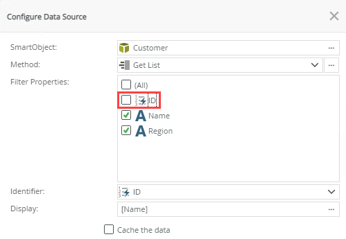
| Filter Properties | The SmartObject properties on which you want to search when a person types a value or when the resolve method of the control executes. Use this to limit the search to properties that make sense. For example, you may want to exclude properties such as File, Memo, and GUID as the person who uses the picker probably won't have this information. |
| Identifier | The SmartObject property to use when you save values a person select in the picker. This is the value that you get if you map the control in a rule action such as Transfer Data, or the value that the bound field is set to. This is typically an ID. 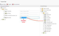 |
| Display | The SmartObject property (text) to display at runtime, such as City.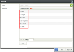 |
| Cache the data | Select this option if you want to cache the SmartObject data to allow for client side filtering when the view is offline. See the Considerations section for information that you need to consider when you use this option. |
| Filter the data according to another control's value | Select this option if you want to filter the data according to another control's value. Use this for cascading controls where the value you select from a Country control filters a City control.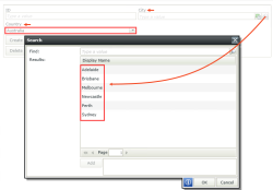 |
| Parent Control (Country) | Specify the control to use to filter the data. In the example above, where the value you select from a Country control filters a City control, the Country control is the parent control. |
| Parent Join Property (CountryID of the Country control) | The SmartObject property on the parent (Country) control that is used to filter the data. This property links the parent data to the child data and needs to match the child join property such as using an ID property. |
| Child Join Property (CountryID of the City control) | The SmartObject property on the current (City) control that is used to filter the data. This property links the parent data to the child data and needs to match the parent join property such as using an ID property. |
When you click the ellipsis next to Method on the Configure Data Source page, the Populate Picker List Control with Data page opens. Use this page to specify input properties and filters to pre-filter the list to search. 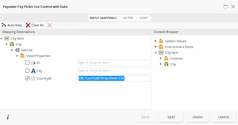
Filters and Sorting
You can filter and sort the results of the control. It is best to configure a pre-filter to limit the number of items searched, especially when you use offline forms. Keep in mind that the Result Limit property (with a default of 100) also applies to the result set. See the Filters and Sorting topic for more information and items that you might consider.
Resolving rule
When you configure data settings through the Method field of the Configure Data Source page, a resolving rule is created to populate the control using these settings. This ensures that the settings apply each time the control requests data.

Depending on your solution requirements and preferences, you can select to save multiple values as XML or a delimited string. If you want to save multiple values as XML, you must enable the Allow Multiple and Save as XML properties under the Details of the Properties section. When you do this, the values are saved in XML format in the database. When you enable the Allow Multiple property and specify a delimiter, the values are saved as a delimited string in the database. In the example below, the Mail_groups__xml_ field shows values saved as XML and the Sales_Regions field shows values saved as semi-colon delimited.

The example below shows how data is saved as XML in the database:
How data is saved as XML in the database
<collection>
<object parentid="57186152-eac8-41c2-8dbd-632f7d1b9279" parenttype="Object">
<fields>
<field name="ID"><value>8</value></field>
<field name="ID"><value>4</value></field>
<field name="ID"><value>1</value></field>
<field name="ID"><value>2</value></field>
<field name="ID"><value>3</value></field>
<field name="ID"><value>5</value></field>
<field name="ID"><value>6</value></field>
<field name="ID"><value>14</value></field>
<field name="ID"><value>9</value></field>
<field name="ID"><value>7</value></field>
</fields>
</object>
</collection>
The example below shows how data is saved as a semi-colon delimited string in the database:
8;4;1;2;3;5;6;14;9;7
You can find the control in the Input section of the Toolbox.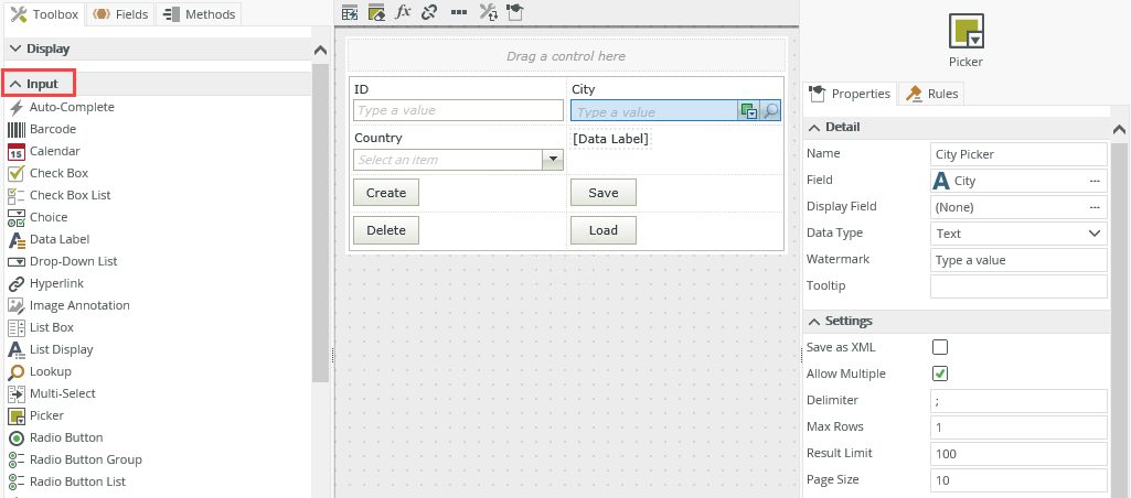
| Properties | Description | Can be set in runtime using rules? |
|---|---|---|
| Detail | ||
| Name | A unique identifier for the control. This property is required and defaults to the name of the control. | No |
| Field | The field bound to the control. See the Binding Fields to Controls section for more information on how to use it. | No |
| Display Field | Use this field if you want to show the control's display value before its data loads. Use this with a When the Form/View Initialized rule to speed up the first time a view or form is used when you're loading data. See Configuring the Display Field property for information about using the Display Field property of a Drop-Down List control. | No |
| Data Type | A drop-down list containing the types of values that the control can accept. | No |
| Watermark | Specify the text to display when the control is not populated. | Yes, see Configure the Set a Control's Properties Action for more information. |
| Tooltip | The value to display when the cursor hovers over the control. | Yes, see Configure the Set a Control's Properties Action for more information. |
| Settings | ||
| Save As XML | Enables you to save multiple values in XML format in the database. | No |
| Allow Multiple | Select this option if you want to save and load multiple values. | No |
| Delimiter | Specify the delimiter to use when you save multiple values into the SmartObject. The property defaults to ";" (semi-colon) and the values are saved in CSV format. | No |
| Max Rows | Enlarges the control's editable area. Type a value between 1 and 1000. The property defaults to 1. | Yes, see Configure the Set a Control's Properties Action for more information. |
| Result Limit | The number of items to return per result set. The limit overrides the page size if it is smaller than the page size. The property defaults to 100. | No |
| Page Size | The number of search results to display per page in the search dialog. Type a value between 1 and 99. The property defaults to 10. | No |
| Data Source | ||
| SmartObject | See Configuring a Data Source for the Control. | No |
| Method | See Configuring a Data Source for the Control. | No |
| Filter Properties | See Configuring a Data Source for the Control. | No |
| Identifier | See Configuring a Data Source for the Control. | No |
| Display | See Configuring a Data Source for the Control. | No |
| Parent Control | See Configuring a Data Source for the Control. | No |
| Parent Join Property | See Configuring a Data Source for the Control. | No |
| Child Join Property | See Configuring a Data Source for the Control. | No |
| Width | Adjusts the width of the control. You can enter any whole percentage up to 100%, whole number or pixel value to a maximum of 32767px. Type the dimension. | Yes, see Configure the Set a Control's Properties Action for more information. |
| Tab Index | Defines a sequence that users follow when they use the Tab key to navigate through a page at runtime. | Yes, see Configure the Set a Control's Properties Action for more information. |
| Visible | Shows or hides the control. | Yes, see Configure the Set a Control's Properties Action for more information. |
| Enabled | Enables or disables the control. | Yes, see Configure the Set a Control's Properties Action for more information. |
| Read-Only | Shows the control as read-only. | Yes, see Configure the Set a Control's Properties Action for more information. |
| Format | Opens the Format page where you can configure formatting and style features such as format, font, borders, padding and margins. See the Format topic for more information. | No |
| Conditional Format | Opens the Conditional Formatting page. You can add conditional formatting to apply a specific format or style when a condition you set is True. Use conditional format on its own or with the Format feature. See Conditional Format for more information. Click the ellipsis to open the Conditional Formatting page. | No |
The control interacts with other controls through rules. When you bind properties between different controls, you can use the data to populate properties or set values. Use the following examples for when to use the control with other controls through rules:
- Set a control’s properties: You can configure the settable properties of the control with this action
- Show/Hide: The Visible property allows you to show or hide the control through rules
- Enable/Disable: The Enabled property allows you to enable or disable the control through rules
- Data Transfer: You can transfer a delimited list of identifiers from items listed in the context browser to the control
- Specify the edit state of view and form controls: You can specify if controls must be read only or editable
- Set Focus: You can use the Focus control method in the Rule Designer to set focus to the control in runtime
- For Each Looping: You can use the For-Each looping rule conditions on List views and list controls
The following events and methods are available on the control:
Rule Events:
- When [control] is Changed: This event executes when the control is set to a new value that is different from the previous value. You can use this event to trigger actions when the control is changed, for example when the user picker is changed, then populate a text box with the name of the user's manager.
- When [control] is Initializing: While you can see this event in the Rule Designer, it has been deprecated. Instead use the When the View/Form Initialize event.
- When [control] is Populated: This event executes each time the control is populated, including load, resolve, search, and when you type a value that is resolved.
- When [control] is Resolving: When you use this event, the Populate a list control with data (asynchronous) action is automatically added. You can add input properties, parameters and filters that are common for any search (for example a security label) to the action, which applies when the control queries (load, resolve, search, and when you type a value that is resolved) the SmartObject for a value or values. This is useful when you want to query users, for example, in a specific department.
- When [control] is Set: This event executes each time the control is set to any value regardless of if the previous value is the same. You can set the control by using the Transfer data action or Execute a control's Load method action. Use this for updating cascading controls.
Using rules to populate the Picker control:
You can also use a filtered data set to populate the control by using the Populate a list control with data action with an event such as When a button is clicked, or When the View executed Initialize. This is useful to pre-populate a picker with a list of items using filters and parameters.

Control Methods:
- Execute a control's Load method: This method functions the same as the Transfer data action however it always triggers a change event regardless if the value is changed or not. Create this method when you use dependent/cascading drop-downs. A rule containing this method is created for you when you use dependent picker controls.
- Execute a control's Resolve method: Resolves the values as if it is manually entered and builds a query against all the selected filters instead of just on the identifier column.
You can use these methods to set up parameters and filters over and above the standard picker control behavior.
When and how data requests occur:
- Load: Data is requested when the control's value is set using a transfer data action, output mappings in a SmartObject, view method execution, or the load control method. The picker uses the value transferred through one of these actions to build a filter using the identifier property to load data. When you use the Transfer Data action, these filters (equals to) are applied on the identifier property as configured in the data source of the control and only the values of the identifier property are transferred. See the Web.config entries section for how to change the filter operator to a contains filter.
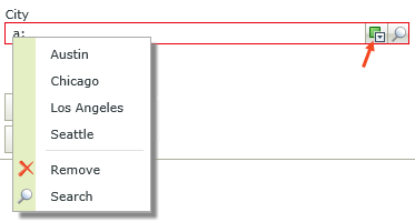
- Resolve: Data is requested when you manually type a value and click the resolve icon. A contains filter is applied to all the filter properties.
- Search: Data is requested when you click the search icon on the search page. A contains filter is applied to all the filter properties. Paging applies based on the Page Size property of the control. See the Web.config entries section for how to show the total number of rows at the bottom of the search dialog.
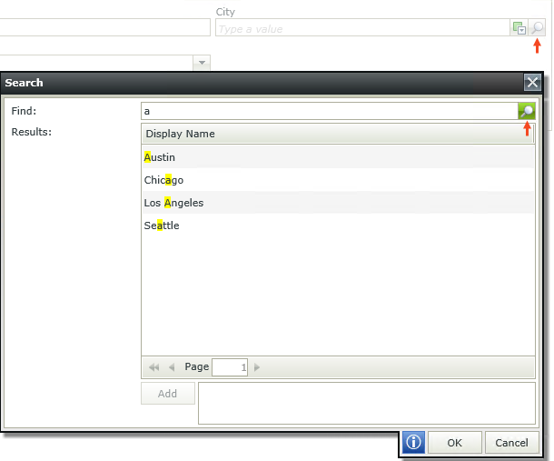
When you use a picker you can search for items using the resolve or search function as shown in the image below.

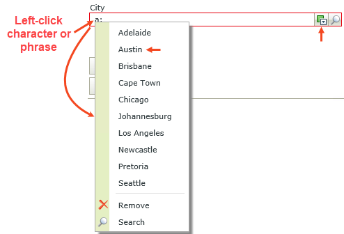
Using the resolve function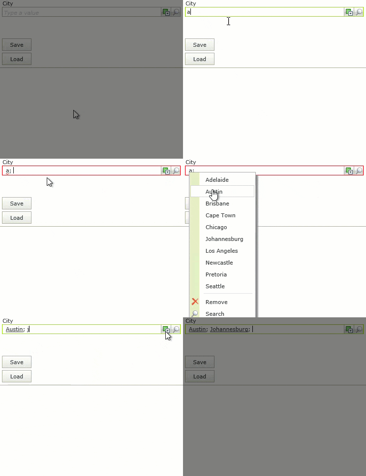
- Type a character or phrase to search for.
- Click the resolve icon.
- Left-click the character or phrase.
- Select the item from the list.
You can add multiple items, remove an item, and access the search function from this menu.
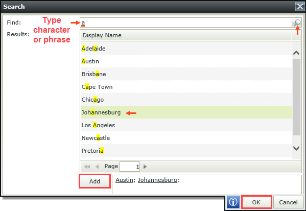
Using the search function

Follow the steps below to use the search function:
- Click the search icon. The Search page opens.
- Type a character or phrase to search for.
- Click the search icon.
- Select the item from the list.
- Click Add one or more times for different results, and then click OK when finished.
You can add multiple items on this page.
- The control is a multi-value list control
- If you want people to select multiple values in the control at runtime, leave the Allow Multiple property of the control enabled, which is on by default.
- If the Allow Multiple option is enabled, and one or more items cannot be resolved, the value of the picker control is blank. If you use rules to transfer values or set another control's properties with the values of the Picker control, it is blank. You can only use the values if every item is resolved.
- The control works best with large sets of data that have an active connection
- You cannot use the control on a column of a List view or Editable List view
- To use the control on an Editable List view, add it to the Add/Edit item. See the List View Column Settings topic to see where to drop a control on an Editable List view.
- Use the Cache the data option only when you have forms configured for offline availability. This loads a list of all possible values into a temporary store and uses this store to search instead of making a server request for each search. You should carefully consider selecting this option if you have large amounts of data since doing so may impact performance.
- You can use the control with forms saved as a draft in the K2 Workspace (Mobile) app to save the data on the form to resume at a later point or to work on the form while offline. See How To: Configure Forms with Draft Functionality, Drafts in Android and Building SmartForms for Mobile Devices for more information on saving a form as a draft in the K2 Workspace (Mobile) apps.
- When you use a Picker control on a view and configure a SmartObject data source that contains a date/date-time property type, at runtime when you search for a date the format is not the same as your local date format. The Picker control shows the server format instead of the user's local format. You can not change the date format on the Picker control (General > Format > Format tab) as this option is grayed out. This is as designed.
- When searching for values and using special characters such as %, _, and a number value, it is advised to deselect the ID as a filter property in the Data Source. If this is not done, the search results may not be correct.
