Auto-Complete Control
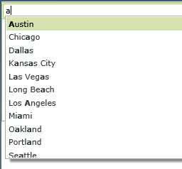
The Auto-Complete control provides suggestions while you type into the field. The control is essentially a text box that can be bound to a SmartObject which, at runtime, filters data in a drop-down by a Contains operator when you start typing a value.

Try it yourself!
- Create a view.
- Drag the control onto the canvas. You can find the control in the Input section of the Toolbox.
- Add a data source to your control. To do this, configure the Type under the Data Source of the Properties section. This is a required field.
- Configure the rest of the properties (optional).
- Run the view.
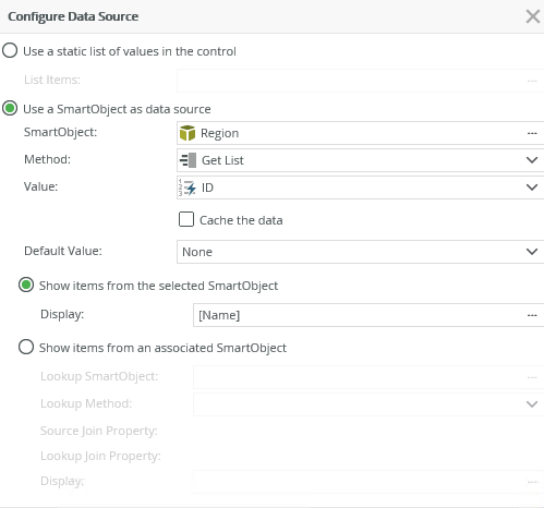
When you click on the ellipsis next to Type in the Data Source section, the Configure Data Source page opens. You can use a SmartObject or a static list of values as the data source for the control.
In the example below, the Region SmartObject is used as the data source and populates the drop-down when you type something in the control.
| Field | Description |
|---|---|
| Use a static list of values in the control | You can create a static list of values to be used in the drop-down when typing. These values are stored as text in the database. Select the option, then click the ellipsis next to List Items to configure the list. |
| List Items | Click the ellipsis next to List Items to configure the list of static values for the control. |
| Use a SmartObject as data source | Select this option if you want to use a SmartObject as the data source. |
| SmartObject | Select the SmartObject that you want to use to populate the control. Click the ellipsis next to SmartObject to select the SmartObject. |
| Method | The method that you want to use to populate the control. Select the method from the drop-down list. |
| Value | The SmartObject property that you want to use as the value in the control. Select the property from the drop-down list. |
| Cache the data | When you select this option, the SmartObject data is cached to allow for client-side filtering, enabling the data to be available offline. This can help performance, but at the expense of potentially retrieving a lot of data at one time. |
| Default Value | This property does not apply to the Auto-Complete control |
| Show items from the selected SmartObject | Shows items from the SmartObject configured as the data source for the control. You can use a property from the SmartObject used as the data source for the display values, or choose a property from an associated SmartObject. |
| Display | The SmartObject property that you want to use for the display values. Click the ellipsis to change the property to use as the display value |
| Show items from an associated SmartObject | Select this option if you want to use a property of an associated SmartObject to be used for the display values |
| Lookup SmartObject | An alternate SmartObject that you want to use as the source of the display values (optional). Click on the ellipsis to select the SmartObject. |
| Lookup Method | The method that you want to use to executed on the lookup SmartObject when retrieving the display values. Select the method from the drop-down. |
| Source Join Property | The SmartObject property on the original SmartObject that is used to join the original SmartObject with the Lookup SmartObject. |
| Lookup Join Property | The SmartObject property on the lookup SmartObject that is used to join the original SmartObject with the Lookup SmartObject. |
| Display | The SmartObject property to use as a display member. Select the item by clicking on the ellipsis. |
When you select the Use a static list of values in the control option for the data source, you can configure Value-Display items for the control. K2 uses the Value to reference a Display value that shows at runtime. For example, if you configure the list as shown below

At runtime you see the following:

You can find the control in the Input section of the Toolbox

| Property | Description | Can be set in runtime using rules? |
|---|---|---|
| Detail | ||
| Name | Every control must have a unique name. This property is required. | No |
| Text | Specify text to use when displaying the control at runtime, for example Region if a region list is used in the drop-down values. | Yes, see Configure the Set a Control's Properties Action for more information. |
| Field | This is the field that is bound to the selected control. Fields are SmartObject properties of the SmartObject selected as the data source of the view. | No |
| Display Field | Allows you to show the control’s display value before its data is loaded. | No |
| Data Type | A drop-down list containing the types of values that the control can accept at runtime. | No |
| Watermark | Specify the text to display when the control is not populated. | Yes, see Configure the Set a Control's Properties Action for more information. |
| Minimum Length | This is the number of characters you can type before the search is filtered. The default is one (1). | Yes, see Configure the Set a Control's Properties Action for more information. |
| Tooltip |
The value to display when the cursor hovers over the control. |
Yes, see Configure the Set a Control's Properties Action for more information. |
| Advanced | ||
| Live Search | Determines when the control is populated. This property is disabled by default. When disabled, the control is populated when the view initializes (loading values in the control before the form is rendered). When this property is enabled, it populates when you type values in the control. | No |
| Delay | This is the delay in milliseconds between when a character is typed and search is performed. A zero delay works for static data and cached SmartObject data, but can produce overhead for a live SmartObject search. The default is zero (0). | Yes, see Configure the Set a Control's Properties Action for more information. |
| Data Source | ||
| Type | Configure a data source source for the control. This can be a SmartObject or a static list of values. | No |
| Items | A read-only list of static list items. | No |
| SmartObject | The SmartObject that is bound to the control. | No |
| Method | The method to use to populate the control. | No |
| Value | The SmartObject property to use as the value for the control. | No |
| Lookup SmartObject | An alternate SmartObject to use as the source of the display values (optional). | No |
| Lookup Method | The method to execute on the lookup SmartObject when retrieving the display values. | No |
| Source Join Property | The SmartObject property on the original SmartObject that is used to join the original SmartObject with the Lookup SmartObject. | No |
| Lookup Join Property | The SmartObject property on the lookup SmartObject that is used to join the original SmartObject with the Lookup SmartObject. | No |
| Display | The SmartObject property used as a display member. | No |
| General | ||
| Width | Adjusts the width of the control. You can enter any whole percentage up to 100%, whole number or pixel value to a maximum of 32767px. Type the dimension. | Yes, see Configure the Set a Control's Properties Action for more information. |
| Tab Index | Defines a sequence that users follow when they use the Tab key to navigate through a page at runtime. | Yes, see Configure the Set a Control's Properties Action for more information. |
| Visible | Shows or hides the control. | Yes, see Configure the Set a Control's Properties Action for more information. |
| Enabled | Enables or disables the control. If the control is disabled, you won't be able to use it. | Yes, see Configure the Set a Control's Properties Action for more information. |
| Read-Only | Shows the control as read-only. | Yes, see Configure the Set a Control's Properties Action for more information. |
| Expression | Opens the Expression Builder to configure expressions to populate the control with dynamically calculated values. | Yes, see Configure the Set a Control's Properties Action for more information. |
| Format | Opens the Format page where you can configure formatting and style features such as format, font, borders, padding and margins. See the Format topic for more information. | No |
| Conditional Format | Opens the Conditional Formatting page. You can add conditional formatting to apply a specific format or style when a condition you set is True. Use conditional format on its own or with the Format feature. See Conditional Format for more information. Click the ellipsis to open the Conditional Formatting page. | No |
| Validation | ||
| Pattern | Set up a validation pattern to enforce validation on the control when data is typed. | No |
| Message | Specify the message to display if the content of the control does not pass validation. | No |
The control interacts with other controls through rules. When you bind properties between different controls, you can use the data to populate properties or set values. Use the following examples for when to use the control with other controls through rules:
- Populate a list control with data: You can populate the control if it has a SmartObject-based data source
- Set a control’s properties: You can configure the settable properties of the control with this action
- Show/Hide: The Visible property allows you to show or hide the control through rules
- Enable/Disable: The Enabled property allows you to enable or disable the control through rules
- Data Transfer: You can transfer data from items listed in the context browser to the control
The following events are available on the control:
Rule Events:
- When [control] is Changed: This event executes when the control is set to a new value that is different from the previous value. You can use this event to trigger actions when the control is changed, for example when the Username auto complete control's value is changed, then populate a text box with the name of the user's manager
- When [control] is Initializing: While you can see this event in the Rule Designer, it has been deprecated. Instead use the When the View/Form Initialize event.
- When [control] is Populated: This event executes each time the control is populated, including load, search, and when you type a value that is resolved
- When [control] is Set: This event executes each time the control is set to any value regardless of if the previous value is the same. You can use this for updating cascading controls.
- The default value of a SmartObject used as the data source is not available in this control. If you must display a default value, you should use a static list as the data source.
- The control only filters data using the Contains operator.
- You cannot use the control to select multiple values.
- You can use umlaut characters such as ü,ö,ä,ß with the control.