Button Control
Use the Button control to perform an action in a view or form. For example, you can use the Rule Designer to configure a rule that calls the Create method of a SmartObject when someone clicks a Submit button.

See the following resources for more information:
- See How To: Create a Custom DocuSign Search Filter for the Envelope List for an example of using the control in a rule to execute a List method.
- Create a view.
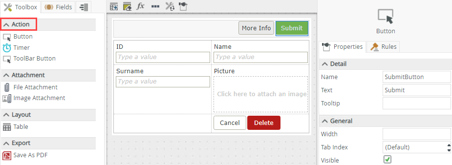
- Drag the button control onto the canvas. You can find the control in the Action section of the Toolbox.
- Configure the properties of the control as needed.
- Create a rule to perform an action when the button raises and event. Most often, you would configure a rule that executes when the control is clicked.
- Run the view and test the button’s behavior.
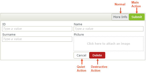
The Style property allows you to apply style actions such as Normal, Main Action, Quiet Action and Destructive Action to the control. This is often used to focus attention to specific actions on a form (e.g. Main Action), to reduce the visual importance of some actions (e.g. Quiet Action), or to highlight 'dangerous' actions (e.g. Destructive Action). You can use these style actions to direct people's attention to the primary action on a form, such as submitting a form, or to highlight risky actions such as deleting a record.
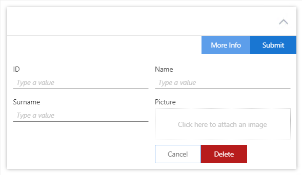
When you use the control on a form, the form's theme determines the font size and color of the control based on the control's Style property. See the table below for information about the different styles and Considerations for more information when you use the Style property.
Example 1: View with styled buttons.

Example 2: The same view from Example 1, on a form with the Blue Void theme applied.

| Style | Description |
|---|---|
| Normal | This is the default style action and inherits its font styling from the theme. Use this for normal action buttons such as More Info on a view or form. |
| Main Action | This is the primary action. Use this to strongly suggest an action on a view or form such as Submit, Register or Buy. |
| Quiet Action | This is a secondary action. Secondary buttons are the alternative we give people to the primary action. Use this for example as a Go Back button to the primary button’s Next, or the Cancel button to the Submit button. |
| Destructive Action | Use this for destructive buttons such as Delete, Remove or Discard. |
You can find the control in the Action section of the Toolbox.

| Properties | Description | Can be set in runtime using Rules |
|---|---|---|
| Detail | ||
| Name | Every control must have a unique name. This property is required and defaults to the name of the control. | No |
| Text | Specify text to use when displaying the control at runtime, for example Submit if the button is used to submit a view or form. | Yes, see Configure the Set a Control's Properties Action for more information. |
| Tooltip |
The value to display when the cursor hovers over the control. |
Yes, see Configure the Set a Control's Properties Action for more information. |
| General | ||
| Width | Adjusts the width of the control. You can enter any whole percentage up to 100%, whole number or pixel value to a maximum of 32767px. Type the dimension. | Yes, see Configure the Set a Control's Properties Action for more information. |
| Tab Index | Defines a sequence that users follow when they use the Tab key to navigate through a page at runtime. | Yes, see Configure the Set a Control's Properties Action for more information. |
| Visible | Shows or hides the control. | Yes, see Configure the Set a Control's Properties Action for more information. |
| Enabled | Enables or disables the control. If the control is disabled, you won't be able to use it. | Yes, see Configure the Set a Control's Properties Action for more information. |
| Style | Applies a defined style to the button such as Quiet Action or Destructive Action. For example, you can use the Destructive Action to highlight a button that deletes records. Note that style and formatting applied with Format and Conditional Format override the Style you select here. See Configuring the Style property for more information about the different actions and Considerations for more information when you use the property | No |
| Format | Opens the Format page where you can configure formatting and style features such as format, font, borders, padding and margins. See the Format topic for more information. | No |
| Conditional Format | Opens the Conditional Formatting page. You can add conditional formatting to apply a specific format or style when a condition you set is True. Use conditional format on its own or with the Format feature. See Conditional Format for more information. Click the ellipsis to open the Conditional Formatting page. | No |
The control interacts with other controls through rules. When you bind properties between different controls, you can use the data to populate properties or set values. Use the following examples for when to use the control with other controls through rules:
- Set a control’s properties: You can configure the settable properties of the control with this action
- Show/Hide a control: The Visible property allows you to show or hide the control through rules
- Enable/Disable a control: The Enabled property allows you to enable or disable the control through rules
- Transfer Data: You can transfer data from items listed in the context browser to the control
- Execute a control's Focus method: You can use the Focus control method in the Rule Designer to set focus to the control in runtime
- The control is also available when you use forms
- The default event is the Click event and is set up automatically when you add a rule
- You can use the Focus control method in the Rule Designer to set focus to the control in runtime
- When you use the Style property of the control, consider the following tips to improve the user experience:
- Put buttons where people can easily find them, or expect to see them, typically at the bottom or top of a form.
- The order of buttons, especially if there are corresponding pairs (such as ‘Previous’ and ‘Next’ or 'Cancel and 'Submit') is important. Always use a consistent placement and order for these buttons.
- Put emphasis on the Main Action (primary button/most important action). You ideally want the person to see the main action button first and then the Quiet Action (secondary button).
- When you use a Destructive Action such as a Delete button, consider using a rule action such as Get confirmation from user to ensure the button was not pressed by mistake, and get confirmation from the person that they really want to perform the destructive action.
- You can use the control with forms saved as a draft in the K2 Workspace (Mobile) app to save the data on the form to resume at a later point or to work on the form while offline. See How To: Configure Forms with Draft Functionality, Drafts in Android and Building SmartForms for Mobile Devices for more information on saving a form as a draft in the K2 Workspace (Mobile) apps.