Text Area Control
The Text Area is an input control used to enter multiple lines of text. When dragging a Field of type Text Area onto the canvas, the properties displayed will be specific to that Field.
- Create a View
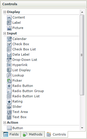
- Drag the Text Area control onto the canvas. The control can be found in the Input section of the Controls found in the View Designer, see the Properties section below
- Configure the properties as required
- Run the View
- The Text Area control is also available in the Form Designer
- The Text Area is commonly associated with Memo type fields
- Focus can be set to this control at runtime by using the Focus control method in the Rule Designer
The Text Area control is available in the Input section of the Controls found in the View Designer and Form Designer.
| Properties | Description | Can be set in runtime using Rules |
|---|---|---|
| Name | A unique identifier for the selected control. This property is required | No |
| Text | The text to be displayed during runtime | Yes, see Control Properties Actions for more information |
| Field | A read-only property displaying the field that is bound to the selected control | No |
| Data Type | A drop-down list containing the types of values that the selected control can accept | No |
| Watermark | The text to display when the control is not populated | Yes, see Control Properties Actions for more information |
| Tooltip | The value to be displayed when the cursor is hovered over the control during runtime | Yes, see Control Properties Actions for more information |
| Rows | The number of rows the control should have (values between 1 and 1000) | Yes, see Control Properties Actions for more information |
| Width | Adjust the width of the control (any whole percentage up to 100%, number or pixel value up to 32767px) | Yes, see Control Properties Actions for more information |
| Tab Index | Used to define a sequence that users follow when they use the Tab key to navigate through a page at runtime | Yes, see Control Properties Actions for more information |
| Visible | A Boolean value used to establish whether the control is visible during runtime | Yes, see Control Properties Actions for more information |
| Enabled | A Boolean value used to establish whether the control is enabled during runtime | Yes, see Control Properties Actions for more information |
| Read-Only | A Boolean value used to establish whether the control is read-only during runtime | Yes, see Control Properties Actions for more information |
| Expression | Opens the Expression Builder to configure expressions to populate the control with dynamically calculated values | Yes, see Control Properties Actions for more information |
| Styles | Opens the Style Builder enabling the user to specify style features like Format, Font, Borders, Padding and Margins. See the Style Builder topic for more information on styling options | No |
| Conditional Styles | Opens the Conditional Formatting Designer used to design styles that will apply only when certain conditions are met. See the Conditional Styles section for more information | No |
| Max Length | The maximum number of characters to accept (values between 0 and 1000) | Yes, see Control Properties Actions for more information |
| Pattern | Set up a validation pattern that can be used to evaluate the value of the selected control | No |
| Message | Specify the message to be displayed if the content of the control does not adhere to the specified Validation Pattern | No |
Pattern
Patterns are regular expressions used to enforce validation on a certain control when data is captured. For the Text Area control, there are several validation types as shown below. Additional validation patterns can be configured and the validation error message can be customized. Creating a Pattern for “percentage” for example, would enforce validation on the selected control, which will fail if the user did not enter the value as “[Value][%]”.
When clicking on the ellipsis next to Pattern, the Validation Patterns screen opens:
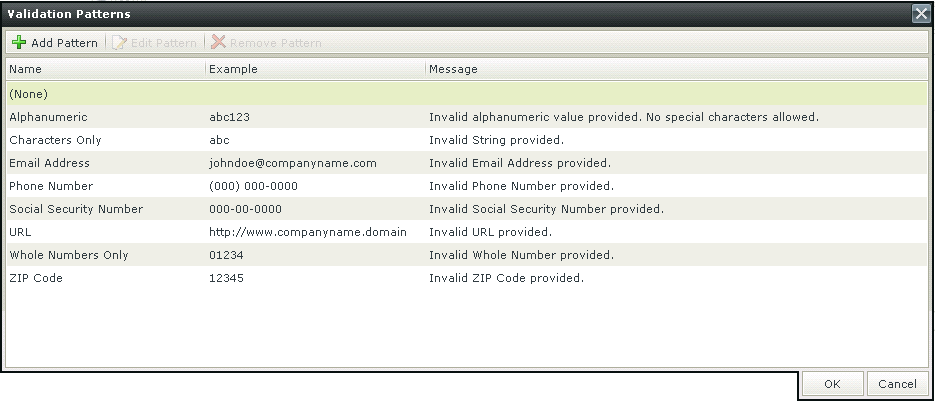
| Actions | Description |
|---|---|
| Add Pattern | Adds a new Validation Pattern |
| Edit Pattern | Edits an existing Validation Pattern |
| Remove Pattern | Removes a Validation Pattern |
Click Add Pattern to add a new pattern. The Add New Validation Pattern screen opens
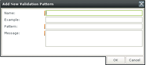
| Fields | Description |
|---|---|
| Name | The name of the Validation Pattern |
| Example | An example of the Validation Pattern such as abc for a Characters Only Validation Pattern |
| Pattern | The regular expression for the Validation Pattern |
| Message | The message to be displayed if the input data does not match the regular expression |
Please note that when using a validation Pattern on a control, a Rule should be added that will execute the "The Form passes validation" Rule Condition in order to execute the Pattern. The Condition needs to be configured in order to specify the controls on which validation will be executed. The validation will only be executed at runtime when this Rule is called. See the Using a Validation Pattern and Rule Condition example.
The Display Time Zone property can be configured by using the set control properties actions allowing the designer to force a particular time zone to be used when displaying the control's value. This property can be used with the Calendar, Data Label, Text Box and Text Area controls and is configured in the Set Control properties rule actions. This property is useful if the datetime should display the same regardless of the end user location/time zone. Examples of where this feature would be beneficial are:
- A good example is birthdays or;
- When you have a time zone setting somewhere else you have to match for example the manner which SharePoint has time zones set per site collection and per user.
- Another example is when referring to a time in a particular time zone. When the user interface would state the time zone and the date time. A good example would be a world clock showing times in New York, London etc.
- Final example is when scheduling a meeting you can select a date/time based on your browser time zone but also show another control indicating the time in another region for the participants.
We're using an example of a world clock, where the user interface would state the time zone and the date time.
- Create a View with two Calendar controls.
- Configure both controls' Picker Type properties as follows:
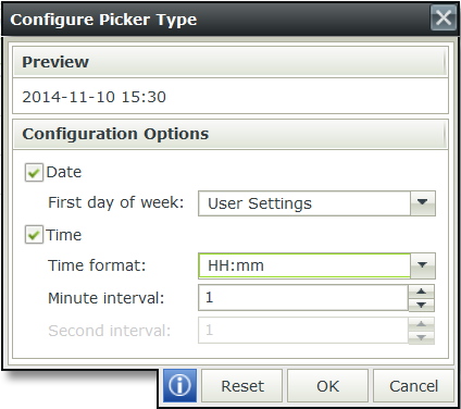
- Use label controls to identify the different clocks. We used London, New York and Hawaii.
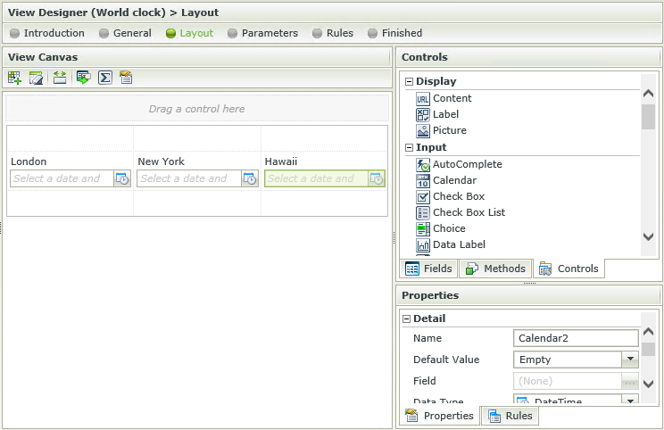
- Create a rule when the View executed Initialize to set the properties of the Calendar controls.
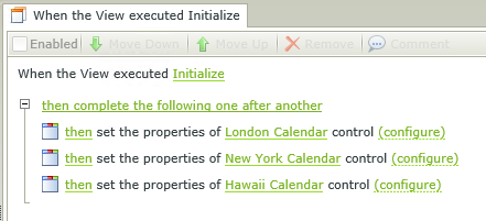
- Configure the Calendar controls as follows:
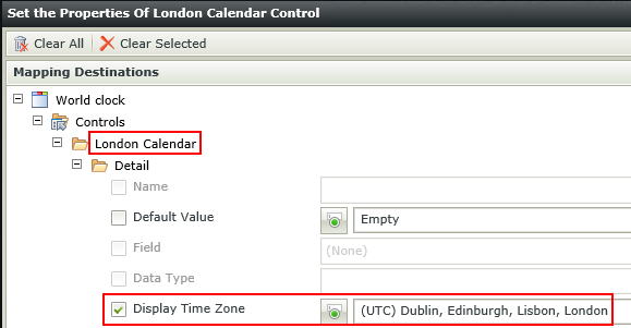
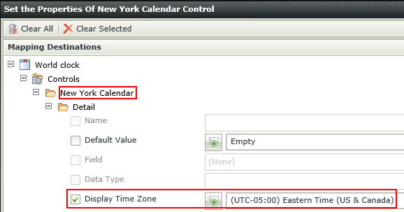
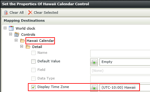
- Finish and Run the View
- Select the current date and time on each control and note the difference in time.

See the Control and Form Properties Actions topic for more detail on how to set a control's properties at runtime.
It is important to note that the Display Time Zone setting can only be configured to be affected at runtime. This means that it will only change when an event takes place at runtime. In addition, the Date and Time format of the control can further be configured using the Style Builder and the Picker Type property (only applicable to the Calendar control).
- The Display Time Zone property only works with the DateTime data type and not with the Date or Time data types.
- The value should be set after the time zone is set. (Don't use Today in the properties, rather set the time zone and then set the default value of today)
- Changing the time zone will not change the control's underlying utc value, only the displayed value.
How to use rules to change the edit state of View and Form controls and tables
