Conditional Styles
Conditional Styles can be applied to controls and can be used individually or in conjunction with Styles. These Styles or Formatting are set to a specific control which will fire when a certain condition validates to TRUE.
An example would be if we have a Radio Button List control that contains the values Pass and Fail. If the Pass option is selected, the background color of the control should change to green. If the Fail option is selected, the background color of the control should change to red. The following steps need to be configured to achieve this result:
- Create a View and add a Radio Button List control
- Configure the control to contain the values Pass and Fail
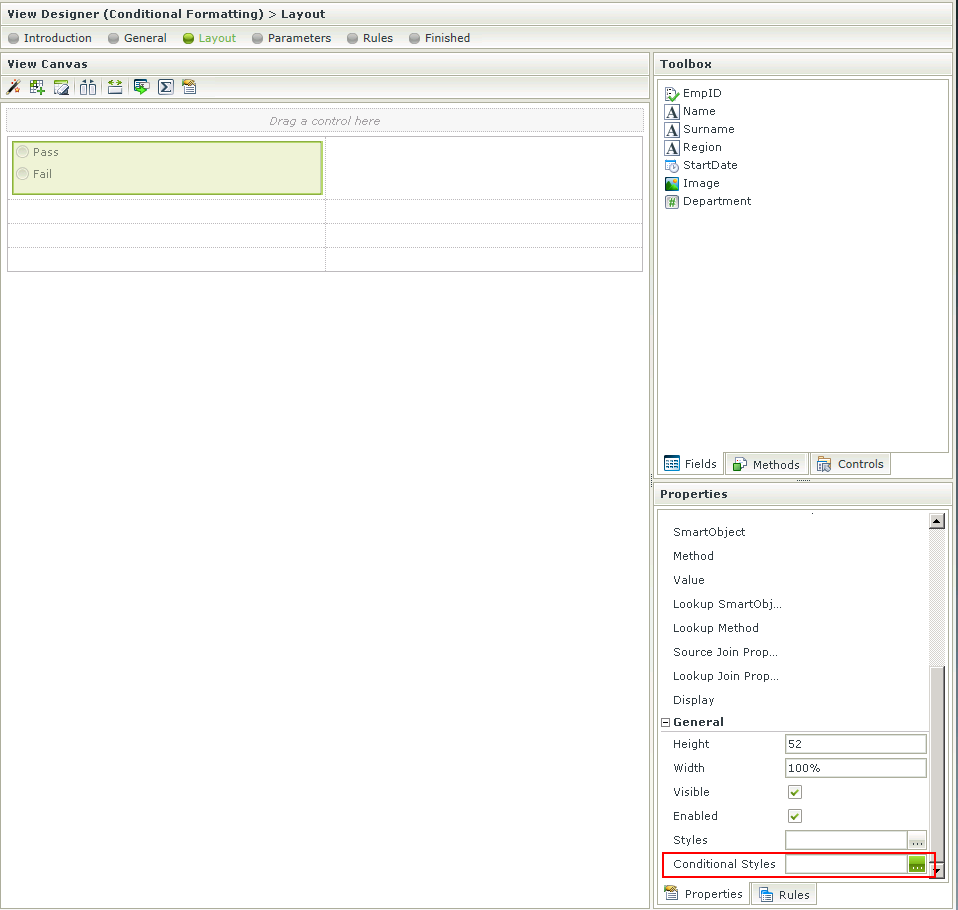
- Select the control and click on the Conditional Styles option in the Properties section of the designer
-
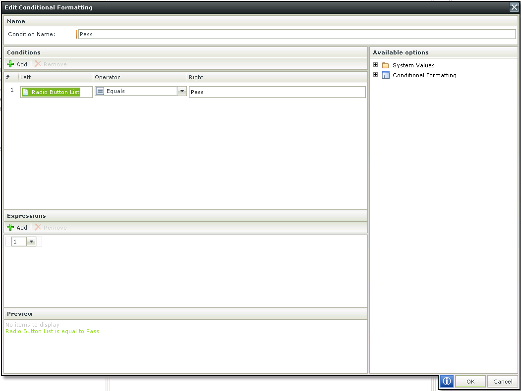
The Condition Name can be specified and the specific condition that is required to be executed can be selected. In this example, drag the control which is available on the right in the Available options into the left condition field and type the word Pass in the right condition field. Note the Preview at the bottom. Click OK. More complex conditions can be added by adding more than one condition and then using the Expressions to logically assess them. The Preview can be used to verify the statement
-
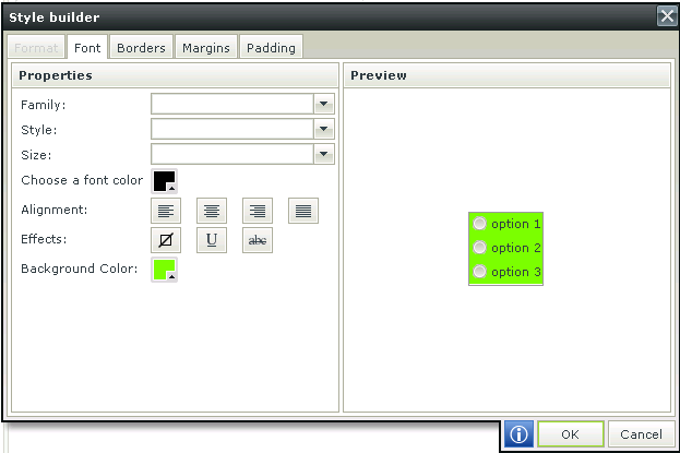
The Style Builder screen opens up. We've selected the background color to change to green when the Pass option is selected. The Style Builder menu can be accessed at the top to affect any other changes required. Click OK
-
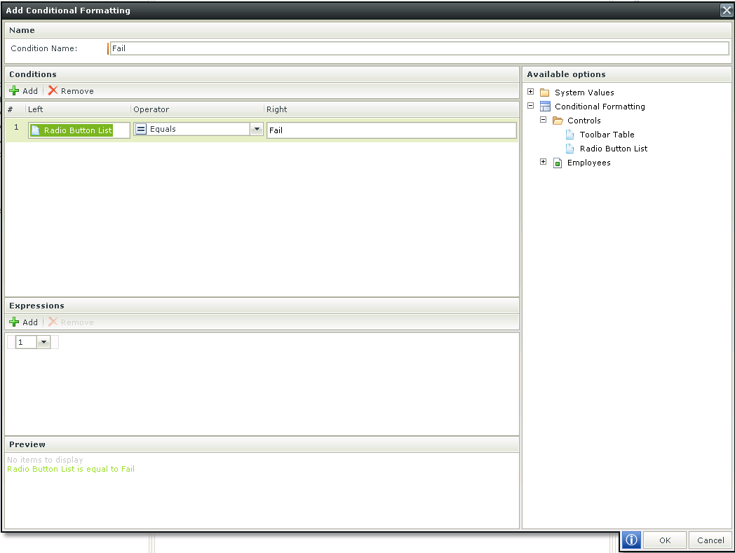
Now do the same for the Fail condition
-
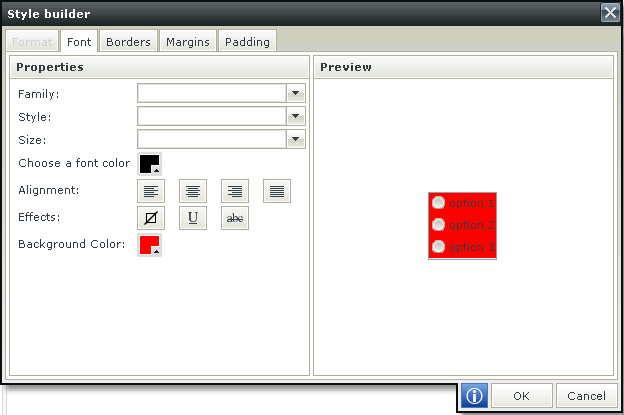
In this instance we've selected the background color to change to red when the Fail option is selected
-
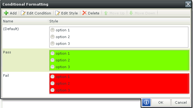
The Conditions will be listed as below:
-
When selecting the Pass option on the View in runtime, the background color changes to green as shown below:

-
When selecting the Fail option on the View in runtime, the background color changes to red as shown below:
