Styles
When clicking on the Edit Styles icon on the Layout screen of the View Designer wizard, the Style Builder screen opens. The style of the cell or control can be configured on this screen. Styles applied to a certain control will change the display value of that control to the specific format specified, for example applying a style of type “percentage” to a control at design time, will result in the runtime value being displayed as a percentage. The value written to the back-end however will still be the value that was entered, and not the display value. Applying the “percentage” Style to a [Textbox], and providing a value of “0.64”, will change the display value to “64%”.
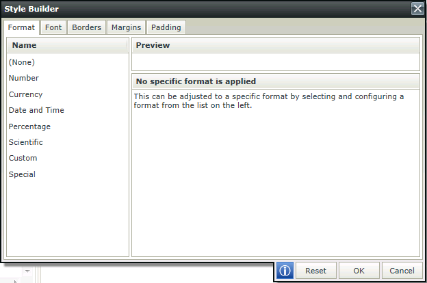
| Format | Description |
|---|---|
| None | No format is applied |
| Number | Applies number formatting to the control. Language/Region and decimal places can be specified. |
| Currency | Applies currency formatting to the control. Language/Region, decimal places and the symbol to be used can be specified. |
| Date and Time | Applies date and time formatting to the control. Language/Region and type of date to be used can be specified. |
| Percentage | Applies percentage formatting to the control. Language/Region and decimal places can be specified. |
| Scientific | Applies scientific formatting to the control. Language/Region and decimal places can be specified. |
| Custom | Applies custom formatting to the control. Language/Region and type can be specified. |
| Special | Applies special formatting to the control. Language/Region and type can be specified. |
| Preview | Previews the changes made to the format of the control |
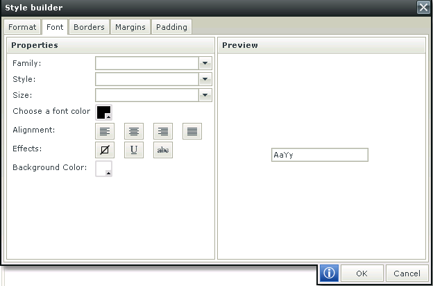
| Font | Description |
|---|---|
| Family | Changes the type of font to be used |
| Style | Changes the font style of the object |
| Size | Changes the font size |
| Choose a font color | Changes the font color |
| Alignment | Aligns the text in respect of the control |
| Effects | Underlines the text or draws a line through the text, or no effect |
| Background color | Changes the background color of the control |
| Preview | Previews the changes made to the font of the control |
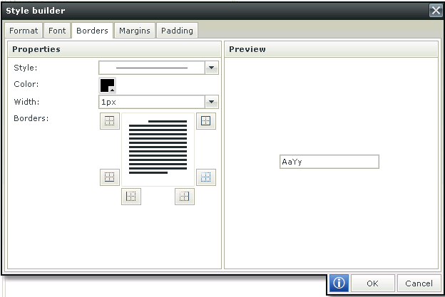
| Borders | Description |
|---|---|
| Style | The style of the left, right, top, and bottom borders |
| Color | The color of all four borders of a range |
| Width | Changes the width of the top, right, bottom, and left borders |
| Borders | Allows the user to specify the appearance of the table cells |
Each label or cell "margin" can be adjusted by setting left and right indents and spacing before and after the text for example:

An indent of 10 pixels have been added to the left of Sale Date
| Margins | Description |
|---|---|
| Default | |
| Top | Height of the top border that retains its size. Adjusts the spacing before the text |
| Right | Width of the right border that retains its size. Adjusts the indent to the right of the text |
| Bottom | Height of the bottom border that retains its size. Adjusts the spacing after the text |
| Left | Width of the left border that retains its size. Adjusts the indent to the left of the text |
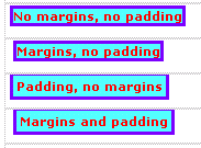
Padding controls the spacing between the contents of a cell and the cell's border. Following is a visual illustration of the difference between applying margins and padding:
| Padding | Description |
|---|---|
| Default | |
| Top | Spacing between the contents of a cell and the cell's border at the top |
| Right | Spacing between the contents of a cell and the cell's border on the right |
| Bottom | Spacing between the contents of a cell and the cell's border at the bottom |
| Left | Spacing between the contents of a cell and the cell's border on the left |
Special formatting has been added to controls enabling formatting of numerical input at runtime. You are able to set the special formatting in the Special menu option in the Format tab of the Style Builder. Four default special formats are available under the English (United States) culture:
- Phone Number
- Social Security Number
- Zip code
- Zip code + 4
Considerations
The following principles apply when using special formatting:
- Formatting is only applied on numbers that are entered into the control at runtime.
- Any value entered in the control at runtime that is not a number will be ignored.
- A “#” in the pattern will be replaced with the number corresponding to the position in the text entered.
- Replacement is done from the back to the front of the text entered at runtime.
- Any other symbol/character in the pattern will be used for example -, (, ) etc. See examples below.
- A 0 (zero) in the pattern represents either the number corresponding to the position in the text entered, or if a number does not exist for it a 0 will be used.
- The list of available special formats will depend on the browser culture (User Settings) or the custom selected culture (Use option)
- The pattern is only applied on the display at runtime, the underlying value remains the same as entered.
Examples
The following examples indicate how the patterns will be applied to the text entered at runtime:
Phone Number
Text Entered: 1234567890
Pattern: (###) ###-####
Result: (123) 456-7890
Social Security Number
Text Entered: 123asd4567asd890aasdf
Pattern: ###-##-####
Result: 234-56-7890
Zip code
Text Entered: 123asd4567asd890aasdf
Pattern: #####
Result: 67890
Zip code + 4
Text Entered: 123asd4567asd890aasdf
Pattern: #####-####
Result: 23456-7890
Creating Custom Special Formats
A custom Special Format can be created. See the following link in the K2 smartforms Developer Reference for more detail:
Adding and Using a Custom Special Format in the Style Builder
The Styles feature can be accessed in the following ways on the different types of Views:
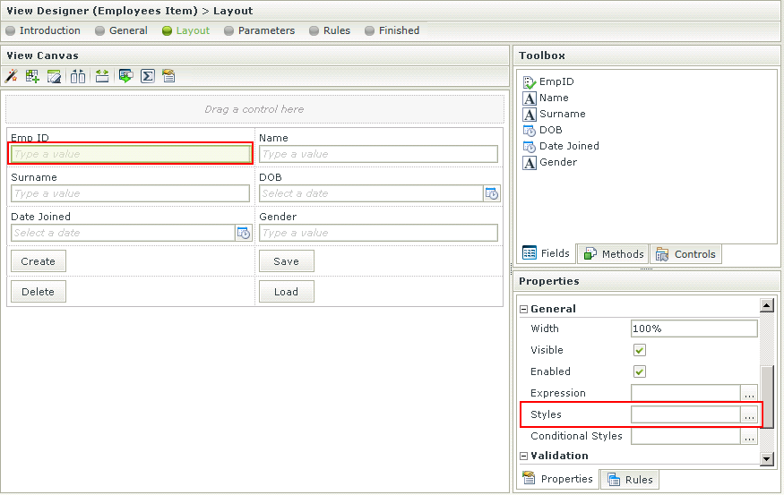
Item View
Select a control on the View and click on Styles in the Properties panel on the right as shown below. The Style Builder will open.
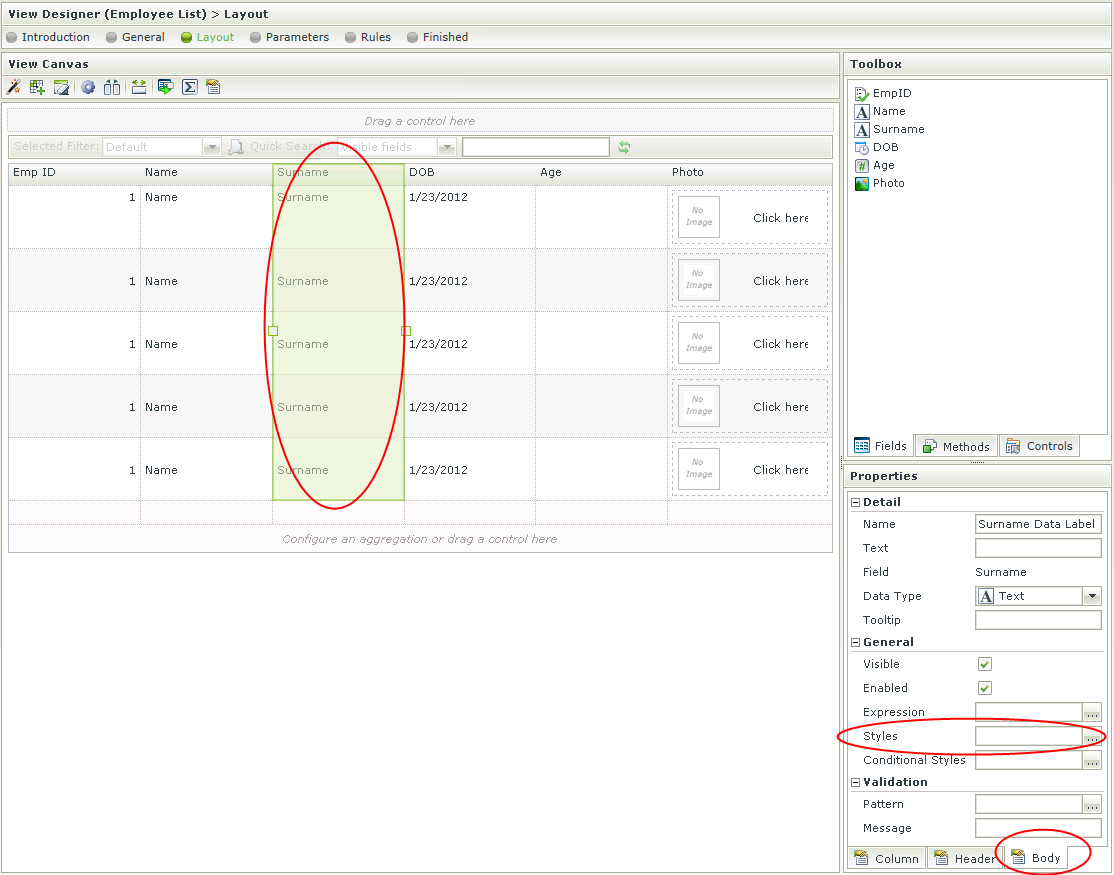
List View
Select a column on the View and click on Styles in the Body tab of the Properties panel on the right as shown below. The Style Builder will open.
Editable List View
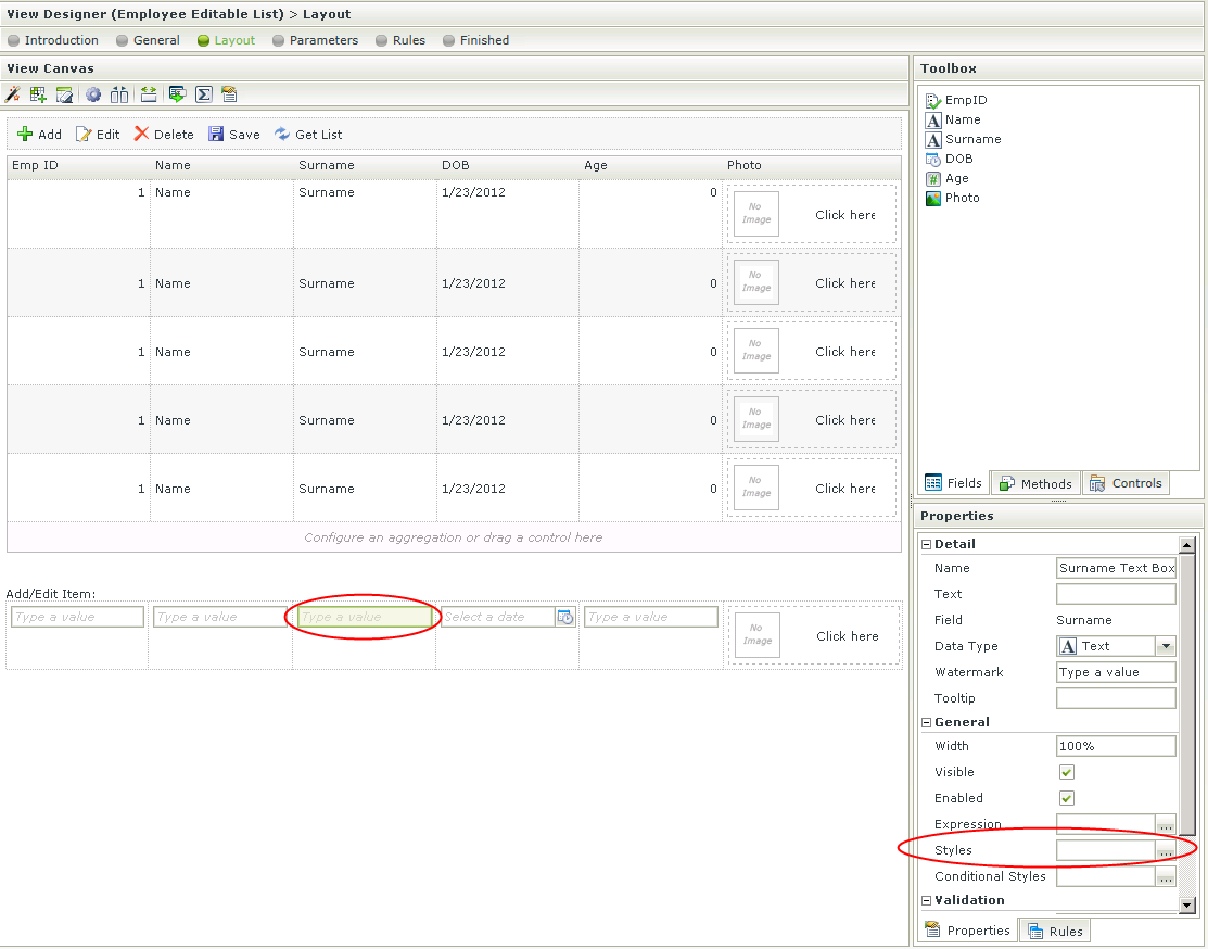
Select a control on the View in the Add/Edit Item section on the canvas and click on Styles in the Properties panel on the right as shown below. The Style Builder will open.
