Lookup Control
The Lookup control is an input control used to select a value from a subview. When dragging a Field of type Lookup onto the canvas, the properties displayed will be specific to that Field.
 How to use the Lookup control
- Create a View
- Drag the Lookup control onto the canvas. The control can be found in the Input section of the Controls found in the View Designer, see the Properties section below
- Configure the SmartObject under Data Source of the Properties section
- Configure a rule to populate the Lookup control, see Considerations
- Configure the rest of the properties as required
- Run the View
Considerations
- Transferring a Value to a Lookup control using the Transfer Data action will populate the control, showing the Display value
- To configure a Lookup:
- Bind the control to a SmartObject selecting the Value member and Display member
- Set up a rule on the Lookup: When the [Lookup] is Clicked, Open a subview (must be a View based on the same SmartObject that is bound to the Lookup)
- Set up a subview double-click rule: On the Rules tab of your View set up a rule When [subview] executed List item double click, Transfer Data
- Configure the Transfer Data action to transfer the Value property of the SmartObject to the Lookup control
- A Close a subview or subform action can be added after the Transfer Data action to close the popup
- See the Using a SmartObject Lookup example for detailed information
- Focus can be set to this control at runtime by using the Focus control method in the Rule Designer
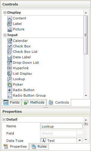
Design Properties
The Lookup control is available in the Input section of the Controls found in the View Designer and Form Designer.
| Properties | Description | Can be set in runtime using Rules |
|---|---|---|
| Name | A unique identifier for the selected control. This property is required | No |
| Field | A read-only property displaying the field that is bound to the selected control | No |
| Data Type | A drop-down list containing the types of values that the selected control can accept | No |
| Watermark | The text to display when the control is not populated | Yes, see Control Properties Actions for more information |
| Tooltip | The value to be displayed when the cursor is hovered over the control during runtime | Yes, see Control Properties Actions for more information |
| SmartObject | Set up data-bindings for the selected control | No |
| Method | The method to be used to populate the control | No |
| Value | The SmartObject property that will be used as the selected value of the control | No |
| Original Property | If the control is part of a View and is linked to a specific field, this property will contain the name of the field that this control is linked to | No |
| Display | The display template of the control, indicating what values are visible when populating | No |
| Width | Adjust the width of the control (any whole percentage up to 100%, number or pixel value up to 32767px) | Yes, see Control Properties Actions for more information |
| Tab Index | Used to define a sequence that users follow when they use the Tab key to navigate through a page at runtime | Yes, see Control Properties Actions for more information |
| Visible | A Boolean value used to establish whether the control is visible during runtime | Yes, see Control Properties Actions for more information |
| Enabled | A Boolean value used to establish whether the control is enabled during runtime | Yes, see Control Properties Actions for more information |
| Read-Only | A Boolean value used to establish whether the control is read-only during runtime | Yes, see Control Properties Actions for more information |
| Styles | Opens the Style Builder enabling the user to specify style features like Format, Font, Borders, Padding and Margins. See the Style Builder topic for more information on styling options | No |
| Conditional Styles | Opens the Conditional Formatting Designer used to design styles that will apply only when certain conditions are met. See the Conditional Styles section for more information | No |
Configure Data Source
When clicking on the ellipsis next to SmartObject, the Configure Data Source screen opens. Configure the data source to be used
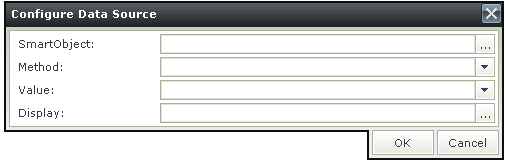
| Fields | Description |
|---|---|
| SmartObject | A SmartObject can be used as data source |
| Method | Defines the available method(s) of the SmartObject |
| Value | The value to be used |
| Display | The item to be displayed |
How to use rules to change the edit state of View and Form controls and tables