List View
The List View presents the user with the functionality to create a View that will be used to display lists of information. The initial screen of the List View Layout allows the user to create labels and controls based on the SmartObject selected or generate a blank layout table for inserting controls. Notice the icons in the toolbar match the options on the View Canvas. Selecting Create Layout Table Only allows the user to design the View by dragging Fields, Methods and Controls from the Toolbox onto the canvas.
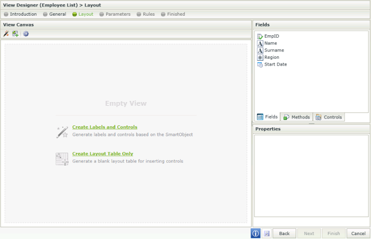
Selecting Create Labels and Controls allows the user to create labels and controls based on the SmartObject selected.
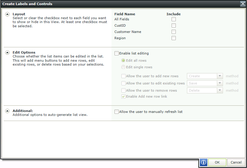
| Feature | Description | How to use it |
|---|---|---|
Layout | Options to generate the View from the fields found in the SmartObject selected as the Data source in the General screen. | Check the Include boxes for fields to be displayed in the View. Then check the Display Only boxes if the field should be read only |
Edit Options |
| Select the option to be used |
Additional | Optionally allow the user to manually refresh the list. | Select the option if required |
The View Designer allows the user to drop three different components onto the canvas. These components can be found in the Toolbox menu:
- Fields - The SmartObject properties are listed on the Fields tab and the associated data type is indicated with an icon. When you drag a field onto the canvas, the appropriate control based on the data type will display
- Methods - The SmartObject methods are listed on the Methods tab and include only those methods that match the View type. For example, on a List View, only the List methods (i.e., methods that deal with multiple records) will display, such as GetList
- Controls - The Controls tab includes common user interface controls such as Buttons, Text boxes, Attachment controls, and so forth. These controls can either be bound to SmartObject properties (Fields), or they can be unbound controls
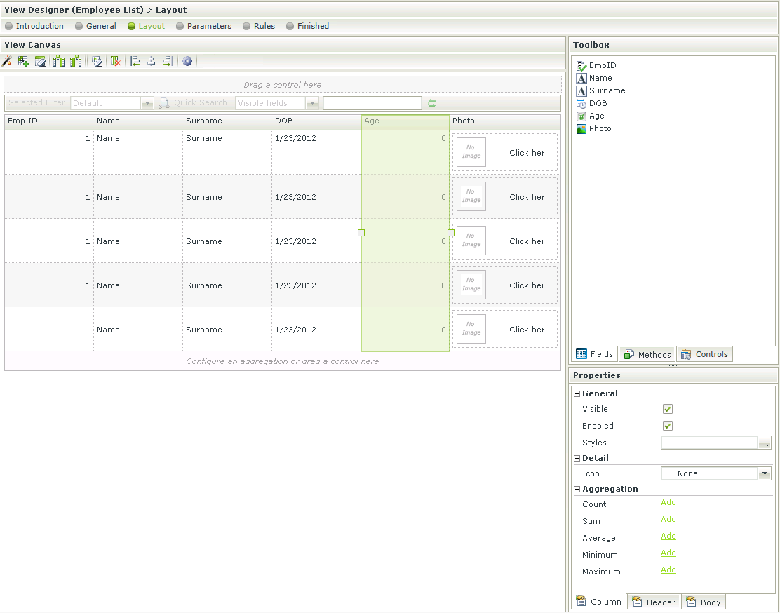
| Feature | Description | How to use it |
|---|---|---|
| Drag a control here | Indicates where a new control should be dragged and dropped | Drag and drop a control |
| Toolbox | Fields - Displays the fields available for use on the View. These fields are the properties of the SmartObject linked to the View Methods - Displays the Methods available for use on the View. These are the methods of the SmartObject linked to the View Controls - Displays the Controls available for use on the View | Drag the Fields, Methods and/or Controls onto the canvas |
| View Rules | Properties - Displays the properties of a field View Rules - Displays the Rules of the View | Properties - Select a field to display the properties of the field View Rules - Select the tab to display the Rules of the View |
When designing a View and clicking on the Create Labels and Controls toolbar button, the View that was designed will be lost and the View will reset to the selection on the Create Labels and Controls screen. To preserve the already designed View, Save or Finish the View. The Create Labels and Controls button can then be executed and if not satisfied with the results, Cancel to revert back to the saved version.
The List View settings can be set by clicking the settings icon in the toolbar:
![]()
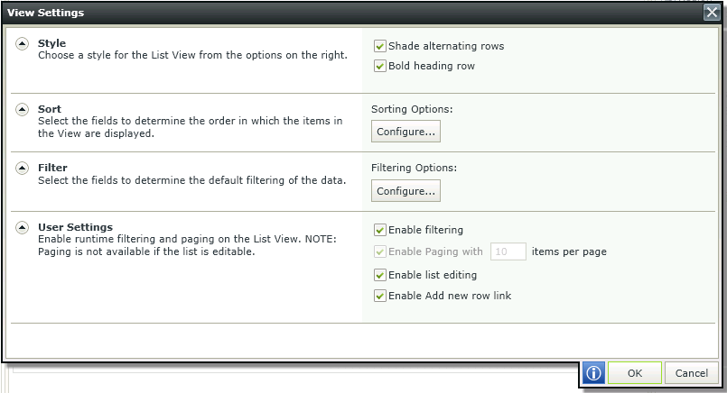
| Feature | Description | How to use it |
|---|---|---|
| Style | Enables styling | Select the options required |
| Sort | Provides sort options | Click on Configure and select up to a maximum of two fields to determine the order in which the items are displayed in the view |
| Filter | Provides filter options | Click on Configure and select up to a maximum of two fields to determine the default filtering of the data |
| User Settings | Enables runtime filtering and paging. Paging is not available if the list is editable | Select the options required and specify the number of items if required |
When clicking on Configure in the Sort section, the Configure Sort Options screen opens. Up to two fields can be selected to determine the order in which the items are displayed in the View
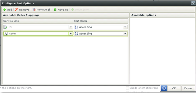
| Feature | Description |
|---|---|
| Add | Adds a new line for order mapping |
| Remove | Removes a line of order mapping |
| Remove All | Removes all the order mappings |
| Move Up | Moves a mapping one position up |
| Move Down | Moves a mapping one position down |
| Ascending/Descending | Enables sorting in a ascending or descending manner |
When clicking on Configure in the Filter section, the Configure Filter Options screen opens. Up to two fields can be selected to determine the default filtering of the data.
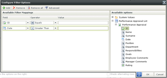
| Feature | Description |
|---|---|
| Add | Adds a new line for filter mapping |
| Remove | Removes a line of filter mapping |
| Remove All | Removes all the filter mappings |
| Advanced | See below |
| Field | Field to be used in the filter mapping |
| Operator | Operator to be used in the filter mapping |
| Value | Value to be used in the filter mapping. Type a value or drag and drop a value from the context browser |
When clicking on Advanced on the Configure Filter Options screen, the Advanced Filter Configuration screen opens. Advanced expressions can be performed here.
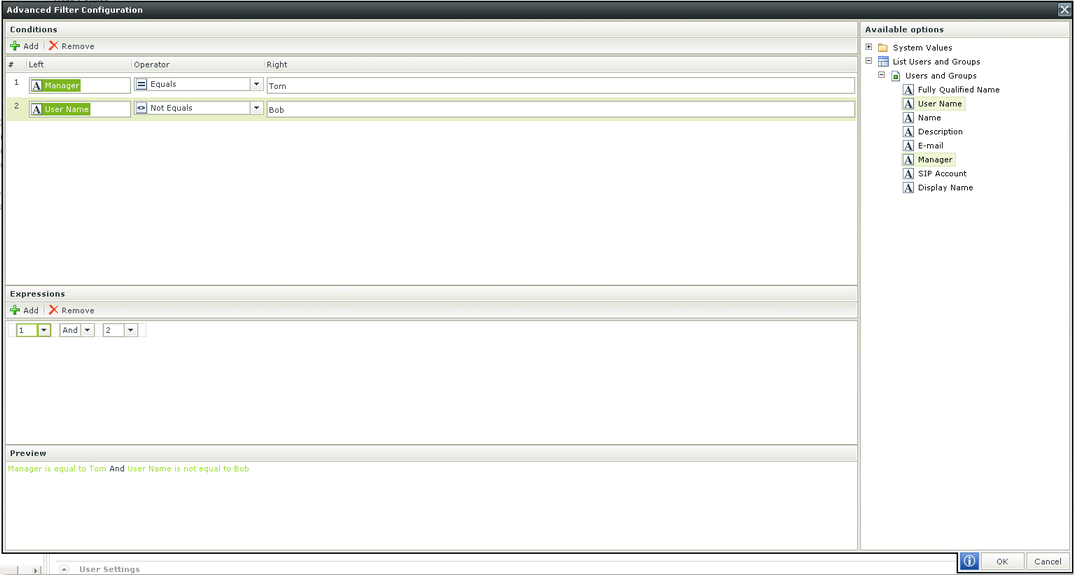
| Feature | Description |
|---|---|
| Conditions | Conditions can be added |
| Expressions | Allows the conditions to be combined using logical operators |
| Preview | Represents the condition and expression in preview mode |
A Quick Search is available on List Views in runtime to allow filtering of lists. The All fields item represents all visible columns on the View. Type search criteria and click on the Refresh button. All results matching the criteria are displayed

Click on the drop-down next to All fields to view the available search fields. These fields represent the column titles used in the View Designer and are displayed according to the list column order (from left to right represented top to bottom).

Click on the Configure a new filter icon as shown below to configure user filters. The fields below represent all columns on a View. The list will therefore include visible and hidden columns. The user filter can be set as the default filter to apply.
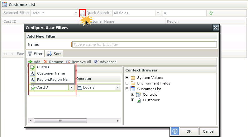
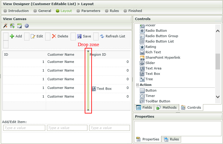
Columns can be added by dragging Fields or Controls onto the canvas.
- Edit a List View or Editable List View.
- Drag a field or control onto the canvas.
- Wait for the drop zone to be displayed, then drop the field or
control where required.
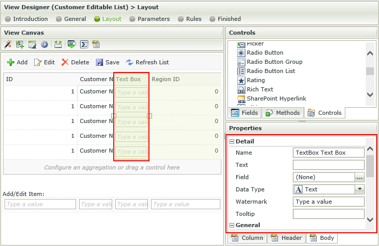
- Note that the column is configured according to the type of field or control.
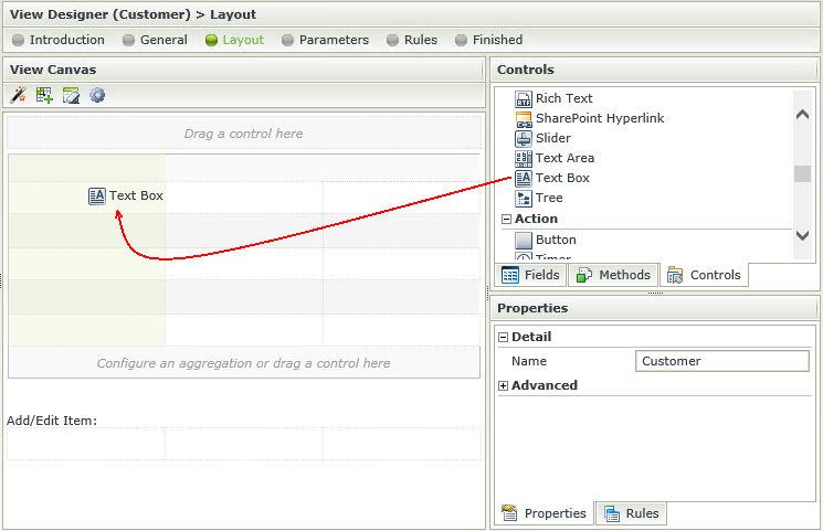
- Fields and controls can also be dragged and dropped directly onto the canvas when creating a new View. It is not necessary to configure the View layout first.
When a control is dragged from the Toolbox of a View, it is bound to that SmartObject property. When using the same control more than once on a View, all of those controls stay bound to that property unless you specifically unbind the control. Controls can be unbound by selecting the control and clicking on the Unbind button in the canvas Toolbar. When one of the controls bound to the property is updated, all of the related controls linked to that property will be updated as well.
It is therefore important to note that when using the dependent drop down scenario on a List View for example, one needs to unbind the parent controls from the foreign keys that were originally dragged upon the canvas. When one drop down changes, it applies the change to the next control, which is bound to the same field, and will attempt to update all the related controls. This will cause a repeating cycle of events.
This is also applicable if a foreign key value is transferred from the one drop down to the other as the primary key value. When the ID's stop matching, this will seem as if the wrong data is returned to the user or unexpected behavior may occur.
The last control that is changed and also linked to a property, determines that property’s value. It is imperative to remember that if a control is not specifically required to save (or show) a particular property’s value, it should not be bound to that property.
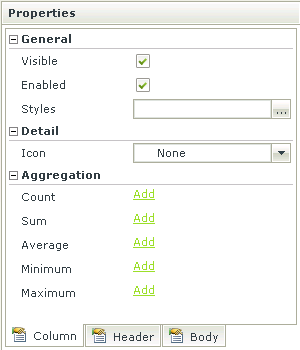
The following Column toolbar options are available when selecting a column:
| Feature | Description | How to use it |
|---|---|---|
| Visible | Indicates whether the control should be visible on the View | Deselect the option if the control should not be visible |
| Enabled | Indicates whether the control should be enabled for use on the View | Deselect the option if the control should not be enabled for use on the View |
| Styles | Provides the ability to apply styling to the control. See the Style Builder topic for more information on styling options | Click on the ellipsis to open the Style Builder |
| Icon | The icon displayed in the control next to the Text | Select the icon from the drop down list |
| Count | Enables the Count aggregation on the control. The number of records in the column will be displayed | Click on Add to add the Count aggregation to the bottom of the View |
| Sum | Enables the Sum aggregation on the control. The sum of the values in the column will be displayed | Click on Add to add the Sum aggregation to the bottom of the View |
| Average | Enables the Average aggregation on the control. The average of the values in the column will be displayed | Click on Add to add the Average aggregation to the bottom of the View |
| Minimum | Enables Minimum aggregation on the control. The minimum (smallest) of the values in the column will be displayed | Click on Add to add the Minimum aggregation to the bottom of the View |
| Maximum | Enables Maximum aggregation on the control. The maximum (biggest) of the values in the column will be displayed | Click on Add to add the Maximum aggregation to the bottom of the View |
The following Header toolbar options are available when selecting a column:
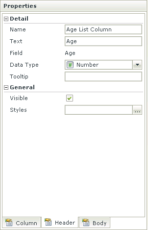
| Feature | Description | How to use it |
|---|---|---|
| Name | Indicates the Name of the column, i.e. the Header | Type a new name if required |
| Text | The text to be displayed in the Header | Type text to be displayed |
| Field | Indicates the field that is used for this column | N/A |
| Data Type | Indicates the data type of the field used for the column | Select a new data type from the drop down list if required |
| Tooltip | Tooltip to be displayed when hovering over the column and Header | Type the tooltip description |
| Visible | Indicates whether the Header should be visible on the View | Deselect the option if the header should not be visible |
| Styles | Provides the ability to apply styling to the Header. See the Style Builder topic for more information on styling options | Click on the ellipsis to open the Style Builder |
The following Body toolbar options are available when selecting a column:
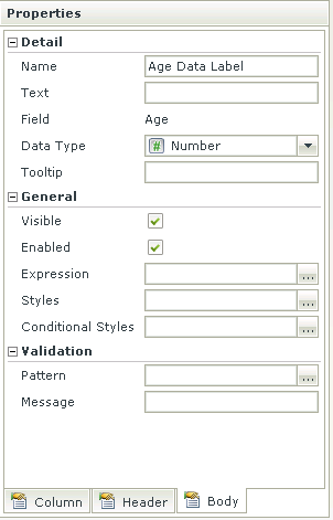
| Feature | Description | How to use it |
|---|---|---|
| Name | Indicates the Name of the rows in the column | Type a new name if required |
| Text | The text to be displayed in the rows | Type text to be displayed |
| Field | Indicates the field that is used for this column | N/A |
| Data Type | Indicates the data type of the field used for the column | Select a new data type from the drop down list if required |
| Tooltip | Tooltip to be displayed when hovering over the rows | Type the tooltip description |
| Visible | Indicates whether the rows should be visible on the View | Deselect the option if the header should not be visible |
| Enabled | Indicates whether the rows should be enabled for use on the View | Deselect the option if the rows should not be enabled for use on the View |
| Expression | An Expression can be added to the control | Click on the ellipsis to open the Expression Builder |
| Styles | Provides the ability to apply styling to the body. See the Style Builder topic for more information on styling options | Click on the ellipsis to open the Style Builder |
| Conditional Styles | Styles or formatting set to a specific control which will fire when a certain condition validates to TRUE. See the Conditional Styles section for more information | Click on the ellipsis to open the Conditional formatting screen |
| Pattern | Patterns are regular expressions used to enforce validation on a certain control when data is captured | Click on the ellipsis to add more patterns |
| Message | The message that will be displayed is the pattern validation fails | Type text |
Patterns are regular expressions used to enforce validation on a certain control when data is captured. There are several validation types as shown below. Additional validation patterns can be configured and the validation error message can be customized. Creating a Pattern for “percentage” for example, would enforce validation on the selected control, which will fail if the user did not enter the value as “[Value][%]”.
When clicking on the ellipsis next to Pattern, the Validation Patterns screen opens:
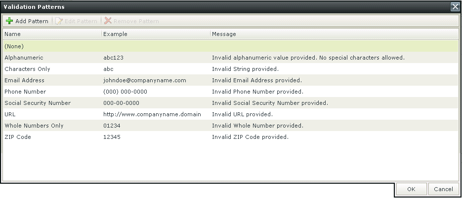
| Feature | Description | How to use it |
|---|---|---|
| Add Pattern | Adds a new Validation Pattern | Click on Add Pattern |
| Edit Pattern | Edits an existing Validation Pattern | Click on Edit Pattern |
| Remove Pattern | Removes a Validation Pattern | Click on Remove Pattern |
Click Add Pattern to add a new pattern. The Add New Validation Pattern screen opens
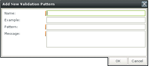
| Feature | Description | How to use it |
|---|---|---|
| Name | The name of the Validation Pattern | Type a name |
| Example | An example of the Validation Pattern such as abc for a Characters Only Validation Pattern | Type an example |
| Pattern | The regular expression for the Validation Pattern | Type the regular expression |
| Message | The message to be displayed if the input data does not match the regular expression | Type the message |
Please note when using a validation Pattern on a control, a
A custom Pattern can be created. Creating a Pattern for “percentage” for example, would enforce validation on the selected control, which will fail if the user did not enter the value as “[Value][%]”.
Click Add Pattern to add a new pattern. The Add New Validation Pattern screen opens

| Feature | Description | How to use it |
|---|---|---|
| Name | The name of the Validation Pattern | Type a name |
| Example | An example of the Validation Pattern such as abc for a Characters Only Validation Pattern | Type an example |
| Pattern | The regular expression for the Validation Pattern | Type the regular expression |
| Message | The message to be displayed if the input data does not match the regular expression | Type the message |
It is important to note the difference in applying validation Patterns to Item Views and Editable List Views.
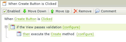
When applying a validation Pattern to an Item View, the Rule Definition should look something like this:
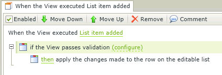
When applying a validation Pattern to an Editable List View, the Rule Definition should look something like this:
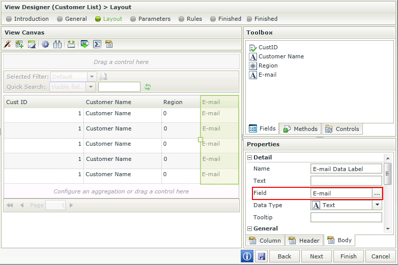
Control bindings are reflected in the Properties of the control. The Field property under the Detail section represents the field (SmartObject property) it is bound to.
Bindings can be removed by using one of the following methods:
- Unbind feature - Select the control and click the Unbind Control icon in the Toolbar. The Field property of the control is set to None.
- Set a property - Select the control, click on the ellipsis next to the Field property and select None.
Unbound controls will have a None value in the Field property and can be bound to a field by using one of the following methods:
- Set a property - Select the control, click on the ellipsis next to the Field property and select a field from the list.
- Drag and drop a field - Drag and drop the field from the Fields tab into the control. The Field property is set to the field.
Considerations
- If a property is deleted from a SmartObject, the control bound to that property will now be unbound when editing the View. Use one of the methods mentioned above to bind the control to another field.
- When mapping more than one control to the same Field, it is important to remember that the mapping is done to the control and the control is bound to the field. The field will be used in the Create, Save, Delete and Load methods.
- When changing the binding of the control to another Field, it is important to note that the control's Data Type property will change to match the Data Type of the new Field. However, the Styling, especially Formatting of the control will remain and needs to be changed by the designer if required.
Click here for information on Control Support