Getting Familiar with the View Designer
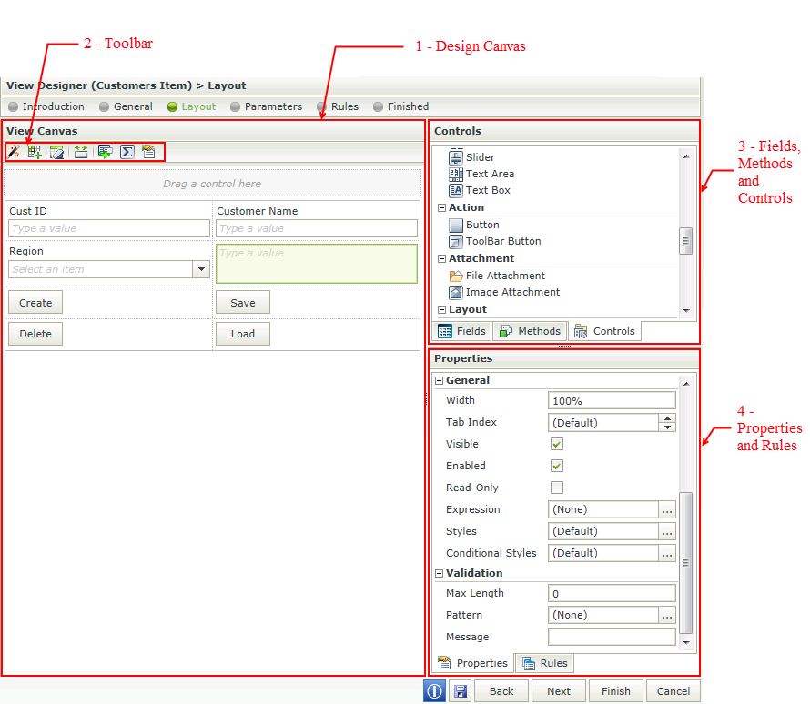
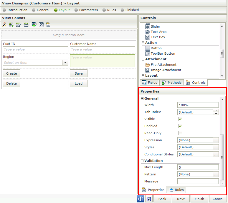
The View Designer allows the user to design a View using fields and methods of an existing SmartObject or design a View using out of the box controls. The View Designer Layout screen contains the following sections as indicated in the image below:
- Design Canvas - Blank space where the View will be designed.
- Toolbar - The toolbar provides various functions for use on the canvas.
- Fields, Methods and Controls - The View Designer allows the user to drop these three components onto the canvas to design a View.
- Properties and Rules - The properties of the controls and Rules applicable to the View or controls. These can be edited.
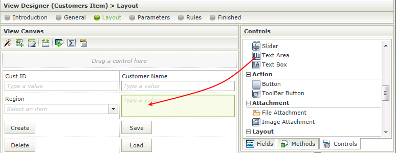
The user can drag and drop fields and methods of an existing SmartObject and/or out of the box controls onto the canvas.
The following toolbar options are available when selecting a control:

| Feature | Icon | Description |
|---|---|---|
| Create Labels and Controls |

|
Creates Labels and Controls using the selected data source |
| Create Layout Table Only |

|
Clears the canvas and inserts a table with the specified number of columns and rows |
| Clear Canvas |

|
Clears the canvas |
| Unbind Control |

|
Unbinds the Control from the current Field |
| Fit Control to Cell |

|
Fits the control to the cell, i.e. removes the width setting |
| Change Control |

|
Changes the control of the field |
| Control Expression |

|
Opens the Calculation Expression Form. Adds an expression to the control. More than one expression can be added |
| Edit Styles |

|
Opens the Style Builder |
When designing a View and clicking on the Create Labels and Controls toolbar button, the View that was designed will be lost and the View will reset to the selection on the Settings step. To preserve the already designed View, Save or Finish the View. The Create Labels and Controls button can then be executed and if not satisfied with the results, Cancel to revert back to the saved version.
The following toolbar options are available when selecting a cell:

| Feature | Icon | Description |
|---|---|---|
| Create Labels and Controls |

|
Creates Labels and Controls using the selected data source |
| Create Layout Table Only |

|
Clears the canvas and inserts a table with the specified number of columns and rows |
| Clear Canvas |

|
Clears the canvas |
| Insert Row Above |

|
Inserts a row above the current cell |
| Insert Row Below |

|
Inserts a row below the current cell |
| Insert Column to the Left |

|
Inserts a column to the left of the current cell |
| Insert Column to the Right |

|
Inserts a column to the right of the current cell |
| Merge Cell to the Right |

|
Merges the current cell with the one on the right |
| Merge Cell Below |

|
Merges the current cell with the one below |
| Clear Cell |

|
Clears the cell |
| Clear Row |

|
Clears the row |
| Remove Column |

|
Removes the column |
| Remove Row |

|
Removes the row |
| Left Align |

|
Aligns the content of the cell to the left |
| Center Align |

|
Aligns the content of the cell in the center |
| Right Align |

|
Aligns the content of the cell to the right |
| Top Align |

|
Aligns the content of the cell to the top |
| Middle Align |

|
Aligns the content of the cell in the middle |
| Bottom Align |

|
Aligns the content of the cell to the bottom |
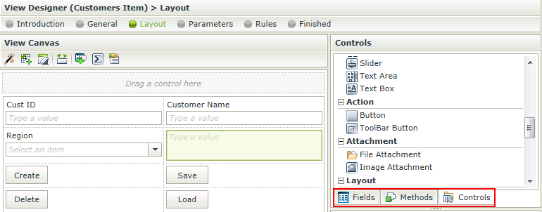
The View Designer allows the user to drop three different components onto the canvas. These components can be found on the right hand side of the Designer.
- Fields - The SmartObject properties are listed on the Fields tab and the associated data type is indicated with an icon. When you drag a field onto the canvas, the appropriate control based on the data type will display
- Methods - The SmartObject methods are listed on the Methods tab and include only those methods that match the View type. For example, on an Item View, only the Scalar methods (i.e., methods that deal with a single record) will display, such as Load, Create, Update, or Delete
- Controls - The Controls tab includes common user interface controls such as Buttons, Text boxes, Attachment controls, and so forth. These controls can either be bound to SmartObject properties (Fields), or they can be unbound controls
Each control has unique properties that can be configured. In addition, rules can be applied on these controls. See the Controls and Rules topics for more information.
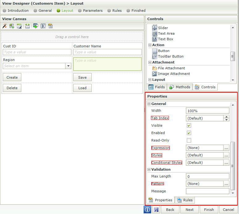
The following generic properties can be found on some of the controls:
