Item View
The Item View presents the user with the functionality to create a View that will be used to capture information. The initial screen of the Item View Layout allows the user to create labels and controls based on the SmartObject selected or generate a blank layout table for inserting controls. Notice the icons in the toolbar match the options on the View Canvas. Selecting Create Layout Table Only allows the user to design the View by dragging Fields, Methods and Controls onto the canvas.
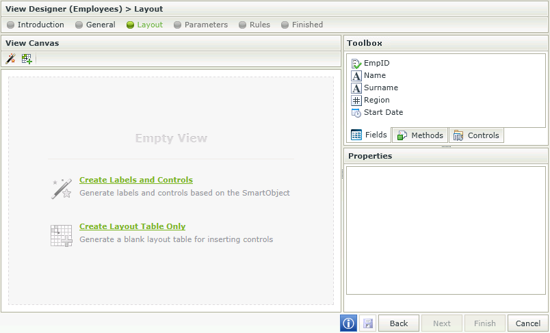
Fields and controls can also be dragged and dropped directly onto the canvas when creating a new View. It is not necessary to first configure the layout. See the Adding columns to the canvas effortlessly section.
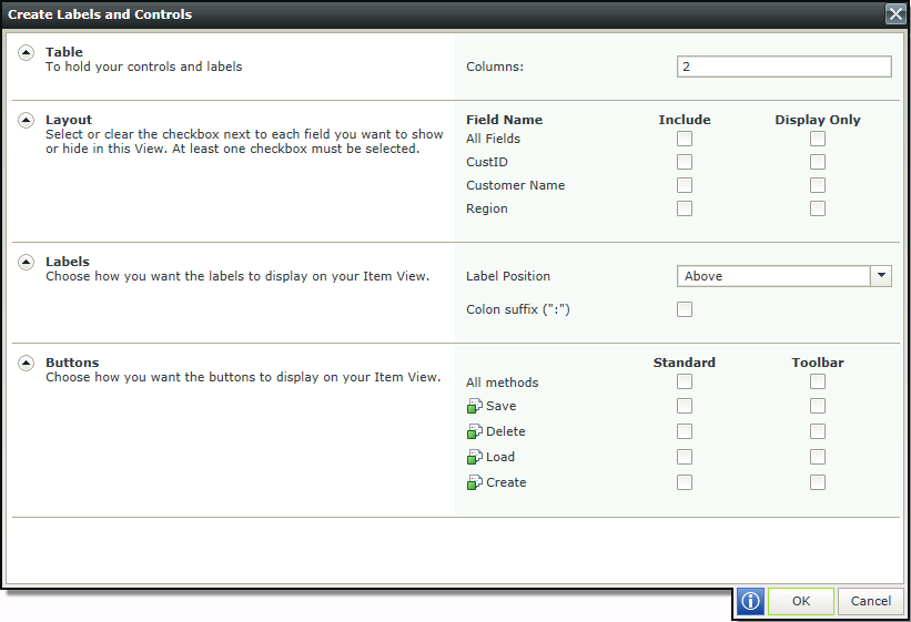
Selecting Create Labels and Controls shows the View setting screen.
| Feature | Description | How to use it |
|---|---|---|
|
Layout |
Options to generate the View from the fields found in the SmartObject selected as the Data source in the General screen. |
Check the Include boxes for fields to be displayed in the View. Then check the Display Only boxes if the field should be read only |
|
Labels |
Indicates where the Label should be placed:
|
Select the option to be used |
|
Colon suffix (":") |
Adds a colon suffix to each label for example Employee: |
Select the option if required |
|
Buttons |
Represents the methods that are available for use on the View. If ticked, a button will be added on the View for the specific method. Standard - Buttons will be placed at the bottom spread across the columns Toolbar - Buttons will be placed at the top in the toolbar |
Select the placement |
|
Table |
The size of the table to hold the controls and their labels |
Enter the number of columns desired |
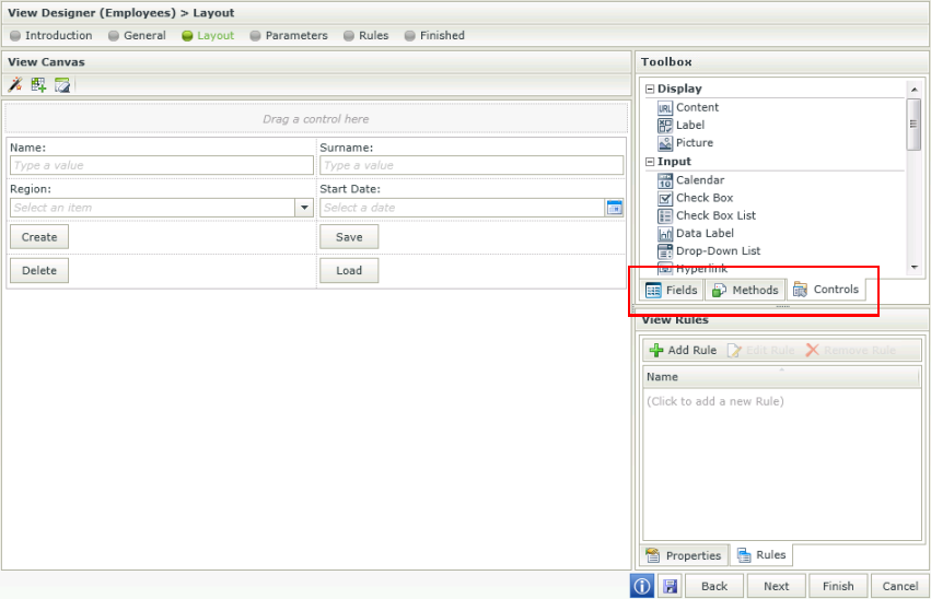
The View Designer allows the user to drop three different components onto the canvas. These components can be found on the right hand side of the Designer:
- Fields - The SmartObject properties are listed on the Fields tab and the associated data type is indicated with an icon. When you drag a field onto the canvas, the appropriate control based on the data type will display
- Methods - The SmartObject methods are listed on the Methods tab and include only those methods that match the View type. For example, on an Item View, only the Scalar methods (i.e., methods that deal with a single record) will display, such as Load, Create, Update, or Delete
- Controls - The Controls tab includes common user interface controls such as Buttons, Text boxes, Attachment controls, and so forth. These controls can either be bound to SmartObject properties (Fields), or they can be unbound controls
| Feature | Description | How to use it |
|---|---|---|
| Drag a control here This area will only be present if Standard Buttons and not Toolbar was chosen in the previous step. |
Indicates where a new control should be dragged and dropped | Drag and drop a control |
| Fields, Methods and Controls |
Fields - Displays the fields available for use on the View. These fields are the properties of the SmartObject linked to the View Methods - Displays the Methods available for use on the View. These are the methods of the SmartObject linked to the View Controls - Displays the Controls available for use on the View |
Drag the Fields, Methods and/or Controls onto the canvas |
| Properties / Rules tabs |
Properties - Displays the properties of a field View Rules - Displays the Rules of the View |
Properties - Select a field to display the properties of the field View Rules - Select the tab to display the Rules of the View |
When a control is dragged to a View, it is bound to that SmartObject property. When using the same control more than once on a View, all of those controls stay bound to that property unless you specifically unbind the control. Controls can be unbound by selecting the control and clicking on the Unbind button in the canvas Toolbar. When one of the controls bound to the property is updated, all of the related controls linked to that property will be updated as well.
It is therefore important to note that when using the dependent drop down scenario on a List View for example, one needs to unbind the parent controls from the foreign keys that were originally dragged upon the canvas. When one drop down changes, it applies the change to the next control, which is bound to the same field, and will attempt to update all the related controls. This will cause a repeating cycle of events.
This is also applicable if a foreign key value is transferred from the one drop down to the other as the primary key value. When the ID's stop matching, this will seem as if the wrong data is returned to the user or unexpected behavior may occur.
The last control that is changed that is also linked to a property, determines that property’s value. It is imperative to remember that if a control is not specifically required to save (or show) a particular property’s value, it should not be bound to that property.
The following toolbar options are available when selecting a control:

| Feature | Icon | Description |
|---|---|---|
| Create Labels and Controls |

|
Creates Labels and Controls using the selected data source |
| Create Layout Table Only |

|
Clears the canvas and inserts a table with the specified number of columns and rows |
| Clear Canvas |

|
Clears the canvas |
| Unbind Control |

|
Unbinds the Control from the current Field |
| Fit Control to Cell |

|
Fits the control to the cell, i.e. removes the width setting |
| Change Control |

|
Changes the control of the field |
| Control Expression |

|
Opens the Calculation Expression Form. Adds an expression to the control. More than one expression can be added |
| Edit Styles |

|
Opens the Style Builder |
When designing a View and clicking on the Create Labels and Controls toolbar button, the View that was designed will be lost and the View will reset to the selection on the Settings step. To preserve the already designed View, Save or Finish the View. The Create Labels and Controls button can then be executed and if not satisfied with the results, Cancel to revert back to the saved version.
The following toolbar options are available when selecting a cell:

| Feature | Icon | Description |
|---|---|---|
| Create Labels and Controls |

|
Creates Labels and Controls using the selected data source |
| Create Layout Table Only |

|
Clears the canvas and inserts a table with the specified number of columns and rows |
| Clear Canvas |

|
Clears the canvas |
| Insert Row Above |

|
Inserts a row above the current cell |
| Insert Row Below |

|
Inserts a row below the current cell |
| Insert Column to the Left |

|
Inserts a column to the left of the current cell |
| Insert Column to the Right |

|
Inserts a column to the right of the current cell |
| Merge Cell to the Right |

|
Merges the current cell with the one on the right |
| Merge Cell Below |

|
Merges the current cell with the one below |
| Clear Cell |

|
Clears the cell |
| Clear Row |

|
Clears the row |
| Remove Column |

|
Removes the column |
| Remove Row |

|
Removes the row |
| Left Align |

|
Aligns the content of the cell to the left |
| Center Align |

|
Aligns the content of the cell in the center |
| Right Align |

|
Aligns the content of the cell to the right |
| Top Align |

|
Aligns the content of the cell to the top |
| Middle Align |

|
Aligns the content of the cell in the middle |
| Bottom Align |

|
Aligns the content of the cell to the bottom |
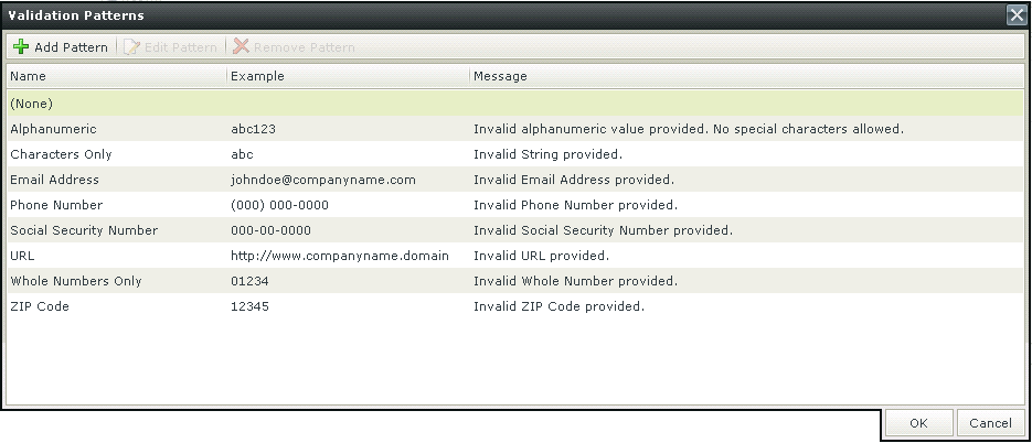
Patterns are regular expressions used to enforce validation on a certain control when data is captured. There are several validation types as shown below. Additional validation patterns can be configured and the validation error message can be customized. Creating a Pattern for “percentage” for example, would enforce validation on the selected control, which will fail if the user did not enter the value as “[Value][%]”.
When clicking on the ellipsis next to Pattern, the Validation Patterns screen opens:
| Feature | Description | How to use it |
|---|---|---|
| Add Pattern | Adds a new Validation Pattern | Click on Add Pattern |
| Edit Pattern | Edits an existing Validation Pattern | Click on Edit Pattern |
| Remove Pattern | Removes a Validation Pattern | Click on Remove Pattern |
Click Add Pattern to add a new pattern. The Add New Validation Pattern screen opens
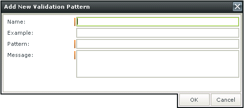
| Feature | Description | How to use it |
|---|---|---|
| Name | The name of the Validation Pattern | Type a name |
| Example | An example of the Validation Pattern such as abc for a Characters Only Validation Pattern | Type an example |
| Pattern | The regular expression for the Validation Pattern | Type the regular expression |
| Message | The message to be displayed if the input data does not match the regular expression | Type the message |
Please note when using a validation Pattern on a control, a
A custom Pattern can be created. Creating a Pattern for “percentage” for example, would enforce validation on the selected control, which will fail if the user did not enter the value as “[Value][%]”.
Click Add Pattern to add a new pattern. The Add New Validation Pattern screen opens

| Feature | Description | How to use it |
|---|---|---|
| Name | The name of the Validation Pattern | Type a name |
| Example | An example of the Validation Pattern such as abc for a Characters Only Validation Pattern | Type an example |
| Pattern | The regular expression for the Validation Pattern | Type the regular expression |
| Message | The message to be displayed if the input data does not match the regular expression | Type the message |
It is important to note the difference in applying validation Patterns to Item Views and Editable List Views.
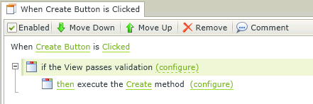
When applying a validation Pattern to an Item View, the Rule Definition should look something like this:
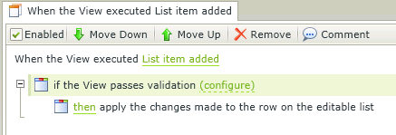
When applying a validation Pattern to an Editable List View, the Rule Definition should look something like this:
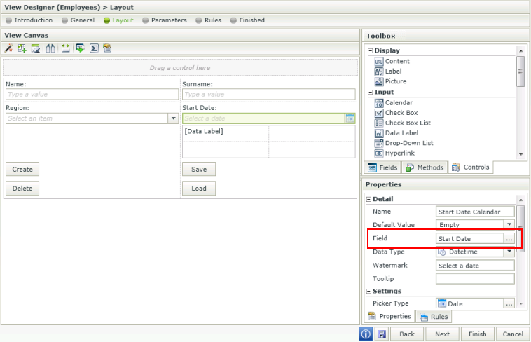
Control bindings are reflected in the Properties of the control. The Field property under the Detail section represents the field (SmartObject property) it is bound to.
Bindings can be removed by using one of the following methods:
- Unbind feature - Select the control and click the Unbind Control icon in the Toolbar. The Field property of the control is set to None.
- Set a property - Select the control, click on the ellipsis next to the Field property and select None.
Unbound controls will have a None value in the Field property and can be bound to a field by using one of the following methods:
- Set a property - Select the control, click on the ellipsis next to the Field property and select a field from the list.
- Drag and drop a field - Drag and drop the field from the Fields tab into the control. The Field property is set to the field.
Considerations
- If a property is deleted from a SmartObject, the control bound to that property will now be unbound when editing the View. Use one of the methods mentioned above to bind the control to another field.
- When mapping more than one control to the same Field, it is important to remember that the mapping is done to the control and the control is bound to the field. The field will be used in the Create, Save, Delete and Load methods.
- When changing the binding of the control to another Field, it is important to note that the control's Data Type property will change to match the Data Type of the new Field. However, the Styling, especially Formatting of the control will remain and needs to be changed by the designer if required.
Click here for information on Control support