List View Column Settings
When you're configuring a List view or Editable List view, every field is represented as a column. Each column has three configurable tabs, namely
column, header, and body, to configure settings such as width, aggregation, styles, expressions, and more. Use the image below to familiarize yourself with the available column settings.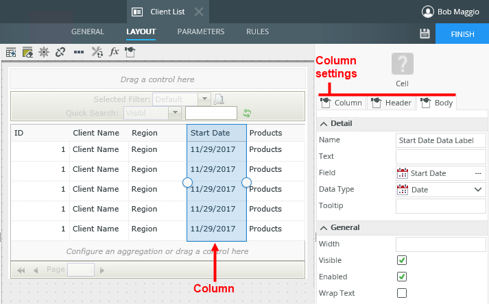
For the column, the header is the row header containing the field name. The body represents the individual records. 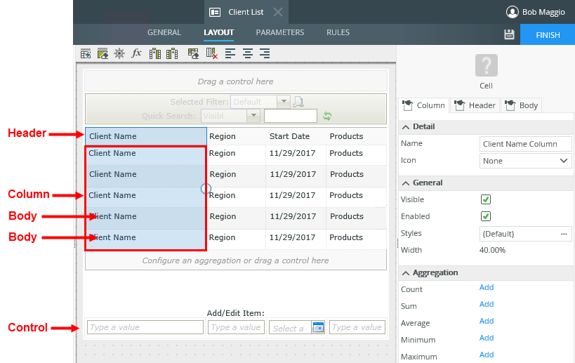
You can configure items such as the icon, style, width, and aggregation using the Column settings. 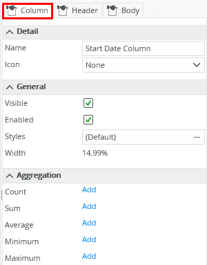
| Feature | Description | How to use it |
|---|---|---|
| Name | The name of the column | Type a new name if you want to change the name of the column |
| Icon | The icon displayed in the control next to the text | Select an icon from the icons available |
| Visible | Indicates if the column should show on the view | Uncheck the option if the control should be hidden |
| Enabled | Indicates if the column can be used at runtime, for example to edit a field and sort the column . | Uncheck the option if the control should not be enabled for use on the view |
| Styles | Enables you to apply styling to the column. See the Style Builder topic for more information | Click the ellipsis to open the Style Builder |
| Count | Adds the Count aggregation on the column. The number of records in the column displays at the bottom of the view at runtime | Click Add to add the Count aggregation to the bottom of the view |
| Sum | Adds the Sum aggregation on the column. The sum of the values in the column displays at the bottom of the view at runtime | Click Add to add the Sum aggregation to the bottom of the view |
| Average | Adds the Average aggregation on the column. The average of the values in the column displays at the bottom of the view at runtime | Click Add to add the Average aggregation to the bottom of the view |
| Minimum | Adds Minimum aggregation on the column. The smallest value in the column displays at the bottom of the view at runtime | Click Add to add the Minimum aggregation to the bottom of the view |
| Maximum | Adds Maximum aggregation on the column. The biggest value in the column displays at the bottom of the view at runtime | Click Add to add the Maximum aggregation to the bottom of the view |
Use the Header settings to configure items such as the tooltip, width, if the header must show on the view, and more.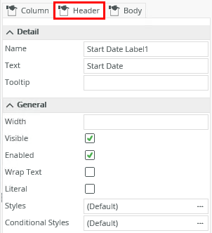
| Feature | Description | How to use it |
|---|---|---|
| Name | The header label name | Type a new name if required |
| Text | The text to display in the header | Type text to display |
| Tooltip | The tooltip to display when you hover over the column and header | Type the tooltip |
| Width | Adjusts the width of the header. You can use any whole percentage up to 100%, number or pixel value up to 32767px | Type details if you want to change this |
| Visible | Indicates if the header must show on the view | Uncheck the option if the header should be hidden |
| Enabled | Indicates if you can use the header, for example to sort a column at runtime by clicking on the header. | Uncheck the option if the header should not be enabled |
| Wrap Text | Positions the text (Name) relative to the cell | Check the option if the header should be wrapped |
| Literal |
Indicates if the text should be read as literal HTML or plain text. In the following example: If Literal is checked, the result is: |
Check the option if you want to add HTML code to the text, such as to highlight or otherwise format the header text |
| Styles | Enables you to apply styling to the header. See the Style Builder topic for more information on styling options | Click the ellipsis to open the Style Builder |
| Conditional Styles | Sets styles or formatting to the header that executes when a certain condition validates to TRUE. See the Conditional Styles section for more information | Click the ellipsis to open the Style Builder |
Use the Body settings to configure items such as the data type, width, expressions, and more. These settings apply to the rows of the column. 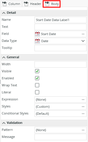
| Feature | Description | How to use it |
|---|---|---|
| Name | Indicates the Name of the rows in the column | Type a new name for the control |
| Text | The text displayed in the rows at design time | Type helper to be displayed, if any. Otherwise the name is used. |
| Field | Indicates the SmartObject field that is used for the rows | If you drag a control onto the canvas, the field displays as None as there is no SmartObject field linked to it. The SmartObject field displays if you drag a Field onto the canvas. |
| Data Type | Indicates the data type of the field or control used for the column. See the Controls topic for information about the different controls and data types. | Confirm the data type or select a new one from the drop down list |
| Tooltip | Tooltip to display when you hover over the rows | Type a tooltip or the name, if left empty |
| Width | Adjusts the width of the rows. You can use any whole percentage up to 100%, number or pixel value up to 32767px | Type details if you want to change this |
| Visible | Indicates if the rows must show on the view | Uncheck the option if the header should be hidden |
| Enabled | Indicates if you can use the rows, for example edit one of the rows in the view at runtime | Uncheck the option if the rows should not be enabled for use on the view |
| Expression | Adds expressions such as calculations and concatenation for example to the control that is executed in runtime | Click the ellipsis to open the Expression Builder |
| Styles | Enables you to apply styling to the body. See the Style Builder topic for more information on styling options | Click the ellipsis to open the Style Builder |
| Conditional Styles | Sets styles or formatting to a control that executes when a certain condition validates to TRUE. See the Conditional Styles section for more information | Click the ellipsis to open the Conditional formatting page |
| Pattern | Patterns are regular expressions used to enforce validation on a certain control when data is captured | Click the ellipsis to add more patterns |
| Message | The message that displays if the pattern validation fails | Type text for the message |