Styles
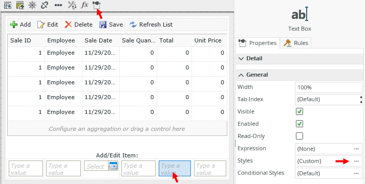
When you click on the Edit Styles icon on the Layout tab of the view or form, or the Styles control property, the Style Builder page opens, allowing you to change the style of the table cell or control. When you apply styles to a control, the display value of that control changes to the format you specify. For example, if you apply a Percentage to a text box control, and you enter a value of 0.64, the display value shows as 64% but the actual value is 0.64.
Use the Style Builder to apply formatting such as
Number, Currency, and Date and Time to a control. 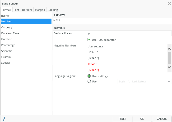
| Format | Description |
|---|---|
| None | No format applies. |
| Number | Applies number formatting to the control. You can specify a Language/Region, the number of decimal places, and how to display negative numbers. |
| Currency | Applies currency formatting to the control. You can specify a Language/Region, the number of decimal places, and the currency symbol. |
| Date and Time | Applies date and time formatting to the control. You can specify a Language/Region and data and time formats. |
| Duration | Applies duration formatting to the control. You can specify a Language/Region, source units to convert from, and the duration format. |
| Percentage | Applies percentage formatting to the control. You can specify a Language/Region and the number of decimal places. |
| Scientific | Applies scientific formatting to the control. You can specify a Language/Region and the number of decimal places. |
| Custom |
Applies custom formatting to the control. You can specify a Language/Region and type. |
| Special | Applies special formatting to the control. You can specify a Language/Region and type. |
| Preview | Shows a preview of the changes you made to the format of the control. |
Use the Duration format to format the display of numerical data as a duration of time, such as 4 Days and 17 Hours.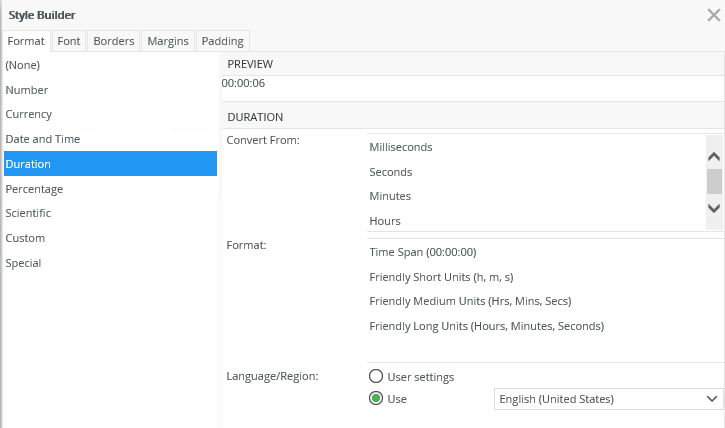
The Convert From takes numerical input and formats it according to what you specify. Convert From options include:
- Milliseconds
- Seconds
- Minutes
- Hours
The available duration Formats include:
- Time Span (00:00:00)
- Friendly Short Units (h, m, s)
- Friendly Medium Units (Hrs, Mins, Secs)
- Friendly Long Units (Hours, Minutes, Seconds)
The following controls support the duration format:
- Data Label
- Label
- Text Box
- Text Area
Configuring the Control with Duration Format
The following is an example of how to use the Duration format on a control.
- On a view, add a text box control.
- Select the control and click the Styles ellipses (...) in the control properties.
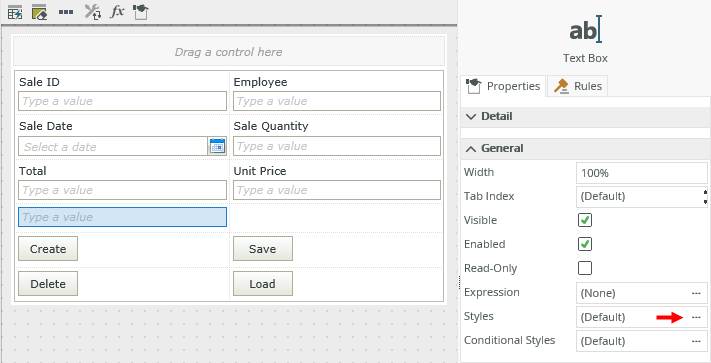
- On the Style Builder page, select the Duration option on the Format tab. Choose a Convert From and Format option.
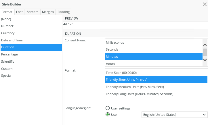
- Click OK, then Save and Finish the view.
- Run the view.
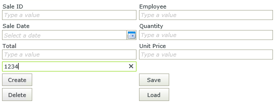
- Enter a numerical value in the text box.
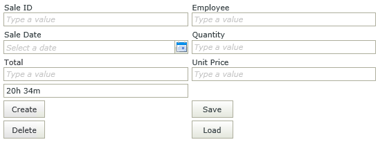
- The numerical value changes to the specified Duration format.
Considerations
- You can only format whole numbers.
- If you enter a value in runtime that is not a number, the value is ignored.
- The list of Duration formats depends on the browser culture (User Settings) or the custom selected culture (User option) you configure as the Language/Region.
Use the Special format to format numbers as shown in the image below.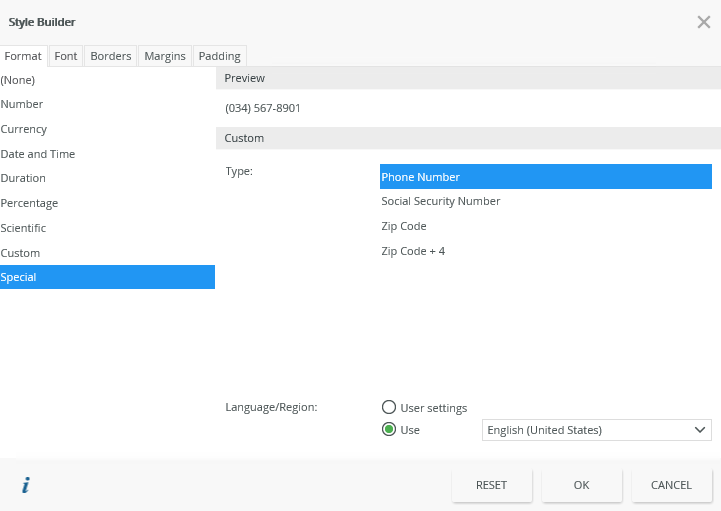
Four default special formats are available for the English (United States) culture:
- Phone Number
- Social Security Number
- Zip code
- Zip code + 4
Examples
The following examples indicate how the patterns apply to the text entered in runtime:
| Text entered | Pattern | Result |
|---|---|---|
| Phone Number | ||
| 1234567890 | (###) ###-#### | (123) 456-7890 |
| Social Security Number | ||
| 123456789 | ###-##-#### | 123-45-6789 |
| Zip code | ||
| 12345 | ##### | 12345 |
| Zip code + 4 | ||
| 123456789 | #####-#### | 12345-6789 |
Creating Custom Special Formats
You can also create a custom special format. See the following link in the K2 Developer Reference for more detail:Adding and Using a Custom Special Format in the Style Builder
Considerations
The following principles apply when you use special formatting:
- Formatting applies to numbers that you enter into the control in runtime.
- If you enter a value in runtime that is not a number, the value is ignored.
- A “#” in the pattern is replaced with the number corresponding to the position in the text that you enter.
- Replacement is done from the back to the front of the text that you enter in runtime.
- Any other symbol/character in the pattern is used, for example -, (, ) See examples above in the Special Formatting section.
- A 0 (zero) in the pattern represents either the number corresponding to the position in the text that you enter, or if a number does not exist for it a 0 is used.
- The list of Special formats depends on the browser culture (User Settings) or the custom selected culture (User option) you configure as the Language/Region setting.
- The pattern applies to the display at runtime, the underlying value remains the same as what you enter.
Apply font features such as style, size, effects and more to a control using the Font tab.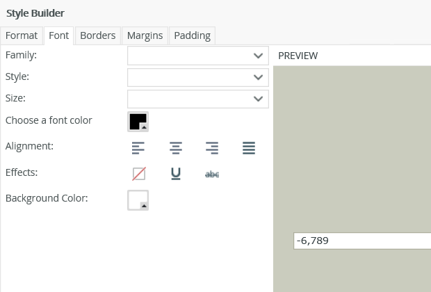
| Font | Description |
|---|---|
| Family | Changes the type of font |
| Style | Changes the font style of the object |
| Size | Changes the font size |
| Choose a font color | Changes the font color |
| Alignment | Aligns the text in respect of the control |
| Effects | Underlines the text or draws a line through the text, or no effect |
| Background color | Changes the background color of the control |
| Preview | Shows a preview of the changes you made to the font of the control |
Apply border features such as style, color, width and borders to a control using the Borders tab.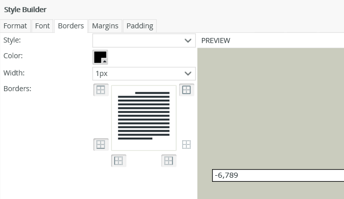
| Borders | Description |
|---|---|
| Style | The style of the left, right, top, and bottom borders |
| Color | The color of all four borders of a range |
| Width | Changes the width of the top, right, bottom, and left borders |
| Borders | Allows you to specify the appearance of the table cells |
You can adjust each label or cell margin by setting left and right indents and spacing before and after the text. The example below shows an indent of 14 pixels applied to the top, right, bottom and left of the cell:

| Margins | Description |
|---|---|
| Default | The default value to apply to the top, right, bottom and left settings. |
| Top | Height of the top border that retains its size. Adjusts the spacing before the cell |
| Right | Width of the right border that retains its size. Adjusts the indent to the right of the cell |
| Bottom | Height of the bottom border that retains its size. Adjusts the spacing after the cell |
| Left | Width of the left border that retains its size. Adjusts the indent to the left of the cell |
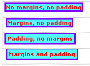
Padding controls the spacing between the contents of a cell and the cell's border. Following is a visual illustration of the difference between applying margins and padding:
| Padding | Description |
|---|---|
| Default |
The default value to apply to the top, right, bottom and left settings. |
| Top | Spacing between the contents of a cell and the cell's border at the top |
| Right | Spacing between the contents of a cell and the cell's border on the right |
| Bottom | Spacing between the contents of a cell and the cell's border at the bottom |
| Left | Spacing between the contents of a cell and the cell's border on the left |
When you work with various types of views, you access the Styles feature in the following ways:
Item View
Select a control on the view and click the Styles ellipsis in the Properties panel on the right, or click the Edit Styles icon in the toolbar as shown below. 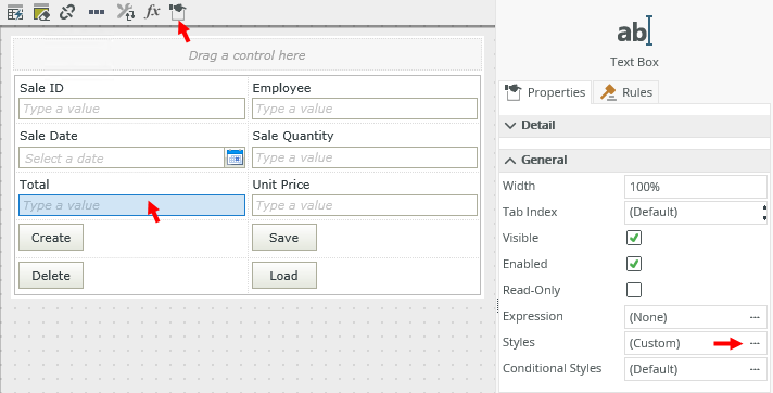
List View
Select a column on the view and click the Styles ellipsis in the Body tab of the Properties panel on the right, or click the Edit Styles icon in the toolbar as shown below. 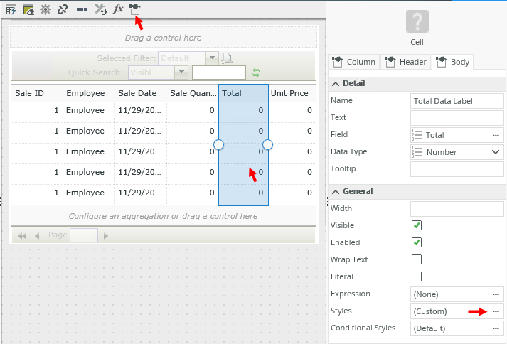
Editable List View
Select a control on the view in the Add/Edit Item section on the canvas and click the Styles ellipsis in the Properties panel on the right, or click the Edit Styles icon in the toolbar as shown below. 