Toolbar Button Control
The Toolbar Button control is an action control with customizable icons used to invoke certain events. The Toolbar Button control can display both text and images. When dragging a Field of type Toolbar Button onto the canvas, the properties displayed will be specific to that Field.
- Create a View
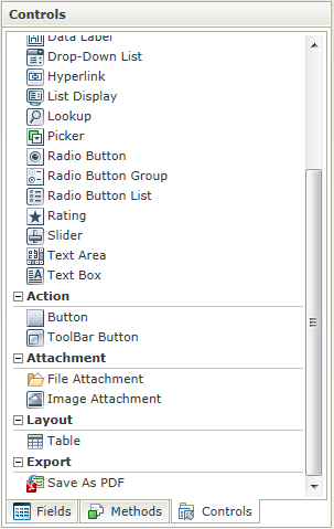
- Drag the Toolbar Button control onto the canvas. The control can be found in the Action section of the Controls found in the View Designer, see the Properties section below
- Configure the properties as required
- Run the View
- The Toolbar Button is most commonly used to action an event that has been set up in the Rule Designer
- The default event is the Click event and is set up automatically when selecting the Button and adding the Rule from the Rules tab on the property grid of the View or Form Designer
- There are 12 customizable icons that can be used (these icons can be extended on the back-end)
- The control does not necessarily have to be placed on the Toolbar
- Focus can be set to this control at runtime by using the Focus control method in the Rule Designer
The Toolbar Button control is available in the Action section of the Controls found in the View Designer and Form Designer.

| Properties | Description | Can be set in runtime using Rules |
|---|---|---|
| Name | A unique identifier for the selected control. This property is required | No |
| Text | The text to be displayed during runtime | Yes, see Control Properties Actions for more information |
| Icon | Select the icon to be displayed on the button | Yes, see Control Properties Actions for more information |
| Tooltip | The value to be displayed when the cursor is hovered over the control during runtime | Yes, see Control Properties Actions for more information |
| Tab Index | Used to define a sequence that users follow when they use the Tab key to navigate through a page at runtime | Yes, see Control Properties Actions for more information |
| Visible | A Boolean value used to establish whether the control is visible during runtime | Yes, see Control Properties Actions for more information |
| Enabled | A Boolean value used to establish whether the control is enabled during runtime | Yes, see Control Properties Actions for more information |
| Styles | Opens the Style Builder enabling the user to specify style features like Format, Font, Borders, Padding and Margins. See the Style Builder topic for more information on styling options | No |
| Conditional Styles | Opens the Conditional Formatting Designer used to design styles that will apply only when certain conditions are met. See the Conditional Styles section for more information | No |
