Picture Control
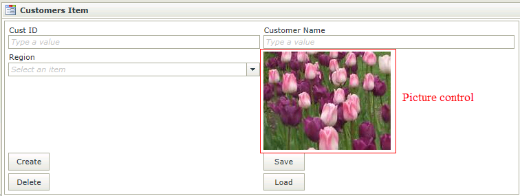
The Picture control is a read-only display control used to display static images. When dragging a Field of type Picture onto the canvas, the properties displayed will be specific to that Field.
- Create a View
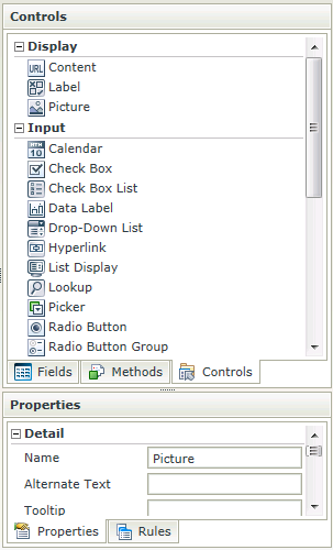
- Drag the Picture control onto the canvas. The control can be found in the Display section of the Controls found in the View Designer, see the Properties section below
- Configure the source in the Properties section
- Configure the properties as required
- Run the View
-
By default, users are not able to upload or download files with the File Attachment control, Image Attachment control or Picture control when using a Form configured for Anonymous Access. Configuration settings are available that allow users to upload and download files using an Anonymous Access Form.
You should carefully consider and evaluate the impact of allowing file uploads and downloads with Anonymous Access Forms, since doing so may be considered a security vulnerability. User Credentials and Authentication are not required for Anonymous Access Forms and therefore any files uploaded or downloaded with such Forms could be performed by anyone that can access the Form, without having to provide credentials first.The setting to allow file uploads and downloads on Anonymous Access Forms can be added to the web.config files for the SmartForms websites, located at the following directories respectively:
[Install Directory]\K2 blackpearl\K2 smartforms Designer
[Install Directory]\K2 blackpearl\K2 smartforms Runtime
Add the following setting to the <appSettings> section of the configuration files listed above:
<add key="Forms.Controls.File.AllowAnonymousAccess" value="true" /> (Applicable to the File Attachment control)
<add key="Forms.Controls.Image.AllowAnonymousAccess" value="true" /> (Applicable to the Picture and Image Attachment controls)
The value should be set to true to allow the controls to function correctly when accessed through Anonymous Access Forms. If this setting is not added or set to false, the controls will not work on Anonymous Access Forms: Errors will occur when uploading or downloading files and image thumbnails may not display. Note that this setting applies to the site as a whole and will apply to all Anonymous Access Forms. It is not possible to configure security for these controls for individual Anonymous Access Forms. - The Picture control is also available in the Form Designer
- A Picture can only be used with the following Rule Actions:
- Show a Control
- Hide a Control
- Set a Control’s Properties
- If the Picture should change dynamically according to context one can use multiple Picture controls and hide the unnecessary images, then and use the “Show a Control” action to show the necessary image and the “Hide a Control” action to hide all the other images
- One can set up a pseudo-implementation of a condition indicator (like a traffic light) using the condition “if a control contains a specific value” and the above-mentioned showing and hiding of the necessary images according to the specified value
- Focus can be set to this control at runtime by using the Focus control method in the Rule Designer
The Picture control is available in the Display section of the Controls found in the View Designer and Form Designer.

| Properties | Description | Can be set in runtime using Rules |
|---|---|---|
| Name | A unique identifier for the selected control. This property is required | No |
| Alternate Text | The text to be displayed during runtime if the picture could not be loaded | Yes, see Control Properties Actions for more information |
| Tooltip | The value to be displayed when the cursor is hovered over the control during runtime | Yes, see Control Properties Actions for more information |
| Source | Configure the image to be displayed during runtime | Yes, see Control Properties Actions for more information |
| Height | Adjust the height of the control (any whole number or pixel value up to 32767px) | Yes, see Control Properties Actions for more information |
| Width | Adjust the width of the control (any whole percentage up to 100%, number or pixel value up to 32767px) | Yes, see Control Properties Actions for more information |
| Tab Index | Used to define a sequence that users follow when they use the Tab key to navigate through a page at runtime | Yes, see Control Properties Actions for more information |
| Visible | A Boolean value used to establish whether the control is visible during runtime | Yes, see Control Properties Actions for more information |
| Styles | Opens the Style Builder enabling the user to specify style features like Format, Font, Borders, Padding and Margins. See the Style Builder topic for more information on styling options | No |
| Conditional Styles | Opens the Conditional Formatting Designer used to design styles that will apply only when certain conditions are met. See the Conditional Styles section for more information | No |
Configure Rule to execute Picture Events
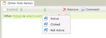
A Rule can be configured to execute a Picture Event. The Events available are as follows:
- When Picture is [Clicked] - When the control is clicked, the cursor will change to a hand (pointer) if this event is configured on the Picture control and the Rule will execute
- When Picture is [Active] - When the cursor is hovered over the picture (Mouse Over), the Rule will execute
- When Picture is [Not Active] - When the cursor is moved from within the picture to its container (Mouse Out), Rule will execute
The Events are displayed when using the Picture control in the Rule Designer:

Picture control Events
See KB001384 - How to use the Picture control Events for examples to use these Events.
