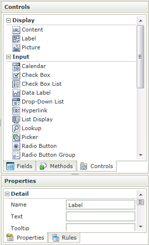
Label Control
The Label control is a read-only display control used to indicate control names or headers.
- Create a View
- Drag the Label control onto the canvas. The control can be found in the Display section of the Controls found in the View Designer, see the Properties section below
- Configure the properties as required
- Run the View
- The Label control is also available in the Form Designer
- A Label control can only be used with the following Rule Actions:
- Show a Control
- Hide a Control
- Set a Control’s Properties
- If the display text should change dynamically depending on context, or in different scenarios, a Data Label is a better option to use as it is configurable during runtime using multiple rules.
The Label control is available in the Display section of the Controls found in the View Designer and Form Designer.

| Properties | Description | Can be set in runtime using Rules |
|---|---|---|
| Name | A unique identifier for the selected control. This property is required | No |
| Text | The text to be displayed during runtime. If left empty or “Label” no value will be displayed | Yes, see Control Properties Actions for more information |
| Tooltip | The value to be displayed when the cursor is hovered over the control during runtime | Yes, see Control Properties Actions for more information |
| Width | Adjust the width of the control (any whole percentage up to 100%, number or pixel value up to 32767px). Note: The Width should be set when using the Wrap Text property. |
Yes, see Control Properties Actions for more information |
| Visible | A Boolean value used to establish whether the control is visible during runtime | Yes, see Control Properties Actions for more information |
| Enabled | A Boolean value used to establish whether the control is enabled during runtime | Yes, see Control Properties Actions for more information |
| Wrap Text | Allows the user to set the Width of the control and if the Text of the Label is longer than the label, the Wrap Text property can be selected to allow the overflow to flow to new lines, growing the Label height. If the Width is set and the Text content runs longer than the Label width, the overflow is hidden and an ellipsis is shown. In runtime, if the Tooltip is set and the content is hidden, the Tooltip shows the full text | Yes, see Control Properties Actions for more information |
| Literal | A Boolean value used to establish whether the text should be read as literal or plain text. In the following example: <div style=”color:blue”>HTML Element</div> If Literal = True, the result will be: HTML Element If Literal = False, the result will be: <div style=”color:blue”>HTML Element</div> The setting is disabled by default. If Literal is not selected, the control does not add any HTML elements to the text. This is useful when you want to render text and controls directly into a page without any additional markup |
Yes, see Control Properties Actions for more information |
| Styles | Opens the Style Builder enabling the user to specify style features like Format, Font, Borders, Padding and Margins. See the Style Builder topic for more information on styling options | No |
| Conditional Styles | Opens the Conditional Formatting Designer used to design styles that will apply only when certain conditions are met. See the Conditional Styles section for more information | No |
