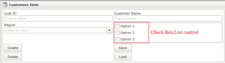
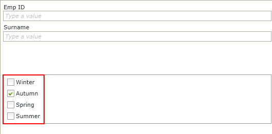
Check Box List Control
The Check Box List Control is an input control used to select multiple values at a time. The Check Box List control provides a multi selection check box group that can be dynamically created by binding the control to a data source. When dragging a field of type Check Box List onto the canvas, the properties displayed will be specific to that Field.
 How to use the Check Box List control
- Create a View .
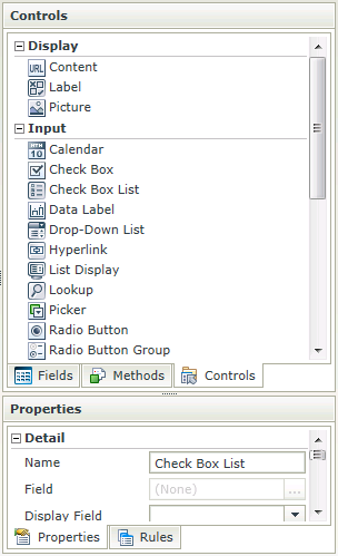
- Drag the Check Box List control onto the canvas. The control can be found in the Input section of the Controls found in the View Designer, see the Properties section below.
- Configure the Type property under Data Source in the Properties section.
- Configure the rest of the properties as required.
- Run the View.
Considerations
- The Check Box List control is a multi-value control.
- Multiple values can be transferred to the Check Box List by using a semi-colon delimited list in the Transfer Data action mappings screen.
- The values should correspond to the list item values.
- Focus can be set to this control at runtime by using the Focus control method in the Rule Designer.
Design Properties
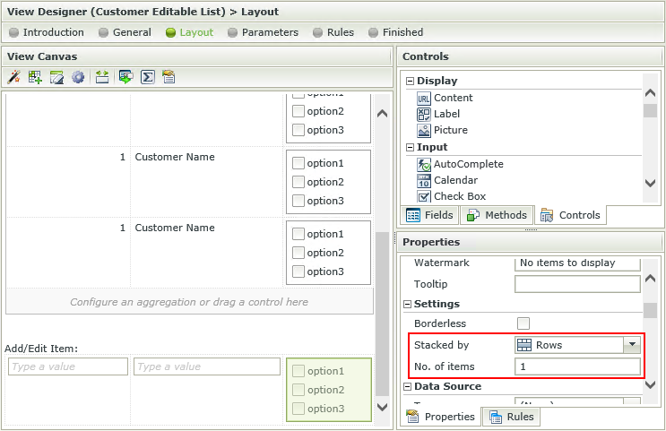
The Check Box List control is available in the Input section of the Controls found in the View Designer.
| Properties | Description | Can be set in runtime using Rules |
|---|---|---|
| Name | A unique identifier for the selected control. This property is required | No |
| Field | A read-only property displaying the field that is bound to the selected control | No |
| Data Type | A drop-down list containing the types of values that the selected control can accept | No |
| Watermark | The text to display when the control is not populated | Yes, see Control Properties Actions for more information |
| Tooltip | The value to be displayed when the cursor is hovered over the control during runtime | Yes, see Control Properties Actions for more information |
| Borderless | A Boolean value used to establish whether the control has borders during runtime | Yes, see Control Properties Actions for more information |
| Stacked by | Indicates whether the items will be displayed in rows or columns at runtime. Default is rows. See the Check Box List items per row or column section below. | Yes, see Control Properties Actions for more information |
| No. of items | Indicates the number of items to be displayed per row or column as selected in the Stacked by property. Default is 1. See the Check Box List items per row or column section below. | Yes, see Control Properties Actions for more information |
| Type | Set up data-bindings for the selected control | No |
| Items | A read-only list of fixed list items | No |
| SmartObject | The SmartObject that has been selected as the data source | No |
| Method | The method to be used to populate the control | No |
| Value | The SmartObject property that will be used as the selected value of the control | No |
| Original Property | If the control is part of a View and is linked to a specific field, this property will contain the name of the field that this control is linked to | No |
| Composite | When a many-to-many scenario is represented and implemented by this control, the Composite property indicates that the values will be retrieved in a way that execution can happen on each state (checked/unchecked) | No |
| Display | The display template of the control, indicating what values are visible when populating | No |
| Lookup SmartObject | An alternate SmartObject to be used as the source of the display values (*optional) | No |
| Lookup Method | The method to be executed on the Lookup SmartObject when retrieving the display values | No |
| Source Join Property | The SmartObject property on the original SmartObject that will be used to join the original SmartObject with the Lookup SmartObject | No |
| Lookup Join Property | The SmartObject property on the Lookup SmartObject that will be used to join the original SmartObject with the Lookup SmartObject | No |
| Height | Adjust the height of the control (any whole number or pixel value up to 32767px) | Yes, see Control Properties Actions for more information |
| Width | Adjust the width of the control (any whole percentage up to 100%, number or pixel value up to 32767px) | Yes, see Control Properties Actions for more information |
| Tab Index | Used to define a sequence that users follow when they use the Tab key to navigate through a page at runtime | Yes, see Control Properties Actions for more information |
| Visible | A Boolean value used to establish whether the control is visible during runtime | Yes, see Control Properties Actions for more information |
| Enabled | A Boolean value used to establish whether the control is enabled during runtime | Yes, see Control Properties Actions for more information |
| Read-Only | A Boolean value used to establish whether the control is read-only during runtime | Yes, see Control Properties Actions for more information |
| Styles | Opens the Style Builder enabling the user to specify style features like Format, Font, Borders, Padding and Margins. See the Style Builder topic for more information on styling options | No |
| Conditional Styles | Opens the Conditional Formatting Designer used to design styles that will apply only when certain conditions are met. See the Conditional Styles section for more information | No |
The multivalue data type is supported with a Check Box List control in Views. This will update and read the values from the multivalue property.The values shown in the Check Box List can be either static values or SmartObject list results.
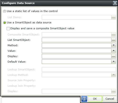
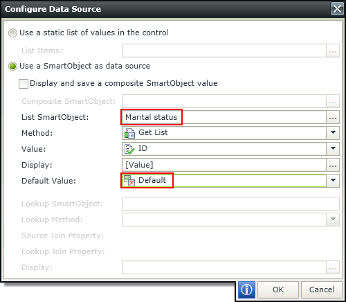
Configure Data Source
When clicking on the ellipsis next to Data Source Type, the Configure Data Source screen opens. Configure the data source to be used to populate the check box list.
| Fields | Description |
|---|---|
| Use a static list of values in the control | A static list of items can be configured |
| List Items | List Item selected |
| Use a SmartObject as data source | A SmartObject can be used as data source |
| Display and save a composite SmartObject value | A composite SmartObject can be selected to be used as a data source |
| List SmartObject | A List SmartObject can be used as data source |
| Method | The method to be used to populate the control |
| Value | The SmartObject property to be used as a value property |
| Display | The SmartObject property to be used as a display member |
| Default Value | The default SmartObject value to be used |
| Lookup SmartObject | An alternate SmartObject to be used as the source of the display values (*optional) |
| Lookup Method | The method to be executed on the Lookup SmartObject when retrieving the display values |
| Source Join Property | The SmartObject property on the original SmartObject that will be used to join the original SmartObject with the Lookup SmartObject |
| Lookup Join Property | The SmartObject property on the Lookup SmartObject that will be used to join the original SmartObject with the Lookup SmartObject |
| Display | Item to be used in the display |
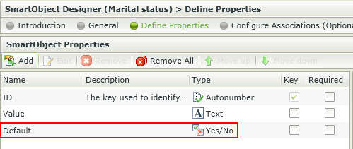
Using a SmartObject with a default value in the control
A Boolean (Yes/No) property can be configured that will be used as the Default value in the Data Source Configuration popup. The value(s) set to true for the Boolean property will be returned to the control at runtime and be displayed according to the control used.
 How to use the default value
- Create a SmartObject with a property of type Yes/No to be used to capture the default value.
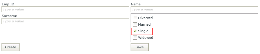
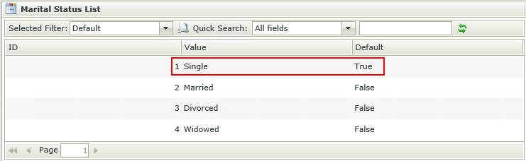
- Generate an Item View and create some data for the SmartObject. We've used the Marital status SmartObject with the following data:
- Single
- Married
- Divorced
- Widowed
- Create another View that will be using the SmartObject containing the default value, for example an Employees Item View.
- Edit the View and drag a Check Box List control onto the canvas.
- Select the Marital status SmartObject as the data source of the control and the property used to identify the default in the Default Value field.
- Save the configuration.
- Run the View and note the default of the control.
Considerations
- When using a change event on the control, for example "When a control [Check Box List] on the View/Form raises an event [Changed]", and a non-empty value is specified, the change event of the control will be executed when the View/Form initializes.
Using a static list of values in the control
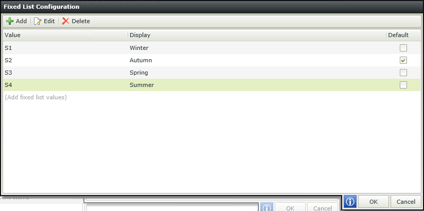
When selecting to Use a static list of values in the control and clicking on the ellipsis, the Fixed List Configuration screen opens. The ability is provided to configure a Value-Display pair where the value of the Value field is stored in the SmartObject, while the value of the Display field is displayed to the user. The Value is then used to reference a Display value that will be displayed to the user during runtime.
Design time configuration
Runtime
 Considerations
- Blank values are permitted.
- Values do not need to be unique which might cause some logical errors.
- The Check Box List control can contain multiple defaults.
- When the View's Clear method is executed, the control will revert to the default value, not a blank value.
- When upgrading from an older version of SmartForms to version 4.6.9 or later, both the Value and Display fields are set to the previous version's Display value for existing applications to ensure backwards compatibility.
Check Box List items per row or column
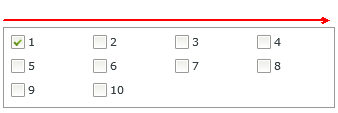
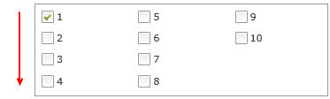
The ability to define the amount of rows/columns to be used as a display is provided. The Stacked by and No. of items properties of the control can be configured to achieve this. When stacking by Rows, the layout will be from left to right until the number of items per row has been reached, then a new row will be created. When stacking by Columns, the layout will be from top to bottom until the number of items per column has been reached, then a new column will be created. The properties are located in the Settings section as shown below:
See the following examples:
Stacked by Rows
Number of items = 4
Stacked by Columns
Number of items = 4
 Considerations
- The Stacked by and No. of items properties of existing controls will default to Rows and 1 when upgraded.
For-Each Looping Rule Conditions
For-Each looping rule conditions are available for use on List Views and list controls. For more information see the Rule Conditions topic.
How to use rules to change the edit state of View and Form controls and tables