Choice control
The Choice control allows you to select single or multiple items from a list of values. You can configure the control to display as one of the following types:
- Drop Down List - enables the selection of a single item from a list of values
- Check Box List - enables the selection of multiple items from a list of values
- Radio Button List - enables the selection of a single item from a list of values

See the following resources for more information:
- See Configure the Initialized Event for more information about using the control with the Initialized event to improve the user experience when a view or form is loaded, for example to populate a drop-down list with data in the background while the rest of the view is available for data entry.
- See How To: Create a Mobile Form with a Barcode Control for an example of using the Choice control with a static list of values on a mobile form.
 Configuring the Control
- Create a view.
- Drag the control onto the canvas. You can find the control in the Input section of the Toolbox.
- Add a data source to your control. To do this, configure the Type under the Data Source of the Properties.
- Specify which type of display you want. To do this, configure the Display Type in the Display section of the Properties.
- Configure the rest of the properties as necessary.
- Run the view.
If you have a field that can be used in a drop-down list, check box list or radio button list, you can drag the field into the Choice control to bypass step 3 above.
Configuring a Data Source for the Control
When you click on the ellipsis next to Data Source > Type in the control's Properties, the Configure Data Source page opens. You can use a SmartObject or a static list of values.
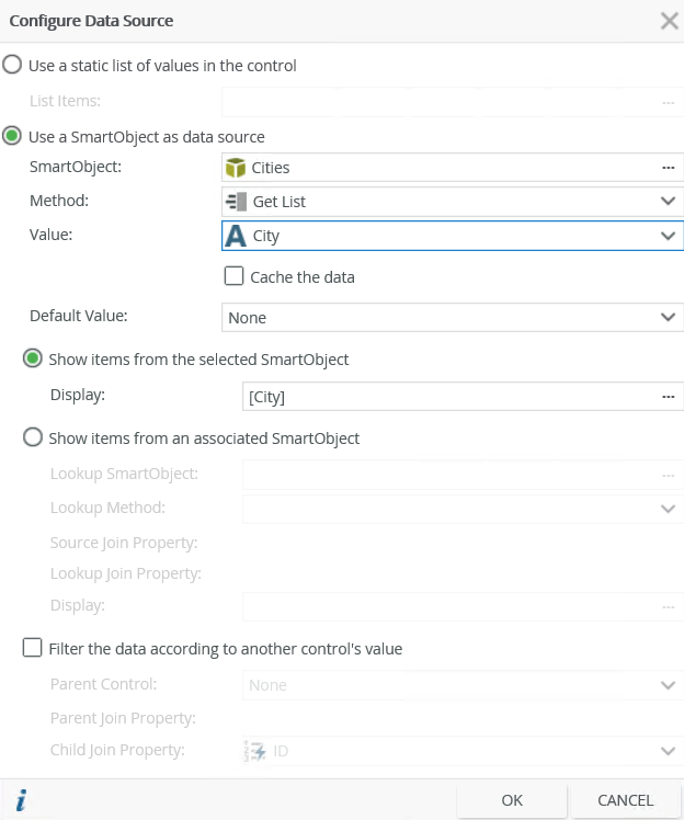
| Field | Description |
|---|---|
| Use a static list of values in the control | You can create a static list of values for the control. These values are stored as text in the K2 database. Select the option and then click the ellipsis next to List Items to configure your static list. |
| List Items | Click the ellipsis next to List Items to configure the list of static values for the control. |
| Use a SmartObject as data source | Select this option if you want to use a SmartObject as the data source. |
| SmartObject | Select the SmartObject that you want to use to populate the control. Click the ellipsis next to SmartObject to select the SmartObject. |
| Method | The method that you want to use to populate the control. |
| Value | The SmartObject property that you want to use as the value in the control. |
| Cache the data | Select this option if you want to cache the data which allows for client side filtering when used offline. |
| Default Value | The default SmartObject value to be used. |
| Show items from the selected SmartObject | Select this option if you want to show items from the parent SmartObject. |
| Display | The SmartObject property to display. |
| Show items from an associated SmartObject | Select this option if you want to show items from an associated SmartObject in the control. |
| Lookup SmartObject | An optional SmartObject that you want to use as the source of the display values. Click on the ellipsis to select the SmartObject. |
| Lookup Method | The method that you want to use to executed on the lookup SmartObject when retrieving the display values. |
| Source Join Property | The SmartObject property on the original SmartObject that is used to join the original SmartObject with the Lookup SmartObject. |
| Lookup Join Property | The SmartObject property on the lookup SmartObject that is used to join the original SmartObject with the Lookup SmartObject. |
| Display | The SmartObject property to display. Select the item by clicking on the ellipsis. |
| Filter the data according to another control's value | Select this option if you want to filter the data according to another control's value. |
| Parent Control | Specify the control to use to filter the data. |
| Parent Join Property | The SmartObject property on the parent control that is used to filter the data. |
| Child Join Property | The SmartObject property on the current control that is used to filter the data. |
Choice Control items per row or column
Use the Stacked by and No. of items Properties to specify the amount of rows or columns to display. When you select to stack by rows, the first row starts from left to right until the number of items per row is reached, and then a new row is created. When you stack by columns, the first column starts from top to bottom until the number of items per column is reached, and then a new column is created. You can find these properties in the Settings section: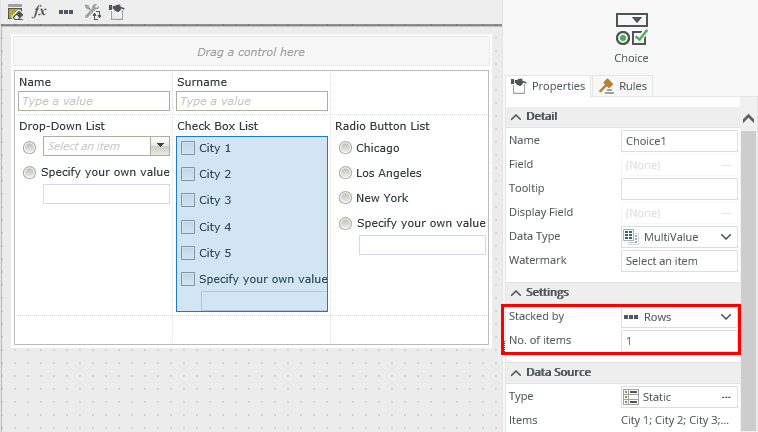
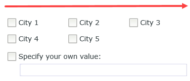
The image below shows an example of stacking three items per row using the Check Box List type:
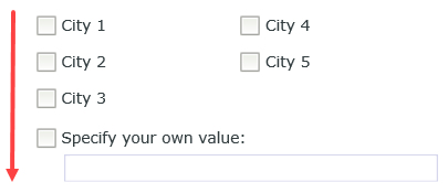
The image below shows an example of stacking three items per column using the Check Box List type:
Properties
You can find the control in the Input section of the Toolbox.

| Property | Description | Can be set in runtime using rules? |
|---|---|---|
| Detail | ||
| Name | A unique identifier for the selected control. This property is required and defaults to the name of the control. | Yes, see Configure the Set a Control's Properties Action for more information. |
| Field | The field bound to the control. See the Binding Fields to Controls section for more information on how to use it. | No |
| Tooltip |
The value to display when the cursor hovers over the control. |
Yes, see Configure the Set a Control's Properties Action for more information. |
| Display Field | The field to display in the control. | No |
| Data Type | A drop-down list containing the types of values that the control can accept. | No |
| Watermark | Specify the text to display when the control is empty. | Yes, see Configure the Set a Control's Properties Action for more information. |
| Settings | ||
| Stacked by | Specify how to display the items. You can choose between rows and columns. The property defaults to rows. See the Choice control items per row or column section for more information. | Yes, see Configure the Set a Control's Properties Action for more information. |
| No. of items | Specify the number of items to display per row or column. The default is 1. | Yes, see Configure the Set a Control's Properties Action for more information. |
| Data Source | ||
| Type | Configure a data source for the control. This can be a SmartObject or a static list of values. | No |
| Items | A read-only list of static list items. | No |
| Default SmartObject | The SmartObject property to use for the Default Value. | No |
| SmartObject | The SmartObject to which the control is bound. | No |
| Method | The method to use to populate the control. | No |
| Value | The SmartObject property to use as the value for the control. | No |
| Lookup SmartObject | An optional SmartObject to use as the source of the display values. | No |
| Lookup Method | The method to execute on the lookup SmartObject when retrieving the display values. | No |
| Source Join Property | The SmartObject property on the original SmartObject that is used to join the original SmartObject with the Lookup SmartObject. | No |
| Lookup Join Property | The SmartObject property on the lookup SmartObject that is used to join the original SmartObject with the Lookup SmartObject. | No |
| Display | The SmartObject property to use as a display member. Select the item by clicking on the ellipsis. | No |
| Parent Control | Specify the control to use to filter the data. | No |
| Parent Join Property | The SmartObject property on the parent control that is used to filter the data. | No |
| Child Join Property | The SmartObject property on the current control that is used to filter the data. | No |
| Display | ||
| Display Type |
The type of display to use for the control. Select one of the following:
|
Yes, see Configure the Set a Control's Properties Action for more information. |
| Delimiter | Specify the delimiter to use when you select the Check Box List display type and save the values into the SmartObject. The property defaults to ";" (semi-colon). | Yes, see Configure the Set a Control's Properties Action for more information. |
| Allow Own Value | Select this option if you want to specify a new value for the records that you add in runtime. | Yes, see Configure the Set a Control's Properties Action for more information. |
| Allow Empty Selection | Select this option if you want to allow a blank value in the control resulting in an empty value when the record is saved. This option is only available on the Drop-Down List display type. | Yes, see Configure the Set a Control's Properties Action for more information. |
| General | ||
| Height | Adjusts the height of the control. You can enter any whole number or pixel value (maximum of 32767px). When set to blank, it's sized to fit the content of the control. | Yes, see Configure the Set a Control's Properties Action for more information. |
| Width | Adjusts the width of the control. You can enter any whole percentage up to 100%, whole number or pixel value to a maximum of 32767px. Type the dimension. | Yes, see Configure the Set a Control's Properties Action for more information. |
| Tab Index | Defines a sequence that users follow when they use the Tab key to navigate through a page at runtime. | Yes, see Configure the Set a Control's Properties Action for more information. |
| Visible | Shows or hides the control. | Yes, see Configure the Set a Control's Properties Action for more information. |
| Enabled | Enables or disables the control. | Yes, see Configure the Set a Control's Properties Action for more information. |
| Read-Only | Shows the control as read-only. | Yes, see Configure the Set a Control's Properties Action for more information. |
| Format | Opens the Format page where you can configure formatting and style features such as format, font, borders, padding and margins. See the Format topic for more information. | No |
| Conditional Format | Opens the Conditional Formatting page. You can add conditional formatting to apply a specific format or style when a condition you set is True. Use conditional format on its own or with the Format feature. See Conditional Format for more information. Click the ellipsis to open the Conditional Formatting page. | No |
Rules, Events and Actions
The control interacts with other controls through rules. When you bind properties between different controls, you can use the data to populate properties or set values. Use the following examples for when to use the control with other controls through rules:
- Populate a list control with data: You can populate the control if its data source is a SmartObject
- Set a control’s properties: You can configure the settable properties of the control with this action
- Show/Hide: The Visible property allows you to show or hide the control through rules
- Enable/Disable: The Enabled property allows you to enable or disable the control through rules
- Data Transfer: You can transfer data from items listed in the context browser to the control
The following events are available on the control:
Rule Events:
- When [control] is Changed: This event executes when the control is set to a new value that is different from the previous value. You can use this event to trigger actions when the control is changed, for example when the option is changed, then set the properties of another control.
- When [control] is Initializing: While you can see this event in the Rule Designer, it has been deprecated. Instead use the When the View/Form Initialize event.
- When [control] is Populated: This event executes each time the control is loaded. You can execute a rule condition or action when the control loads such as set focus to the control.
- When [control] is Set: This event executes each time the control is set to any value regardless of if the previous value is the same. You can use this for updating cascading controls.
Considerations
- You can use either static values or SmartObject list results
- You must always specify a delimiter because the control saves and loads a delimited list of values
- Avoid using this control when you have complex data scenarios because there is no Key value in the Data Source setup, so associating these values with other data may not work as expected