Button Control
Use the Button control to perform an action in a view or form. For example, you can use the Rule Designer to configure a rule that calls the Create method of a SmartObject when someone clicks a Submit button.

- See How To: Create a Custom DocuSign Search Filter for the Envelope List for an example of using the control in a rule to execute a List method.
- Create a view.
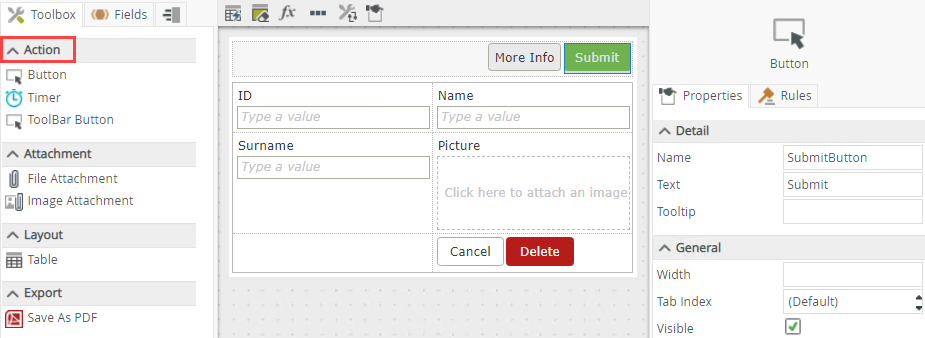
- Drag the button control onto the canvas. You can find the control in the Action section of the Toolbox.
- Configure the properties of the control as needed.
- Create a rule to perform an action when the button raises and event. Most often, you would configure a rule that executes when the control is clicked.
- Run the view and test the button’s behavior.
You can find the control in the Action section of the Toolbox.

| Properties | Description | Can be set in runtime using Rules |
|---|---|---|
| Detail | ||
| Name | Every control must have a unique name. This property is required and defaults to the name of the control. | No |
| Text | Specify text to use when displaying the control at runtime, for example Submit if the button is used to submit a view or form. | Yes, see Configure the Set a Control's Properties Action for more information. |
| Tooltip |
The value to display when the cursor hovers over the control. |
Yes, see Configure the Set a Control's Properties Action for more information. |
| General | ||
| Width | Adjusts the width of the control. You can enter any whole percentage up to 100%, whole number or pixel value to a maximum of 32767px. Type the dimension. | Yes, see Configure the Set a Control's Properties Action for more information. |
| Tab Index | Defines a sequence that users follow when they use the Tab key to navigate through a page at runtime. | Yes, see Configure the Set a Control's Properties Action for more information. |
| Visible | Shows or hides the control. | Yes, see Configure the Set a Control's Properties Action for more information. |
| Enabled | Enables or disables the control. If the control is disabled, you won't be able to use it. | Yes, see Configure the Set a Control's Properties Action for more information. |
| Format | Opens the Format page where you can configure formatting and style features such as format, font, borders, padding and margins. See the Format topic for more information. | No |
| Conditional Format | Opens the Conditional Formatting page. You can add conditional formatting to apply a specific format or style when a condition you set is True. Use conditional format on its own or with the Format feature. See Conditional Format for more information. Click the ellipsis to open the Conditional Formatting page. | No |
The control interacts with other controls through rules. When you bind properties between different controls, you can use the data to populate properties or set values. Use the following examples for when to use the control with other controls through rules:
- Set a control’s properties: You can configure the settable properties of the control with this action
- Show/Hide a control: The Visible property allows you to show or hide the control through rules
- Enable/Disable a control: The Enabled property allows you to enable or disable the control through rules
- Transfer Data: You can transfer data from items listed in the context browser to the control
- Execute a control's Focus method: You can use the Focus control method in the Rule Designer to set focus to the control in runtime
- The control is also available when you use forms
- The default event is the Click event and is set up automatically when you add a rule
- You can use the Focus control method in the Rule Designer to set focus to the control in runtime
- You can use the control with forms saved as a draft in the K2 Workspace (Mobile) app to save the data on the form to resume at a later point or to work on the form while offline. See How To: Configure Forms with Draft Functionality, Drafts in Android and Building SmartForms for Mobile Devices for more information on saving a form as a draft in the K2 Workspace (Mobile) apps.