Lookup Control
The Lookup control allows you to select a value from a dialog containing a list of possible values.

Follow the steps below to configure a scenario where the control is used to get a value from a pop-up dialog, which is based on a subview.
- Create Customer and Region SmartObjects as shown:
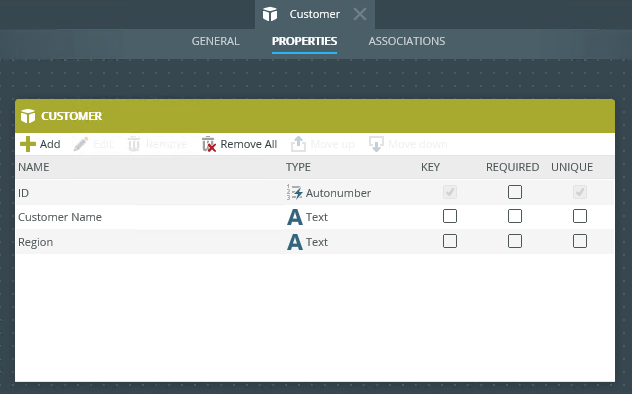
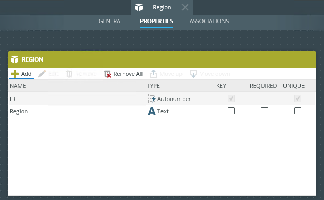
- Auto-generate an Item view and List view using the Region SmartObject.
- Run the Item view and add a few regions.
- Auto-generate an Item view using the Customer SmartObject.
- Edit the Customer Item view and change the Region text box control to a lookup control.
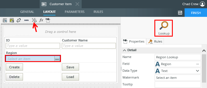
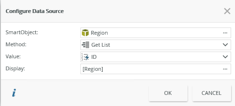
- Add a data source to your control. To do this, configure the SmartObject as the the Data Source located in the Properties section.
- Navigate to the rules and add the following rule. Select the Region List view as the subview.
This rule opens the dialog.

- Finish the rule and add the next rule for when the subview is double clicked. This rule closes the subview and transfers the value back to the main view.

- Configure the transfer data action to transfer the ID property of the SmartObject to the lookup control.

- Add another action to close the subview as shown.
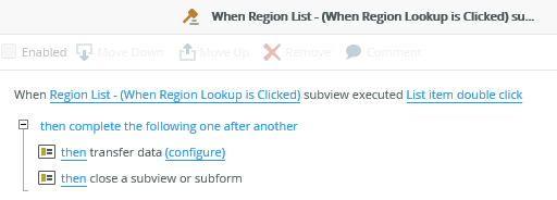
- Finish the rule and the view.
- Check in the view, and then run it.
- Click the ellipsis on the Region control.

- The Region List subview opens. Double click a region.

- The subview closes and the region you selected appears in the lookup control.

When you click on the ellipsis next to Data Source > SmartObject in the control's Properties, the Configure Data Source page opens.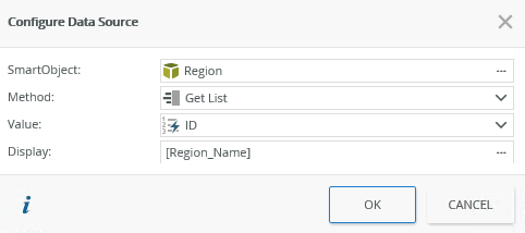
| Fields | Description |
|---|---|
| SmartObject | Select the SmartObject that you want to use to populate the control. Click the ellipsis next to SmartObject to select one. |
| Method | The method that you want to use to populate the control. |
| Value | The SmartObject property that you want to use as the value in the control. |
| Display | The SmartObject property to display. Select the item by clicking on the ellipsis. |
You can find the control in the Input section of the Toolbox. 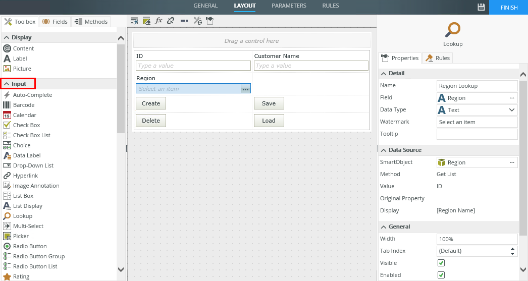
| Properties | Description | Can be set in runtime using rules? |
|---|---|---|
| Detail | ||
| Name | A unique identifier for the control. This property is required and defaults to the name of the control. | No |
| Field | The field bound to the control. See the Binding Fields to Controls section for more information on how to use it. | No |
| Data Type | A drop-down list containing the types of values that the control can accept. | No |
| Watermark | Specify the text to display when the control is empty. | Yes, see Control Properties Actions for more information. |
| Tooltip | The value to display when you hover over the control. | Yes, see Control Properties Actions for more information. |
| Data Source | ||
| SmartObject | The SmartObject to which the control is bound. | No |
| Method | The method to use to populate the control. | No |
| Value | The SmartObject property to use as the value for the control. | No |
| Original Property | If the control is part of a view and is linked to a specific field, this property contains the name of the field that the control is linked to. | No |
| Display | The SmartObject property to display. | No |
| General | ||
| Width | Adjusts the width of the control. You can enter any whole percentage up to 100%, whole number or pixel value to a maximum of 32767px. Type the dimension. | Yes, see Control Properties Actions for more information. |
| Tab Index | Defines a sequence that users follow when they use the Tab key to navigate through a page at runtime. | Yes, see Control Properties Actions for more information. |
| Visible | Shows or hides the control. | Yes, see Control Properties Actions for more information. |
| Enabled | Enables or disables the control. | Yes, see Control Properties Actions for more information. |
| Read-Only | Shows the control as read-only. | Yes, see Control Properties Actions for more information. |
| Styles | Opens the Style Builder allowing you to specify style features like format, font, borders, padding and margins. See the Style Builder topic for more information on styling options. | No |
| Conditional Styles | Opens the Conditional Formatting page. You can design styles that apply only when certain conditions are met. See the Conditional Styles section for more information. Click the ellipsis to open the Conditional Formatting page. | No |
The control interacts with other controls through rules. When you bind properties between different controls, you can use the data to populate properties or set values. Use the following examples for when to use the control with other controls through rules:
- Set a control’s properties: You can configure the settable properties of the control with this action
- Show/Hide: The Visible property allows you to show or hide the control through rules
- Enable/Disable: The Enabled property allows you to enable or disable the control through rules
- Data Transfer: You can transfer data from items listed in the context browser to the control
- Specify the edit state of view and form controls: You can specify if controls must be read only or editable.
- Set Focus: You can use the Focus control method in the Rule Designer to set focus to the control in runtime