List Display Control
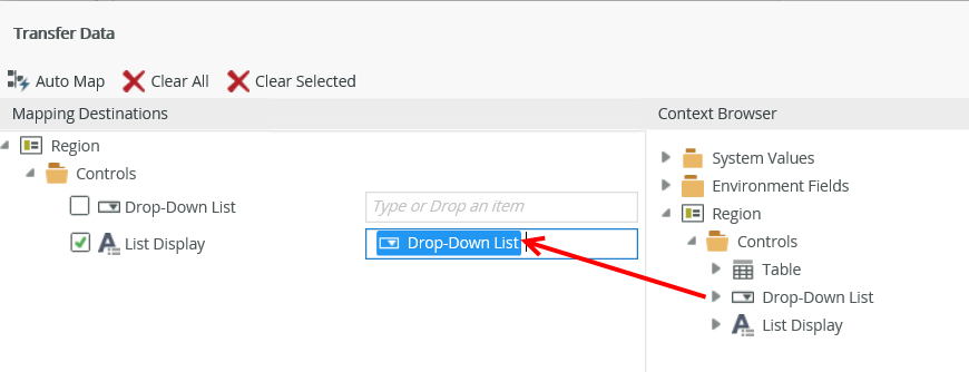
The List Display control allows you to display data from a SmartObject, typically one used to get a list of values and bound to another control as in the example here. You can bind the control to a field, or use it unbound. If the control is unbound, you need to add a rule to transfer the value from the SmartObject to the control. For example, if you have a drop-down list bound to a field, you can transfer the value to the list display when the value of the drop-down list changes, as shown here.

Follow the steps below to configure a scenario where the control is used on a view.
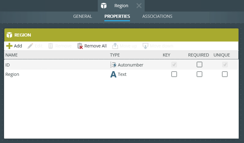
- Create a Region SmartObject as shown below.
- Auto-generate an Editable List view from the SmartObject.
- Run the Editable List view and add a few regions.
- Create an Item view called Region and drag a Drop-Down List control onto the canvas.
- Add a data source to the drop-down list. To do this, configure the Type under the Data Source of the Properties section. Select the Region SmartObject.
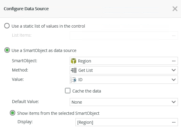
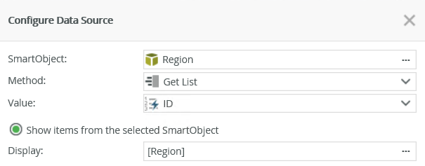
- Drag a List Display control onto the canvas and add a data source to the control. Select the Region SmartObject.
- Navigate to the rules and add the following rule:

- Configure the action as shown. Map the Drop-Down List control to the List Display.
- Finish the rule and the view.
- Check in the view, and then run it.
- Select a region from the drop-down list.
- Note the region shows in the list display when you change the item in the drop-down list.

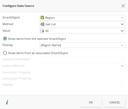
When you click on the ellipsis next to Data Source > Type in the control's Properties, the Configure Data Source page opens. You can use items to display from the selected SmartObject or from an associated SmartObject.
| Fields | Description |
|---|---|
| SmartObject | Select the SmartObject that you want to use to populate the control. Click the ellipsis next to SmartObject to select one. |
| Method | The method that you want to use to populate the control. |
| Value | The SmartObject property that you want to use as the value in the control. |
| Show items from the selected SmartObject | Select this option if you want to show items from the main SmartObject. |
| Display | The SmartObject property to display. |
| Show items from an associated SmartObject | Select this option if you want to show items from an associated SmartObject. |
| Lookup SmartObject | An optional SmartObject that you want to use as the source of the display values. Click on the ellipsis to select the SmartObject. |
| Lookup Method | The method that you want to use on the lookup SmartObject when retrieving the display values. |
| Source Join Property | The SmartObject property on the main SmartObject that is used to join the original SmartObject with the Lookup SmartObject. |
| Lookup Join Property | The SmartObject property on the lookup/associated SmartObject that is used to join the SmartObjects. |
| Display | The SmartObject property to display. Select the item by clicking on the ellipsis. |
You can find the control in the Input section of the Toolbox.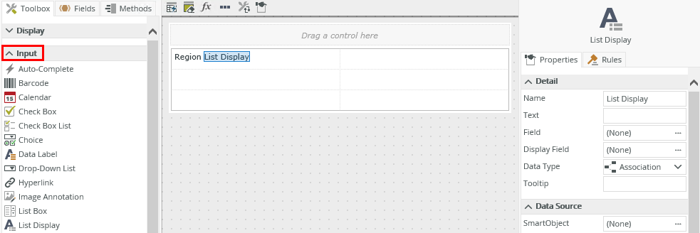
| Properties | Description | Can be set in runtime using rules? |
|---|---|---|
| Detail | ||
| Name | A unique identifier for the control. This property is required and defaults to the name of the control. | No |
| Text | The text (column header) to display for the control. | Yes, see Control Properties Actions for more information. |
| Field | The field bound to the control. See the Binding Fields to Controls section for more information on how to use it. | No |
| Display Field | Use this field if you want to show the control's display value before its data loads. Use this with a When the Form/View Initialized rule to speed up the first time a view or form is used when you're loading data. To see how to configure the control and integrate rules to display a value on load, see Display a value in a control while loading data. | No |
| Data Type | A drop-down list containing the types of values that the control can accept. | No |
| Tooltip | The value to display when you hover over the control. | Yes, see Control Properties Actions for more information. |
| Data Source | ||
| SmartObject | The SmartObject to which the control is bound. | No |
| Method | The method to use to populate the control. | No |
| Lookup SmartObject | An optional SmartObject to use as the source of the display values. | No |
| Value | The SmartObject property to use as the value for the control. | No |
| Lookup Method | The method to execute on the lookup SmartObject when retrieving the display values. | No |
| Source Join Property | The SmartObject property on the main SmartObject that is used to join the original SmartObject with the Lookup SmartObject. | No |
| Lookup Join Property | The SmartObject property on the lookup/associated SmartObject that is used to join the SmartObjects. | No |
| Display | The SmartObject property to display. Select the item by clicking on the ellipsis. | No |
| General | ||
| Width |
Adjusts the width of the control. You can enter any whole percentage up to 100%, whole number or pixel value to a maximum of 32767px. Type the dimension. Note: You must set this value if you use the Wrap Text property. |
Yes, see Control Properties Actions for more information. |
| Visible | Shows or hides the control. | Yes, see Control Properties Actions for more information. |
| Enabled | Enables or disables the control. | Yes, see Control Properties Actions for more information. |
| Wrap Text | Allows you to set the width of the control. If the text of the label is longer than the label, you can enable the Wrap Text property to allow the overflow to flow to new lines, growing the label height. If the width is set and the text content runs longer than the label width, the overflow is hidden and an ellipsis shows. In runtime, if the Tooltip is set and the content is hidden, the tooltip shows the full text. | Yes, see Control Properties Actions for more information. |
| Literal | Select how the text should be read, as literal or plain text. In the following example: <div style=”color:blue”>HTML Element</div> If you select Literal, the result is: HTML Element If you don't select Literal, the result is: <div style=”color:blue”>HTML Element</div> The property defaults to plain text. If you don't select Literal, the control does not render HTML elements and, as in the example, HTML code is treated as plain text |
Yes, see Control Properties Actions for more information. |
| Styles | Opens the Style Builder allowing you to specify style features like format, font, borders, padding and margins. See the Style Builder topic for more information on styling options. | No |
| Conditional Styles | Opens the Conditional Formatting page. You can design styles that apply only when certain conditions are met. See the Conditional Styles section for more information. Click the ellipsis to open the Conditional Formatting page. | No |
- The control is not an input control, and you can only use it to display data
- The control is not a list control, and you can only display one value
- If the control is unbound, you must configure a transfer data rule action to pass the relevant value (which should be the matching property) to the control
- The control has the functionality of a Data Label control with dynamic value population when you use an associated SmartObject