Legacy Theme
Use a theme on your form to customize items such as the color palette and fonts. When you select a legacy theme, the look and feel of the theme applies to your form. You can find a list of themes in the form properties of the Form Designer. If you want to design your own style using customized colors, you can create a style profile. For more information about creating a style profile, see Style Profile.
Make sure to use responsive themes for the K2 Workspace (Mobile) apps. Using themes other than responsive themes on your mobile app may result in unexpected behavior such as incorrect sizing of controls.
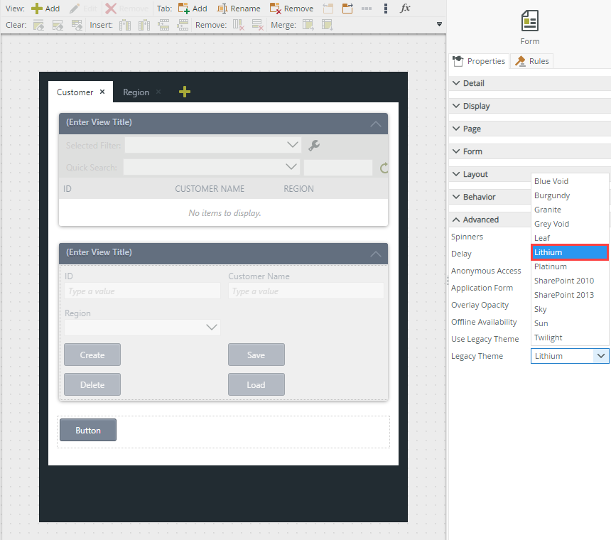
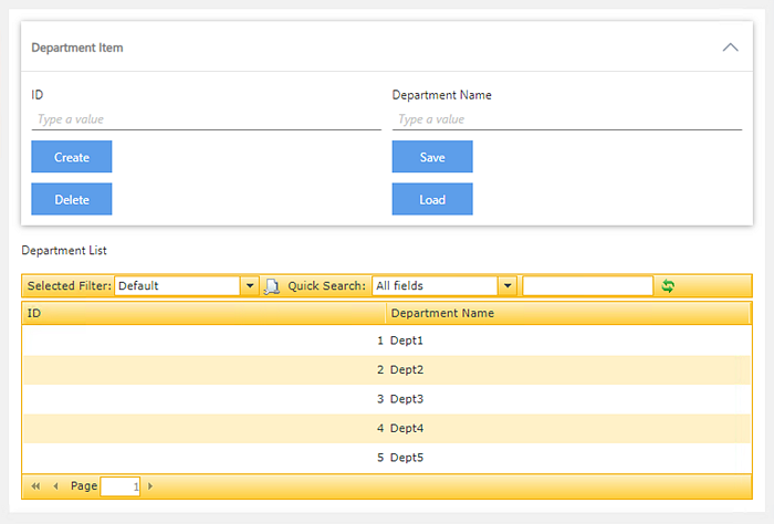
The example below shows the Lithium theme.
The Blue Void, Grey Void and Lithium themes are responsive themes which you can use on touch interfaces such as tablets or smartphones as well as desktop browsers. The themes adapt to smaller screen sizes by resizing and moving elements for optimal viewing. For information on browser compatibility, see the Product Compatibility, Integration and Support article.
- Create a form.
- Select the theme under Advanced in the form's properties.
- Finish the form.
- Use the runtime URL of the form to run the form on any device such as a tablet or smartphone. The theme adapts to the screen size of the device to display the form optimally.
The example shows how to apply a theme to a form: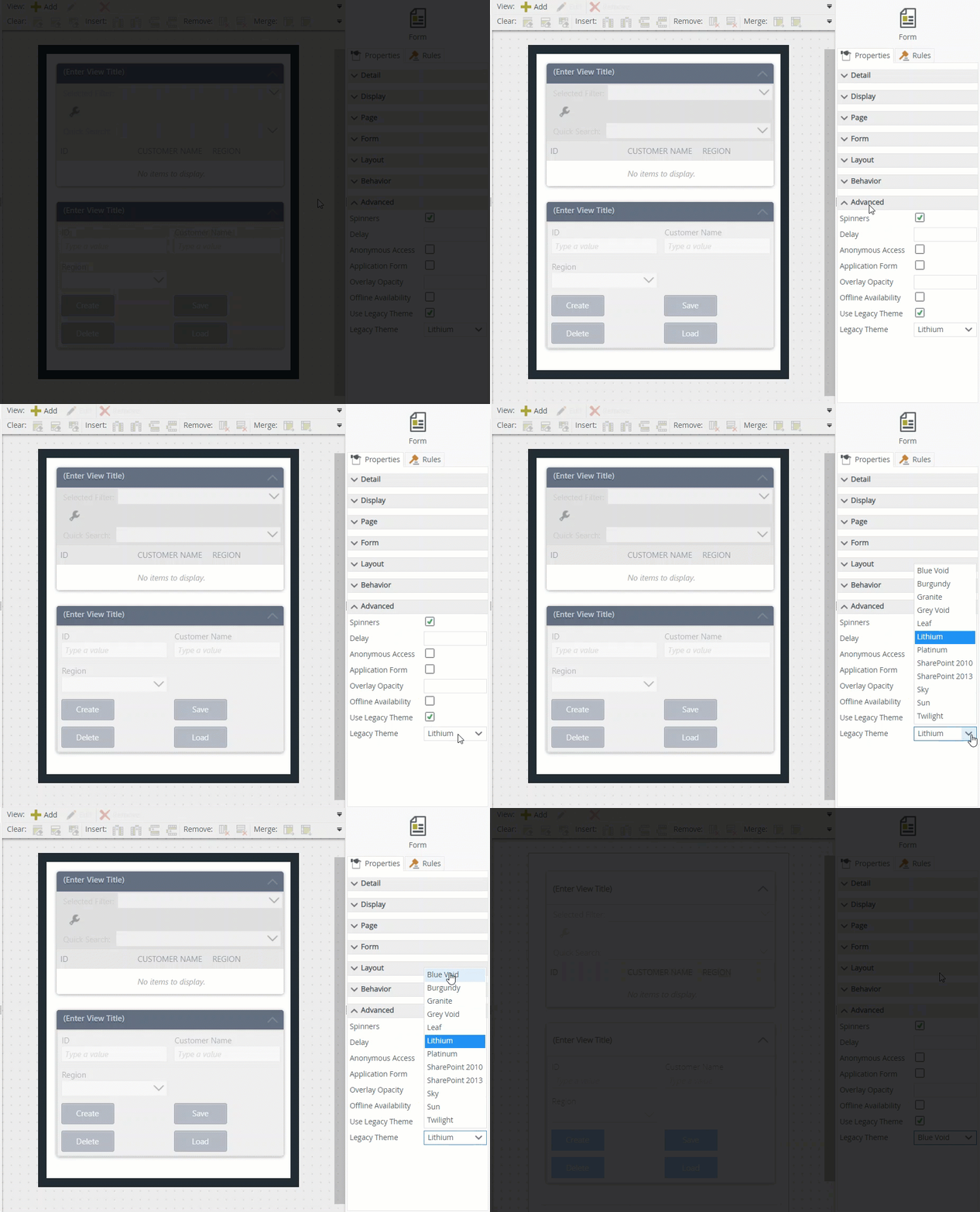
Below are examples of a form with the Lithium theme, the first when opened on an Apple iPhone 5 and the second on a Samsung Galaxy tablet:
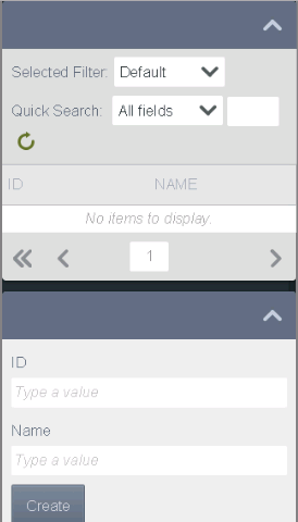
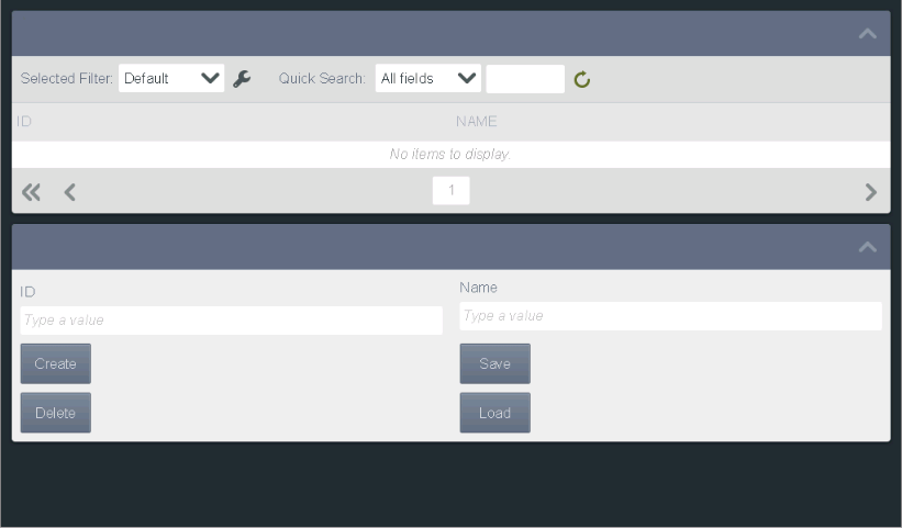
You can use the Theme parameter to test what views and forms look like when you apply a different theme. Or you can configure a rule and use the theme parameter to change the theme when something happens on the form. You can also configure rules and use the theme parameter in your rules.
For example, if you have a form containing a view and you want to show different themes for the form and view based on the form user's role in your organization, you can configure rules to do this and use the theme parameter to test it.
Manually add the theme parameter to a URL
You can add the theme query string parameter to the URL of your form. In this example we're using the Departments form with a query string parameter of ?_theme=[value] where the [value] is the theme name.
To test the theme you can use the links below to browse to the form from the K2 Designer's properties page, and then add the parameter string to the end of the URL:
- Testing URL - opens the form in designer mode such as https://[domain]/Designer/Runtime/Form/Departments/
- Runtime URL - opens the form in runtime mode such as https://[domain]/Runtime/Runtime/Form/Departments/
Add ?_theme=[value] to the end of the URL and replace [value] with the name of the theme you want to show. If the theme name contains a space, use a plus sign (+) to replace the space (for example Blue Void should be blue+void, and the entire form URL should look like https://k2.denallix.com/Runtime/Runtime/Form/New+Client/?_theme=blue+void
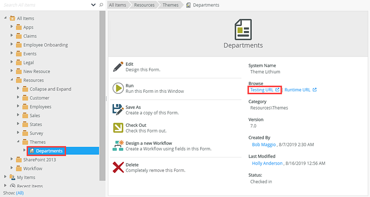
From K2 Designer select a form and click the Testing URL link.
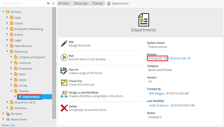
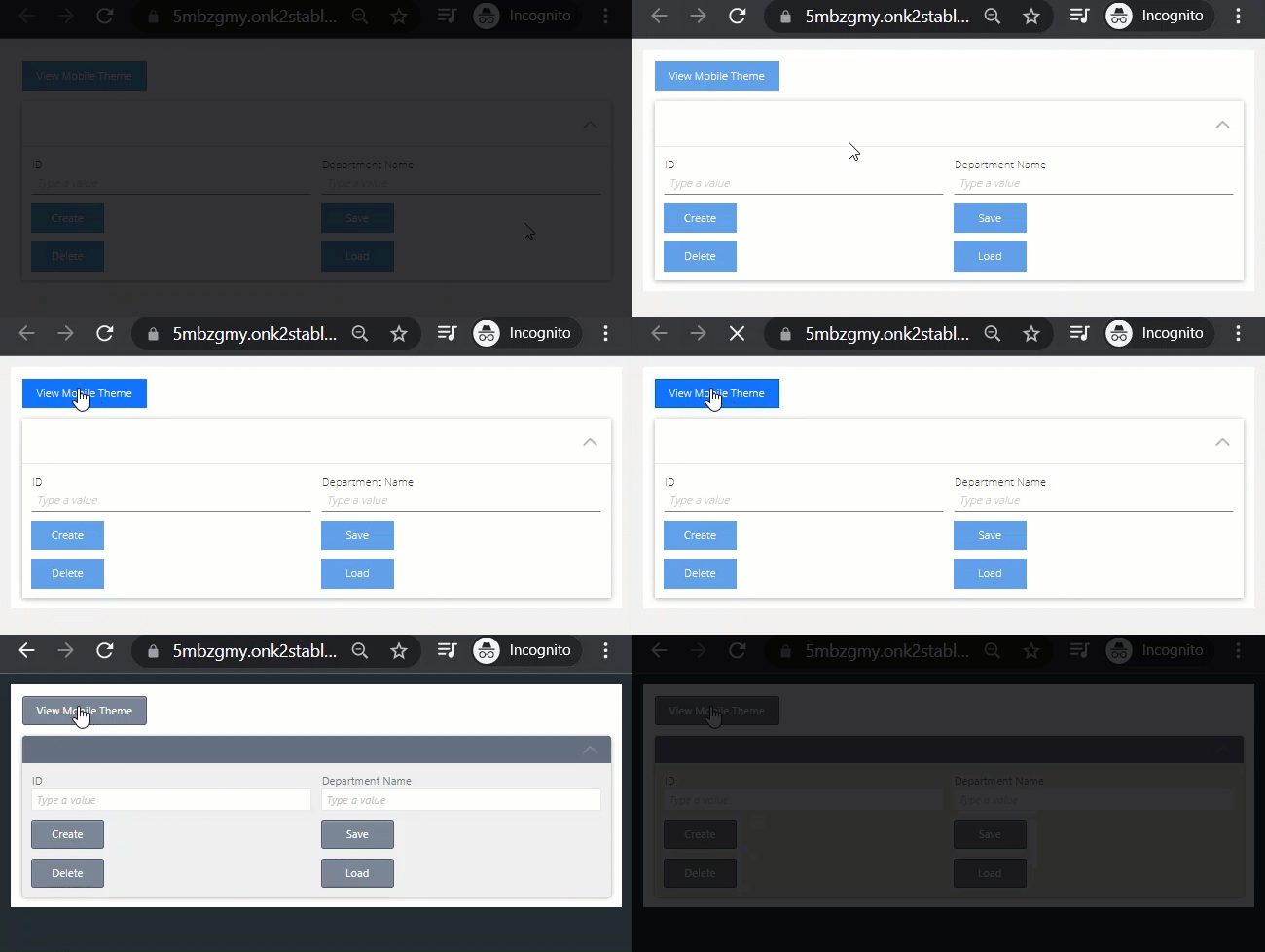
The Departments form opens in a new browser window in designer mode. In this example, the form shows using the Blue Void theme as specified in the form's properties. Type ?_theme=sun at the end of the URL and press Enter on your keyboard. The Departments form shows using the Sun theme.

Use a button to change the theme of a form
You can also define form rules to switch the theme applied to a form. For example, you may want to use different themes depending on the device being used to view the form.
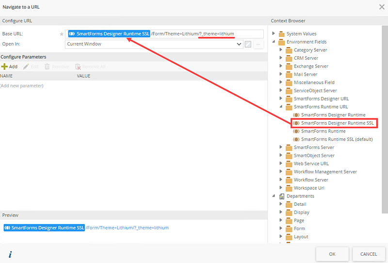
In this example, you use a form called Departments containing the Department Item view. You apply the Blue Void theme to your form by default, and configure a rule to change the theme to Lithium when you click a button. This rule contains a navigate to a URL action, which you configure with the link to the form and the new theme (Lithium) parameter. The images below show the form and rule configuration.
Departments form at design time showing the View Mobile Theme button: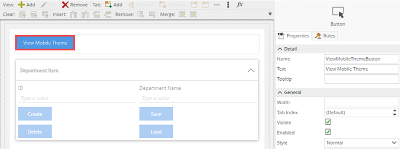
Rule Designer at design time showing View Mobile Theme button rule configuration: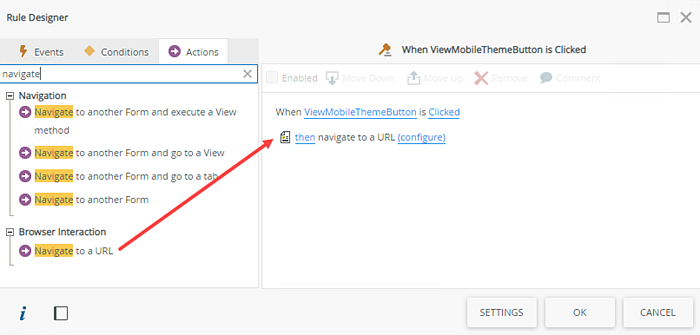
To test the View Mobile Theme button, from K2 Designer select the Departments form and click the Testing URL link.
The Departments form opens in a new browser window. In this example, the form shows using the Blue Void theme as specified in the form's properties. Click the View Mobile Theme button to change the theme to the mobile friendly Lithium theme.
Use the navigate to a URL action to set the theme for a view
If you have a form containing a rule that opens a subview, the subview inherits the theme of the form. Use the navigate to URL action with a theme parameter if you want to use a different theme for the subview.
In this example, you use a form called Departments containing the Department Item view. You apply the Blue Void theme to your form and configure a rule to change the theme when you click a button. This rule contains a navigate to a URL action, which you configure with the view (Employee List) URL and the new theme (Sun) parameter. The images below show the form and rule configuration.
Departments form at design time showing the Open Employees List button: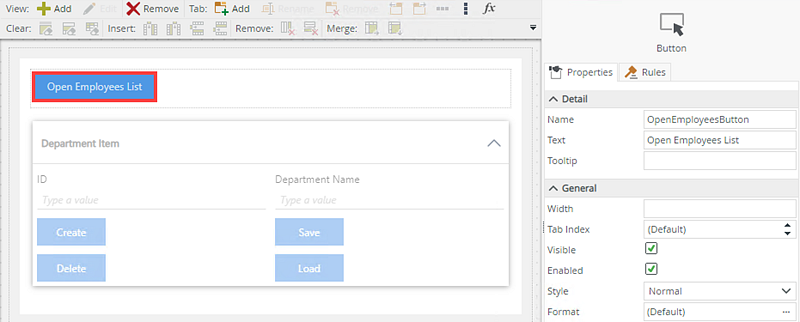
Rule Designer at design time showing Open Employees button rule configuration: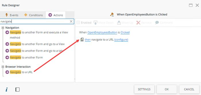
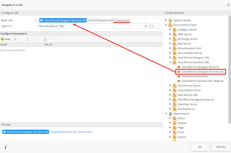
To test the Open Employees List button, from K2 Designer select the Departments form and click the Testing URL link.

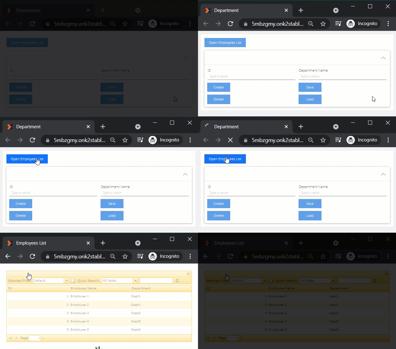
The Departments form opens in a new browser window. In this example, the form shows in the Blue Void theme as specified in the forms display properties. Click the Open Employee List button to open the Employee List view in a new browser window. The view shows in the Sun theme.
Use a Content control to show a view in a different theme on a form
If you have a form containing more than one view, you can apply different themes to the views when the form loads by using a Content control that shows the URL of the view with the theme parameter applied.
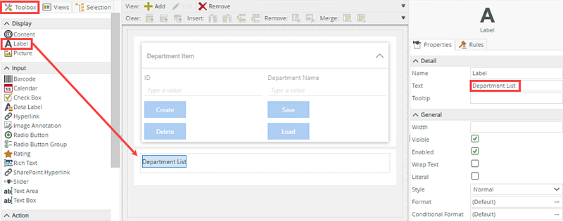
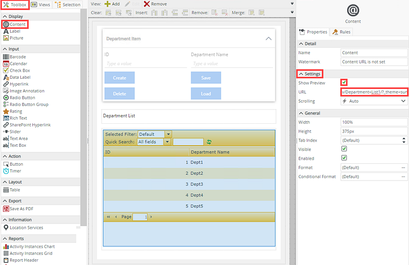
In this example, you use a form called Departments containing the Department Item and Department List views. You apply the Blue Void theme to your form and add a Content control to embed the Department List view. You configure the Content control by adding the Department List view's URL and the new theme (Sun) parameter. The images below show the Content control configuration.
From the Toolbox, drag a Label onto the Departments form. Type Department List into the Text field to rename the label.
From the Toolbox, drag a Content control onto the form. In the Setting section, paste the copied Department List runtime URL in the URL field and check the Show Preview check box. Click Finish to save the form.
When you configure the Content control, it is easier to copy and paste the view URL into the URL field. From K2 Designer, locate the view and select the Runtime URL link. Copy the URL. Then edit the form and paste the copied URL into the Content control’s URL field.
At runtime, the form shows using the Blue Void theme and the Department List view shows using the Sun theme.
- See Style Profile for information about customized styling options.
- You need to consider the following when you design forms for smaller devices like smartphones and tablets:
- Ensure that labels and their controls are either on the same row or in the same cell. The smaller screen causes controls to move below each other, and empty cells create big spaces between controls and labels meant to show above or next to controls. For example, if you have a row of labels followed by a row of controls, and the intention is that the labels relate to the controls, on a smartphone you will see the following:
[Label for Text Box]
[Label for Picker]
[Text Box]
[Picker]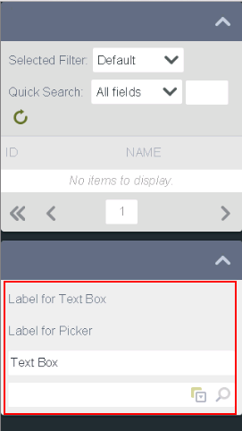
- Ensure that you use the correct Max. Form Width for subviews and subforms. Popups that open in portrait layout do not update when you change the orientation in runtime and they only adapt for orientation when you reopen them.
- The form width on a mobile device is 100%. To adjust the width of the form, change the Max. Form Width property.
- You can use the Style, Format, and Conditional Format properties of Label and Data Label controls, and the Theme property of a form, to change the text style of your controls on a form. See Understanding the Impact of the New SmartForms Text Styles for more information about styling options and how they impact each other.
- Responsive themes show the current page number and back/forward navigation arrows in place of the page 1 of x pagination you see on full size themes.
- Ensure that labels and their controls are either on the same row or in the same cell. The smaller screen causes controls to move below each other, and empty cells create big spaces between controls and labels meant to show above or next to controls. For example, if you have a row of labels followed by a row of controls, and the intention is that the labels relate to the controls, on a smartphone you will see the following: