Get to Know the Form Design Canvas
You use the form design canvas to build your forms. Get to know the different areas and elements of the canvas.
Toolbox, Views and Selection
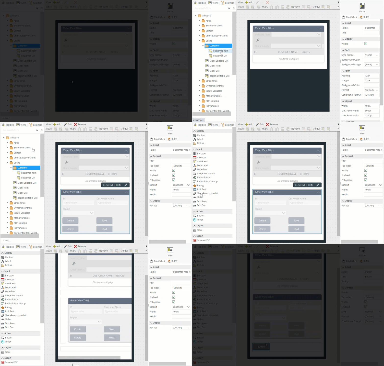
You can drag controls and views onto the canvas. These components are available on the left side of the designer.
- Controls - The Toolbox tab includes common controls such as buttons, text boxes, and attachment controls. Use these controls and bind them to SmartObject properties (fields), or keep them unbound and use them with rules.
- Views - The Views tab includes views that you can use on your form. Use these views with rules and parameters.
- Selection - The Selection tab shows the views, controls and tabs that you are using on your form.
The example below shows how to
use a view and control on the design canvas.

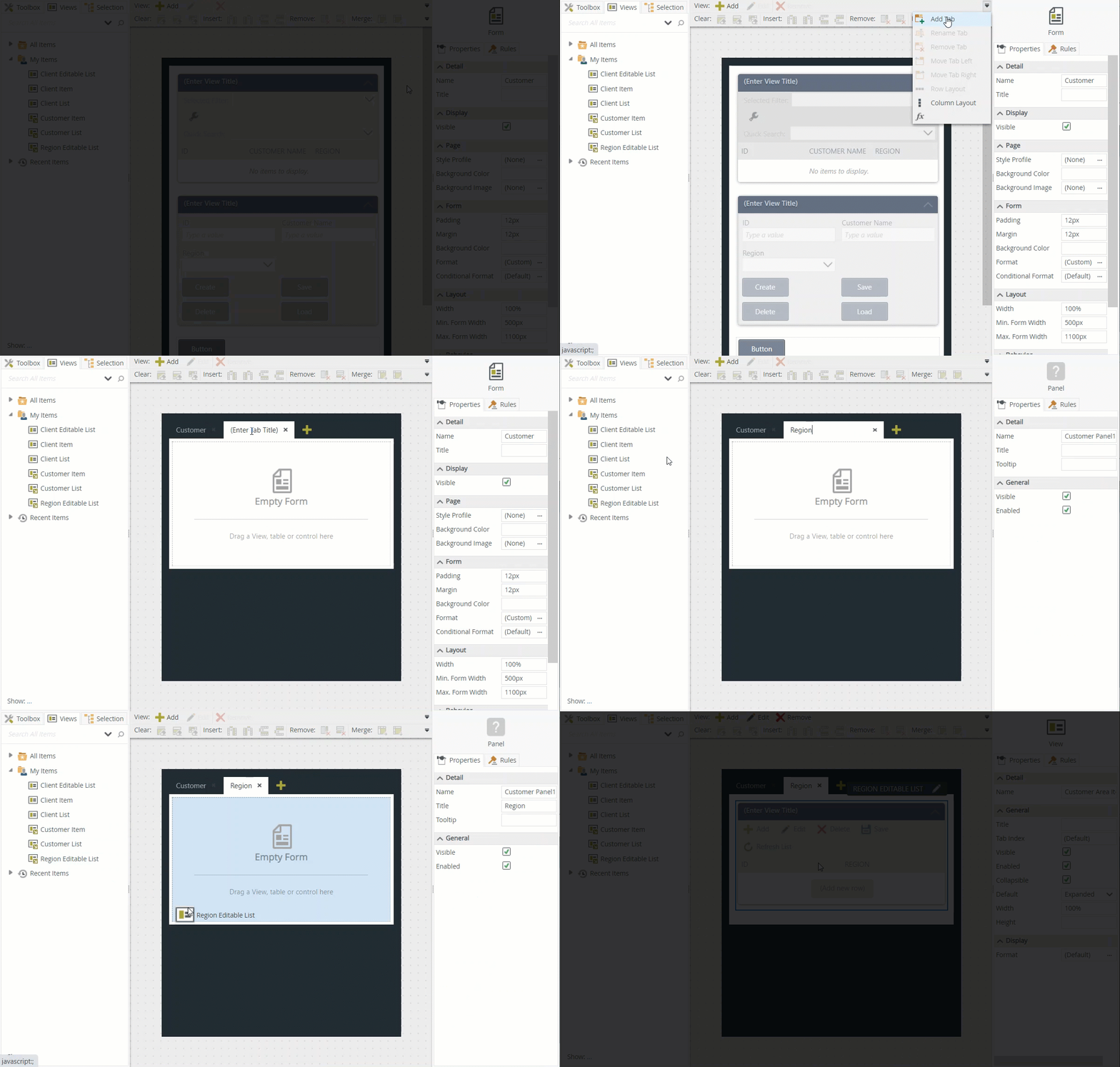
Toolbar
Use the toolbar to add views and tabs, and to configure controls and table cells. See toolbar for more detailed information. This example illustrates how to use the toolbar options to add a tab to a form and then a view to the tab.

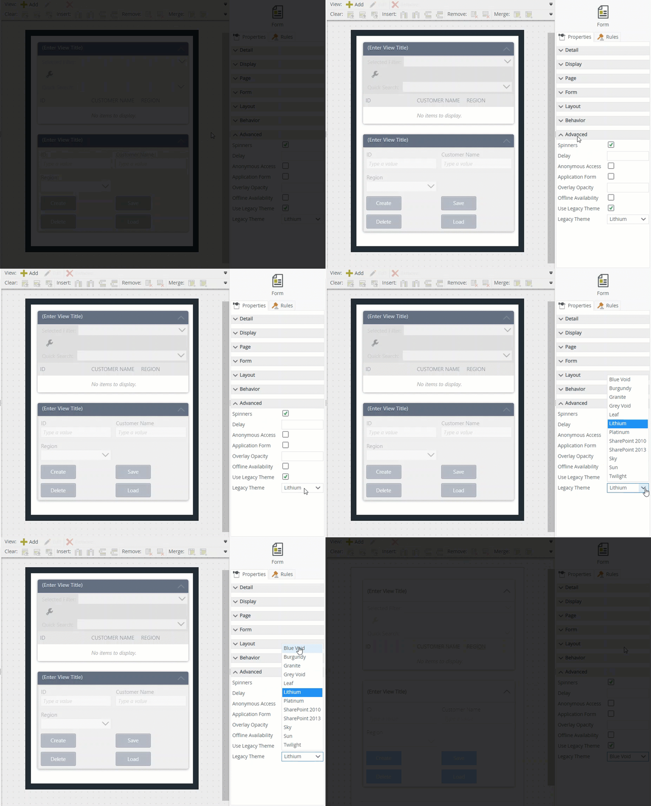
Properties and Rules
Each control, view and form has configurable properties. You can also use rules with these components. See the Controls, Views and Rules topics for more information. This example illustrates how to apply a theme to your form.

Other Properties
You can find the following standard properties available on most of the controls: