SharePoint Hyperlink Control
The SharePoint Hyperlink control is an input control and allows the user to display a hyperlink or picture. The control is specifically for SharePoint linked data for example when using a Hyperlink control in SharePoint and editing the Form in SmartForms, the functionality is available in SmartForms. In addition you can structure your Service Object data to work with it as well if you want to. The benefit you get is you have various display types on the same control and you can also display your link as an image. The control can be displayed as one of the following:
- Input - Provides the user with the ability to input the data at runtime by typing a description and web address for the URL
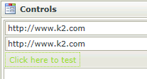
- Hyperlink - Displays the description as a hyperlink at runtime. It can't be set by the user at runtime, but rules can be used to set the hyperlink at runtime. Acts like a read-only display
- Picture - Renders the URL specified in the properties at design time as an image at runtime
- Create a View
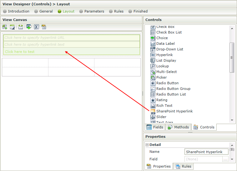
- Drag the SharePoint Hyperlink control onto the canvas. The control can be found in the Input section of the Controls found in the View Designer, see the Properties section below
- Configure the Type located in the Data Source section of the Properties
- Configure the rest of the properties as required
- Run the View
- Values can be transferred to the SharePoint Hyperlink control by using the Transfer Data action mappings screen
- Values are saved using a delimiter and when returned the first value will be applied as the text and the second value will be applied as the description of the URL. It is important to always have a delimiter specified
The SharePoint Hyperlink control interacts with other controls through rules. Depending on the control properties, there are certain actions where the control surfaces. Following are a few examples:
- Set a control’s properties- The control's settable properties can be configured using this action
- Show/Hide - The Visible property allows for the control to be shown or hidden through rules
- Enable/Disable - The Enabled property allows for the control to be enabled or disabled through rules
- Data Transfer - Data can be transferred from items listed in the Context Browser to the SharePoint Hyperlink control
The SharePoint Hyperlink control is available in the Input section of the Controls found in the View Designer.

| Property | Description | Can be set in runtime using Rules |
|---|---|---|
| Detail | ||
| Name | A unique identifier for the selected control. This property is required | Yes, see Control Properties Actions for more information |
| Field | The field that is bound to the selected control | No |
| Data Type | A drop-down list containing the types of values that the selected control can accept | No |
| Text | The text for the description of the hyperlink | Yes, see Control Properties Actions for more information |
| URL Title | Inserts a control label. Type a value to be displayed as the label of the control | Yes, see Control Properties Actions for more information |
| URL Watermark | The watermark url to be displayed in runtime if no data is available | Yes, see Control Properties Actions for more information |
| Display Title | Inserts a display label | Yes, see Control Properties Actions for more information |
| Display Watermark | The watermark display to be displayed in runtime if no data is available | Yes, see Control Properties Actions for more information |
| Test Hyperlink Text | Text to be displayed in runtime to test the hyperlink | Yes, see Control Properties Actions for more information |
| Settings | ||
| URL | The URL to direct to when clicked (a protocol must be specified for a URL to be valid) for example http://www.k2.com | Yes, see Control Properties Actions for more information |
| Show Preview | No | |
| Display | ||
| Display Type |
|
Yes, see Control Properties Actions for more information |
| Delimiter | The type of delimiter to be used when saving the values. The default is "," | Yes, see Control Properties Actions for more information |
| General | ||
| Height | Adjusts the height of the control. Any whole number or pixel value up to 32767px. When set to zero, it will automatically change the size to fit the content of the page. Type the dimension to be used | Yes, see Control Properties Actions for more information |
| Width | Adjusts the width of the control. Any whole percentage up to 100%, whole number or pixel value to a maximum of 32767px can be entered. Type the dimension to be used | Yes, see Control Properties Actions for more information |
| Tab Index | Used to define a sequence that users follow when they use the Tab key to navigate through a page at runtime | Yes, see Control Properties Actions for more information |
| Visible | Shows or hides the control in runtime | Yes, see Control Properties Actions for more information |
| Enabled | Enables or disables the control in runtime | Yes, see Control Properties Actions for more information |
| Read-Only | Used to establish whether the control is read-only during runtime | Yes, see Control Properties Actions for more information |
| Expression | Opens the Expression Builder to configure expressions to populate the control with dynamically calculated values. Click on the ellipsis to open the Expression Builder | Yes, see Control Properties Actions for more information |
| Styles | Opens the Style Builder enabling the user to specify style features like Format, Font, Borders, Padding and Margins. See the Style Builder topic for more information on styling options | No |
| Conditional Styles | Opens the Conditional Formatting Designer. This is used to design styles that will apply only when certain conditions are met. See the Conditional Styles section for more information. Click on the ellipsis to open the Conditional formatting screen | No |
