Radio Button controls
This topic covers the following controls:- Radio Button – This control is a single radio button that can interact with rules individually. Multiple radio button controls can be grouped together.
- Radio Button Group – This control is used to group radio button controls to form a list of options.
- Radio Button List – This control is a list of grouped radio buttons and is used to select a single value.
 Radio Button
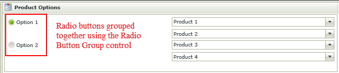
The Radio Button control contains one Radio Button that can interact with rules individually. Multiple Radio Button controls can be grouped together by using the Radio Button Group control which in effect provides a list of options. These Radio Button controls can still interact with rules individually .
 When to use it
The Radio Button and Radio Button Group controls are used instead of the Radio Button List control when a layout is required where the buttons are not visually grouped together.
How to use it- Create a View.
- Drag one or more Radio Button controls onto the design canvas.
- Configure the rest of the properties of the Radio Button control. Optional
- If two or more Radio Buttons are used and grouping is required, drag the Radio Button Group control onto the design canvas.
- Group the two Radio Buttons together by selecting the Radio Button Group in the Group field of the Radio Button control’s Properties.
- Configure the rest of the Properties of the controls as required. Configure unique values in the Value properties of the Radio Button controls when using these controls in advanced conditions or data transfer rules. These values are used to determine the specific value of the Radio Button control within the Radio Button Group control.
- Configure rules if required.
- Run the View.
Considerations- When used with the Radio Button Group control, Radio Button controls need to be grouped together by selecting the Radio Button Group control in the Group property of each Radio Button control. The Radio Button Group control is not visible at runtime. It is only used for grouping purposes.
- When using the Radio Button control with the Radio Button Group control in advanced conditions or data transfer for example, the Value property of the grouped Radio Buttons need to be set and unique so that the Radio Button Group control can determine its specific value within the Group control.
- Tab Index behavior - If the Tab Index property of any control on a View or Form is set, using the tab key at runtime will navigate to the first Radio Button in the Group. Focus to the rest of the Radio Buttons within the Group can be set by using the up and down or left and right arrow keys. If the Tab Index property has not been set for any of the controls on the View, or any View on the Form, and none of the Radio Buttons in the Group is selected, the user will be able to tab to all the Radio Buttons depending on the type of browser used. If a Radio Button is then selected, focus can be set to the rest of the Radio Buttons by use of the arrow keys.
Design Properties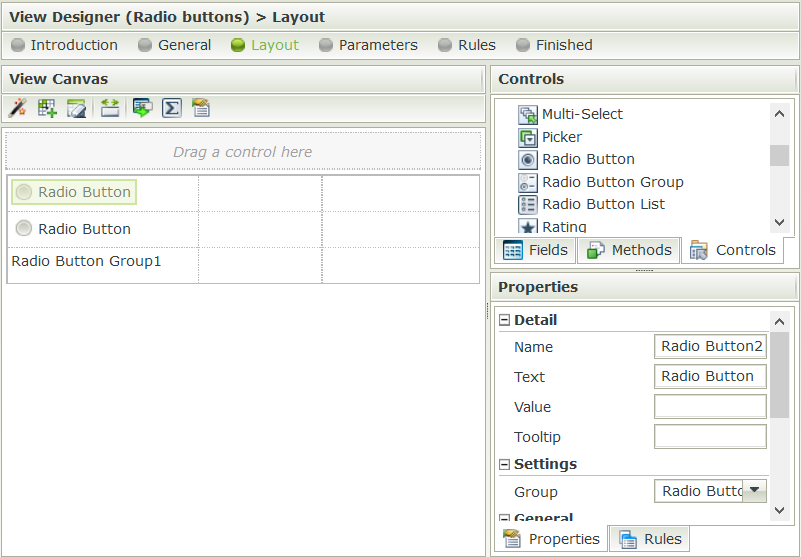
| Properties | Description | Can be set in runtime using Rules |
|---|---|---|
| Detail | ||
| Name | A unique identifier for the selected control. This property is required. | No |
| Text | The text to be displayed during runtime | Yes, see Control Properties Actions for more information |
| Group | Indicates the Radio Button Group control to which the Radio Button control is linked. When used with the Radio Button Group control, this field is required. The group can be set to None. If a group control is present, the controls whose group is set to "None" will behave as if they are in their own group. | Yes, see Control Properties Actions for more information |
| Value | A unique identifier for the value of the selected control. This property is required when used with the Radio Button Group control to determine the specific value of the Radio Button control within the Radio Button Group control. Specifically required when used in advanced conditions and data transfers | Yes, see Control Properties Actions for more information |
| General | ||
| Visible | A Boolean value used to establish whether the control is visible during runtime | Yes, see Control Properties Actions for more information |
| Enabled | A Boolean value used to establish whether the control is enabled during runtime | Yes, see Control Properties Actions for more information |
| Read-Only | A Boolean value used to establish whether the control is read-only during runtime | Yes, see Control Properties Actions for more information |
| Styles | Opens the Style Builder, enabling the user to specify style features like Format, Font, Borders, Padding and Margins. See the Style Builder topic for more information on styling options | No |
| Conditional Styles | Opens the Conditional Formatting Designer used to design styles that will apply only when certain conditions are met. See the Conditional Styles section for more information | No |
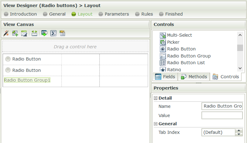
Radio Button GroupThe Radio Button Group control is used to group Radio Button controls to create a list of options. This control is used for grouping purposes and is not visible at runtime.
When to use itThe Radio Button and Radio Button Group controls are used instead of the Radio Button List control when a layout is required where the buttons are not visually grouped together.
How to use it- Create a View.
- Drag two or more Radio Button controls onto the design canvas.
- Drag the Radio Button Group control onto the design canvas.
- Group the two Radio Buttons together by selecting the Radio Button Group in the Group field of the Radio Button control’s Properties.
- Configure the rest of the Properties of the controls as required. Configure unique values in the Value properties of the Radio Button controls when using these controls in advanced conditions or data transfer rules. These values are used to determine the specific value of the Radio Button control within the Radio Button Group control.
- Configure rules if required.
- Run the View.
Considerations- The Radio Button Group control cannot function on its own. Radio Button controls need to be grouped together by selecting the Radio Button Group control in the Group property of each Radio Button control.
- The Radio Button Group control is not visible at runtime. It is only used for grouping purposes.
- When using the control in advanced conditions or data transfer for example, the Value property of the grouped Radio Buttons need to be set and unique so the Radio Button Group control can determine its specific value within the Group control.
Design Properties| Properties | Description | Can be set in runtime using Rules |
|---|---|---|
| Detail | ||
| Name | A unique identifier for the selected control. This property is required. | No |
| Value | A unique identifier for the value of the selected control. This property is required when used with the Radio Button Group control to determine the specific value of the Radio Button control within the Radio Button Group control. Specifically required when used in advanced conditions and data transfers | Yes, see Control Properties Actions for more information |
| General | ||
| Tab Index | Used to define a sequence that users follow when they use the Tab key to navigate through a page at runtime | Yes, see Control Properties Actions for more information |
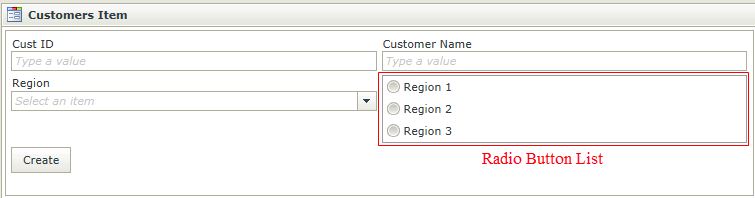
Radio Button ListThe Radio Button List control is an input control used to select a single value from a list of options. When dragging a Field of type Radio Button List onto the canvas, the properties displayed will be specific to that Field.
 When to use it
The Radio Button List control is used when a layout is required where the buttons are visually grouped together.
How to use it- Create a View.
- Drag the control onto the design canvas.
- Configure the Properties of the control.
- Make sure to configure the data source so the list can be populated at runtime.
- Run the View.
Considerations- Values can be transferred to the Radio Button List by using the Transfer Data action mappings screen.
- The value should correspond to the list item value.
- A Radio Button List can be associated to a SmartObject or have static list values.
- Focus can be set to this control at runtime by using the Focus control method in the Rule Designer.
- The Horizontal property has been replaced by the Stacked by and No. of items properties. See the Radio Button List items per row or column section.
Design Properties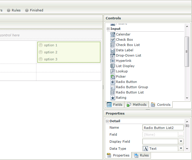
| Properties | Description | Can be set in runtime using Rules |
|---|---|---|
| Name | A unique identifier for the selected control. This property is required | No |
| Field | A read-only property displaying the field that is bound to the selected control | No |
| Display Field | No | |
| Data Type | A drop-down list containing the types of values that the selected control supports | No |
| Watermark | The text to display when the control is not populated | Yes, see Control Properties Actions for more information |
| Tooltip | The value to be displayed when the cursor is hovered over the control during runtime | Yes, see Control Properties Actions for more information |
| Borderless | A Boolean value used to establish whether the control has borders during runtime | Yes, see Control Properties Actions for more information |
| Stacked by | Indicates whether the items will be displayed in rows or columns at runtime. Default is rows. See the Radio Button List items per row or column section below. | Yes, see Control Properties Actions for more information |
| No. of items | Indicates the number of items to be displayed per row or column as selected in the Stacked by property. Default is 1. See the Radio Button List items per row or column section below | Yes, see Control Properties Actions for more information |
| Type | Set up data-bindings for the selected control | No |
| Items | The configured static items list | No |
| SmartObject | The selected SmartObject that has been bound to the control | No |
| Method | The method to be used to populate the control | No |
| Value | The SmartObject property that will be used as the control value | No |
| Lookup SmartObject | A SmartObject to be used as the source of the display values (*optional) | No |
| Lookup Method | The method to be executed on the lookup SmartObject when retrieving the display values | No |
| Source Join Property | The SmartObject property on the original SmartObject that will be used to join the original SmartObject with the Lookup SmartObject | No |
| Lookup Join Property | The SmartObject property on the lookup SmartObject that will be used to join the original SmartObject with the Lookup SmartObject | No |
| Display | The SmartObject property that will be shown in the user interface visible to the end user | No |
| Height | Adjust the height of the control (any whole number or pixel value up to 32767px) | Yes, see Control Properties Actions for more information |
| Width | Adjust the width of the control (any whole percentage up to 100%, number or pixel value up to 32767px) | Yes, see Control Properties Actions for more information |
| Tab Index | Used to define a sequence that users follow when they use the Tab key to navigate through a page at runtime | Yes, see Control Properties Actions for more information |
| Visible | A Boolean value used to get or set the control's visible state. In other words if the control is viewable | Yes, see Control Properties Actions for more information |
| Enabled | A Boolean value used to establish whether the control is enabled during runtime. When Enabled is set to false the control appears to disallow interaction and disallows interaction | Yes, see Control Properties Actions for more information |
| Read-Only | A Boolean value used to establish whether the control is read-only during runtime. When Read-Only is set to false the control appears to allow interaction but disallows interaction | Yes, see Control Properties Actions for more information |
| Styles | Opens the Style Builder enabling the user to specify style features like Format, Font, Borders, Padding and Margins. See the Style Builder topic for more information on styling options | No |
| Conditional Styles | Opens the Conditional Formatting Designer used to design styles that will apply only when certain conditions are met. See the Conditional Styles section for more information | No |
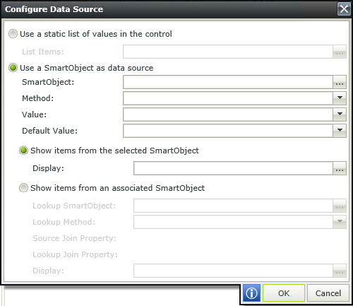
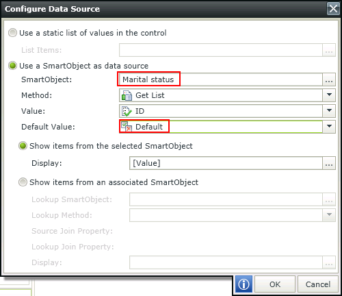
Configure Data SourceWhen clicking on the ellipsis next to Data Source Type, the Configure Data Source screen opens. Configure the data source to be used.
| Fields | Description |
|---|---|
| Use a static list of values in the control | A static list of items can be configured |
| List Items | List Item selected |
| Use a SmartObject as data source | A SmartObject can be used as data source |
| SmartObject | The selected SmartObject that has been bound to the control |
| Method | The method to be used to populate the control |
| Value | The SmartObject property to be used as a value property |
| Default Value | The default SmartObject value to be used |
| Show items from the selected SmartObject | Shows items from the selected SmartObject |
| Display | The SmartObject property to be used as a display member |
| Show items from an associated SmartObject | Shows items from an associated SmartObject |
| Lookup SmartObject | An alternate SmartObject to be used as the source of the display values (*optional) |
| Lookup Method | The method to be executed on the lookup SmartObject when retrieving the display values |
| Source Join Property | The SmartObject property on the original SmartObject that will be used to join the original SmartObject with the Lookup SmartObject |
| Lookup Join Property | The SmartObject property on the lookup SmartObject that will be used to join the original SmartObject with the Lookup SmartObject |
| Display | The SmartObject property to be used as a display member |
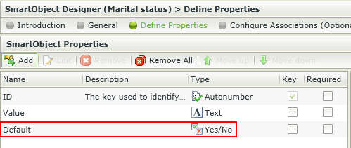
Using a SmartObject with a default value in the control
A Boolean (Yes/No) property can be configured that will be used as the Default value in the Data Source Configuration popup. The value(s) set to true for the Boolean property will be returned to the control at runtime and be displayed according to the control used.
 How to use the default value
- Create a SmartObject with a property of type Yes/No to be used to capture the default value.
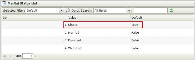
- Generate an Item View and create some data for the SmartObject. We've used the Marital status SmartObject with the following data:
- Single
- Married
- Divorced
- Widowed
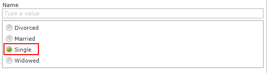
- Create another View that will be using the SmartObject containing the default value, for example an Employees Item View.
- Edit the View and drag a Radio Button List control onto the canvas.
- Select the Marital status SmartObject as the data source of the control and the property used to identify the default in the Default Value field .
- Save the configuration.
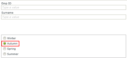
- Run the View and note the default of the control.
Considerations
- When using a change event on the control, for example "When a control [Radio Button List] on the View/Form raises an event [Changed]", and a non-empty value is specified, the change event of the control will be executed when the View/Form initializes.
Using a static list of values in the control
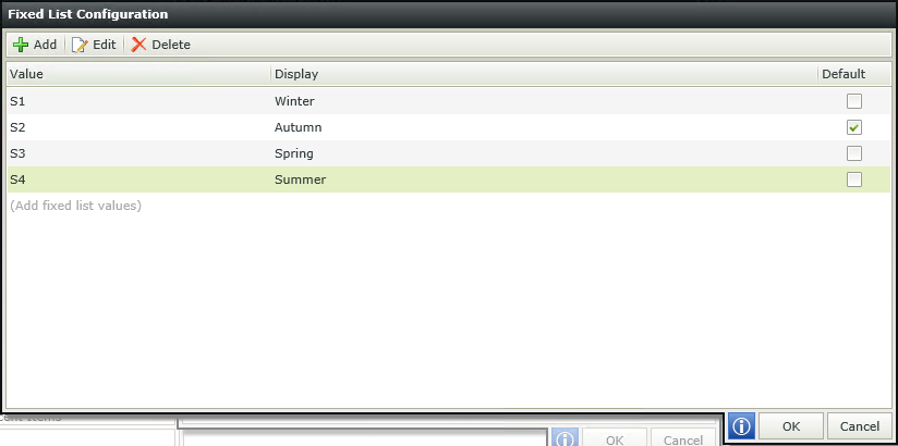
When selecting to Use a static list of values in the control and clicking on the ellipsis, the Fixed List Configuration screen opens. The ability is provided to configure a Value-Display pair where the value of the Value field is stored in the SmartObject, while the value of the Display field is displayed to the user. The Value is then used to reference a Display value that will be displayed to the user during runtime.
Design time configuration
Runtime
 Considerations
- Blank values are permitted.
- Values do not need to be unique which might cause some logical errors.
- The Radio Button List control can only contain one default.
- When the View's Clear method is executed, the Radio Button List control will revert to the default value, not a blank value.
- When upgrading from an older version of SmartForms to version 4.6.9 or later, both the Value and Display fields are set to the previous version's Display value of existing applications to ensure backwards compatibility.
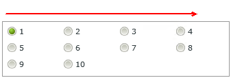
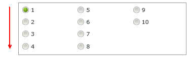
Radio Button List items per row or columnThe ability to define the amount of rows/columns to be used as a display is provided. The Stacked by and No. of items properties of the control can be configured to achieve this. When stacking by Rows, the layout will be from left to right until the number of items per row has been reached, then a new row will be created. When stacking by Columns, the layout will be from top to bottom until the number of items per column has been reached, then a new column will be created. The properties are located in the Settings section as shown below:
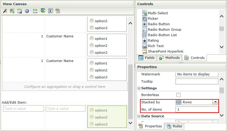
See the following examples:
Stacked by Rows
Number of items = 4
Stacked by Columns
Number of items = 4
 Considerations
- The Stacked by and No. of items properties of existing controls will default to Rows and 1 when upgraded to K2 smartforms 4.6.9.
For-Each Looping Rule ConditionsFor-Each looping rule conditions are available for use on List Views and list controls. For more information see the Rule Conditions topic.
How to use rules to change the edit state of View and Form controls and tables