Rich Text Control
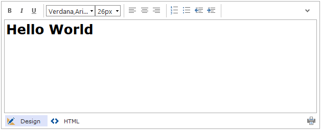
The Rich Text control is an input control and provides the user with text and graphics interchange. It is essentially a content editable control which transforms the data input into HTML. Using HTML format, the data can be customized within the user interface.
- Create a View
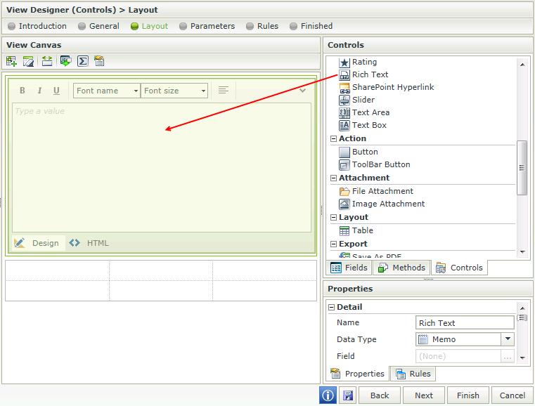
- Drag the Rich Text control onto the canvas. The control can be found in the Input section of the Controls found in the View Designer, see the Properties section below
- Configure the properties as required
- Run the View
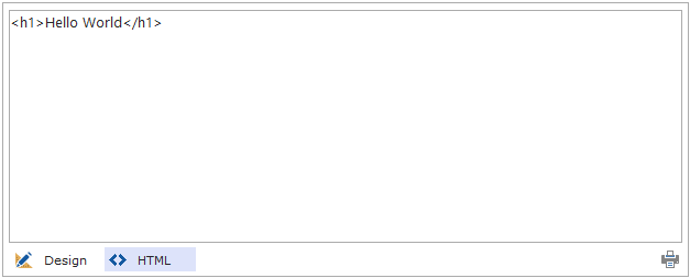
- HTML generated at runtime in the HTML viewer may differ depending on the Browser used. It is recommended to use the Chrome browser to ensure a close resemblance to the Design viewer at runtime.
The Rich Text control interacts with other controls through rules. Depending on the control properties, there are certain actions where the control surfaces. Following are a few examples:
- Set a control’s properties- The control's settable properties can be configured using this action
- Show/Hide - The Visible property allows for the control to be shown or hidden through rules
- Enable/Disable - The Enabled property allows for the control to be enabled or disabled through rules
- Data Transfer - Data can be transferred from items listed in the Context Browser to the Rich Text control
The Rich Text control is available in the Input section of the Controls found in the View Designer.

| Property | Description | Can be set in runtime using Rules |
|---|---|---|
| Detail | ||
| Name | A unique identifier for the selected control. This property is required | Yes, see Control Properties Actions for more information |
| Data Type | A drop-down list containing the types of values that the selected control can accept | No |
| Field | The field that is bound to the selected control | No |
| Watermark | The text to display when the control is not populated | Yes, see Control Properties Actions for more information |
| Tooltip | The value to be displayed when the cursor is hovered over the control during runtime | Yes, see Control Properties Actions for more information |
| Display | ||
| HTML | The HTML code to be populated in the control at runtime. Can be Text or HTML Text | Yes, see Control Properties Actions for more information |
| General | ||
| Height | Adjusts the height of the control. Any whole number or pixel value between 1px and 32767px can be used. Type the dimension to be used | Yes, see Control Properties Actions for more information |
| Width | Adjusts the width of the control. Any whole percentage up to 100%, whole number or pixel value to a maximum of 32767px can be entered. Type the dimension to be used | Yes, see Control Properties Actions for more information |
| Visible | Shows or hides the control in runtime | Yes, see Control Properties Actions for more information |
| Enabled | Enables or disables the control in runtime | Yes, see Control Properties Actions for more information |
| Read-Only | Used to establish whether the control is read-only during runtime | Yes, see Control Properties Actions for more information |
| Expression | Opens the Expression Builder to configure expressions to populate the control with dynamically calculated values. Click on the ellipsis to open the Expression Builder | Yes, see Control Properties Actions for more information |
| Styles | Opens the Style Builder enabling the user to specify style features like Format, Font, Borders, Padding and Margins. See the Style Builder topic for more information on styling options | No |
| Conditional Styles | Opens the Conditional Formatting Designer. This is used to design styles that will apply only when certain conditions are met. See the Conditional Styles section for more information. Click on the ellipsis to open the Conditional formatting screen | No |
| Settings | ||
| Show Toolbar | Shows or hides the toolbar at runtime | Yes, see Control Properties Actions for more information |
| Toolbar Items | Indicates which toolbar items to include at runtime | No |
| Edit Mode | ||
| Design View | Provides the user interface for design. Deselect the option if the Design View tab should not be available at runtime | Yes, see Control Properties Actions for more information |
| HTML View | Displays the HTML representing the text and graphic display. Deselect the option if the HTML View tab should not be available at runtime | Yes, see Control Properties Actions for more information |
| Preview | Enables the user to preview the design. Select the option if the Preview tab should be available at runtime. Disabled by default | Yes, see Control Properties Actions for more information |

