Hyperlink Control
The Hyperlink control is an input control used to navigate to a specified URL. The Hyperlink control displays an HTML link to an address, which opens in the default browser of the computer. When dragging a Field of type Hyperlink onto the canvas, the properties displayed will be specific to that Field.

The Hyperlink control's Read-Only property is selected by default. Untick the Read-Only option in design time to enable editing at runtime
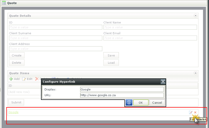
Click the Edit or Delete icon as shown below.

- Create a View
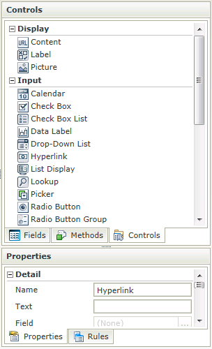
- Drag the Hyperlink control onto the canvas. The control can be found in the Input section of the Controls found in the View Designer, see the Properties section below
- Configure the URL under Settings of the Properties section if required
- Configure the Read-Only property if required. The Read-Only property is enabled by default
- Configure the rest of the properties as required
- Run the View
- The Hyperlink control is also available in the Form Designer
- The hyperlink accepts the following protocols:
- http
- https
- ftp
- ftps
- mailto
- news
- An enabled hyperlink is configurable during runtime
- The Hyperlink expression can be used to specify the display and URL dynamically
- The specified URL can be opened in a new window, current frame or current window
- Using a Transfer Data action one can configure a hyperlink using a static (or dynamic) string in the following format
<a url="site">Display</a>
- The Navigate to URL action’s configuration screen can also be used to set up a URL using dynamic values
- Focus can be set to this control at runtime by using the Focus control method in the Rule Designer
The Hyperlink control is available in the Input section of the Controls found in the View Designer and Form Designer.

| Properties | Description | Can be set in runtime using Rules |
|---|---|---|
| Name | A unique identifier for the selected control. This property is required | No |
| Text | The text to be displayed during runtime. If left empty the URL or watermark will be used as display text | Yes, see Control Properties Actions for more information |
| URL | The URL to direct to when clicked (a protocol must be specified for a URL to be valid) | Yes, see Control Properties Actions for more information |
| Target |
The desired location of the page to be opened. The following options are available:
|
Yes, see Control Properties Actions for more information |
| Field | A read-only property displaying the field that is bound to the selected control | No |
| Data Type | A drop-down list containing the types of values that the selected control can accept | No |
| Watermark | The text to display when the control is not populated | No |
| Tooltip | The value to be displayed when the cursor is hovered over the control during runtime | Yes, see Control Properties Actions for more information |
| Tab Index | Used to define a sequence that users follow when they use the Tab key to navigate through a page at runtime | Yes, see Control Properties Actions for more information |
| Visible | A Boolean value used to establish whether the control is visible during runtime | Yes, see Control Properties Actions for more information |
| Enabled | A Boolean value used to establish whether the control is enabled during runtime | Yes, see Control Properties Actions for more information |
| Read-Only | A Boolean value used to establish whether the control is read-only during runtime | Yes, see Control Properties Actions for more information |
| Expression | Opens the Expression Builder to configure expressions to populate the control with dynamically calculated values | Yes, see Control Properties Actions for more information |
| Styles | Opens the Style Builder enabling the user to specify style features like Format, Font, Borders, Padding and Margins. See the Style Builder topic for more information on styling options | No |
| Conditional Styles | Opens the Conditional Formatting Designer used to design styles that will apply only when certain conditions are met. See the Conditional Styles section for more information | No |
How to use rules to change the edit state of View and Form controls and tables