Vertical Navigation
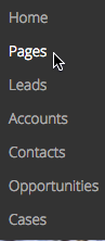
The Vertical Navigation component is used to build custom navigation menus in a vertical layout. Navigation items are displayed as a list, arranged in a single column from top to bottom.
These items allow end users to navigate apps, access different web pages, or perform actions using Action flows.
Using the Vertical Navigation component
The Vertical Navigation component guides users through an app and its workflow actions. Use this component to build drop-down menus within a Nintex Apps page, that connect to a range of actions.
Add navigation items to the Vertical Navigation component
-
Add a Vertical Navigation component to a Nintex Apps page. For more information, see Add components to the canvas.
-
Configure the Component properties.
-
To add a navigation item to the component, click the component on the canvas and click Add subnav item.
-
To delete a navigation item, click the item on the canvas and click
 .
.
Add actions to individual navigation items
-
Select a navigation item on the canvas and click the Interactions tab in the Properties panel.
-
To add actions, click Add. The following options are available:
-
Add action flow: Use Action flows to launch actions.
-
Show menu: Use the Show/hide menu action to add a drop-down menu to the navigation item.
-
Component actions
You can configure component actions using Run component action.
-
Expand sub-navigation: Expands all necessary navigation menus to highlight the selected navigation item. This is useful for showing deeply nested items, as it can highlight any item at any level.
-
Item: The navigation item to expand to.
-
- Select navigation: Simulates a user clicking the selected navigation item, triggering the actions associated with it.
- Item: The navigation item to select.
Component properties
 General tab
-
Unique ID: An automatically generated alphanumeric identifier for the component. You can rename if needed. (Required)
-
Style variant: Style variants are created and set in the Design System Studio. Some components have pre-defined variants for a specific aspect of a component's style. Nintex Apps builders can style and customize elements to create their own themes within the DSS. These themes will dynamically populate as selectable values in the Style variant dropdown.
Note:To refresh available style variant options, click Refresh style variants.
This is useful for when changes to the design system (like style variants or variable options) have been made in another browser window or by another user.
- Item source: Select the source of navigation menu items.
Nintex Apps:
Manual
User Menu
Apps
Note: All options, except Manual, automatically populate menu items.
- Allow HTML: To render HTML markup within the navigation item label, turn on the toggle.
Layout tab
-
Margins: Sets a component's margin (the space around it) relative to other components on the page.
- To set margins for all sides, click
 All.
All.
-
To set margins for each side individually, click
 Separate.
Set margins using spacing variables defined in the design system. Custom or arbitrary values are not allowed. For more information, see Spacing.
- To set margins for all sides, click
Display logic tab
Standard Display logic options are available for the following behaviors:
-
Render if...
-
Style variants
Nested elements
These properties determine how individual navigation items work and display within the Vertical Navigation component.
General tab
- Unique ID: An automatically generated alphanumeric identifier for the component. You can rename if needed. (Required)
-
Style variant: Style variants are created and set in the Design System Studio. Some components have pre-defined variants for a specific aspect of a component's style. Nintex Apps builders can style and customize elements to create their own themes within the DSS. These themes will dynamically populate as selectable values in the Style variant dropdown.
Note:To refresh available style variant options, click Refresh style variants.
This is useful for when changes to the design system (like style variants or variable options) have been made in another browser window or by another user.
- Label: The text that appears within each navigation item. It shows where the item navigates when clicked.
- Icon: The icon that appears beside the navigation item label. To choose the icon you want, click the icon selector.
-
Type: Determines how the navigation item works.
- Action: Allows the builder to configure the action to perform when a user clicks the navigation item.
-
Section: Sets the navigation item as a parent folder that displays its child items when clicked.
Note: You can add sub-navigation items to an Action type navigation item. These sub-navigation items display when the parent is clicked, even if the action moves the end user away from the page. Therefore, the navigation bar must remain visible across the app when the parent item’s action is triggered.
Interactions tab
To add actions, click Add. The following options are available:
-
Add action flow: Use Action flows to launch actions.
-
Show menu: Use the Show/hide menu action to add a drop-down menu to the tab.
Display logic tab
Standard Display logic options are available for the following behaviors:
-
Render if...
-
Enable if...
-
Selected if...
-
Style variants