Table
A functional and versatile component, the Table displays a list of records. Like a spreadsheet, selected fields are displayed as columns and records are listed as individual rows. The Table component is not only a way to display records, but also to search, edit, and add records.
Jump to:
Using the Table component
Note: The content below assumes you have a Nintex Apps page and at least one working model with fields selected and no conditions set.
The Table component is one of the basic building blocks of Nintex Apps pages. Once you've added a Table to the page, customize it:
- Add a Table to a Nintex Apps page.
- Adjust the Table properties to customize the overall functionality of the table.
Note: The Table must be attached to a model to display data.
- Add fields and adjust their properties to control the appearance and functionality of table columns. You can add model fields or template fields.
Note: The field window "remembers" the order in which you selected the fields. Check the field boxes in the order you want them to appear on the table.
Now, get creative:
- Add filters to make it easier to dynamically sort records.
- Use drawers to reveal additional data.
- Create custom actions to affect one or more records.
- Customize table views:
- Add a scrollbar to make it easier to navigate large tables
- Customize table columns:
- Conditionally render columns
- Allow users to control columns
- Add summaries to numeric columns
- Allow users to Export data as a spreadsheet. For more information, see Export tab under Component properties.
- Click row header boxes to open mass update options.
It's all possible with the Table component!
Table headers and pagination
Every Table includes a header and pagination. Depending on the property settings, these sections can include various features. For more information, see the Headers and Pagination tabs in Component properties.
Sticky headers
If the height of the Table component is shorter than the amount of data being displayed—in other words, the Table contains more records than can be seen at one time on the screen—the end user can scroll through the data. In this case, the header remains visible at the top of the Table (a "sticky header") no matter how far a user scrolls down.
Note: If using IE 11, the header will not "stick" but instead scroll out of sight.
Table modes
Table modes determine how records display at runtime and how users can interact with those records. To set a mode, click the Table on the canvas and adjust the Default mode property.
Mode options include:
- Read with inline-editing (default): Users can view records, but they can't edit until they click Edit. This is useful when users need to view and update information, such as on an opportunity or account detail page.
- Edit: Records display in an editable state if the user has the appropriate permissions. Edit mode is best for pages that require data entry.
- Data grid: Records display in editable cells, but don't include the Edit icon. Data grid mode is useful for viewing columns and rows of data, similar to a spreadsheet.
- Read-only: Records display in an uneditable state regardless of the user's permissions. Read-only mode is best for pages that require information organized in a Table view, but only as a reference.
General features
Click Add features to add features to your table, including actions, filters, and views.
 Add fields and buttons
Click Add Fields dropdown to insert fields into a table. You can also add a button group from that drop down.
Add Button Group
This inserts a button group directly into the Table component at the selected location.
When you add buttons to the Table component, these buttons have their own properties. All Table button properties are the same as those for Ink Button Set buttons.
Add features
Click Add features to add features to your table, including actions and filters.
Add Actions
You can access Row Actions, Global Actions, and Mass Actions via the Add features menu on the component. Actions can then be updated by clicking on them.
You can add actions to clicks and right-clicks by configuring actions in the Interactions tab.
Add Filters
You can filter data within a Table component using either the Filter Set component, or by adding a filter on the Table component itself ( Add features > Table filter ). Learn more about creating, configuring, and conditionally rendering filters.
Additional Table features
Give end users control over columns
- The property Allow users to reorder columns (Display tab > Columns) lets users drag and drop column headers to reorder them on the page.
- The property Allow column hiding (Display tab > Columns) lets users open the Table Settings modal and choose whether the associated column will be visible on the page.
Note: These settings persist whenever end users revisit the page, as they are stored in the Personalization framework.
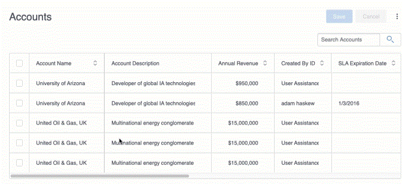
Give users the ability to sort records
There are two ways to apply a sort in the Table component:
- Click on the Sort Builder in the component and build a sort.
- Click on the sort icon in the column header.
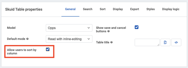
To enable sort within the column header, check the box to Allow users to sort by column on the General tab of the Table properties.
Click the sort icon in the column header to interact with the sort dropdown.
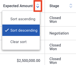
The sort dropdown provides three options:
- Sort ascending
- Sort descending
- Clear sort
As you select or clear options in the dropdown, the sort sequence in the Sort Builder will update accordingly.
Keyboard interactions (data grid mode only)
Using Data grid mode will allow the user to rapidly input or edit data using up/down arrows, Esc, Enter, and Tab. This eliminates the need for a separate mouse click to edit and speeds up data input via the keyboard.
Checkbox
- Tab: focuses on the tab to the immediate right of the current cell
- Enter: checks/unchecks
- Spacebar: selects/deselects
Combobox
- Esc: confirms changes, closes dropdown and returns to Focus state
- Tab: confirms changes, focuses on the tab to the immediate right of the current cell
- Enter: when in edit mode, selects the focused menu item and returns the current cell to Focus state
- Up/down: navigate dropdown menu
- Spacebar: selects/deselects
Currency
- Tab: focuses on the tab to the immediate right of the current cell
- Enter: checks/unchecks
Date
- Esc: confirms changes and returns to Focus state
- Tab: confirms changes and focuses on the tab to the immediate right of the current cell
- Enter: confirms changes and focuses on the tab immediately below the current cell
If the date is incomplete when changes are confirmed, the date will default in the following ways:
- Date is blank: cell is left empty
- Only month provided: defaults the day to '1' and the year to [THIS YEAR]
- Only month and day provided: defaults the year to [THIS YEAR]
Datetime
- Esc: confirms changes and returns to Focus state
-
- Tab:
-
- if editing the time, confirms changes and focuses on the tab to the immediate right of the current cell
- if editing the date, highlights the time section of the current cell
-
- Enter:
-
- when in edit mode, if item in dropdown menu is focused, confirms changes and highlights the date section of the current cell
- when in edit mode, if no item in dropdown menu is focused, confirms changes and focuses on the tab immediately below the current cell
If the date is incomplete when changes are confirmed, the date will default in the following ways:
- Date is blank: cell is left empty
- Only month provided: defaults the day to '1' and the year to [THIS YEAR]
- Only month and day provided: defaults the year to [THIS YEAR]
- Esc: exits edit mode and returns to Focus state
- Tab: confirms changes and focuses on the tab to the immediate right of the current cell
- Enter: when in edit mode, confirms changes and focuses on the tab immediately below the current cell
Formula
Formula fields are not editable in this mode.
Multi-select picklist
- Esc: confirms changes and closes dropdown and returns to Focus state
- Tab: confirms changes and focuses on the tab to the immediate right of the current cell
- Enter: when in edit mode, selects the focused menu item
- Up/down: navigate dropdown menu.
Number
- Esc: exits edit mode and returns to Focus state
- Tab: confirms changes and focuses on the tab to the immediate right of the current cell
- Enter: when in edit mode, confirms changes and focuses on the tab immediately below the current cell
Percent
- Esc: exits edit mode and returns to Focus state
- Tab: confirms changes and focuses on the tab to the immediate right of the current cell
- Enter: when in edit mode, confirms changes and focuses on the tab immediately below the current cell
Picklist
- Esc: closes dropdown and returns to Focus state
- Tab: focuses on the tab to the immediate right of the current cell
- Enter: when in edit mode, selects the focused menu item and returns the current cell to Focus state
- Up/down: navigate dropdown menu
Reference
- Esc: closes dropdown and returns to Focus state
-
- Tab:
-
- when menu item focused, focuses on 'View all'
- when 'View all' focused, focuses on the tab to the immediate right of the current cell
-
- Enter:
-
- when in edit mode with a menu item focused, selects the focused menu item
- when in edit mode with the 'View all' button focused, opens search modal
- Up/down: navigate dropdown menu
Text
- Esc: exits edit mode and returns to Focus state
- Tab: confirms changes and focuses on the tab to the immediate right of the current cell
- Enter: when in edit mode, confirms changes and focuses on the tab immediately below the current cell
Text area
- Esc: confirms changes and returns to Focus state
- Tab: confirms changes and focuses on the tab to the immediate right of the current cell
- Enter: when in edit mode, confirms changes and focuses on the tab immediately below the current cell
URL
- Esc: exits edit mode and returns to Focus state
- Tab: confirms changes and focuses on the tab to the immediate right of the current cell
- Enter: when in edit mode, confirms changes and focuses on the tab immediately below the current cell
Unique ID
- Esc: exits edit mode and returns to Focus state
- Tab: confirms changes and focuses on the tab to the immediate right of the current cell
- Enter: when in edit mode, confirms changes and focuses on the tab immediately below the current cell
Use a character counter in string and textarea fields
A character counter helps end users know when they are approaching the content limit for text entry fields and encourages them to make input more succinct. Nintex Apps property Show length counter adds a counter for string fields and the larger textarea fields:
- Click the string or textarea field within the component.
- In the Field Properties pane, check Show length counter.
When editing the field, end users will now see a character countdown ("25/ 128") that indicates the number of characters used (the first number) and how many total characters are allowed (the second number).
- The counter is enabled by default for standard textarea fields.
- The counter is not available for Salesforce rich text area type fields.
Change the field character limits
When using the counter, the character limits are preset by the connection. (For example, Salesforce sets a limit of 128 characters for string fields, and 3200 characters for textarea fields). These limits are set by the field's metadata.
To change the limit:
-
Click the model with the field whose limit you want to override, then click Fields.
-
Click the specific textarea or string field.
-
In the Field's Description pane, check Override field metadata.
- Under Length, set the length to the desired number of characters.
-
Click Save.
For more information on field metadata overrides, see Field Metadata Overrides topic.
Patterns and best practices
Limiting displayed records
To learn how to limit the records displayed, read the Conditions topic.
Opening one drawer at a time
It's possible to have drawers open on multiple Table rows at the same time, but this can lead to a cluttered UI. To close all other drawers when one is opened, try this build pattern:
- Create a row action for toggling the drawer.
- Add a Close all drawers action.
- Add Open/close a drawer action, which opens the row in context.
Component actions
Component actions are available using Run component action.
-
Change Table mode: Changes the mode of the selected component.
-
Table mode: The mode to switch the selected component to. Select one of the following options:
-
Edit
-
Read with in-line editing
-
Read-only
-
Data grid
-
Toggle between this and the default mode: To switch between the selected mode and the mode set in the component's Default mode property, turn on the toggle.
-
-
-
Export Table data: Exports data from the Table specified in the action's Component property according to the configuration set in the Table's Export tab.
-
Go to page: Navigates to the Target page in the component.
- Target page:
- First page
- Last page
- Previous page
- Next page
-
Show table configuration modal: Displays the Table Settings popup, which allows the users to reorder columns on the page and/or choose whether a column will be visible, or hidden on the page.
-
Open all drawers: Opens drawers for all rows in the selected Table.
Note: When this action is run, each drawer activates any configured Before load actions. Note that drawers may have other actions configured, such as query actions.
-
Close all drawers: Closes drawers for all rows in the selected Table.
Component properties
General tab
- Unique Id: An automatically generated alphanumeric identifier for the component. You can rename if needed. (Required).
-
Model: Specifies the data source that the component will display.
-
Style variant: Style variants are created and set in the Design System Studio. Some components have pre-defined variants for a specific aspect of a component's style. Nintex Apps builders can style and customize elements to create their own themes within the DSS. These themes will dynamically populate as selectable values in the Style variant dropdown.
Note:To refresh available style variant options, click Refresh style variants.
This is useful for when changes to the design system (like style variants or variable options) have been made in another browser window or by another user.
- Default mode:
- Read with inline-editing (Default): Displays records in read mode on page load. To convert to Edit mode, click Edit.
- Edit: Records display in edit mode on page load; users can toggle individual records to read mode by clicking Edit. Edit mode is best used for new, clone, and edit pages where you want all table rows open for editing.
- Data grid: Records display in edit mode on page load. Optimized for keyboard interactions, users can quickly move through the table to navigate and edit. Following is the list of keyboard interactions.
- Esc: Confirms changes and returns to Focus state.
- Tab: Confirms changes and focuses on the tab to the immediate right of the current cell.
- Shift + Tab: Reverse tab through the table.
- Enter: Confirms changes and focuses on the tab immediately below the current cell.
- Up/down: Navigates the drop-down menu.Note:
- If date is incomplete when changes are confirmed, the date will default in the following ways:
- Date is blank: cell is left empty
- Only month provided: defaults the day to '1' and the year to [THIS YEAR]
- Only month and day provided: defaults the year to [THIS YEAR]
- While in Data grid mode, links in editable fields aren't clickable. There are two ways to address this:
- Select the field in the Table component and check Read-only in the Field properties pane. This locks the field for the end user.
- Allow end users to toggle Table mode by adding a Change Table mode action and selecting either Edit or Read with inline-editing mode.
- If date is incomplete when changes are confirmed, the date will default in the following ways:
- Read-only: Records display in read mode and cannot be edited.Note:
Nintex Apps works with your connection's security settings so users will not be able to edit records they don't have permission to edit (even if the table is set to Edit mode). While you should not use this as a security measure, setting the Default Mode to Read-Only ensures that the end user cannot edit the Table's content on the page.
-
ARIA label: Determines what description will be read by assistive technology, such as screen readers, by setting the aria-label HTML attribute, which is part of the Web Accessibility Initiative—Accessible Rich Internet Applications (WAI-ARIA) spec.
Used to describe elements where text may not be visible, this property can be a specific string of text, the merge variables of one or more fields, or a combination of the two.
- Allow HTML in title and column header labels: To render HTML markup in the component's title or column header labels (set via the field's Custom label property), turn on the toggle. The markup will be parsed and displayed accordingly.
Note:
While using custom HTML can allow for powerful customizations, it can come with risks. Custom HTML can result in unexpected behaviors. If you do use custom HTML, test your pages thoroughly in a sandbox environment after each Nintex Apps update.
Layout tab
-
Height strategy: Sets the height for the Table component.
-
Fit to content: Sizes the Table component to the content within the Table.
-
Min height (Optional): The minimum height of the Table component. Options are:
- None
- Short (240px)
- Medium (480px)
- Tall (720px)
-
Custom: Uses a custom height.
- Custom min height: Height of the table, using a number and a sizing unit. For more information, see Sizing measurements.
-
Max Height (Optional): Maximum height of the Table component. Options are:
-
None
-
Short (240px)
-
Medium (480px)
-
Tall (720px)
-
Custom: Uses a custom height.
- Custom max height: Height of the table, using a number and a sizing unit. For more information, see Sizing measurements.
-
-
-
Fixed height: Sets an absolute height for the Table.
-
Height:
-
Not specified
-
Short (240px)
-
Medium (480px)
-
Tall (720px)
-
Custom: Uses a custom height.
- Custom height: Height of the table, using a number and a sizing unit. For more information, see Sizing measurements.
-
-
-
-
Margins: Sets a component's margin (the space around it) relative to other components on the page.
- To set margins for all sides, click
 All.
All.
-
To set margins for each side individually, click
 Separate.
Set margins using spacing variables defined in the design system. Custom or arbitrary values are not allowed. For more information, see Spacing.
- To set margins for all sides, click
Header tab
-
Show header: To display the header on the component, turn on the toggle.
-
Table title: Title that is displayed on the component. If left blank, the component will not display a title.
-
Show save and cancel buttons: To display the Save and Cancel buttons on the component, turn on the toggle.
- Save icon: The icon on the Save button. To choose the icon you want, click the icon selector.
-
Cancel icon: The icon on the Cancel button. To choose the icon you want, click the icon selector.
Pagination tab
- Show pagination: To display the pagination on the component, turn on the toggle.
Records per page: Manages how many rows are visible on the component. Select an option from the drop-down menu or enter a custom number.
Show records per page dropdown: To display a drop-down menu on the component that allows users to select how many records to view per page, turn on the toggle.
Show "Load more" button: To display the Load More button on the component, turn on the toggle. The model’s Max # of records determines the initial number of records shown. Users can click the Load More button to load additional records.
Reset pagination on query: To reset pagination to the first page after any edits or queries to the model, turn on the toggle.
Column tab
-
Allow users to sort by column: To display buttons that allow users to sort the table by the column's values in ascending or descending order, turn on the toggle. (Turned on by default)
-
Allow users to reorder columns: To allow users to reorganize their tables on the runtime page by dragging and dropping column headers to new locations, turn on the toggle. (Turned on by default)
-
Allow column hiding: To allow users to choose whether to show or hide this specific column using the Table Settings dialog, turn on the toggle.
-
More actions button icon: The icon that opens the More Actions dialog, allowing the user to select Configure table or Export table data. To choose the icon, click the icon selector.
-
-
Allow users to freeze columns: Indicates the options for allowing the user to adjust the number of frozen columns in runtime.
-
Never: Users cannot adjust frozen columns.
-
Using drag and drop: Users adjust frozen columns by hovering over the thicker column line until a colored bar displays, then moving that bar to the right side of the last column they want to freeze.
Note: The thicker column line will be on the right side of the first column—or on the right side of the last column set as frozen in the Set Number of Frozen Columns .
-
Via Table settings modal: Users set the number of columns to freeze using the Number of Columns to Freeze option in the Table Settings modal.
-
Either by drag and drop or via Table settings: Users adjust columns using either the drag and drop method, or via the Table Settings modal.
Note: Allow users to freeze columns helps end users navigate tables with extensive columns. Using this feature with drawers can produce a confusing user experience.
-
- Set number of frozen columns: If you will have many columns in the Table, it can be useful to freeze 1 (or more) of the columns on the left side of the table. Users can scroll to the right to see additional columns that may not fit on screen, while still seeing the important data in the initial column(s). This property is blank by default, all columns (except the row actions and drawer icon columns) are not frozen.
Note: If Allow users to reorder columns toggles is turned on, users can move columns into and out of the frozen zone. The number of frozen columns remains the same; a column moved in replaces one that was already in the frozen zone. That column moves outside of the frozen zone.
- Enable adaptive columns: To make columns adapt to the size of their content, turn on the toggle.
Note: Adaptive columns only function in Read with inline-editing mode.
Rows tab
-
Row actions on left: To display Row Actions on the left instead of the default right side, turn on the toggle.
-
Show row numbers: To display row numbers in the far-left column, turn on the toggle.
- Row height strategy:
Fixed height: Sets an absolute height for rows in the table.
Height: Sets the height of the table.
Default: Uses the default row height defined in the Design System Studio.
Custom: Uses a custom row height.
- Custom Height: The height of the row, using a number and a sizing unit.
Cell overflow: Determines how content that overflows the cell is handled.
- No scroll: A cell with content that overflows the cell height does not include a scroll bar; overflow content is only accessible to the user if they choose to edit the cell.
- Scroll: A cell with content that overflows the cell height includes a scroll bar.
Fit to content: Sizes the height to fit the content.
Min height: The minimum height of the row, using a number and a sizing unit.
Max height: The maximum height of the row, using a number and a sizing unit.
Cell overflow:
- No scroll: When Max Height is set, a cell with content that overflows the set height does not include a scroll bar; overflow content is only accessible to the user if they choose to edit the cell.
- Scroll: When Max Height is set, a cell with content that overflows the set height includes a scroll bar.
Search tab
- Show search box: To display the search box on the component, turn on the toggle.
-
Search method: Determines if a search will query the server and filter its data, or filter local data on the client. Select one of the following options.
-
Server (Default): Returns search results from all data on the server.
-
Client: Returns search results only from the data currently loaded on the page. For large datasets, this can reduce filtering time. If users typically filter only the visible data rather than all records on the server, enabling this option may improve performance.
Note: If the server contains a large data set that hasn't been fully loaded on the page, and the Search method is set to Client, the filter may return incomplete results, as it can only filter the data currently available. This may lead to unexpected omissions.
-
-
Search results: Determines which results are displayed based on the search query. Select one of the following options.
-
Match exactly: Results are only shown for records that match the search term.
For example, if the search text is George Washington, only records that contain George Washington exactly as written, with no additional words in between will be displayed.
-
Contain all terms: Results are shown for records that contain all of the terms in the query, even if they may appear in a different order or disconnected from each other.
For example, if the search text is George Washington, any record that contains both George and Washington, regardless of their order or placement will be displayed.
-
Contain at least one term: Results are shown for records that contain any of the terms in the query.
For example, if the search text is George Washington, any record containing either George or Washington will be displayed.
-
-
Search box placeholder text: Type the custom text to display as placeholder text in the search box until the user starts typing.
-
Search icon display: Determines how the search icon is displayed. Select one of the following options.
-
Button: Appears as an icon inside the search box that users can click to perform a search.
-
Inset icon: Appears inside the search box and not meant to be clicked.
-
None
-
-
Search icon: Determines the search icon that is displayed inside the search box. To edit and reset the selected icon, click
 .
. -
Empty search behavior: When the search box is cleared, the model is re-queried without any search conditions, so records are likely to be returned. To remove all records from the model when the search box is emptied, select Remove all model data. Select one of the following options.
-
Re-query for model data: Clears the search term and retrieves all records from the model.
-
Remove all model data: Clears the search term and removes all records from the model.
-
-
ARIA label: Determines what description will be read by assistive technology, such as screen readers, by setting the aria-label HTML attribute, which is part of the Web Accessibility Initiative—Accessible Rich Internet Applications (WAI-ARIA) spec.
Used to describe elements where text may not be visible, this property can be a specific string of text, the merge variables of one or more fields, or a combination of the two.
Search fields
-
Search fields: Specifies which fields will be searched against from the component's search bar.
Note:Depending on the connection used for the model attached to the component, this property may not be available.
-
Field: Nintex Apps searches on searchable fields by default. Search can be narrowed to individual fields by clicking Add new Search Field, and then using the field picker to select the field.
Note:- (Salesforce connections only) SOQL can search Picklist fields and Reference fields, but not Long Text fields.
- You can add multiple search fields.
-
Search operator: Select from the following logical operators:
- =
- starts with
- Contains
-
Nintex Apps for Salesforce
By default, Salesforce Objects use SOQL. To ensure proper functionality, enable the Allow Search property on any Salesforce objects to be included in the search. For more information see, Make Search Faster.
For more information on using these search options with Salesforce, see Salesforce's SOQL and SOSL Reference Guide.
Sort tab
- Show Sort Builder: To display the sort builder on the component, turn on the toggle.
- Button icon: Determines the sort icon that is displayed on the sort builder. To edit and reset the selected icon, click .
- Button label: The label text that appears on the sort builder. Type the text you want to display to users.
- Button icon: Determines the sort icon that is displayed on the sort builder. To edit and reset the selected icon, click
-
Sort client-side: To sort only the field values already loaded on the page, turn on the toggle. This applies sorting only to the data currently in the model, not to any data still on the server.
Export tab
Export properties allow end users to configure and customize the data they'd like to export into a CSV file.
Important: Data export is not supported when using the Salesforce Mobile app.
Export properties apply to the Export Table data option in the Table header menu and the Export Table data component action.
-
Add export option to the Table header menu: To display a menu in the Table header that allows users to export the Table’s data, turn on the toggle.
- Use table columns as export columns: To export all columns currently added to the Table, turn on the toggle. If turned off, the Export columns section appears in the Properties pane, allowing users to add and customize the fields to be exported.
Note: Enabling Allow users to show/hide column on a field's properties will not affect which columns are exported. If users hide columns within a Table, their export will still include all columns within the component.
-
Append row ID column: To include a column in the export that contains the ID of each exported row, turn on the toggle.
-
Attempt to load in all records before export: To load every available record before exporting, turn on the toggle.
Note:Some connections may limit how many records are returned in one call. If a call tries to return records that exceed a connection's stated limit, an error will be returned and the export will fail.
-
Sanitize field values: To ensure all field values are treated as strings and prevent malicious formulas from executing in other applications, turn on the toggle. Field values will be prepended with a single quote and wrapped in double quotes.
For example, this value:=A4+'PotentiallyMaliciousFormula'+@becomes"'=A4+'PotentiallyMaliciousFormula'+@"in the exported CSV.
- Custom file name: To use a custom name for the exported CSV file, enter a value in this field.
Export columns
These properties allow users to configure and customize the columns they'd like to export into a CSV file.
Note: These properties only display if Use Table Columns as Export Columns is unchecked, a user has added at least one column, and the new column added under Export Columns is selected.
- Column type: The type of column used in the export:
- Field: This option allows you to select a single field for export. Unselected columns will not be exported.
- Field: The specific model field to export, selectable from picklist populated with fields from the connected model.
- Header type: Determines what column header text is displayed in the exported CSV:
- Use field label: To display the field’s Label metadata (a less technical and human-readable name) in the exported CSV, turn on the toggle. For example, Account Name or Employees
- Use field API name: To display the field’s API name in the exported CSV, which is typically used by systems for data import or backend processes, turn on the toggle. For example, Name or NumberOfEmployees.
- Custom label: If checked, the exported CSV will display a custom label instead of any associated label or API name.
- Label: The custom text to be displayed as a column header.
- Template: Use template column types to include multiple fields in one column through merge syntax.
- Template: Specifies which fields the template should include by either selecting them from the field picker, manually entering their merge variables, or using custom text.
- Label: The custom text to be displayed as a column header.
- Field: This option allows you to select a single field for export. Unselected columns will not be exported.
Interactions tab
Interactions trigger Action flows based on typical ways an end user may interact with a page element or component. You can configure Interactions on various elements. Options vary, but may include:
- Click
-
Right click
Display logic tab
Standard Display logic options are available to display or hide the component or feature.
Nested elements
Field properties
Once fields are added to the Table component, each field has a specific set of properties. These properties vary, depending upon the field type. Click on the field within the table to reveal and edit its properties.
Template fields
In addition to adding Fields from the Add Fields drop down on the component, it's possible to add a Template. This creates a field on the table which can be configured from the Field Properties tab.
Template fields provide a way to display arbitrary text or HTML alongside field data. Other fields may be included within a template field through the use of merge syntax.
A basic template field for a full name may look like this:
{{FirstName}} {{LastName}}
It is also possible to update any fields included within a template field at runtime by double-clicking the Template field within the component.
For additional information, see Using Fields.
Drawer properties
Before-load actions
Before-load actions refers to actions used before a drawer is loaded. Generally, these actions are used to activate and set the values of model conditions, and to query models to ensure that the contextually-relevant data will display in the drawer.
-
In the Properties panel, expand Before-load actions.
-
Click Add.
-
Select Add action flow.
-
Click Create new action flow. For more information, see Action flows.
Context variables
Context variables for context containers are managed from the Context variables property section. For more information, see Context.
-
In the Properties panel, expand Context variables.
-
Click Add context variable.
-
Enter a Context variable name.
-
Select a Value type.
-
Select a Value source.