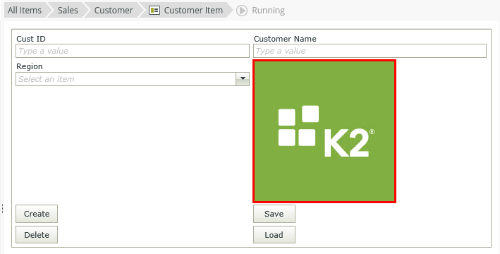
Picture Control
The Picture control is a read-only display control that allows you to display static images. 
- Create a view.
- Drag the control onto the canvas. You can find the control in the Display section of the Toolbox.
- Add a source to your control. To do this, configure the Source under the Data Source of the Properties section.
- Configure the rest of the properties as required.
- Run the view.
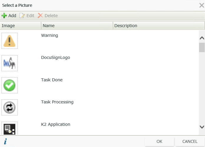
When you click on the ellipsis next to Data Source > Source in the control's Properties, the Select a Picture page opens. You can use pictures to display from the list or upload your own pictures.
On this page you can add, edit, and delete pictures. However, be careful when you do this because you can edit or delete pictures that other people have uploaded.
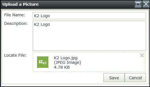
When you click Add the Upload a Picture page opens.
Add pictures using this dialog. 
You can find the control in the Display section of the Toolbox.
| Properties | Description | Can be set in runtime using rules? |
|---|---|---|
| Detail | ||
| Name | A unique identifier for the control. This property is required and defaults to the name of the control. | No |
| Alternate Text | The text to display if the picture can not load. | Yes, see Configure the Set a Control's Properties Action for more information. |
| Tooltip | The value to display when the cursor hovers over the control. | Yes, see Configure the Set a Control's Properties Action for more information. |
| Data Source | ||
| Source | The picture to display. | Yes, see Configure the Set a Control's Properties Action for more information. |
| General | ||
| Height | Adjusts the height of the control. You can enter any whole number or pixel value (maximum of 32767px). When set to blank, it's sized to fit the content of the control. | Yes, see Configure the Set a Control's Properties Action for more information. |
| Width | Adjusts the width of the control. You can enter any whole percentage up to 100%, whole number or pixel value to a maximum of 32767px. Type the dimension. | Yes, see Configure the Set a Control's Properties Action for more information. |
| Tab Index | Defines a sequence that users follow when they use the Tab key to navigate through a page at runtime. | Yes, see Configure the Set a Control's Properties Action for more information. |
| Visible | Shows or hides the control. | Yes, see Configure the Set a Control's Properties Action for more information. |
| Enabled | Enables or disables the control. | Yes, see Configure the Set a Control's Properties Action for more information. |
| Format | Opens the Format page where you can configure formatting and style features such as format, font, borders, padding and margins. See the Format topic for more information. | No |
| Conditional Format | Opens the Conditional Formatting page. You can add conditional formatting to apply a specific format or style when a condition you set is True. Use conditional format on its own or with the Format feature. See Conditional Format for more information. Click the ellipsis to open the Conditional Formatting page. | No |
The control interacts with other controls through rules. When you bind properties between different controls, you can use the data to populate properties or set values. Use the following examples for when to use the control with other controls through rules:
- Set a control’s properties: You can configure the settable properties of the control with this action
- Show/Hide: The Visible property allows you to show or hide the control through rules
- Enable/Disable: The Enabled property allows you to enable or disable the control through rules
- Set Focus: You can use the Focus control method in the Rule Designer to set focus to the control in runtime
The following events are available on the control:
Rule Events:
- When [control] is Active: You can execute a rule condition or action when you hover (mouse over) over the control
- When [control] is Clicked: You can execute a rule condition or action when the control is clicked. If you configure this event, the cursor also changes to a hand (pointer) when the control is clicked
- When [control] is Not Active: You can execute a rule condition or action when the cursor moves from within the picture to its container (mouse out)
- Show a Control
- Hide a Control
- Set a Control’s Properties
- When you configure a form for anonymous access, you cannot upload or download files with the File Attachment, Image Attachment and Picture controls. You should carefully consider and evaluate the impact of allowing file uploads and downloads with anonymous
access forms, since doing so may be considered a security vulnerability. User credentials and authentication are not required for
anonymous access forms and therefore any files uploaded or downloaded with such forms can be performed by anyone that can access the
form, without having to provide credentials. To allow file uploads and downloads for anonymous access forms,
you can add the following configuration settings to the web.config files of the SmartForms websites. Find the websites here:
[Install Directory]\K2\K2 smartforms Designer
[Install Directory]\K2\K2 smartforms Runtime
Add the following setting to the <appSettings> section of the configuration files listed above:
<add key="Forms.Controls.File.AllowAnonymousAccess" value="true" /> (Applies to the File Attachment and Image attachment controls)
<add key="Forms.Controls.Image.AllowAnonymousAccess" value="true" /> (Applies to the Picture control)
You must set the value to true to allow the controls to function when you access them through anonymous access forms. If you do not add this setting or if you set it to false, the controls do not work on anonymous access forms, namely errors occur when uploading or downloading files, and image thumbnails may not display. This configuration applies to the entire site and all anonymous access forms. It is not possible to configure security for the File Attachment, Image and Picker controls for individual anonymous forms. - The control is also available when you use forms
- If you want the control to change dynamically according to context, for example using a traffic light scenario, you can use multiple picture controls with the if a control contains a specific value rule condition. You can show one of the controls if a condition is true and hide the other controls.