User Performance Grid
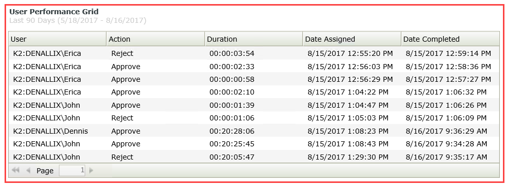
The User Performance Grid control lists users who have participated in a workflow activity according to filter criteria, and is displayed as detailed information of an activity instance or instances per user. You can use the grid to:
- View the detail such as Action and Duration of activity instances per user
- View the detail of the user who has participated in a workflow instance. To do this, you can configure a rule to interact with the Workflow Instances Grid. See the Rules, Events and Actions section for more detail
- View the variables (data fields) for the specific workflow activity. To do this, you can configure a rule to interact with the Workflow Data Grid. See the Rules, Events and Actions section for more detail
- Determine who the task is assigned to if a workflow step is incomplete

- Create a view.
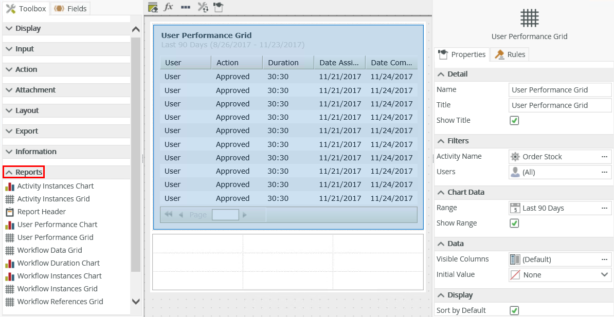
- Drag the control onto the canvas. You can find the control in the Reports section of the Toolbox.
- Configure the rest of the properties as necessary.
- Run the view.
You can find the control in the Reports section of the Toolbox.

| Property | Description | Can be set in runtime using rules? |
|---|---|---|
| Detail | ||
| Name | A unique identifier for the selected control. This property is required and defaults to the name of the control. | No |
| Title | The title of the control. | Yes, see Control Properties Actions for more information. |
| Show Title | Shows or hides the title. | Yes, see Control Properties Actions for more information. |
| Filters | ||
| Activity Name | This is the activity on which you want to filter the data. Click the ellipsis to use the Activity Picker. | Yes, see Control Properties Actions for more information. |
| Users | Select users who participated in an activity instance. Click the ellipsis to use the Users Picker. | Yes, see Control Properties Actions for more information. |
| Chart Data | ||
| Range | The date range to use to filter the data. The data returned typically executes according to the date on which the user actioned an activity instance. Select a date range from the predefined drop-down list to filter. Click the ellipsis to use the Date Range Picker. |
Yes, see Control Properties Actions for more information. |
| Show Range | Shows or hides the Range. | Yes, see Control Properties Actions for more information. |
| Data | ||
| Visible Columns | The columns to show for the control. Click the ellipsis to select or deselect the columns. | Yes, see Control Properties Actions for more information. |
| Initial Value | Allows you to select the first record when the report is run. First record: Selects the first record in the list when the report is run. Use this option if you only expect one record to return and require no user interaction to select the record. None: No record is automatically selected when the report is run. |
Yes, see Control Properties Actions for more information. |
| Display | ||
| Sort by Default | Sorts the list by Date Completed. | No |
| Use Paging | Enables paging of the list. | Yes, see Control Properties Actions for more information. |
| Page Size | The number of records to show per page. | Yes, see Control Properties Actions for more information. |
| General | ||
| Width | Adjusts the width of the control. You can enter any whole percentage up to 100%, whole number, or pixel value to a maximum of 32767px. | Yes, see Control Properties Actions for more information. |
| Visible | Shows or hides the control. | Yes, see Control Properties Actions for more information. |
| Enabled | Enables or disables the control. | Yes, see Control Properties Actions for more information. |
| Read-Only | Shows the control as read-only. | Yes, see Control Properties Actions for more information. |
| Styles | Opens the Style Builder allowing you to specify style features like format, font, borders, padding and margins. See the Style Builder topic for more information on styling options. | No |
| Conditional Styles | Opens the Conditional Formatting page. You can design styles that apply only when certain conditions are met. See the Conditional Styles section for more information. Click the ellipsis to open the Conditional Formatting page. | No |
Report controls interact with each other through rules. When you bind properties between different controls, you can use the data to populate properties or set values.
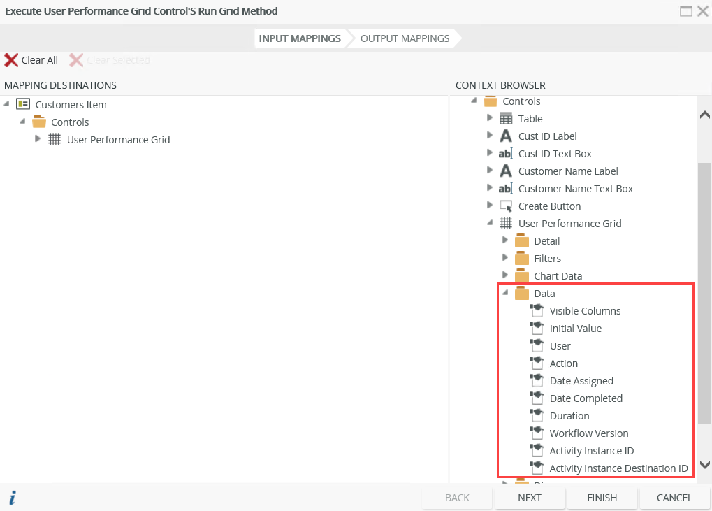
- When you use rules, you can use the control properties in the context browser for mapping to other controls. This means that you can drag the property from the control to another control’s properties or control value.

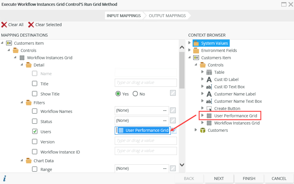
- You can, for example, use the User Performance Grid to populate the Workflow Instances Grid. This allows you to click a record in the User Performance Grid, the Workflow Instances Grid is updated to show workflow instances where the user has participated. Create and configure the following rule for this scenario:

Map the User Performance Grid value to the Users filter of the Workflow Instances Grid.
Security on the Report controls ensures that the data is seen by only those who are authorized. Permissions are based on the process rights assigned to the process in Management Site:
- Admin or View permissions: You can access the Report controls.
- View Participate permissions: You can view the Report controls from the point where you are part of the workflow.
- When you click on a record in the list of the control, the value of the grid is the selected instance which you can use to bind properties or configure rules
- A user's performance is measured on completion of an activity. The control is populated with data when a user has completed the activity and does not display any other status.
- When you use custom themes, be sure to specify the CSS classes for the elements
- You cannot change grid control columns as they are predefined. You can, however, deselect columns in the control's properties so that they don't display
- You can use reporting controls to access the data of workflows created in any workflow designer, including the K2 Designer and K2 Designer for SharePoint