Item Views
Use Item views to read and capture information related to single records, such as shown here.
You have two options when the view is empty: You can Create Labels and Controls based on the SmartObject you selected on the General tab, or you can generate a blank layout table for inserting controls. If you want to get back to an empty view, click the Clear canvas button in the toolbar. 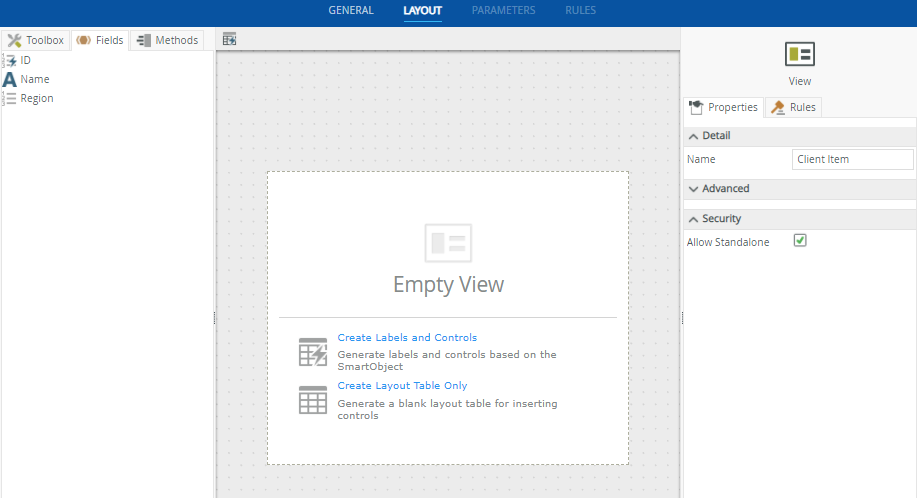
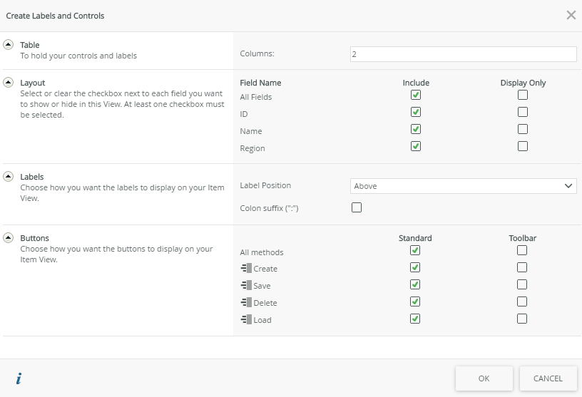
Selecting the first option, Create Labels and Controls, allows you to specify the details for creating the table, layout, labels, and buttons. Clicking OK automatically generates the view.
| Feature | Description | How to use it |
|---|---|---|
| Table | Specify the size of the table to hold the controls and their labels | Enter the number of columns you need |
| Layout | Specify the SmartObject fields that you want to show on your view. When you select the Display Only option, the control only displays data at runtime and the value of the control is not editable. You can use to populate display only controls with data. | Select the fields you want to show on your view |
| Labels | Label Position: Specify where the labels appear in relation to the controls:
|
Select the option to be used |
| Buttons |
Represents the methods from the SmartObject you selected as the data source. If checked, a button is added on the view for the method. Standard - Buttons are placed at the bottom spread across columns and rows Toolbar - Buttons are placed at the top in a toolbar |
Select the methods and placement |
You can now start customizing your view using controls, fields, methods, and rules.
You can configure the column width by using the column resize widget as shown below.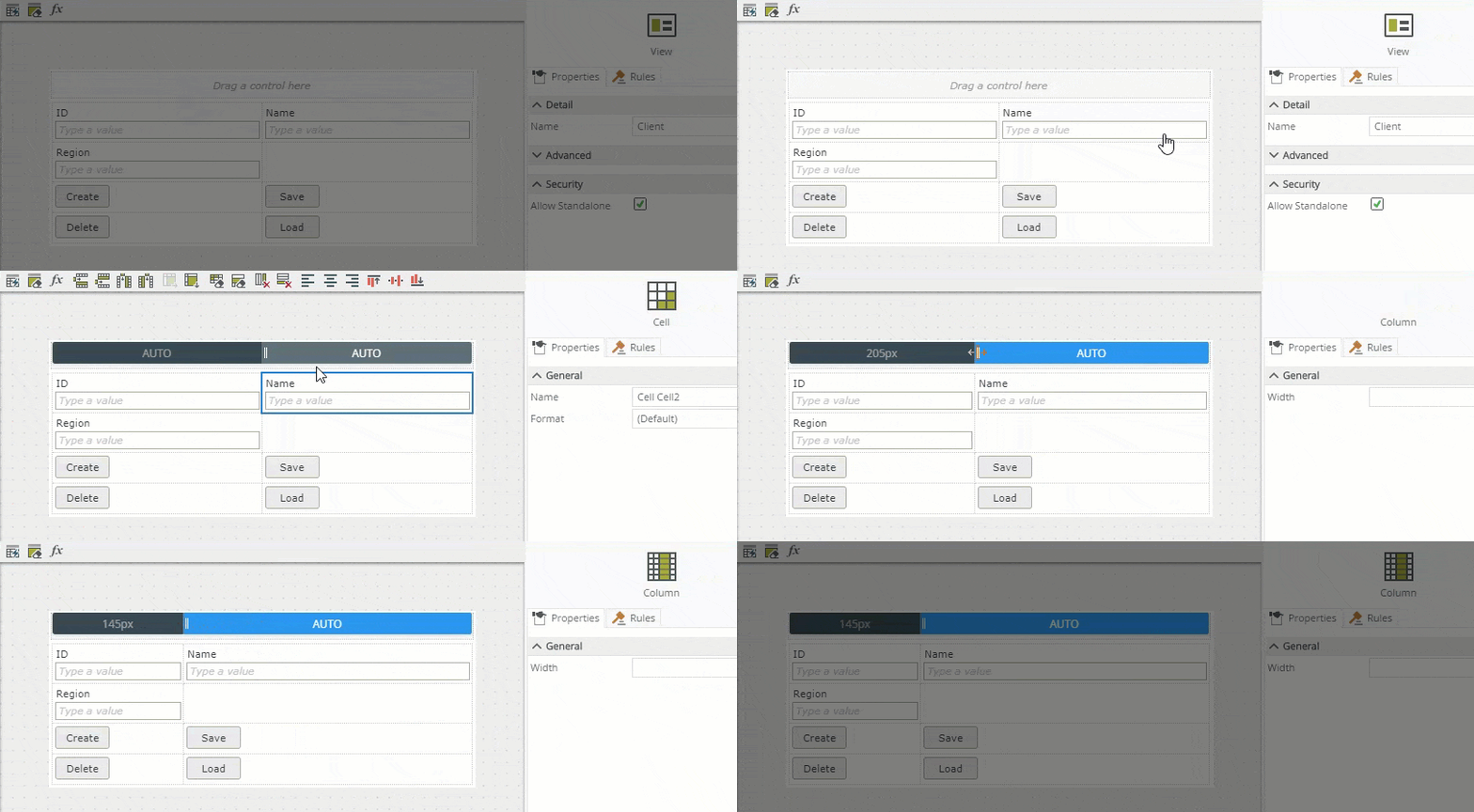
Alternatively set the column width manually using the column's Width property. Select a cell, click the column width widget and then specify a percentage. 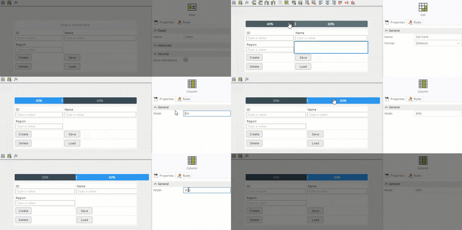
- The table control renders as a table grid. For detailed information see CSS Table Grid.
- Configure the Width property if you want to use specific width values, such as 80% or 200px, otherwise use the resize widget to resize your columns.
- Width values must be between 0-9999px or 0%-100%.
- The only special characters allowed are "%" and "px".
- Decimal places are allowed.
- An empty width value is rendered as auto-width at runtime.
- We recommend that you use only one of the two resizing methods rather than combining manual values and using the resize widget, because doing so may result in the total width of all columns exceeding 100%, as shown below.
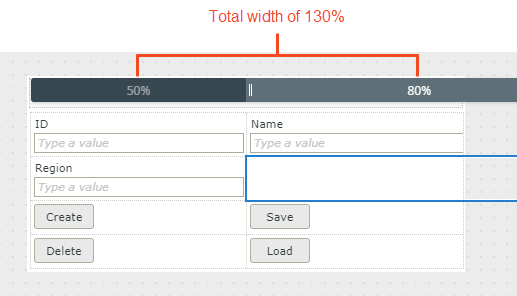
- You can mix value types, for example some columns as "%" and others as "px" values.
- The table width determines the runtime display, all columns in the table are automatically recalculated by the web browser at runtime to fit the specified table width.
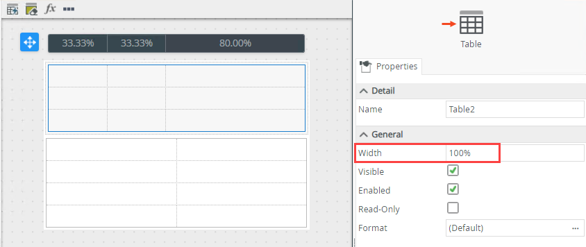
- When the sum of the columns in the table is less than the size of the table, a shaded out area shows in design time. This area will remain blank at runtime.

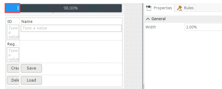
- When you set the Width property to a small percentage or pixel size, the column may appear wider in the designer - this allows you to select the column at design time. The column is sized correctly at runtime.
When you select a cell within the table, you can also change the background color and apply padding to a cell by using the Format property. 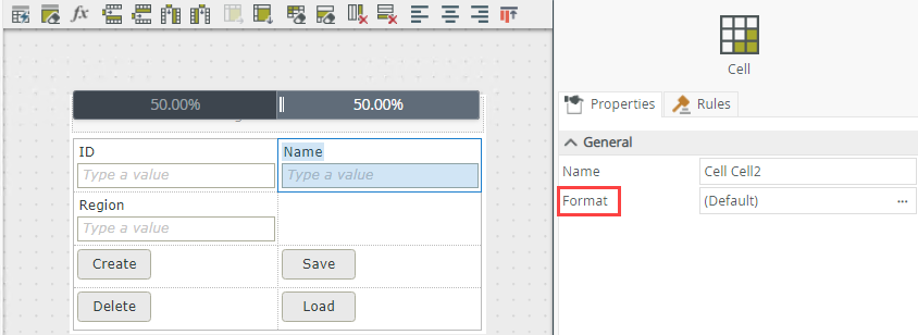
When you select a cell within the table, you can adjust the width of the column by entering a percentage value for the Width property. You can also change the background color and apply padding to a cell by using the Format property. 
| Properties | Description | Can be set in runtime using rules? |
|---|---|---|
| General | ||
| Name | A unique identifier for the cell. | No |
| Format | Use this property to apply background color and padding to a cell. | No |
| Column | ||
| Width | Adjusts the width of the column. You can enter any percentage up to 100%. Type the dimension. When you specify a cell width, the width is applied to the column and all cells in the column inherit the setting. | No |
Select Create Layout Table Only to design the view by
See the
Controls are supported differently based on where you drop them and the type of view you're designing. See the topic Binding Controls for information on how to bind and unbind a SmartObject field from a control. You can use bound and unbound controls in all zones of an item view.