Rating Control
The Rating control allows you to select a number of stars to represent a rating. Use the control to rate things like satisfaction with products and services.

Try it yourself!
- Create a view.
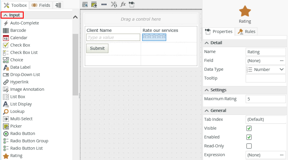
- Drag the control onto the canvas. You can find the control in the Input section of the Toolbox.
- Configure the rest of the properties as necessary.
- Run the view.
You can find the control in the Input section of the Toolbox. 
| Properties | Description | Can be set in runtime using rules? |
|---|---|---|
| Detail | ||
| Name | A unique identifier for the control. This property is required and defaults to the name of the control. | Yes, see SmartForm controls extensibility for more information. |
| Field | The field bound to the control. See the Binding Fields to Controls section for more information on how to use it. | No |
| Data Type | A drop-down list containing the types of values that the control can accept. | No |
| Tooltip |
The value to display when the cursor hovers over the control. |
Yes, see Configure the Set a Control's Properties Action for more information. |
| Settings | ||
| Maximum Rating | The number of stars to display (any whole number between 1 and 1000). | Yes, see Configure the Set a Control's Properties Action for more information. |
| General | ||
| Tab Index | Defines a sequence that users follow when they use the Tab key to navigate through a page at runtime. | Yes, see Configure the Set a Control's Properties Action for more information. |
| Visible | Shows or hides the control. | Yes, see Configure the Set a Control's Properties Action for more information. |
| Enabled | Enables or disables the control. | Yes, see Configure the Set a Control's Properties Action for more information. |
| Read-Only | Shows the control as read-only. | Yes, see Configure the Set a Control's Properties Action for more information. |
| Expression | Opens the Expression Builder to configure expressions to populate the control with dynamically calculated values. | Yes, see Configure the Set a Control's Properties Action for more information. |
| Format | Opens the Format page where you can configure formatting and style features such as format, font, borders, padding and margins. See the Format topic for more information. | No |
| Conditional Format | Opens the Conditional Formatting page. You can add conditional formatting to apply a specific format or style when a condition you set is True. Use conditional format on its own or with the Format feature. See Conditional Format for more information. Click the ellipsis to open the Conditional Formatting page. | No |
The control interacts with other controls through rules. When you bind properties between different controls, you can use the data to populate properties or set values. Use the following examples for when to use the control with other controls through rules:
- Set a control’s properties: You can configure the settable properties of the control with this action
- Show/Hide: The Visible property allows you to show or hide the control through rules
- Enable/Disable: The Enabled property allows you to enable or disable the control through rules
- Data Transfer: You can transfer data from items listed in the context browser to the control
- Set Focus: You can use the Focus control method in the Rule Designer to set focus to the control in runtime
- The control is also available when designing forms
- You can change a number field’s control to a rating control by using the Change control button
- You can use expressions or the Transfer dataaction to configure the Maximum Rating property
- Use conditional formatting to change the border color of the control according to the rating value selected