Calendar Control
The Calendar control is an input control used to select date and time from a calendar. When dragging a Field of type Date/Time onto the canvas, the properties displayed will be specific to that Field.
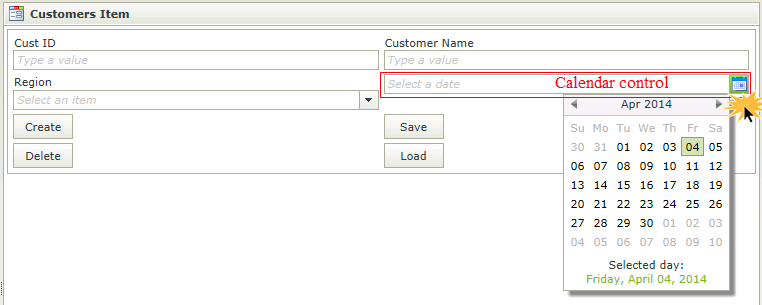
When viewed at runtime, the different icons are used to identify the type of picker selected for the Calendar control. A date can be selected and time specified depending on the type of picker configured. The time is displayed according to the Date/Time culture settings used in respect of a 12-hour or 24-hour clock. Specify a time by clicking on the hours, minutes or seconds and using the up and down arrows. These will apply according to the intervals configured in design time. Alternatively, type the required hours, minutes or seconds. For more detail see the Picker Type and Format Time Setting sections in the Design Properties.
- Create a View
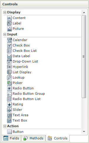
- Drag the Calendar control onto the canvas. The control can be found in the Input section of the Controls found in the View Designer, see the Properties section below
- Configure the Picker Type property if required
- Configure the rest of the properties as required
- Run the View
- The Calendar control is also available in the Form Designer
- There are Date and Time expressions that can be used on the Calendar control to dynamically calculate dates, days of the week, end/start of a quarter, etc.
- Values can be transferred to and from a Calendar control using the Transfer data action: static text can be used; values from another control; or System Values from the Context Browser
- The Default Value property setting is used to populate the initial value of the Calendar control in runtime
- The Picker Type property settings are used for display in the Calendar picker
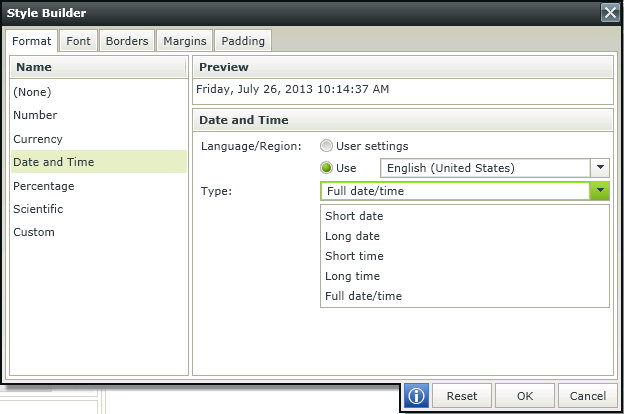
- The format of the values within a Calendar control can be set using the Format tab on the Style Builder
- The Date and Time Style Format settings determine the display after a selection has been made from the Calendar picker
- When using Styles on the Calendar control and applying a Date and Time format, it is important to keep this format in sync with the settings applied in the Picker Type property to ensure correct expected behavior. For example, when using Full date/time format in the Style Builder and selecting the Time option in the Picker Type property, the value will be displayed in Full date/time format in runtime, but when clicking on the Calendar picker, only the Time will be available for editing
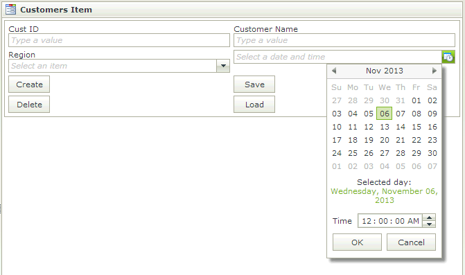
- When selecting Date and Time or Time in the Picker Type property, the Time value displayed in the Calendar picker will show either AM/PM or a 24-hour picker depending on the user culture settings
- Focus can be set to this control at runtime by using the Focus control method in the Rule Designer
The Calendar control is available in the Input section of the Controls found in the View Designer and Form Designer.
| Properties | Description | Can be set in runtime using Rules |
|---|---|---|
| Name | A unique identifier for the selected control. This property is required | No |
| Field | The Field bound to the selected control. See the Binding Fields to Controls section for more information on how to use it | No |
| Data Type | A drop-down list containing the types of values that the selected control can accept. See the Date/Time Use Cases section. | No |
| Watermark | The text to display when the control is not populated | Yes, see Control Properties Actions for more information |
| Default Value |
This property is used to populate the initial value of the Calendar control in runtime. The following values are available:
|
Yes, see Control Properties Actions for more information |
| Tooltip | The value to be displayed when the cursor is hovered over the control during runtime | Yes, see Control Properties Actions for more information |
| Picker Type | The Calendar picker type can be specified which includes Date, Time or Date and Time. These settings will apply when clicking on the Calendar picker in runtime | No |
| Width | Adjust the width of the control (any whole percentage up to 100%, number or pixel value up to 32767px) | Yes, see Control Properties Actions for more information |
| Tab Index | Used to define a sequence that users follow when they use the Tab key to navigate through a page at runtime | Yes, see Control Properties Actions for more information |
| Visible | A Boolean value used to establish whether the control is visible during runtime | Yes, see Control Properties Actions for more information |
| Enabled | A Boolean value used to establish whether the control is enabled during runtime | Yes, see Control Properties Actions for more information |
| Read-Only | A Boolean value used to establish whether the control is read-only during runtime | Yes, see Control Properties Actions for more information |
| Expression | Opens the Expression Builder to configure expressions to populate the control with dynamically calculated values | Yes, see Control Properties Actions for more information |
| Styles | Opens the Style Builder enabling the user to specify style features like Format, Font, Borders, Padding and Margins. See the Style Builder topic for more information on styling options | |
| Conditional Styles | Opens the Conditional Formatting Designer used to design styles that will apply only when certain conditions are met. See the Conditional Styles section for more information | No |
The Picker Type property can be set to use Date
 , Time
 or Date and Time
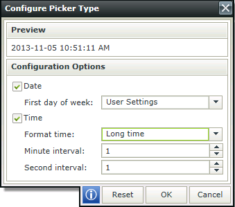
 . The Calendar will be displayed as such at runtime. The default is set to use Date. When clicking on the ellipsis next to the property, the Configure Picker Type dialog opens. Select the option or options required and set the criteria to be used with each.
| Fields | Description |
|---|---|
| Date | |
| First day of week | Represents the day when the week is started for your specific organization. When User Settings is selected, the default value of the user's browser culture settings will apply. Alternatively a specific day can be selected |
| Time | |
| Format time |
Defines the manner in which the time will be presented in runtime. The following options are available:
|
| Minute interval |
Adjust the interval when using the up and down arrows to select minutes in the Calendar during runtime. The following intervals are available:
|
| Second interval |
Adjust the interval when using the up and down arrows to select seconds in the Calendar during runtime. The following intervals are available:
|
| Reset | |
| Reset | Resets the values to the default system values i.e. Date and intervals of 1 |
The Calendar control allows for a 12 hour AM/PM clock or 24 hour clock to be displayed within the Calendar picker. This is useful when having customers in different countries with different culture settings. There are three items to consider when using the Calendar Picker as they work in conjunction and will influence the result at runtime.
Picker Type property - Determines the format of the Date and Time displayed in the Calendar picker at runtime and whether it's displayed as a 12 hour AM/PM clock or 24 hour clock
Date and Time Style applied to the control - Determines the display of the value in the control at runtime
Browser culture - Determines the format of the Long time and Short time
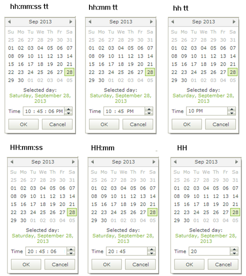
The selections made in the above items determine the display of the Calendar picker and Calendar control at runtime. The following options are available at design time for use with the Format time option of the Picker Type property:
- Long time - Displays either as hh:mm:ss tt or HH:mm:ss depending on whether the culture of the Calendar control as configured in the Style Builder has a default 12 hour AM/PM clock or 24 hour clock configured
- Short time - Displays either as hh:mm tt or HH:mm depending on whether the culture of the Calendar control as configured in the Style Builder has a default 12h AM/PM clock or 24h clock
- hh:mm:ss tt - Displays as a 12 hour clock
- hh:mm tt - Displays as a 12 hour clock
- hh tt - Displays as a 12 hour clock
- HH:mm:ss - Displays as a 24 hour clock
- HH:mm - Displays as a 24 hour clock
- HH - Displays as a 24 hour clock
Explanation of the notations:
h = hour
m = minute
s = second
tt = A.M or P.M
h/H = 12/24 hour
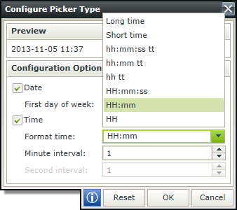
Following are examples of the different Time formats of the Calendar picker at runtime depending on the Format Time settings used:
The Display Time Zone property can be configured by using the set control properties actions allowing the designer to force a particular time zone to be used when displaying the control's value. This property can be used with the Calendar, Data Label, Text Box and Text Area controls and is configured in the Set Control properties rule actions. This property is useful if the datetime should display the same regardless of the end user location/time zone. Examples of where this feature would be beneficial are:
- A good example is birthdays or;
- When you have a time zone setting somewhere else you have to match for example the manner which SharePoint has time zones set per site collection and per user.
- Another example is when referring to a time in a particular time zone. When the user interface would state the time zone and the date time. A good example would be a world clock showing times in New York, London etc.
- Final example is when scheduling a meeting you can select a date/time based on your browser time zone but also show another control indicating the time in another region for the participants.
We're using an example of a world clock, where the user interface would state the time zone and the date time.
- Create a View with two Calendar controls.
- Configure both controls' Picker Type properties as follows:
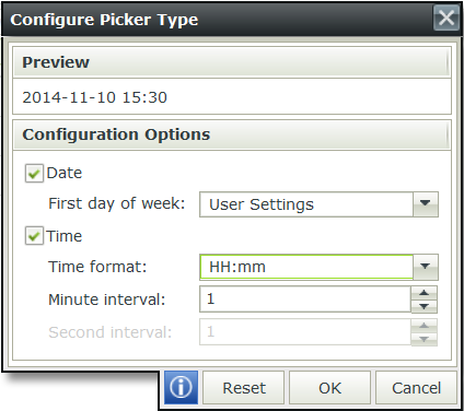
- Use label controls to identify the different clocks. We used London, New York and Hawaii.
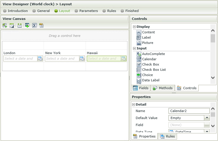
- Create a rule when the View executed Initialize to set the properties of the Calendar controls.
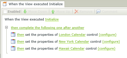
- Configure the Calendar controls as follows:
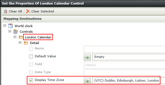
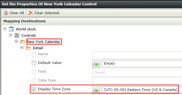
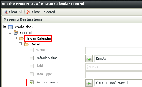
- Finish and Run the View
- Select the current date and time on each control and note the difference in time.

See the Control and Form Properties Actions topic for more detail on how to set a control's properties at runtime.
It is important to note that the Display Time Zone setting can only be configured to be affected at runtime. This means that it will only change when an event takes place at runtime. In addition, the Date and Time format of the control can further be configured using the Style Builder and the Picker Type property (only applicable to the Calendar control).
- The Display Time Zone property only works with the DateTime data type and not with the Date or Time data types.
- The value should be set after the time zone is set. (Don't use Today in the properties, rather set the time zone and then set the default value of today)
- Changing the time zone will not change the control's underlying utc value, only the displayed value.
Use cases of Date, Datetime, Time, Timezone data types:
- Datetime - Should be used to specify a utc time that will show in different locations relative to the user's timezone.
- Datetime with timezone - Should be used to specify a utc time that will not vary depending on the user's timezone.
- Date - Should be used for a timezone invariant date (no time).
- Time - Should be used for a timezone invariant time (no date).
How to use rules to change the edit state of View and Form controls and tables
