AutoComplete control
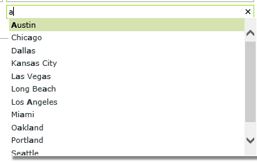
The AutoComplete control provides suggestions while you type into the field. The control is in essence a text box that can be bound to a SmartObject which, at runtime, filters data in a drop-down by a Contains operator when a user captures a value.
- Create a View .
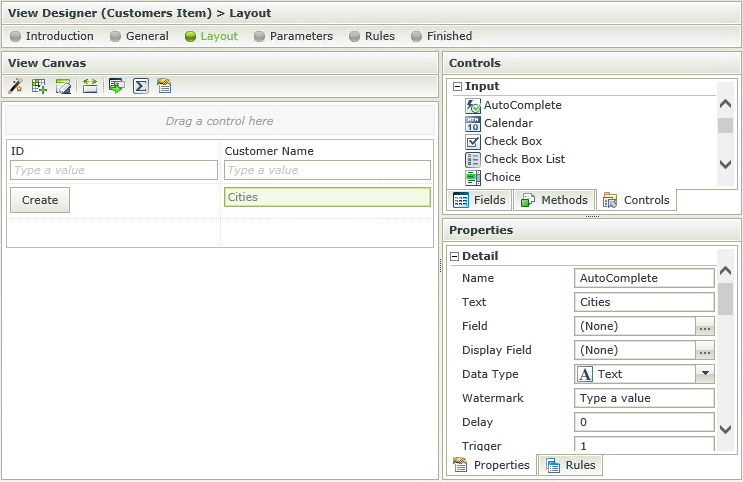
- Drag the AutoComplete control onto the canvas. The control can be found in the Input section of the Controls found in the View Designer.
- Configure the Type under the Data Source of the Properties section.
- Configure the rest of the properties as required.
- Run the View.
- The AutoComplete control can be associated to a SmartObject or have a static list of values.
- The default value of a SmartObject used as the data source is not available in this control. If a default value should be displayed at runtime, it is advised to use the static list option as the data source.
- The control currently only filters data using the Contains operator.
- The control cannot be used to select multiple values.
The AutoComplete control interacts with other controls through rules. Depending on the control properties, there are certain actions where the control surfaces. Following are a few examples:
- Populate a list control with data: The control can be populated if it has a SmartObject-based data source
- Set a control’s properties: The control's settable properties can be configured using this action
- Show/Hide: The Visible property allows for the control to be shown or hidden through rules
- Enable/Disable: The Enabled property allows for the control to be enabled or disabled through rules
- Data Transfer: Data can be transferred from items listed in the Context Browser to the control
The AutoComplete control is available in the Input section of the Controls tab found in the View Designer.
| Property | Description | Can be set in runtime using Rules |
|---|---|---|
| Detail | ||
| Name | A unique identifier for the selected control. This property is required. | No |
| Text | Text to be used when displaying the control at runtime. | Yes, see Control Properties Actions for more information |
| Field | The field that is bound to the selected control. | No |
| Display Field | Allows you to show the control’s display value before its data has been loaded. | No |
| Data Type | A drop-down list containing the types of values that the selected control can accept. | No |
| Watermark | The text to display when the control is not populated. | Yes, see Control Properties Actions for more information |
| Delay | This is the delay in milliseconds between when a character is typed and search is performed. A zero delay will work for static data and SmartObject data source cached data search, but can produce overhead for a SmartObject data source live search. Default is zero (0). | Yes, see Control Properties Actions for more information |
| Trigger | Number of characters before the search is filtered. Default is one (1). | Yes, see Control Properties Actions for more information |
| Live Search | Determines when the control will be populated. Live Search is disabled by default. When disabled, the control will populate when the View initializes (think of this as pre-loading the control with values when the View initializes). When this property is enabled, it will populate when values are captured in the control. | No |
| Tooltip | The value to be displayed when the cursor is hovered over the control during runtime. | Yes, see Control Properties Actions for more information |
| Data Source | ||
| Type | Set up data-bindings for the selected control. | No |
| Items | A read-only list of static list items. | No |
| SmartObject | The SmartObject that has been bound to the control. | No |
| Method | The method to be used to populate the control. | No |
| Value | The SmartObject property to be used as a value for the control. | No |
| Lookup SmartObject | An alternate SmartObject to be used as the source of the display values (*optional). | No |
| Lookup Method | The method to be executed on the lookup SmartObject when retrieving the display values. | No |
| Source Join Property | The SmartObject property on the original SmartObject that will be used to join the original SmartObject with the Lookup SmartObject. | No |
| Lookup Join Property | The SmartObject property on the lookup SmartObject that will be used to join the original SmartObject with the Lookup SmartObject. | No |
| Display | The display template of the control. | No |
| General | ||
| Width | Adjust the width of the control (any whole percentage up to 100%, number or pixel value up to 32767px). | Yes, see Control Properties Actions for more information |
| Tab Index | Used to define a sequence that users follow when they use the Tab key to navigate through a page at runtime. | Yes, see Control Properties Actions for more information |
| Visible | A Boolean value used to establish whether the control is visible during runtime. | Yes, see Control Properties Actions for more information |
| Enabled | A Boolean value used to establish whether the control is enabled during runtime. | Yes, see Control Properties Actions for more information |
| Read-Only | A Boolean value used to establish whether the control is read-only during runtime. | Yes, see Control Properties Actions for more information |
| Expression | Opens the Expression Builder to configure expressions to populate the control with dynamically calculated values. | Yes, see Control Properties Actions for more information |
| Styles | Opens the Style Builder enabling the user to specify style features like Format, Font, Borders, Padding and Margins. See the Style Builder topic for more information on styling options. | No |
| Conditional Styles | Opens the Conditional Formatting Designer used to design styles that will apply only when certain conditions are met. See the Conditional Styles section for more information. | No |
| Validation | ||
| Pattern | Set up a validation pattern that can be used to evaluate the value of the selected control | No |
| Message | Specify the message to be displayed if the content of the control does not adhere to the specified Validation Pattern | No |
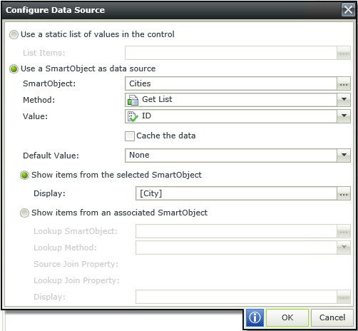
When clicking on the ellipsis next to Type in the Data Source section, the Configure Data Source screen opens. Configure the data source to be used for the control.
| Field | Description |
|---|---|
| Use a static list of values in the control | A static list of items can be configured. These values are stored as Text in the database. Click the ellipsis next to List Items to configure the list. |
| List Items | Click the ellipsis next to List Items to configure the list of static values for the control. |
| Use a SmartObject as data source | A SmartObject can be used as data source. Select this option if a SmartObject should be used as data source. |
| SmartObject | The selected SmartObject that has been bound to the control. Click the ellipsis next to SmartObject to select the SmartObject. |
| Method | The method to be used to populate the control. Select the method from the drop-down list. |
| Value | The SmartObject property to be used as the value for the control. Select the property from the drop-down list. |
| Cache the data | When selected, the SmartObject data will be cached to allow for client side filtering enabling the data to be available offline. This can help performance, but at the expense of retrieving live data from the data provider. |
| Default Value | The Default Value property does not apply to the AutoComplete control |
| Show items from the selected SmartObject | Shows items from the selected Data Source SmartObject. |
| Display | The SmartObject property to be used as the display value. |
| Show items from an associated SmartObject | Shows items from an associated SmartObject instead of the Data Source SmartObject. |
| Lookup SmartObject | An alternate SmartObject to be used as the source of the display values (*optional). Click on the ellipsis to select the SmartObject. |
| Lookup Method | The method to be executed on the lookup SmartObject when retrieving the display values. Select the method from the drop-down. |
| Source Join Property | The SmartObject property on the original SmartObject that will be used to join the original SmartObject with the Lookup SmartObject. |
| Lookup Join Property | The SmartObject property on the lookup SmartObject that will be used to join the original SmartObject with the Lookup SmartObject. |
| Display | The SmartObject property to be used as a display member. Select the item by clicking on the ellipsis. |
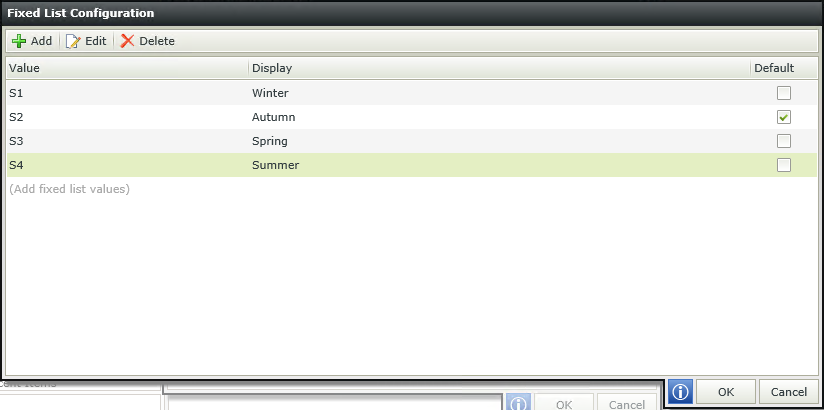
When selecting Use a static list of values in the control and clicking on the ellipsis, the Fixed List Configuration screen opens. This allows you to configure Value-Display items for the control. The Value is used to reference a Display value that will be displayed to the user at runtime.
Design time configuration
Runtime

- The control can only contain one value.
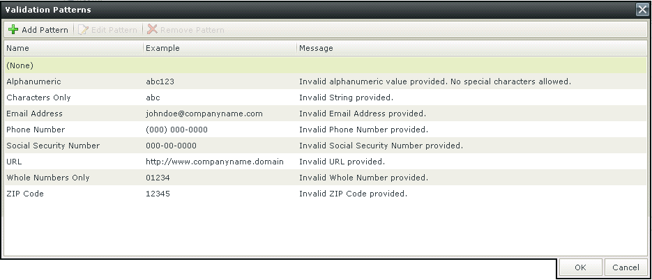
Patterns are regular expressions used to enforce validation on a certain control when data is captured. There are several validation types as shown below. Additional validation patterns can be configured and the validation error message can be customized. Creating a Pattern for “percentage” for example, would enforce validation on the selected control, which will fail if the user did not enter the value as “[Value][%]”.
When clicking on the ellipsis next to Pattern, the Validation Patterns screen opens:
| Feature | Description | How to use it |
|---|---|---|
| Add Pattern | Adds a new Validation Pattern | Click on Add Pattern |
| Edit Pattern | Edits an existing Validation Pattern | Click on Edit Pattern |
| Remove Pattern | Removes a Validation Pattern | Click on Remove Pattern |
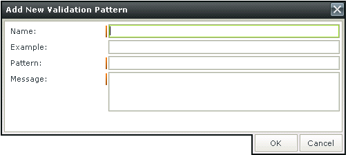
Click Add Pattern to add a new pattern. The Add New Validation Pattern screen opens
| Feature | Description | How to use it |
|---|---|---|
| Name | The name of the Validation Pattern | Type a name |
| Example | An example of the Validation Pattern such as abc for a Characters Only Validation Pattern | Type an example |
| Pattern | The regular expression for the Validation Pattern | Type the regular expression |
| Message | The message to be displayed if the input data does not match the regular expression | Type the message |
Please note when using a validation Pattern on a control, a
A custom Pattern can be created. Creating a Pattern for “percentage” for example, would enforce validation on the selected control, which will fail if the user did not enter the value as “[Value][%]”.
Click Add Pattern to add a new pattern. The Add New Validation Pattern screen opens

| Feature | Description | How to use it |
|---|---|---|
| Name | The name of the Validation Pattern | Type a name |
| Example | An example of the Validation Pattern such as abc for a Characters Only Validation Pattern | Type an example |
| Pattern | The regular expression for the Validation Pattern | Type the regular expression |
| Message | The message to be displayed if the input data does not match the regular expression | Type the message |
It is important to note the difference in applying validation Patterns to Item Views and Editable List Views.
When applying a validation Pattern to an Item View, the Rule Definition should look something like this:
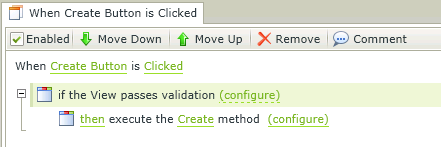
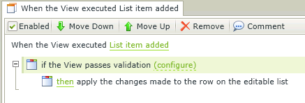
When applying a validation Pattern to an Editable List View, the Rule Definition should look something like this:
