CCreate a custom form control overview
This topic describes the class structure of the MyCustomSliderControl project.
The custom slider control leverages the NintexFormControl Class to create a bindable Nintex Forms control. The slider control is a styled HTML5 range slider control, <input type="range">, that uses the JavaScript JQuery library to set the control value on page load by retrieving the value from the textbox control. The code then reads the value of the range control and stores it in the textbox control. The textbox control in turn can be bound to a SharePoint list. You can use the textbox control to store as text a variety of data types. In the case of the range control it is storing an integer value within the maximum and minimum values of the control range.
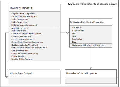
You can find a class diagram of the control below. The control uses the following two classes.
The two classes are derived from the NintexFormControl class and NintexFormsControlProperties class in the Nintex.Forms.Sdk library.

MyCustomSliderControl Class
This class contains the assets used to create the custom interaction element, in this case the range slider. The class contains the JQuery script, a pointer to the control CSS, generates the HTML for the control, grabs the control properties from the MyCustomSliderControlProperites Class, leverages the textbox control to access the textbox control bindings, and then registers the control package with SharePoint.
MyCustomSliderControlProperties Class
This class defined the control properties which are created by the constructed when the object is instantiated.
The constructor defined the properties which map to the attributes of the control. For the slider control, the HTML element contains the following attributes.
| HTML5 attribute | Notes | MyCustomSliderControlProperties | Data Type |
|---|---|---|---|
| min="0" | default 0 | Min | integer |
| max="100" | default 100 | Max | integer |
| step="1" | default 1 | Step | integer |
| value="50" | default min + (max-min)/2 | StartValue | integer |
| data-orientation="vertical" | default horizontal | IsHorizontal | boolean |
NintexFormControl Class and NintexFormsControl Properties Class
These classes implement the basic functionality required by Nintex controls that contain child controls. The NintexFormsControl Class inherits from the BaseBindableFormControl which in turn inherits from the .NET class System.Web.UI.WebControls.WebControl. The class enables the control to bind with SharePoint lists and interact with the events. You will be able to associate validation rules, inline functions, and other features of the Nintex Forms designer with your control. For information about these classes see the Nintex.Forms.Sdk Namespace
Create a custom form control sample
System.Web.UI.WebControls.WebControl
http://rangeslider.js.org (Simple, small and fast JavaScript/JQuery polyfill for the HTML5)