View Toolbar
When designing views, you use the toolbar to configure controls and cells. The toolbar changes depending on what you have selected, and allows you to do things like create labels and controls, bind and unbind controls, change controls, configure expressions, change the style or format of a control, insert rows and columns, merge cells and more.
The Control Toolbar
The following toolbar options are available when you select a control:

The List View Settings icon is available when designing a List view.
| Feature | Icon | Description |
|---|---|---|
| Create Labels and Controls |

|
Creates labels and controls using the data source (SmartObject). |
| List View Settings |

|
Allows you to specify how you want to style, sort, and filter your list view, or to change the List view to an editable list view. |
| Clear Canvas |

|
Clears the canvas. |
| Unbind Control |

|
Unbinds the control from the current field. |
| Fit Control to Cell |

|
Fits the control to the cell (removes the width setting). |
| Change Control |

|
Allows you to choose a different control for the field. |
| Expressions |

|
Opens the Expression Builder to add an expression to the cell. You can add more than one expression. |
| Edit Format |

|
Opens the Format page to apply formatting and styling to the control. |
When designing a view and clicking on the Create Labels and Controls toolbar button, the design applied to the current view is reset and a new table with controls added using the default settings. If you want to be able to revert the view back, save or finish the view. The Create Labels and Controls button can then be executed and if not satisfied with the results, cancel to revert back to the saved version.
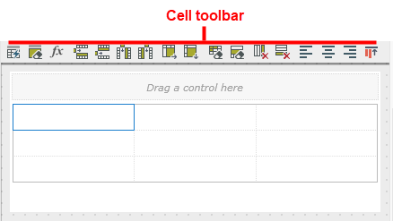
Cell Toolbar Options
The following toolbar options are available when you select a table cell:

| Feature | Icon | Description |
|---|---|---|
| Create Labels and Controls |

|
Creates labels and controls using the selected data source |
| List View Settings |

|
Allows you to specify how you want to style, sort, and filter your List view, or change the List view to an editable list view. |
| Clear Canvas |

|
Clears the canvas |
| Control Expression |

|
Use the Expression Builder to add an expression to the control. You can add more than one expression. |
| Insert Row Above |

|
Inserts a row above the current cell |
| Insert Row Below |

|
Inserts a row below the current cell |
| Insert Column to the Left |

|
Inserts a column to the left of the current cell |
| Insert Column to the Right |

|
Inserts a column to the right of the current cell |
| Merge Cell to the Right |

|
Merges the current cell with the one on the right |
| Merge Cell Below |

|
Merges the current cell with the one below |
| Clear Cell |

|
Clears the cell |
| Clear Row |

|
Clears the row |
| Remove Column |

|
Removes the column |
| Remove Row |

|
Removes the row |
| Left Align |

|
Aligns the content of the cell to the left |
| Center Align |

|
Aligns the content of the cell in the center |
| Right Align |

|
Aligns the content of the cell to the right |
| Top Align |

|
Aligns the content of the cell to the top |
| Middle Align |

|
Aligns the content of the cell in the middle |
| Bottom Align |

|
Aligns the content of the cell to the bottom |