Editable List Views
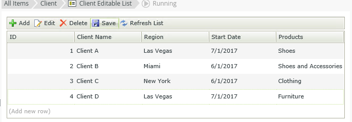
Use an Editable List view to create a view that displays and allows you to edit lists of information as shown here:
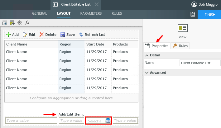
When you create a List view, you can select to Enable list editing. This turns a regular List view into an Editable List view. An Editable List view is the same as the List View Layout with options turned on in the Add/Edit Item section of the view, which is how records in the table are represented when they're in an editable state. Each control represents the data type of the control listed in the column. You can configure properties by selecting the control and changing the configuration in the Properties panel. In the example, the calendar control is configured for editing the Start Date column.

Controls behavior is based on where you use them and the type of view you're designing. See the topic Binding Controls for information on how to bind and unbind a SmartObject field to a control. Bound and unbound controls are treated in the following way:
- You can use bound and unbound controls in all drop zones. The Add/Edit Item row supports all types of controls, while the body section supports the same controls as per the List view (see above).
- Unbound control - only the Data Label is supported which you can use to display a default value
You can use the Data Label control as an unbound control to display a default value for new list entries. This helps if a certain value is used often. By setting the default value, you don't have to select or type the value each time, and you still have the ability to enter a different value.
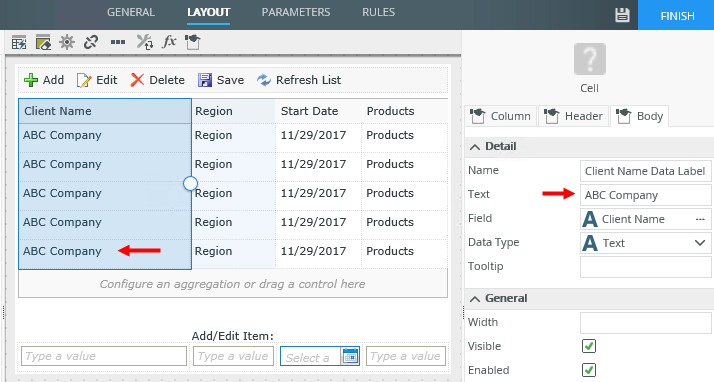
- Drag the Data Label control from the Toolbox onto a column.
- Type the default value in the Text field of the control's properties.

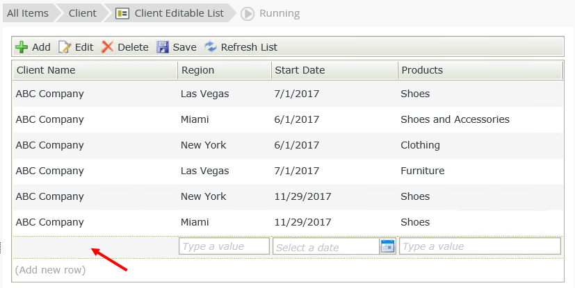
- Finish the view and run the view.
-
The Data Label control is blank when adding a new entry, and the default applies as soon as the record is saved.
