Table Control
The Table control allows you to create a layout table in views and forms to help you organize other controls and apply styling to cells.

- Create a view.
- Drag the control onto the canvas. You can find the control in the Layout section of the Toolbox.
- Specify the number of columns and rows to use.
- Drag controls to the cells of the table.
- Configure the controls if necessary.
- Configure the rest of the Table control's properties as necessary.
- Configure rules as necessary.
- Run the view.
You can find the control in the Layout section of the Toolbox.
| Properties | Description | Can be set in runtime using rules? |
|---|---|---|
| Detail | ||
| Name | A unique identifier for the control. This property is required and defaults to the name of the control. | No |
| General | ||
| Width | Adjusts the width of the control. You can enter any whole percentage up to 100%, whole number or pixel value to a maximum of 32767px. Type the dimension. | Yes, see Control Properties Actions for more information. |
| Visible | Shows or hides the control. | Yes, see Control Properties Actions for more information. |
| Enabled | Enables or disables the control. | Yes, see Control Properties Actions for more information. |
| Read-Only | Shows the control as read-only. | Yes, see Control Properties Actions for more information. |
| Styles | Opens the Style Builder allowing you to specify borders and padding. See the Style Builder topic for more information on styling options. | No |
The control interacts with other controls through rules. When you bind properties between different controls, you can use the data to populate properties or set values. Use the following examples for when to use the control with other controls through rules:
- Show/Hide: The Visible property allows you to show or hide the control through rules
- Enable/Disable: The Enabled property allows you to enable or disable the control through rules
- Specify the edit state of view and form controls: You can specify if controls must be read only or editable
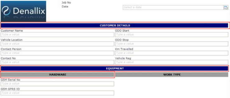
When you work with a table and a cell requires styling such as background color, you can use the Text Box control to apply styling or configure other properties which will in turn apply to the cell. In the example below the Text Box control's width is set to 100%, it is configured as read-only and styling is applied. You configure all of these properties to the table cell.

- The control is also available when designing forms