Progress control
The Progress control is a visual control that displays custom progress steps based on a pre-configured data source. You can add SmartObject data or static data as the data source for the control. The steps are arranged along a rail, which acts as the connecting line between the steps in the control. Each step can have a status such as Complete, Error, or In Progress, providing a clear indication of the process or task's progression. To function properly, the control requires at least one rule to manage the progress through these steps.
Additionally, the control offers styling options, allowing you to customize the appearance, such as changing the color of the rail background or the step icon. The control is also supported by the legacy themes. 
Use cases for the control:
- Task breakdown: It is ideal for processes or tasks that are divided into multiple stages, giving people a clear visual indicator of their progress.
- Visibility of remaining steps: Helps people understand how many steps are left in a process or task, improving clarity.
- Enhanced navigation: Improves navigation between steps, guiding people through a multi-stage process or task.
- Minimized confusion: Reduces the risk of abandonment by providing people with a clear understanding of what remains in the process or task.
Visit Nintex Community to view the Video tutorial: Create a progress control
 Configure the control
- Create a view.
- Drag the control onto the canvas. You can find the control in the Display section of the Toolbox.
- Configure a data source.
- Configure a rule to manage the progress through the steps.
- Configure the rest of the properties as necessary.
- Run the view.
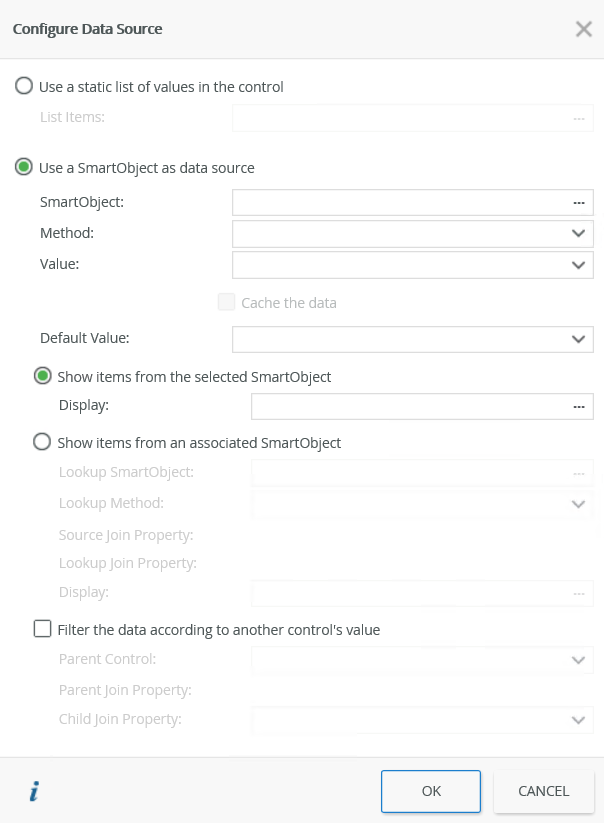
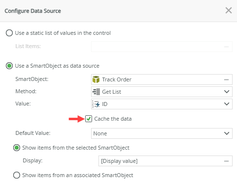
Configure a data source for the control
When you click on the ellipsis next to Data Source Type in the control's Properties, the Configure Data Source page opens. You can use a SmartObject or a static list of values to populate the control.
| Fields | Description |
|---|---|
| Use a static list of values in the control | Select this option if you want to use a static list of values as the data source to populate the control, and then click the ellipsis next to List Items to configure the list. |
| List Items | Click the ellipsis next to List Items to configure the list of static values for the control. |
| Use a SmartObject as data source | Select this option if you want to use a SmartObject as the data source to populate the control. |
| SmartObject | Click the ellipsis next to SmartObject to configure the SmartObject as the data source. |
| Method | The method that you want to use to populate the control. Select the method from the drop-down list. |
| Value | The SmartObject property that you want to use as the value (identifier) in the control. See Use a SmartObject as the data source for more information. |
| Cache the data | Select this option if you want to cache the SmartObject data to allow for client side filtering when the view or form is offline. |
| Default Value | The default SmartObject value to be used. This value has no effect on the Progress control since the control is based on the order of the data used in the SmartObject. We suggest you use None for this value. |
| Show items from the selected SmartObject | This option is required to show the display items (steps) from the parent SmartObject in the control. See Use a SmartObject as the data source for more information. |
| Display | The SmartObject property to use as the display (steps). See Use a SmartObject as the data source for more information. |
| Show items from an associated SmartObject | Select this option if you want to use an associated SmartObject as the source for the display (steps) values. |
| Lookup SmartObject | The associated SmartObject that you want to use as the source for the display (steps) values. Click on the ellipsis to select the SmartObject. This SmartObject must be associated with the original SmartObject. |
| Lookup Method | The method that you want to use to execute on the lookup SmartObject when retrieving the display (steps) values. Select the method from the drop-down list. |
| Source Join Property | The SmartObject property on the original SmartObject that is used to join the original SmartObject with the Lookup SmartObject. This is the value field (identifier) required for the control. |
| Lookup Join Property | The SmartObject property on the lookup SmartObject that is used to join the original SmartObject with the Lookup SmartObject. This is the value field (identifier) required for the control. |
| Display | The SmartObject property to use as the display (steps). Select the item by clicking on the ellipsis. |
| Filter the data according to another control's value | Select this option if you want to filter the data according to another control's value. |
| Parent Control | Specify the control to use to filter the data. |
| Parent Join Property | The SmartObject property on the parent control that is used to filter the data. |
| Child Join Property | The SmartObject property on the current control that is used to filter the data. |
Use a SmartObject as the data source
When you configure a SmartObject and create data to use as the data source for the control, make sure you do this correctly to display as you expect in the control at runtime.
- An in-depth understanding of SmartObjects is required to configure the SmartObject and create data in such a way that you expect at runtime. See SmartObjects for more information.
- The SmartObject requires a value property (identifier) and a display property for the control to function correctly.
- Steps returned from a SmartObject are not visible in design time as the data is only retrieved at runtime. To view your steps for the control, run the view.
- When configuring the SmartObject, note that the default SmartObject value has no effect when selected since the control is based on the order of the data used in the SmartObject. Ensure you capture the data in the correct order in the SmartObject to display as you expect in the control at runtime.
Follow the steps below to configure a SmartObject as the data source for the control:
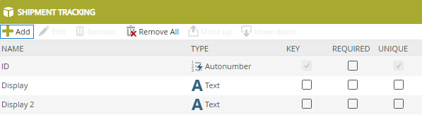
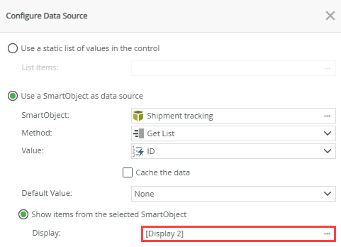
- Create a SmartObject with an identifier and display property. A SmartObject can contain multiple display fields. When you configure the data source for the control in the view, you can choose which display set to use. The example below uses the ID (identifier), Display (display), and Display 2 (display) properties.
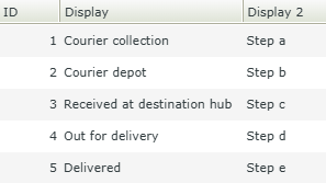
- Create an Item view to capture data for the steps (display value) of the control. Note the example shows steps (display values) for both display fields. We will use both display values in this example.
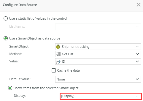
- Create another Item view from the SmartObject, drag the Progress control onto the design canvas, configure the data source for the control, and select your first display field as shown below.
- Create a rule to manage the progress of the steps at runtime, then run the view. Note the steps for the Display property of the SmartObject are shown at runtime.
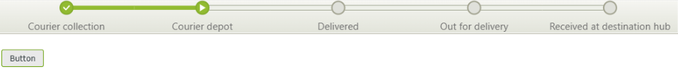
- To show the steps of your second display field, select the Display 2 property in the data source as shown below.
- Run the view and note the updated steps.
Use a static list of values as the data source
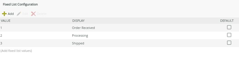
When you select to Use a static list of values in the control on the Configure Data Source page and you click the ellipsis, the Fixed List Configuration page opens. You can configure the static list on a bound or unbound control. When the control is bound, use this page to configure a Value-Display pair where the value of the Value field is stored in the SmartObject, while the value of the Display field is displayed in the control. This is useful for example when you have a step code and step description; you will enter the code in the Value field and the description in the Display field.
When the control is unbound, you can configure static values for both fields. You can use the value of the control with conditional logic, for example, to show/hide other controls according to the selection in the list.
The Value field and Display field values can be the same or they can be different. Selecting the default has no effect on this control.
The image below shows the configuration with different values for the Value and Display fields.
- The values for the Value field must be unique.
- There is no built-in reorder functionality. The order in which data is entered determines the display order at runtime. If changes are required, you must manually edit the order in the data source.
Client side filtering
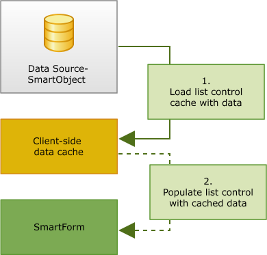
You have the option to cache the SmartObject data to enable client-side filtering. This is especially useful when you use a view in a form and you need the data to be available if the form is offline. The control's data set is populated on initial load (from the server), any other changes to the underlying data source's data does not reflect in the current session until another server call is forced to update the data set. To enable the caching of data, select the Cache the data option on the Configure Data Source page.
How caching is applied
You don't have to configure anything except select the Cache the data option to enable caching. The rules are automatically configured by the server. You can, however, remove these rules and place them somewhere else depending on your needs. This is an explanation of how caching is applied by the system.
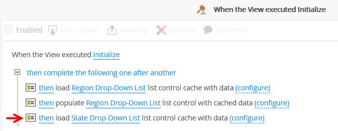
Below is a diagram of how the caching is applied in the background to enable client-side filtering.
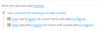
When you select the Cache the data option, the following two actions are added to the When the View executed Initialize rule event:
- Load [Progress] list control cache with data
- Populate [Progress] list control with cached data
The following steps refer to the diagram shown above and describe what happens in the background when caching is applied:
When you access a form, the view initializes and the rule action to Load list control cache with data executes as shown in point 1. Next, the rule action to populate list control with cached data executes as indicated in point 2. You can see updated data on the form. When the form goes offline, you still have access to the information.
How caching is applied with cascading data
The example below uses the Drop-Down List control, but the same applies for using the Progress control. If you select the options Cache the data and Filter the data according to another control's value on the Configure Data Source page, 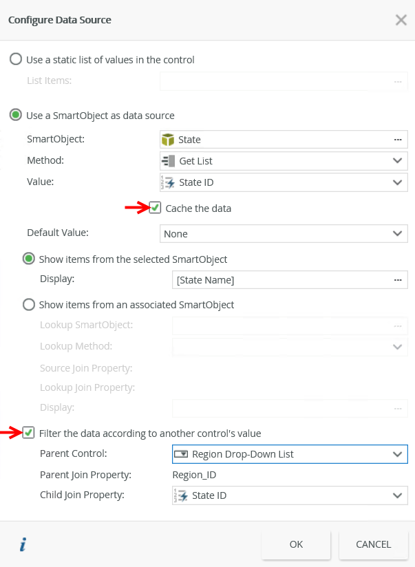
the following action is added to the When the View executed Initialize event;
- Load [State Drop-Down List] list control (child control) cache with data
 and to the When [Region Drop-Down List] is Changed rule of the parent control:
- Populate [State Drop-Down List] list control (parent control) with cached data
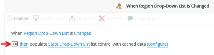
- If you filter the cached data, you can remove the filter to reset the list
- When the form is offline and additional records are added to the data set, these are only available once the cached data is retrieved from the server again
Properties
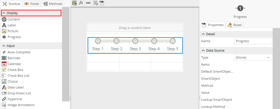
You can find the control in the Display section of the Toolbox.
| Properties | Description | Can be set in runtime using rules? |
|---|---|---|
| Detail | ||
| Name | A unique identifier for the control. This property is required and defaults to the name of the control. | Yes, see Configure the Set a Control's Properties Action for more information. |
| Data Source | ||
| Type | Configure a data source for the control. This can be a SmartObject or a static list of values. | No |
| Items | A read-only list of static list items. See Use a static list of values as the data source for more information. | No |
| Default SmartObject Property | The SmartObject property to use for the Default Value. This value has no effect on the Progress control since the control is based on the order of the data used in the SmartObject. We suggest you use None for this value. | No |
| SmartObject | The SmartObject that you want to use to populate the control. See Use a SmartObject as the data source for more information. | No |
| Method | The method that you want to use to populate the control. See Use a SmartObject as the data source for more information. | No |
| Value | The SmartObject property that you want to use as the value (identifier) in the control. See Use a SmartObject as the data source for more information. | No |
| Lookup SmartObject | An optional SmartObject to use as the source for the display values. See Use a SmartObject as the data source for more information. | No |
| Lookup Method | The method to execute on the lookup SmartObject when retrieving the display values. See Use a SmartObject as the data source for more information. | No |
| Source Join Property | The SmartObject property on the original SmartObject that is used to join the original SmartObject with the Lookup SmartObject. See Use a SmartObject as the data source for more information. | No |
| Lookup Join Property | The SmartObject property on the lookup SmartObject that is used to join the original SmartObject with the Lookup SmartObject. See Use a SmartObject as the data source for more information. | No |
| Display | The SmartObject property to use as the display (steps). See Use a SmartObject as the data source for more information. | No |
| Parent Control | The control used to filter the data. | No |
| Parent Join Property | The SmartObject property on the parent control that is used to filter the data. | No |
| Child Join Property | The SmartObject property on the current control that is used to filter the data. | No |
| General | ||
| Width | Adjusts the width of the control. You can enter any whole percentage up to 100%, whole number or pixel value to a maximum of 32767px. Type the dimension. | Yes, see Configure the Set a Control's Properties Action for more information. |
| Visible | Shows or hides the control. Enabled by default. | Yes, see Configure the Set a Control's Properties Action for more information. |
| Enabled | Enables or disables the control. Enabled by default. | Yes, see Configure the Set a Control's Properties Action for more information. |
| Read-Only | Shows the control as read-only. Disabled by default. | Yes, see Configure the Set a Control's Properties Action for more information. |
| Format |
Opens the Format page where you can configure formatting and style features such as font, borders, padding and margins. See the Format topic for more information. |
No |
| Conditional Format | Opens the Conditional Formatting page. You can add conditional formatting to apply a specific format or style when a condition you set is True. Use conditional format on its own or with the Format feature. See Conditional Format for more information. Click the ellipsis to open the Conditional Formatting page. | No |
Rules, events and actions
The control requires at least one rule to manage the progress through the steps. It also interacts with other controls through rules. When you bind properties between different controls, you can use the data to populate properties or set values. Use the following examples for when to use the control with other controls through rules:
- Populate a list control with data: You can populate the control if it has a SmartObject-based data source. This rule action is automatically added to the When the view executed Initialize rule event when you add the control to a view.
- Set a control’s properties: You can configure the settable properties of the control with this action.
- Execute a control's method: You can change the status of a step at runtime with this action.
- Show/Hide: The Visible property allows you to show or hide the control through rules.
- Enable/Disable: The Enabled property allows you to enable or disable the control through rules.
Rule event:
The following rule events are available for this control:
- When [control] is Changed: This event executes when the control is set to a new value that is different from the previous value. You can use this event to trigger actions when the control is changed, for example set the properties of the control, see property mappings.
- When [control] is Clicked: This event executes when the control is clicked at runtime. You can use this event to trigger actions when the control is clicked, for example set the properties of the control, see property mappings.
Control methods:
You can use the following control methods to change the status of a step at runtime. These methods are available when using the Execute a control's method rule action.
- Set Step Complete method: Changes the step status to Complete (
 )
) - Set Step Error method: Changes the step status to Error (
 )
) - Set Step In Progress method: Changes the step status to In Progress (
 )
) - Set Step Not Started method: Changes the step status to Not Started (
 )
) - Set Step Paused method: Changes the step status to Paused (
 )
)
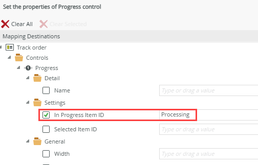
When you use the Set a control’s properties rule action, note the following settable property options:
In Progress Item ID – This is the current step considered in progress. Use this setting to specify the position (step) in the control that it must advance to at runtime.
Selected Item ID - This represents the step currently selected by the user. You can select a step either by clicking on it at runtime or by explicitly setting this value. When you set this value, the corresponding step will appear as selected at runtime. If the control is not read-only or disabled, the selected step can change dynamically, allowing updates for use in other rules.
For example, clicking a button may open a subview and update a Progress control to display the "Processing" step. If a step is in a state such as Error or In Progress, its background will change to reflect the selected state color, and the text will become bold. However, any icons within the step will remain unchanged.
These fields can be incremented or set using expressions, functions, other controls' outputs, or user inputs. Since it maps to configured data, any assigned value must exist within the data set (SmartObject or static list data). 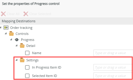
Create a rule to manage the progress
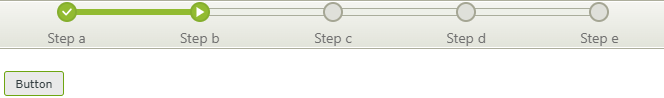
The control requires a rule(s) to manage the progress of the steps at runtime. A simple example is to create a rule that sets the In Progress Item ID property of the control when a button is clicked as shown in the image below. 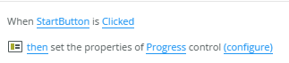
We use the value of the Value field in the case of a static list data source to specify the position (step) in the control that it must advance to at runtime. Note that this value must be an exact match. In the case of a SmartObject data source, use the identifier related to the display value. 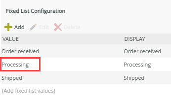
When the Start button is clicked in this example, the control advances from Order received to Processing. Note the status of the Processing step shows as In Progress (). See rules, events, and actions for information about other statuses you can set to change at runtime.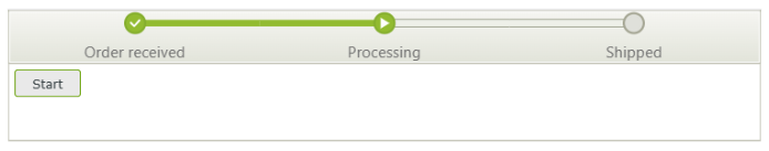
Apply a style profile to your control
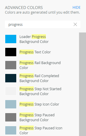
You can use variables in the Advanced section of the Style Profile Designer to apply styles for statuses (error, in progress, paused, completed), rails, text color, and more. Search for these by typing progress as shown below. This styling is limited to the Dynamic theme.
Considerations
- The control is not supported on mobile devices.
- The control is not available on a form, only on a view.
- Steps returned from a SmartObject are not visible at design time, as the data is only retrieved at runtime.
- When using a SmartObject as the data source for the control, note that it must include a value field (identifier) and one or more display fields.
- Sort and display
- SmartObjects: If you need to configure a custom display order, you can edit the Populate a list control with data rule action and apply rule filters and sorting to achieve this. The Populate a list control with data rule action is automatically added to the When the view executed Initialize rule event when you add the control to a view.
- Static list data: There is no built-in reorder functionality. The order in which data is entered determines the display order at runtime. If changes are required, you must manually edit the order in the data source.
- SmartObject: When configuring a SmartObject as the data source for the control, note that the default SmartObject value has no effect when selected since the control is based on the order of the data used in the SmartObject. Ensure you capture the data in the correct order in the SmartObject to display as you expect in the control at runtime.
- You can select a step by clicking on it at runtime. If the control is not read-only or disabled, the selected step can change dynamically, allowing updates for use in other rules. For example, clicking a button may open a subview and update a Progress control to display the "Processing" step. If a step is in a state such as Error or In Progress, its background will change to reflect the selected state color, and the text will become bold. However, any icons within the step will remain unchanged.