Dynamic Chart control
The Dynamic Chart control offers the flexibility to display customized data across various chart types, including area, bar, column, line, and pie charts. It uses a SmartObject as its data source, ensuring that the chart automatically updates its data whenever the underlying data changes. This makes the control an excellent choice for real-time data visualization and analysis.
Additionally, the control offers styling options, allowing you to customize the appearance, such as changing the color of the series, legend, category axis, value axis, and more. The control is also supported by the legacy themes.
Visit Nintex Community to view the Video tutorial: Use a dynamic chart control.
 Configure the control
- Create a view.
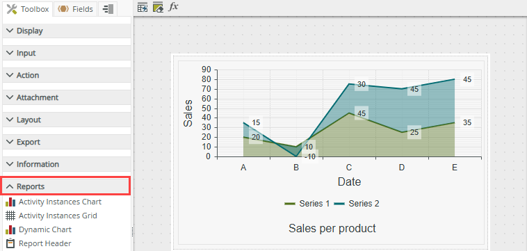
- Drag the control onto the canvas. You can find the control in the Reports section of the Toolbox.
- Configure the data source for the control.
- Configure the properties of the control to display the data you want in the chart.
- Configure a rule if required (optional).
- Run the view.
Configure a data source for the control
When you click on the ellipsis next to Data Source>SmartObject in the control's Properties, the Configure Data Source page opens. You can use a SmartObject to populate the control.
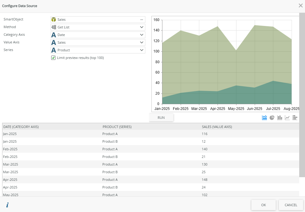
| Fields | Description |
|---|---|
| SmartObject | The SmartObject you want to use to populate the chart. Click the ellipsis next to SmartObject to select the SmartObject. |
| Method | The SmartObject method you want to use to populate the chart. Select the method from the drop-down list. |
| Category Axis | The SmartObject property you want use on the category axis (X axis) of the chart. Select the property from the drop-down list. |
| Value Axis | The SmartObject property you want use on the value axis (Y axis) of the chart. Select the property from the drop-down list. |
| Series | The SmartObject property you want use for the series of the chart. Select the property from the drop-down list. |
| Limit preview results (top 100) | Limits the preview results to the top 100 results. Note that disabling this option may have a performance impact at runtime if you have large data sets. |
| Run | Click Run to preview your chart. Click any of the chart icons to the right of the Run button to select another type of chart to preview. |
Properties
You can find the control in the Reports section of the Toolbox.
| Property | Description | Example | Can be set using rules? |
|---|---|---|---|
| Detail | |||
| Name | Every control must have a unique name. This property is required and defaults to the name of the control. | No | |
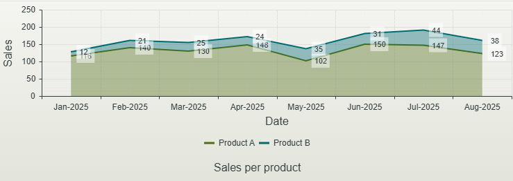
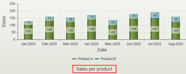
| Title | Specify the title for the chart to show. | 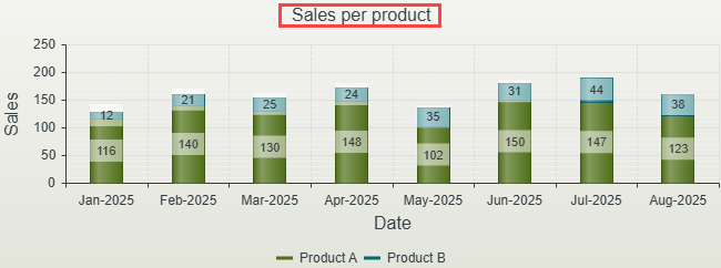 Click to enlarge |
Yes, see Configure the Set a Control's Properties Action for more information. |
| Show Title | Shows or hides the title. | Yes, see Configure the Set a Control's Properties Action for more information. | |
| Horizontal Alignment | The position to display the title horizontally Left - Displays the title on the left Center -Displays the title in the center Right - Displays the title on the right |
Click to enlarge |
Yes, see Configure the Set a Control's Properties Action for more information. |
| Vertical Alignment | The position to display the title vertically Top - Displays the title at the top Bottom - Displays the title at the bottom |
 Click to enlarge |
Yes, see Configure the Set a Control's Properties Action for more information. |
| Watermark | Specify the text to display if no data is available. | Yes, see Configure the Set a Control's Properties Action for more information. | |
| Data source | |||
| SmartObject | The SmartObject that you want to use to populate the control. See Configure a data source for the control for more information. | No | |
| Method | The method that you want to use to populate the control. See Configure a data source for the control for more information. | No | |
| Category Axis | The SmartObject property you want to show on the category axis (X axis). See Configure a data source for the control for more information. | 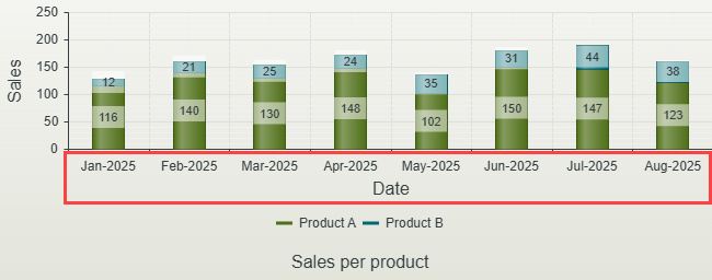 Click to enlarge |
No |
| Value Axis | The SmartObject property you want to show on the value axis (Y axis). See Configure a data source for the control for more information. | 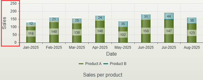 Click to enlarge |
No |
| Series | The SmartObject property you want to show for the series of the chart. This is the series of data that refers to a set of related data points that are plotted together to show trends, correlations, or comparisons. See Configure a data source for the control for more information. | 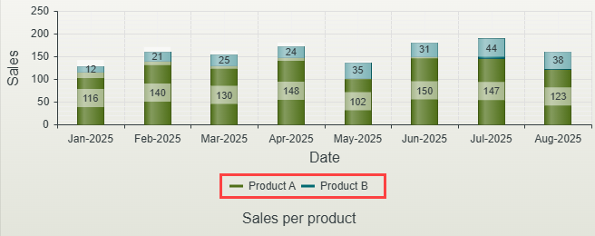 Click to enlarge |
No |
| Display | |||
| Chart Type | You can display the chart as one of the following types: Area - Combines the line chart and bar chart to show how one or more groups' numeric values change over the progression of a second variable, typically that of time. An area chart is distinguished from a line chart by the addition of shading between lines and a baseline, like in a bar chart. Bar - Is a chart using rectangular bars with lengths proportional to the values they represent. Column - Displays values as sets of vertical columns that are grouped by category. Line - Displays information as a series of data points called 'markers' connected by straight line segments. Pie - Is a circular chart divided into sectors. Each sector shows the relative size of each value. |
Yes, see Configure the Set a Control's Properties Action for more information. | |
| Display Type |
You can display the chart as stacked, clustered or aggregated
Not applicable to the Bar chart |
Yes, see Configure the Set a Control's Properties Action for more information. | |
| Chart Effect |
The following effects determine how the control renders when you click an item in the chart: Not applicable to the Bar chart |
Yes, see Configure the Set a Control's Properties Action for more information. | |
| Show Tooltips | Select this option to show the tooltips | 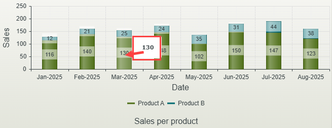 Click to enlarge |
Yes, see Configure the Set a Control's Properties Action for more information. |
| Show Labels | Select this option to show the labels | 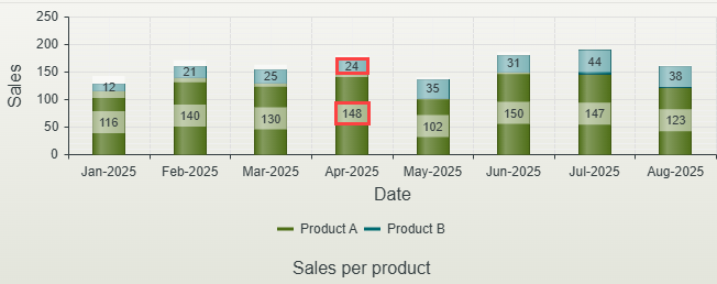 Click to enlarge |
Yes, see Configure the Set a Control's Properties Action for more information. |
| Label Position |
The position of the label
|
Yes, see Configure the Set a Control's Properties Action for more information. | |
| Label Format | Changes how the label is formatted, where {0} is a placeholder for the value. Type any value to the left or right of the {0} to change the appearance. For example if you want to show a currency, you can add $ in front of the {0} as shown in the example. | 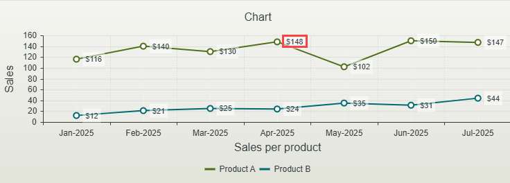 Click to enlarge |
No |
| Legend | |||
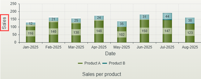
| Show Legend | This shows the data displayed in the graph's value axis (Y axis), also called the graph series. Select this option to show the legend. | Click to enlarge |
Yes, see Configure the Set a Control's Properties Action for more information. |
| Position | The position of the legend in relation to the chart. Select an option from the drown-down list. You can combine position and alignment to achieve optimal positioning within the control. | Yes, see Configure the Set a Control's Properties Action for more information. | |
| Alignment | The position alignment in relation to the chart. Select an option from the drop-down list. You can combine position and alignment to achieve optimal positioning within the control. | Yes, see Configure the Set a Control's Properties Action for more information. | |
| Orientation | The legend can be displayed horizontally or vertically. Select the option from the drop-down list. | Yes, see Configure the Set a Control's Properties Action for more information. | |
| Reverse | Select this option if you want to show the data in reverse order. | Yes, see Configure the Set a Control's Properties Action for more information. | |
| Category Axis | |||
| Title |
The title for the category axis (X axis). Not applicable to the Bar chart |
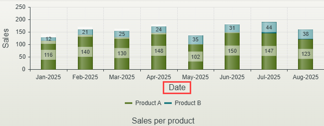 Click to enlarge |
Yes, see Configure the Set a Control's Properties Action for more information. |
| Title Visible |
Select this option if you want to show the title for the category axis. Not applicable to the Bar chart |
Yes, see Configure the Set a Control's Properties Action for more information. | |
| Title Position |
The position of the title on the category axis (X axis). Select the position from the drop-down list. Not applicable to the Bar chart |
Yes, see Configure the Set a Control's Properties Action for more information. | |
| Labels Visible | Select this option if you want to show the labels on the category axis. | 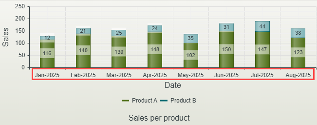 Click to enlarge |
Yes, see Configure the Set a Control's Properties Action for more information. |
| Label Rotation | The angle at which you can rotate labels to display more effectively when the chart contains more than a few items. The default setting is 0. Type a rotation angle, such as 45. |  Click to enlarge |
Yes, see Configure the Set a Control's Properties Action for more information. |
| Labels Justified | Justifies the labels to the entire area of the chart. Aligning or positioning the labels helps to improve readability and visual clarity. | 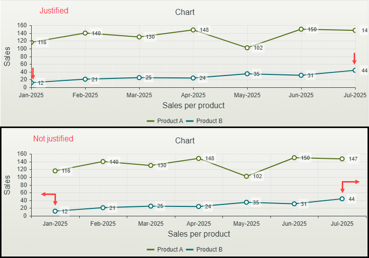 Click to enlarge |
Yes, see Configure the Set a Control's Properties Action for more information. |
| Label Step | The frequency at which labels must be displayed on the chart. This depends on the type of chart, the amount of data, and the goal of the visualization. Showing too many labels can clutter the chart, while too few can make it difficult to interpret the data accurately. Typing 2 for example will show every second label as shown in the example. |  Click to enlarge |
Yes, see Configure the Set a Control's Properties Action for more information. |
| Major Grid Lines | Enables the major grid lines. These lines guide the viewer in understanding the scale of the data. They are typically more prominent and spaced at regular intervals across the chart to mark significant points or ranges along the axes. | Yes, see Configure the Set a Control's Properties Action for more information. | |
| Minor Grid Lines | Enables the minor grid lines. These lines are secondary grid lines that appear in a chart to provide additional reference points, usually between the major grid lines. They are less prominent than major grid lines and serve to refine the chart’s scale for more precise readings or finer visual guidance. | Yes, see Configure the Set a Control's Properties Action for more information. | |
| Reverse | Reverses the data on the category axis. Select this option if you want to show the data in reverse order. This also moves the value axis to the opposing side. | 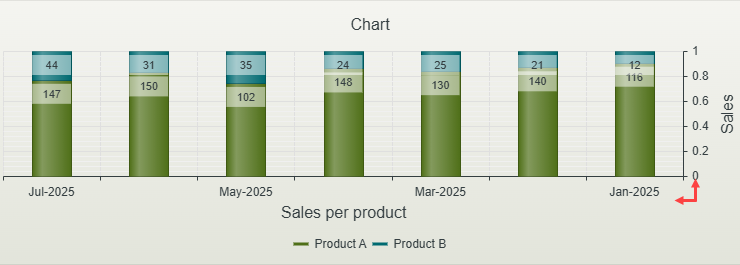 Click to enlarge |
Yes, see Configure the Set a Control's Properties Action for more information. |
| Axis Type | Default - Applies the default format as per the SmartObject property data type Date - Applies a date format to the data. You can further customize the date by using the Label Format property. |
Yes, see Configure the Set a Control's Properties Action for more information. | |
| Label Format | When you select Date in the Axis Type property, you can customize the format here by typing the format you want to apply, for example dd-MMM-yyyy. See Date label format support for more information. | No | |
| Min. Value | The value for the minimum data point. This is the smallest value or data point that appears on the chart. It’s important to define the minimum data point properly, as it can impact the readability and interpretation of the chart. Type the minimum value. | Yes, see Configure the Set a Control's Properties Action for more information. | |
| Max. Value | The largest value or data point in your dataset. Similar to the minimum data point, the maximum data point plays a crucial role in defining the range of the chart’s axis and ensuring that the chart accurately represents the full scale of the data. Type the maximum value. | Yes, see Configure the Set a Control's Properties Action for more information. | |
| Value Axis | |||
| Title |
The title for the value axis (Y axis). Not applicable to the Bar chart |
 Click to enlarge |
Yes, see Configure the Set a Control's Properties Action for more information. |
| Title Visible |
Select this option if you want to show the title for the value axis. Not applicable to the Bar chart |
Yes, see Configure the Set a Control's Properties Action for more information. | |
| Title Position |
The position of the title on the value axis (Y axis). Select the position from the drop-down list. Not applicable to the Bar chart |
Yes, see Configure the Set a Control's Properties Action for more information. | |
| Labels Visible | Select this option if you want to show the labels on the value axis. | 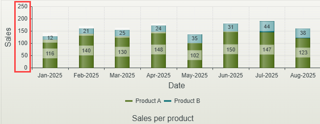 Click to enlarge |
Yes, see Configure the Set a Control's Properties Action for more information. |
| Label Rotation | The angle at which you can rotate labels to display more effectively when the chart contains more than a few items. The default setting is 0. Type a rotation angle, such as 45. | 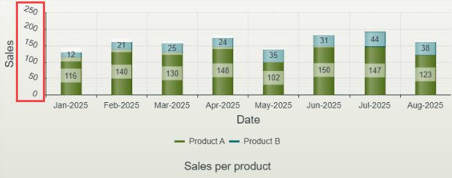 Click to enlarge |
Yes, see Configure the Set a Control's Properties Action for more information. |
| Label Step | The frequency at which labels must be displayed on the chart. This depends on the type of chart, the amount of data, and the goal of the visualization. Showing too many labels can clutter the chart, while too few can make it difficult to interpret the data accurately. Typing 2 for example will show every second label. | Yes, see Configure the Set a Control's Properties Action for more information. | |
| Major Grid Lines | Enables the major grid lines. These lines guide the viewer in understanding the scale of the data. They are typically more prominent and spaced at regular intervals across the chart to mark significant points or ranges along the axes. | Yes, see Configure the Set a Control's Properties Action for more information. | |
| Minor Grid Lines | Enables the minor grid lines. These lines are secondary grid lines that appear in a chart to provide additional reference points, usually between the major grid lines. They are less prominent than major grid lines and serve to refine the chart’s scale for more precise readings or finer visual guidance. | Yes, see Configure the Set a Control's Properties Action for more information. | |
| Reverse | Reverses the data on the value axis. Select this option if you want to show the data in reverse order. | Yes, see Configure the Set a Control's Properties Action for more information. | |
| Type | Choose the type of value axis from the drop-down list. Numeric - A linear scale, if the axis goes from 1 to 10, then each unit represents a difference of 1. Logarithmic - A nonlinear scale used to represent data where each unit represents a multiplicative factor. The scale increases by an order of magnitude (1, 10, 100, 1000, etc.) |
Yes, see Configure the Set a Control's Properties Action for more information. | |
| Label Format | You can customize the value label format by typing the format you want to apply, for example 0%, converts decimal to percentage (0.5 → 50%). See Numeric label format support for more information. | No | |
| Min. Value | The value for the minimum data point. This is the smallest value or data point that appears on the chart. It’s important to define the minimum data point properly, as it can impact the readability and interpretation of the chart. Type the minimum value. | Yes, see Configure the Set a Control's Properties Action for more information. | |
| Max. Value | The largest value or data point in your dataset. Similar to the minimum data point, the maximum data point plays a crucial role in defining the range of the chart’s axis and ensuring that the chart accurately represents the full scale of the data. Type the maximum value. | Yes, see Configure the Set a Control's Properties Action for more information. | |
| Series | |||
| Gap | Adjusts the gap between the data series. Type a number to change the gap. The default gap is 1.5. | 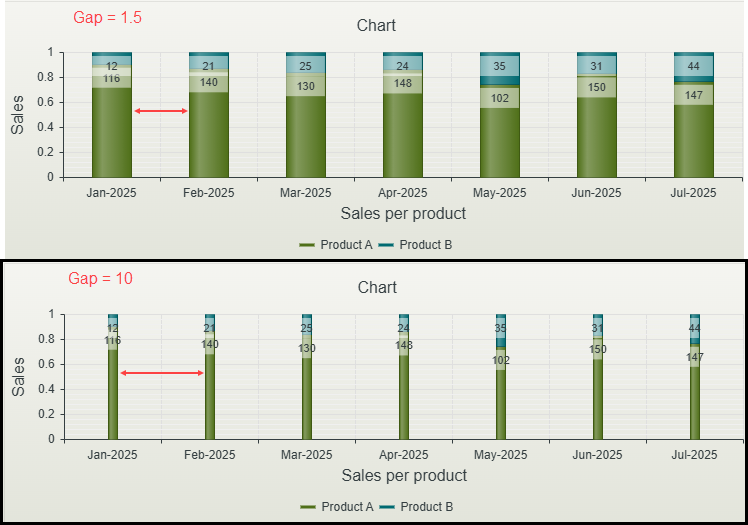 Click to enlarge |
Yes, see Configure the Set a Control's Properties Action for more information. |
| Spacing | Adjusts the spacing across the chart. Type a number to change the spacing. The default spacing is 0.4. | Yes, see Configure the Set a Control's Properties Action for more information. | |
| Show Markers | Enables the markers on a Line or Area chart. Markers are graphical elements used to highlight specific data points or values. They are represented as circles placed at each data point along a line. Markers help to make individual data points stand out, improving the readability of the chart and making it easier to interpret trends, patterns, or specific values in the data. | 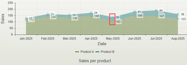 Click to enlarge |
Yes, see Configure the Set a Control's Properties Action for more information. |
| Marker Size | The size of the marker on a Line or Area chart. You can enter any whole number. | Yes, see Configure the Set a Control's Properties Action for more information. | |
| Show Area Line | Shows the area line of an Area chart. The area line is the line that outlines the filled area. |  Click to enlarge |
Yes, see Configure the Set a Control's Properties Action for more information. |
| Area Line Size | The size of the area line for an Area chart. You can enter any whole number. | Yes, see Configure the Set a Control's Properties Action for more information. | |
| General | |||
| Height | Adjusts the height of the control. You can enter any whole number or pixel value (maximum of 32767px). The default is 275px. | Yes, see Configure the Set a Control's Properties Action for more information. | |
| Width | Adjusts the width of the control. You can enter any whole percentage up to 100%, whole number, or pixel value (maximum of 32767px). | Yes, see Configure the Set a Control's Properties Action for more information. | |
| Visible | Shows or hides the control. | Yes, see Configure the Set a Control's Properties Action for more information. | |
| Enabled | Enables or disables the control. If the control is disabled, you cannot interact with the control. | Yes, see Configure the Set a Control's Properties Action for more information. | |
| Animations | Enables chart animation. Rather than showing the entire chart at once, the data points or elements on the chart are revealed, updated, or transformed gradually. Note that enabling this option may have a performance impact at runtime if you have large data sets. | Yes, see Configure the Set a Control's Properties Action for more information. | |
| Format | Opens the Format page where you can configure formatting and style features such as format, font, borders, padding and margins. See the Format topic for more information. | No | |
| Conditional Format | Opens the Conditional Formatting page. You can add conditional formatting to apply a specific format or style when a condition you set is True. Use conditional format on its own or with the Format feature. See Conditional Format for more information. Click the ellipsis to open the Conditional Formatting page. | No | |
Date label format support
The following formats are supported:
| Format | Example | Description |
|---|---|---|
| Year formats | ||
| yy | 25 | Two-digit year |
| yyyy | 2025 | Four-digit year |
| Month formats | ||
| M | 3 | Month without leading zero |
| MM | 03 | Month with leading zero |
| MMM | Mar | Abbreviated month name |
| MMMM | March | Full month name |
| Day formats | ||
| d | 9 | Day without leading zero |
| dd | 09 | Day with leading zero |
| ddd | Tue | Abbreviated weekday name |
| dddd | Tuesday | Full weekday name |
| Hour formats | ||
| h | 2 | 12-hour format, no leading zero |
| hh | 02 | 12-hour format, with leading zero |
| H | 14 | 24-hour format, no leading zero |
| HH | 14 | 24-hour format, with leading zero |
| Minutes and seconds formats | ||
| m | 5 | Minute without leading zero |
| mm | 05 | Minute with leading zero |
| s | 9 | Second without leading zero |
| ss | 09 | Second with leading zero |
| Time zone formatting | ||
| z | +5 | Time zone offset, short |
| zz | +05 | Time zone offset, with leading zero |
| zzz | +05:00 | Full time zone offset |
| Common full date-time patterns | ||
| Format | Example | |
| yyyy-MM-dd | 2025-03-19 | |
| dd/MM/yyyy | 19/03/2025 | |
| MM-dd-yyyy | 03-19-2025 | |
| dd-MMM-yyyy | 19-Mar-2025 | |
| MMMM dd, yyyy | March 19, 2025 | |
| yyyyMMdd | 20250319 | |
| yyyy/MM/dd HH:mm:ss | 2025/03/19 14:30:00 | |
Numeric label format support
The following formats are supported:
| Format | Example | Description |
|---|---|---|
| 0% | 50% | Converts decimal to percentage (0.5 → 50%). |
| 0.00% | 50.00% | Converts decimal to percentage with two decimal places (0.5 → 50.00%). |
| 0 | 1234 | Digit placeholder (ensures at least one digit, no leading zeros). |
| 0000 | 0123 | Enforces a minimum of 4 digits, adding leading zeros if needed (123 → 0123). |
| 0.00 | 1.20 | Ensures 2 decimal places (1.2 → 1.20). |
| +0;-0;0 | +123, -123, 0 | Custom positive, negative, and zero format (123 → +123, -123 → -123, 0 remains 0). |
| 0.00E+00 | 1.23E+03 | Scientific notation with 2 decimal places (1230 → 1.23E+03). |
Rules, events, and actions
The control interacts with other controls through rules. When you bind properties between different controls, you can use the data to populate properties or set values. Use the following examples for when to use the control with other controls through rules:
- Populate a list control with data: You can populate the control since it has a SmartObject-based data source
- Set a control’s properties: You can configure the settable properties of the control with this action
- Show/Hide: The Visible property allows you to show or hide the control through rules
- Enable/Disable: The Enabled property allows you to enable or disable the control through rules
The following events are available on the control:
Rule events:
- When [control] is Changed: This event executes when the control is set to a new value that is different from the previous value. You can use this event to trigger actions when the control is changed, for example when the chart is changed, then set the properties of another control.
- When [control] is Clicked: You can execute a rule condition or action when the control is clicked, for example populate another control.
- When [control] is Populated: This event executes each time the control is loaded. You can execute a rule condition or action when the control is loaded, for example set the properties of another control.
Apply a style profile to your control
You can use variables in the Advanced section of the Style Profile Designer to apply styles to chart series, legend, category axis, value axis and more. Search for these by typing chart as shown below. This styling is limited to the Dynamic theme.
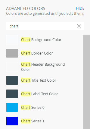
Chart control style inheritance
The following style profile variables affect both the Dynamic Chart control and existing report chart controls:
- Chart Title Text Color
- Chart Label Text Color
- Chart Series 0 - 11 Colors
- Chart Category Axis Title Color
- Chart Value Axis Title Color
- Chart Series Labels Color
- Chart Value Axis Labels Color
- Chart Legend Title Color
Considerations
- The control is not available when designing forms.
- When you use the control together with the Save as PDF control, and you configure a percentage for the width of the control, a pixel width is calculated and used instead. When using the chart with the Save as PDF control, set the width of the control in pixels.
- When you use custom themes, be sure to specify the CSS classes for the elements.