Custom controls
- This feature is available to advanced users with extensive knowledge of Cascading Style Sheets and JavaScript. Use this feature only if you fully understand CSS and JS, as using these programming languages may affect the way the control display and behave on your view or form.
- You need to be part of the Control Administrators role to create, edit, or delete a custom control.
- If you create custom controls, you're fully responsible for maintaining them.
- We do not recommend editing controls that are already configured and in use in production. Modifying a control alters its definition and may affect how it renders at runtime. To safely make changes, first remove all instances of the control from every view and form, then edit the control as needed, and finally re-add it to the desired views and forms.
- We recommend having the latest fixpack installed.
- If your Nintex Automation K2 environment stops working after adding or using a custom constrol, contact Nintex Customer Central.
- If legacy custom controls do not function as expected after upgrading to K2 5.9, re-register the affected control to restore its expected functionality.
You can create your own custom controls in Management providing more flexibility and extensibility to the K2 product. Once created, these controls are available in the Designer for use in views and forms.
 Prepare your custom control files
To upload a custom control, a zipped file is required including the following:
- JavaScript files (runtime and design-time)
- Icons
- CSS files
- Manifest file called manifest.json
Manifest structure example
The following is a simplified manifest scaffold illustrating the top-level fields, properties, events, methods, and parameters. For more detailed manifest configurations and specifics, please refer to the Control Dojo developer resource on GitHub.
{
"displayName": "Custom Text Input",
"tagName": "Text-control",
"description": "A stylized text input with a floating label and custom bottom border.",
"icon": "text-input.svg",
"designtimeScriptFileNames": [
"text-control-designer.js"
],
"runtimeScriptFileNames": [
"text-control-runtime.js"
],
"designtimeStyleFileNames": [
"text-control-styles.css"
],
"runtimeStyleFileNames": [
"text-control-styles.css"
],
"datatypes": [
"Text"
],
"valuePropertyID": "Value",
"supports": [
"Value",
"Width",
"Height",
"IsVisible",
"IsEnabled",
"IsReadOnly",
"TabIndex",
"ControlExpression"
],
"properties": [
{
"id": "labelColor",
"friendlyName": "Label Border Color",
"type": "string",
"initialValue": "#777777",
"category": "Appearance",
"description": "Sets the hex color for the bottom border of the label."
},
{
"id": "backgroundColor",
"friendlyName": "Input Background",
"type": "string",
"initialValue": "#3CBCFF",
"category": "Appearance",
"description": "The background color of the input area."
}
],
"events": [
{
"id": "OnChanged",
"displayname": "On Changed"
},
{
"id": "OnFocus",
"displayname": "On Focus"
}
],
"methods": [
{
"id": "returnValue",
"displayname": "Set Focus",
"returnType": "string",
"parameters": [
{
"name": "Id",
"type": "number"
}
]
},
{
"id": "clearValue",
"displayname": "Clear Value",
"returnType": "None",
"parameters": []
}
]
}To allow the control to interact with rules, you must create the control's events, properties, methods, and files that will be exposed in the rule designer and properties panel in the Designer.
Rule events and methods
The rules that are available for a control depend on the events and methods specific to your control. The following code snippet is an excerpt of the manifest.json file and the entries used to create the events and methods for the rules.
Example of a control containing two events and two methods:
{
"events": [
{
"id": "OnChanged",
"displayname": "Changed"
},
{
"id": "OnButtonClick",
"displayname": "Button Clicked"
}
],
"methods": [
{
"id": "clearSelection",
"displayname": "Clear Selection",
"returnType": "None",
"description": "Resets the control and clears any currently selected items.",
"parameters": []
},
{
"id": "selectById",
"displayname": "Select By ID",
"returnType": "None",
"description": "Programmatically selects an item using its unique ID value.",
"parameters": [
{
"name": "id",
"type": "text"
}
]
}
]
}Certain rules such as transfer data and set control properties depend on the properties of your control and whether they have get/set methods.
The following code snippet is an excerpt of the manifest.json file and the entries used to create properties.
Example:
{
"properties": [
{
"id": "maxLength",
"displayname": "Maximum Length",
"type": "int",
"initialValue": "255",
"validationPattern": "^[1-9]\\d*$",
"validationMessage": "Must be a positive integer greater than zero.",
"category": "Validation",
"description": "Maximum number of characters allowed.",
"refreshDisplay": true,
"changesDisplay": true
},
{
"id": "List",
"displayname": "List Items",
"type": "listdata",
"category": "Detail",
"initialValue": "[{\"display\": \"Item 1\", \"value\": \"1\"},{\"display\": \"Item 2\",\"value\": \"2\"}]",
"refreshDisplay": true,
"description": "The collection of items to be displayed in the control."
}
]
}
The CSS must be correctly scoped using the appropriate tag name in each selector, for example: Text-control.label. The tag name used in the CSS must match the tag name defined in the manifest.json, as both the CSS and the runtime will reference this tag. While the tag name should follow the standard rules for custom HTML elements, the system allows tag names to begin with capital letters.
Text-control .container {
display: flex;
justify-content: stretch;
position: relative;
padding-top: 20px;
}
Text-control .input {
flex-grow: 1;
outline: none;
border: none;
padding: 0px;
padding-bottom: 5px;
background-color: #3CBCFF;
color: white;
}
Text-control .label {
pointer-events: none;
position: absolute;
top: 0px;
bottom: 0px;
left: 0px;
right: 0px;
border-bottom: solid 1px #777777;
}Supported control icon file types:
- SVG
- JPG
- JPEG
- PNG
Image types
Supported control image file types:
- SVG
- JPG
- JPEG
- PNG
- GIF
Apply a style profile to your control
A custom control inherits the styling used on a view or a form. You can use style profile variables when creating the stylesheets to apply styles to your custom control. This styling is limited to the Dynamic theme. Custom variables for style profiles are not supported
Example custom controls
Control Administrators role
To create, edit, or delete a custom control, you must be part of the Control Administrators role in Management. Navigate to Management>Users>Roles, then add a user to the Control Administrators role. 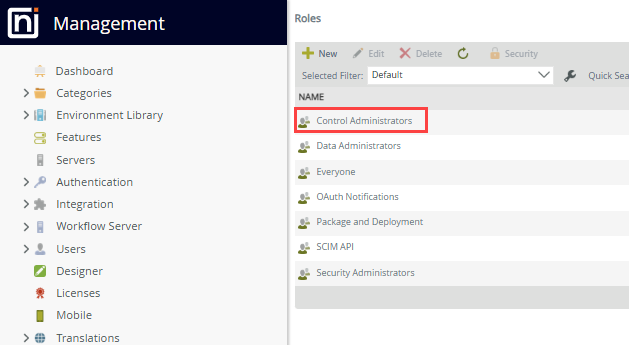
- In the Roles page, search for Control Administrators, using the Search function if necessary.
- Select Edit from the menu to update the properties of Control Administrators.
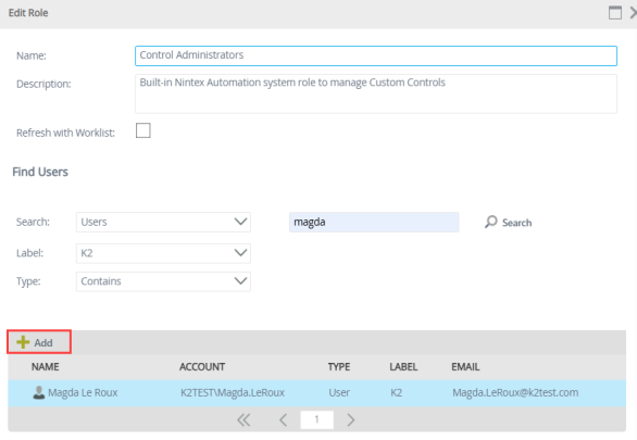
-
Use the Search bar to find the required user, select the user, then click Add to include the user as a control administrator.
Refresh Management to see the Custom Controls node. 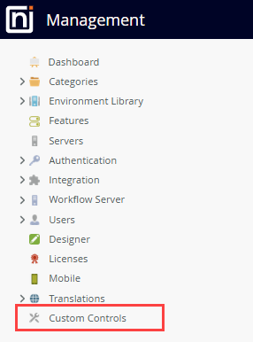
Manage custom controls
Manage custom controls in Management>Custom Controls.
The Custom Controls node in Management is only available after a user is added to the Control Administrators role.
Add a control
Add the zipped file containing your custom JavaScript, icons (SVG, JPEG, JPG) , CSS, and manifest,json files to Management>Custom Controls.
Follow the steps below to upload the zipped file:
- Navigate to Management>Custom Controls.
- Click New.
- Drag the zipped file into the Upload file box of the Add control dialog box or click the link to upload a file.
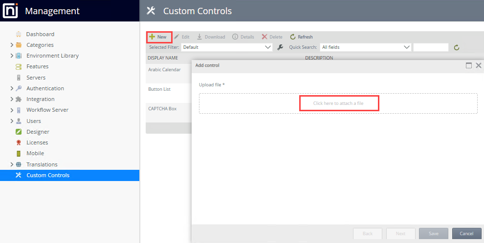
- The zipped file is uploaded and decompressed to populate the necessary fields in the Custom Controls page. Click Next.
- The Add control page shows the display name, the description, and the display icon. This page is populated from the information provided in the uploaded file.
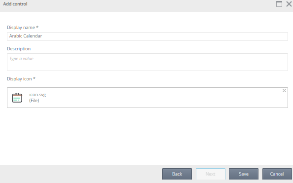
- Click Save.
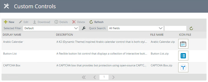
The list is updated with the custom control name, description, file name, and the icon, similar to the example below.
Custom controls in forms and views
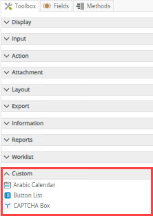
Once a control is created in Management, it's available in the Custom section in the Toolbox of a view and form. The custom control can be dragged into the design canvas of either a view or form.
 Edit a control
- We do not recommend editing controls that are already configured and in use in production. Modifying a control alters its definition and may affect how it renders at runtime. To safely make changes, first remove all instances of the control from every view and form, then edit the control as needed, and finally re-add it to the desired views and forms.
- When a custom control is edited, it is available in its updated state to all users.
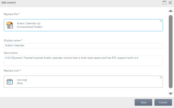
To edit a custom control navigate to Management>Custom Controls and select the custom control to update.
- Click Edit, then update the control as required.
- Click Save to save the changes.
Delete a control
To delete a custom control navigate to Management>Custom Controls.
- Deleting a control from the list of available controls in Management>Custom Controls removes the control for all users.
- A custom control cannot be deleted if instances of the control appear in an existing view or form. Ensure you delete all instances of the control from all views and forms before you delete it from Management.
Select the custom control to remove, then click Delete.
Refresh the list of controls
Click Refresh to refresh the list of custom controls.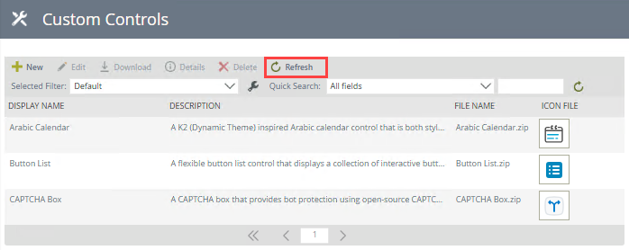
Download
A custom control can be downloaded for storage or deployment to another environment. Select a control, then click Download.
Details
The Details option allows you to view the details of the control such as contact person, who uploaded the control, and who last modified the control. You can also see the views and forms containing the control. Click the link to open the view or form in the Designer. Use the search and filter to view specific views, forms, or controls.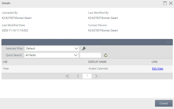
Search, filter, and sort
You can specify how you want to filter and sort the results by configuring the Filter and Sort options. You can also use the quick search function to refine your search.
Filter
When you click the Configure a new filter icon, the Configure User Filters page opens. You can type a value or use the Context Browser to drag and drop a value in the Value field.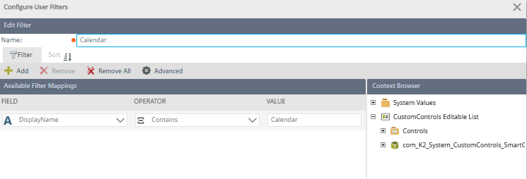
| Feature | Description |
|---|---|
| Add | Adds a new line for you to apply a filter |
| Remove | Removes a filter line |
| Remove All | Removes all the filter lines |
| Advanced | See the Advanced Filter Options section below |
| Field | The field to use in the filter |
| Operator | Operator to be used in the filter |
| Value | Value to be used in the filter. Type a value or drag and drop a value from the context browser |
Advanced Filter Options
When you click Advanced on the Configure Filter Options page, the Advanced Filter Configuration page opens. You can configure advanced expressions such as the one shown in the image below. When you use fields to filter data, you must match the value on the right side with the data type of the SmartObject field. For example, the region ID of 2 filter matches the data type of the ID field, which is number. The filter would not work if you specified a region name using text or a field containing text.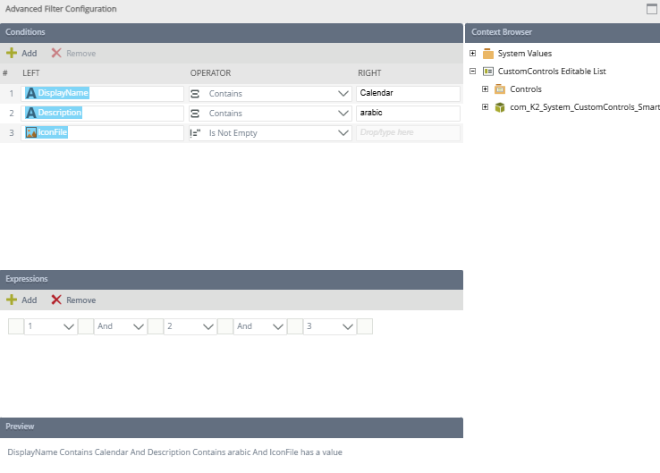
| Feature | Description |
|---|---|
| Conditions |
You can specify conditions containing a value on the left, an operator, and a value on the right. You can type a value or use the context browser to drop a field. As you add conditions, they are listed and given a number on the left. You can use this number to build or edit your expression using the Expressions section. To remove a condition, select the entire condition and click Remove. The following operators are available:
For more information about building expressions see Expression Builder. |
| Expressions | Combines the conditions using logical operators such as And and Or. You can:
|
| Preview | Shows the expression in preview mode |
Sort
When you click Sort on the Configure User Filters page, the Available Sort Mappings section opens. Select a field to sort on, then whether it must be sorted ascending or descending. 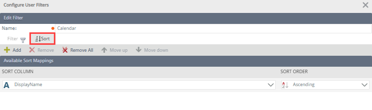
| Feature | Description |
|---|---|
| Add | Adds a new line for you to sort |
| Remove | Removes a sort line |
| Remove All | Removes all sort lines |
| Move Up | Moves a sorting column one position up |
| Move Down | Moves a sorting column one position down |
| Ascending/Descending | Enables sorting a column in a ascending or descending order |
Troubleshooting
Symptom: When you try to access the Custom Controls node in Management, the "You do not have access to this page. To gain access, please contact your administrator." error message occurs.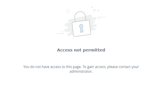
Explanation/Solution: To create a custom control, you must be part of the Control Administrators role and refresh Management to see the Custom Controls node.