Custom controls
- Custom controls are the responsibility of the person who creates them in Management and could include features such as accessibility (keyboard navigation, screen readers, ARIA where applicable), localization, and responsiveness. If you didn't create the custom control and you have questions about it or expect it to behave differently, please contact your administrator.
- You need to be part of the Control Administrators role to create, edit, or delete a custom control in Management.
- We do not recommend editing controls in Management that are already configured and in use in production. Modifying a control alters its definition and may affect how it renders at runtime. To safely make changes, first remove all instances of the control from every view and form, then edit the control as needed, and finally re-add it to the desired views and forms.
- If legacy custom controls do not function as expected after upgrading to K2 5.9, re-register the affected control to restore its expected functionality.
The custom control feature allows you to create and upload a customized control in Management which is then available to all users in the Designer under the Custom section of the Toolbox in views and forms. See Custom controls in Management for more information about requirements and creating and uploading custom controls.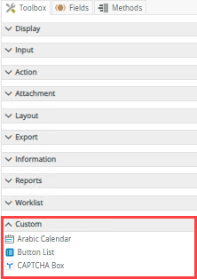
 Configure the control
Once the custom control is uploaded in Management, you can see and use the control in the Designer.
- Create a view.
- Drag the control onto the canvas. You can find the control in the Custom section of the Toolbox.
- Configure the control's properties. Each custom control has its own specific properties as defined by the person who created the custom control.
- Configure control-specific rules if required. Each custom control has its own specific rules as defined by the person who created the custom control.
- Run the view.
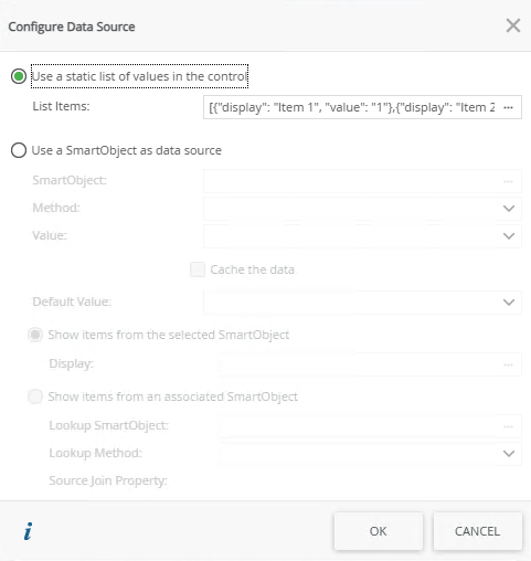
Configure a data source for the control
When you click on the ellipsis next to Data Source Type in the control's properties, the Configure Data Source page opens. You can use a SmartObject or a static list of values.
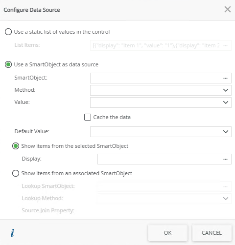
| Fields | Description |
|---|---|
| Use a static list of values in the control | You can create a static list of values to be used in the control. Select the option and click the ellipsis next to List Items to configure the list. |
| List Items | Click the ellipsis next to List Items to configure the list of static values for the control. |
| Use a SmartObject as data source | A SmartObject can be used as data source. |
| SmartObject | Select this option if you want to use a SmartObject as the data source. |
| Method | The method that you want to use to populate the control. |
| Value | The SmartObject property that you want to use as the value in the control. |
| Cache the data | This option is not currently supported. |
| Default Value | The default SmartObject value to be used. |
| Show items from the selected SmartObject | Select this option if you want to show items from the parent SmartObject in the control. |
| Display | The SmartObject property to be used as a display member. Select the item. |
| Show items from an associated SmartObject | This option is not currently supported. |
| Lookup SmartObject | This option is not currently supported. |
| Lookup Method | This option is not currently supported. |
| Source Join Property | This option is not currently supported. |
Use a static list of values in the control
When you select to Use a static list of values in the control on the Configure Data Source page and you click the ellipsis, the Fixed List Configuration page opens. You can configure the static list on a bound or unbound control. When the control is bound, use this page to configure a Value-Display pair where the value of the Value field is stored in the SmartObject, while the value of the Display field is displayed in the control. This is useful for example when you have a product code and product description; you will enter the code in the Value field and the description in the Display field.
When the control is unbound, you can configure static values for both fields. You can use the value of the control with conditional logic, for example, to show/hide other controls according to the selection in the list.
The Value field and Display field values can be the same or they can be different. You can also select the default to display when the control is populated.
- It is recommended to have unique values for the Value field
- The control can contain multiple defaults. If you use the multivalue data type with the control, you can select multiple defaults
- When you use the view's Clear method, the control reverts to the default value, not a blank value
- If you use the Value or Display fields in a rule you must add a For-Each Looping condition to your rule to ensure that a loop context is built to retrieve the selected item values.
Properties
You can find the control in the Custom section of the Toolbox. Each custom control has its own specific properties, which are determined by the definitions in the manifest.json file uploaded in Management.
| Properties | Description | Can be set in runtime using rules? |
|---|---|---|
| Detail | ||
| Name | A unique identifier for the selected control. This is the display name of the custom control as uploaded in Management. | Yes, see SmartForm controls extensibility for more information. |
| General | ||
| Width | Adjusts the width of the control. You can enter any whole percentage up to 100%, whole number or pixel value to a maximum of 32767px. Type the dimension. | Yes, see Configure the Set a Control's Properties Action for more information. |
| Height | Adjusts the height of the control. You can enter any whole number or pixel value (maximum of 32767px). When set to blank, it defaults to 375px. | Yes, see Configure the Set a Control's Properties Action for more information. |
| Tab Index |
Defines a sequence that users follow when they use the Tab key to navigate through a page at runtime. |
Yes, see Configure the Set a Control's Properties Action for more information. |
| Visible | Shows or hides the control. | Yes, see Configure the Set a Control's Properties Action for more information. |
| Enabled | Enables or disables the control. | Yes, see Configure the Set a Control's Properties Action for more information. |
| Read-Only | Shows the control as read-only. | Yes, see Configure the Set a Control's Properties Action for more information. |
Rules, events, and actions
Each custom control has its own specific rules, which are determined by the definitions in the manifest.json file uploaded in Management. The control interacts with other controls through rules. When you bind properties between different controls, you can use the data to populate properties or set values. Use the following examples for when to use the control with other controls through rules:
- Populate a list control with data: You can populate the control if it has a SmartObject-based data source
- Set a control’s properties: You can configure the settable properties of the control with this action
- Show/Hide: The Visible property allows you to show or hide the control through rules
- Enable/Disable: The Enabled property allows you to enable or disable the control through rules
- Data Transfer: You can transfer multiple values to the control using a semi-colon delimited list in the Transfer Data rule action
When you define control methods in the manifest.json and JavaScript files, you need to create a rule in the Designer to execute the method.
Control methods example: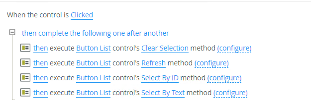
Control conditions example: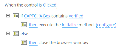
Considerations
- A custom control inherits the styling used on a view or a form if variables have been added to the custom control.
- Custom variables for style profiles are not supported.
- You can use Package and Deployment to deploy your custom controls to another environment. If you have access to use Package and Deployment, you can deploy a package containing a custom control to another environment, but you won't have access to manage the custom control in the new environment. You must be part of the Control Administrators role to do this.
- The custom control does not have a name length restriction, and a tooltip is not provided.
- Custom controls that are data bound won't show on a form.
- Using the Format and Conditional Format properties are not available with this version of the release.
- The person who created the custom control is responsible for accessibility (keyboard navigation, screen readers, ARIA where applicable), localization, and responsiveness.
- The following are not currently supported with custom controls:
- Data binding
- When you define control methods in the manifest.json and JavaScript files, a rule is not automatically created for you. You need to create a rule in the Designer to execute the method.
- When configuring a data source, associated SmartObjects cannot be configured.
- When configuring a data source, the Cache the data option is not supported. This can be done using JavaScript code.
- Package and Deployment
- Controls cannot be deployed to an environment that does not have Nintex Automation K2 (5.9) or later.