4. Create the Contact Item View
In this step you will design an item view from the Contact SmartObject. This item view is used in two ways: to capture contact header information for new records and to edit existing records.
Creating the view directly from the Contact SmartObject generates the SmartObject properties as controls (think form fields and labels). You will edit the layout of the view, then assign a predefined list of static values to the Relationship drop-down list control.
-
Design a new view from the Contact SmartObject. Name the view Contact Item View then move the view to the Views category. This is the user interface for entering the header content (such as name and address).
- Begin by designing a new view from the Contact SmartObject. When you design a view from a SmartObject, K2 creates a relationship between the view and the SmartObject. This in turn, creates a relationship between the view controls (the form fields where you enter content) and the SmartObject properties.
Right-click the Contact SmartObject (located in the SmartObjects category) and select Design View.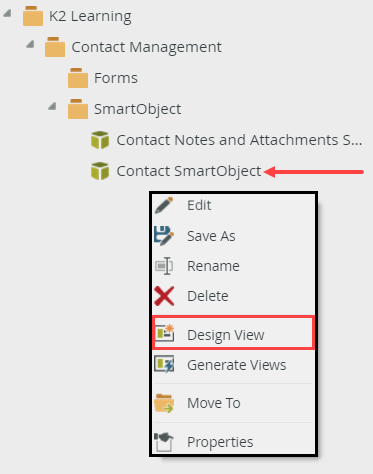
- Breadcrumb Bar: use the breadcrumb bar to switch designer screens
- General: view details, such as name, SmartObject, view type
- Layout: design canvas, view menu, toolbox, properties
- Parameters: add and configure view parameters, assign default values
- Rules: add new rules, edit existing rules
- View Menu: change control types, add functions, clear canvas
- Toolbox: add or change controls and methods
- Toolbox: add controls directly to the design canvas
- Fields: add SmartObject fields from the bound SmartObject
- Methods: add methods in button format to the design canvas
- Design Canvas: drag and drop controls, fields and methods to create a reusable view
- Properties Pane: edit and configure control properties
- Rules (separate tab): add, edit and configure a control's rules
- Next, you will name the view and move it to the Views category. Because you designed the view from the Contact SmartObject (in the SmartObjects category), K2 created the view in the SmartObject category. To keep organized, you will move it to the Views category.
On the GENERAL tab, name the new view
Contact Item View
then change the category to Views. To change the category, click the ellipses on the right side of the Category field, then select Views. Click OK. Confirm the Item View option is the view type. Click CREATE.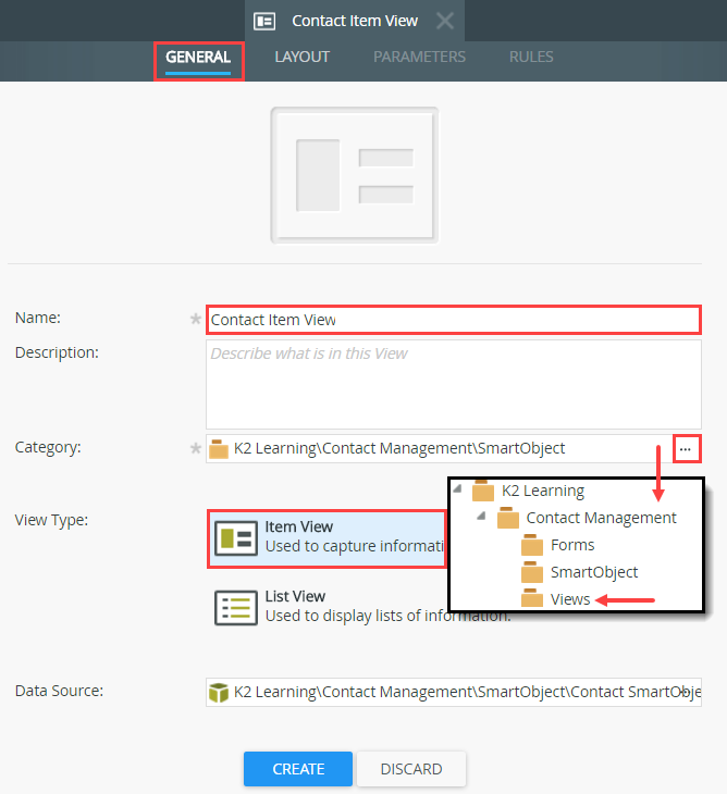
K2 Designer is the tool used to build and edit SmartObjects, views, forms and workflows. The designer has the following key areas: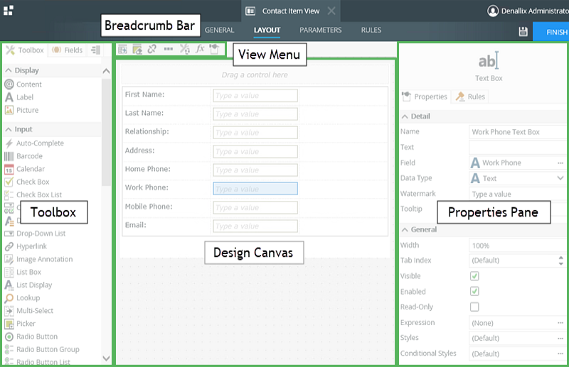
- Begin by designing a new view from the Contact SmartObject. When you design a view from a SmartObject, K2 creates a relationship between the view and the SmartObject. This in turn, creates a relationship between the view controls (the form fields where you enter content) and the SmartObject properties.
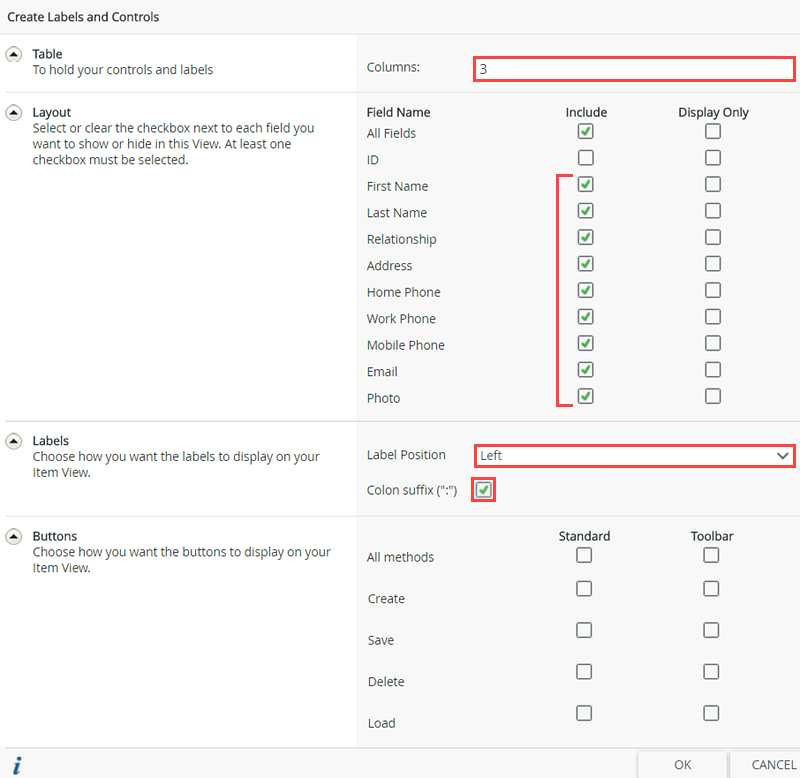
- Create the labels and controls you will use for the header content user interface. Use the Create Labels and Controls option with the following settings:
- Columns: 3
- Fields: All except ID
- Label Position: Left
- Colon suffix: Yes
- Buttons: None
- Next, you can choose whether to have K2 automatically generate a view for you based on the controls you select, or you can add an empty layout table and add the controls you need manually. In this application, you will let K2 generate the layout table and controls for you. On the LAYOUT screen, click Create Labels and Controls.
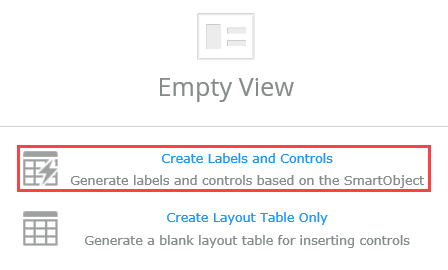
- On the Create Labels and Controls screen, make the following configurations:
- Change the number of columns to 3.
- The first column will house the control labels. The second and third columns will house the text box and image controls. In two rows, you will merge the second and third cells, to create more room for longer text entries.
- Include all the fields, except the ID.
- ID is a hidden field that contains the SmartObject record ID. You do not need it to be a part of your user interface.
- Change the Label Position to Left.
- CHECK the box to add the Colon suffix.
- Do not enable any Button controls.
- You do not need the default buttons added as you will add and configure your own buttons and rules in a later step.
- Change the number of columns to 3.
-
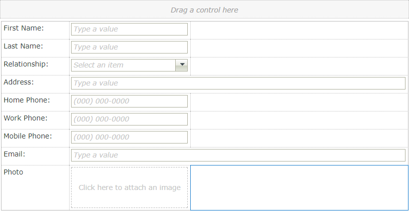
Add the photo label and control if it is missing. First add a new row to the bottom of the layout table. From the Controls pane, drag the Photo control into the second cell. Drag the label to the first cell. This is a known issue.
- If the photo label and control are missing, you can easily add them back in. First, you will a new row to the bottom of your layout table. Then you can simply drag and drop the control from the Fields pane into the new row.
Add a new row to the bottom of the table. Click in the Email label cell to highlight the cell. The cell will have a blue border when highlighted. From the view canvas menu, click the Insert Row Below icon. K2 adds the new row at the bottom of the table.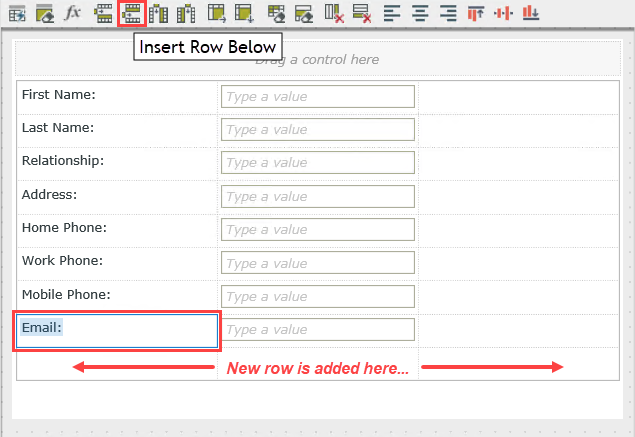
- From the Fields pane on the left side of your screen, drag the Photo control to the second table cell. Click to highlight the Photo label, then drag it to the first cell.
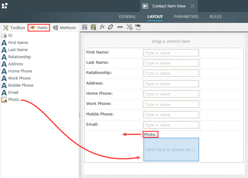
- If the photo label and control are missing, you can easily add them back in. First, you will a new row to the bottom of your layout table. Then you can simply drag and drop the control from the Fields pane into the new row.
-
Add phone number validation patterns to the three phone number controls to ensure that the data entered is valid. Optionally, add watermarks to the three phone controls to give users a hint as to what the input value should look like. First highlight the Home Phone text box, then access the Patterns editor in the Properties pane. Select the Phone Number option. Repeat this step for the other two phone numbers.
- Next, you will add patterns to the three phone number controls. Patterns are regular expressions that validate that the data entered into a control is valid (for example, phone numbers or email addresses). This helps to ensure data is valid and consistent when it is entered.
Click to highlight the Home Phone control. After you click the control, the Properties pane will appear on the right side of the screen. Click the Pattern ellipses to open the editor.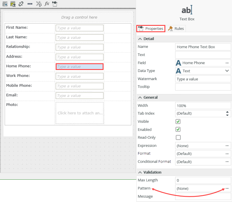
- Click to select the Phone Number pattern, then click OK.
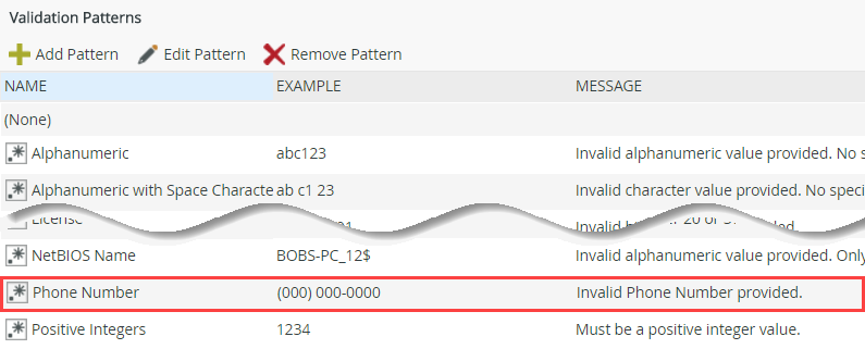
Notice that the Pattern value is set to Phone Number, indicating that the data entered for this control by the user will have to match the phone number pattern.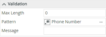
- Repeat the steps above and add phone number patterns to the Work Phone and Mobile Phone controls.
- (Optional). You may want to give users a "mask" or hint to show what the input value for a control should look like. You can use Watermarks for this.
Add Watermarks for each of the three phone text box controls, by entering (000) 000-0000 in the Watermark property.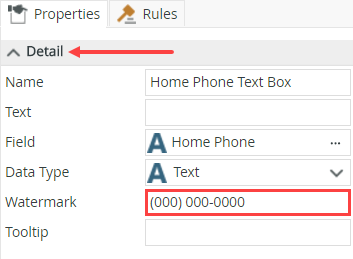
- Next, you will add patterns to the three phone number controls. Patterns are regular expressions that validate that the data entered into a control is valid (for example, phone numbers or email addresses). This helps to ensure data is valid and consistent when it is entered.
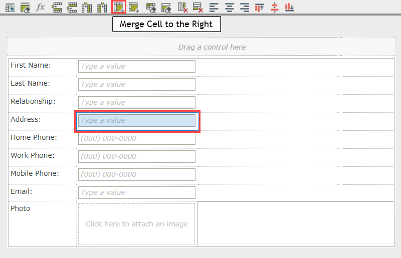
- Adjust the table layout so that it flows better. First, adjust the width of the first column so that the controls are closer to their labels. Second, merge the second and third cells in the Address and Email rows to accommodate longer text boxes. When you are done, the layout table should look like this:
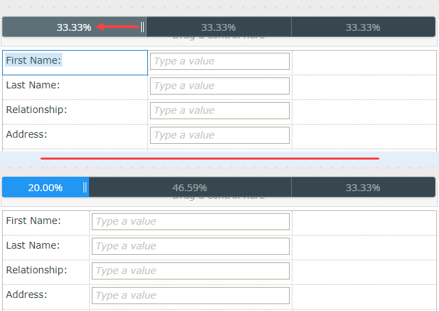
- Next, you will adjust the column widths so that the forms is easier for our users to use. Click inside table. You see the table widget appear above. Drag the resize bar to the left to make the first column narrower.
- Now you will merge two adjoining table cells so that the users have more space to enter data. Click inside the table cell of the Address control. Note: you don't want to click the control itself, but inside the table cell. The cell will have a blue border when it's highlighted. Click the Merge Cell to the Right icon in the view canvas menu. Repeat this step for the Email table cell.
- Next, you will adjust the column widths so that the forms is easier for our users to use. Click inside table. You see the table widget appear above. Drag the resize bar to the left to make the first column narrower.
-
Next, you will limit the relationship types that you can select, by providing a static drop-down list of values to choose from. Change the Relationship control to a drop-down list, and then add the following static values:
Family
Friend
Co-Worker
Business Associate
Other- The last configuration for the Contact Item View is to change the Relationship control to a drop-down list, then provide static values for the list. This keeps your database values consistent across records, because users can only select a value from a predefined list of relationship types. This will also help if you want to filter the records by the relationship type, because records can only have certain Relationship types.
Click to highlight the Relationship control. Click the Change Control icon in the view canvas menu. Change the control type to Drop-Down List, then click OK.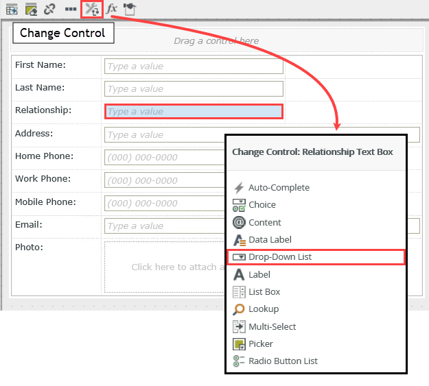
- Next, you will configure the static values for the Relationship control. Click to highlight the Relationship control if it is not already. In the Properties pane, locate the Data Source heading. Click the ellipses for the Type property.
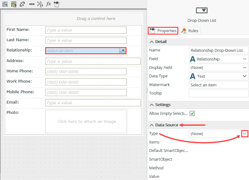
- Select the Use a static list of values in the control option, then click the ellipses for the List Items property. Add the following relationship types in both the VALUE and DISPLAY columns. Click OK, then OK once again.
Family
Friend
Co-Worker
Business Associate
Other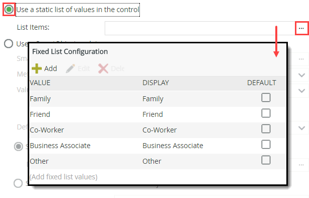
- Click FINISH in the upper right corner of the screen to save and exit the view designer.
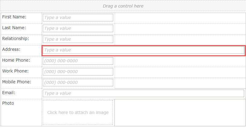
Your view should look like the image below at this point.
- The last configuration for the Contact Item View is to change the Relationship control to a drop-down list, then provide static values for the list. This keeps your database values consistent across records, because users can only select a value from a predefined list of relationship types. This will also help if you want to filter the records by the relationship type, because records can only have certain Relationship types.
Take a minute to review the controls and labels generated from the Contact SmartObject. In some cases, the Photo control may be missing. If it is, follow the next step to add a new row, then add the photo control. If the Photo control is already there, you can skip step 3 and go on to step 4.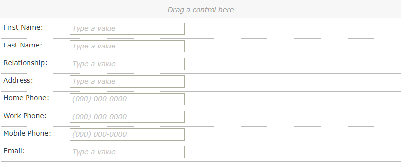
Review
In this step, you created the item view that manages the "header" content of a contact record. You created the view directly from the Contact SmartObject, which automatically bound the view to the SmartObject. The SmartObject properties were then generated as controls. You added validation patterns to the phone number controls and added input masks to help users input the correct data. After making some minor adjustments to the view layout, you finished by changing the Relationship control to a drop-down list, then adding static values for the list so that users could only select from a predefined list of values. In the next step, you will create the Contact List View, which will be used to list the contacts you have captured.