Workflow Instances Grid
The Workflow Instances Grid control lists all workflow instances according to specific filter criteria. The data is displayed as detailed information pertaining to a workflow instance or instances. This grid can be used to:
- Determine the Priority and Status of workflow instances
- Determine the start date of a specific workflow instance
- Identify a specific workflow instance if the Folio is set during the workflow
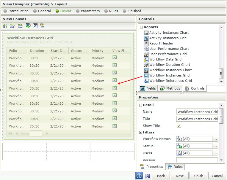
- Open the View Flow of each workflow instance to view the color coded graphical representation of the workflow process. See the example in the Interaction section of this topic
Security is applied to the controls to ensure that the data is seen by authorized individuals within an organization. Permissions are based on the process rights assigned to the process in Management Console:
- Users with Admin or View permissions will have access to the Report controls.
- Users with View Participate permissions will be permitted to view the Report controls from the point where the user has been part of the workflow.
It is important to note that these permissions need to be assigned for each separate workflow. If rights to view report controls are assigned to a Group, these will not apply to the users in that Group with regard to viewing the Report controls. Rights need to be assigned at user level in order for the user to view the Report controls.
- Create a View
- Drag the Workflow Instances Grid control onto the canvas. The control can be found in the Reports section of the Controls found in the View Designer, see the Properties section below
- Configure the properties of the Workflow Instances Grid control as required, see the Properties section below
- Add a rule to Run the Grid when the View is Initialized for example:
Event: When a control on the View raises an event (When the View is Initialized)
Action: Execute a control's method (Execute the Run Grid method)
- Always remember to create a rule to Run the Grid when the View Initializes
- The value of the Workflow Instances Grid is the selected instance. When clicking on a record in the Workflow Instances Grid in runtime, the value of the Grid will be the selected instance and can subsequently be used to bind properties or configure rules
- When using Custom Themes, be sure to specify the CSS classes for the elements
- Grid control columns are predefined and can't be changed. However, columns can be deselected in the properties section of the control so that they are not displayed in runtime, if required
- The data of K2 workflows or processes created by any workflow designer such as K2 Studio, K2 Designer for Visual Studio, K2 Designer and K2 Designer for SharePoint can be made available using the reporting controls
Report controls interact with each other through rules. By binding properties between different controls, data can be used to populate properties or set values in runtime.
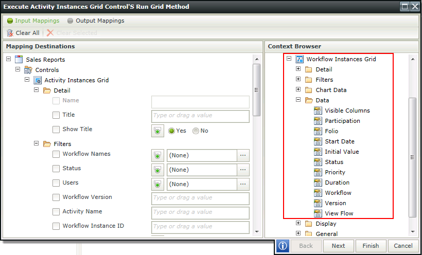
- The column properties displayed on the design canvas are available in the Context Browser for mapping to other controls. This means that the property can be dragged from the control to another control’s properties or control value

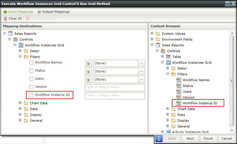
- The following property is available as Input Mapping property and in the Context Browser when using rules for mapping to other controls. This property is additional to those mentioned in the Properties section of this topic, but is only available for interaction with rules:
Workflow Instance ID - Filters the Grid based on a Workflow Instance ID
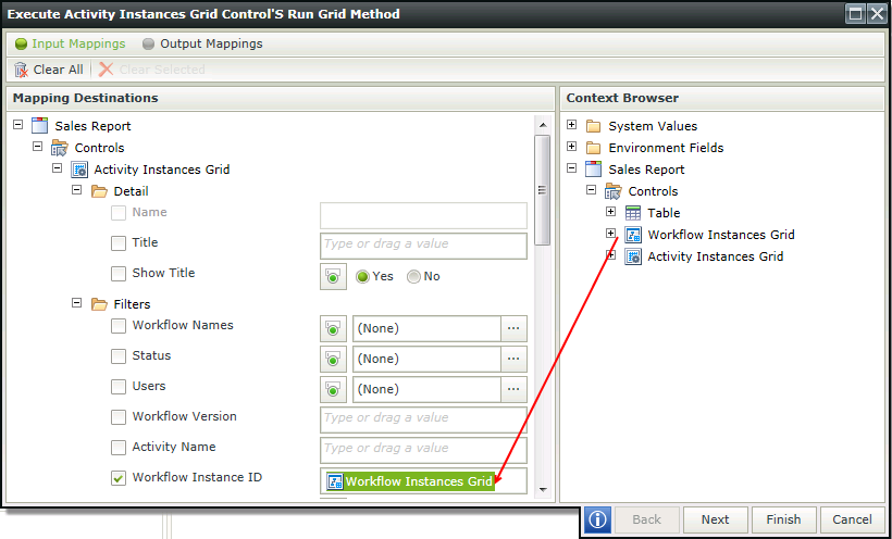
- When using a Grid control to populate another Grid control, for example if the selected workflow in a Workflow Instances Grid should be used to populate an Activity Instances Grid, the following rule will apply:
Event: When a control on the View raises and event
Action: Execute a control's method
Configuration: Map the Workflow Instance Grid to the Workflow Instance ID of the Activity Instances Grid

The Workflow Instances Grid control is available in the Reports section of the Controls found in the View Designer.

| Property | Description | Can be set in runtime using Rules |
|---|---|---|
| Detail | ||
| Name | A unique identifier for the selected control. This property is required | No |
| Title | The Title of the control to be shown in runtime | Yes, see Control Properties Actions for more information |
| Show Title | Shows or hides the Title during runtime | Yes, see Control Properties Actions for more information |
| Filters | ||
| Workflow Names | The workflow on which to filter when returning the data in runtime. If All is selected, all workflow instances will be taken into account when the data is returned. See the Generic Picker Screens topic for more information | Yes, see Control Properties Actions for more information |
| Status | The Status of the specific workflow instance. See the Generic Picker Screens topic for more information | Yes, see Control Properties Actions for more information |
| Users | Includes users who started or participated in a workflow instance. See the Generic Picker Screens topic for more information | Yes, see Control Properties Actions for more information |
| Version | A specific workflow version to be used to filter | Yes, see Control Properties Actions for more information |
| Chart Data | ||
| Range | The Date Range to be used to filter the data. The data returned would typically be executed according to the date on which a workflow instance was started. See the Generic Picker Screens topic for more information | Yes, see Control Properties Actions for more information |
| Show Range | Shows or hides the Data Range in runtime | Yes, see Control Properties Actions for more information |
| Data | ||
| Visible Columns | Enables the user to select which columns should be visible in runtime. See the Generic Picker Screens topic for more information | Yes, see Control Properties Actions for more information |
| Participation | The following criteria can be used in addition to theUsersfilter being applied:
When selecting a specific user(s) in the Filters section, the criteria mentioned above can be used to filter the data returned even further |
Yes, see Control Properties Actions for more information |
| Initial Value | First record - Indicates whether the first record returned on the list should be selected when using the Run method. Typically used when expecting only one record to be returned and no user interaction is required to select the record. If None is selected, no record will automatically be selected when run | Yes, see Control Properties Actions for more information |
| Display | ||
| Sort by Default | Enables sorting of the results by the default in runtime. Date Started is the default | Yes, see Control Properties Actions for more information |
| Use Paging | Enables paging in runtime | Yes, see Control Properties Actions for more information |
| Page size | Enables the user to specify the amount of records to be shown per page in runtime. Default is 10. Type the number of records to be shown per page in runtime if required | Yes, see Control Properties Actions for more information |
| General | ||
| Visible | Shows or hides the control in runtime | Yes, see Control Properties Actions for more information |
| Enabled | Enables or disables the control in runtime | Yes, see Control Properties Actions for more information |
| Read-Only | Enables the control to be read-only in runtime | Yes, see Control Properties Actions for more information |
| Width | Adjusts the width of the control. Any whole percentage up to 100%, whole number or pixel value to a maximum of 32767px can be entered. Type the dimension to be used | Yes, see Control Properties Actions for more information |
| Styles | Opens the Style Builder enabling the user to specify style features like Format, Font, Borders, Padding and Margins. See the Style Builder topic for more information on styling options | No |
| Conditional Styles | Opens the Conditional Formatting Designer. This is used to design styles that will apply only when certain conditions are met. See the Conditional Styles section for more information. Click on the ellipsis to open the Conditional formatting screen | No |
