Tree Control
The Tree control is an input control that displays a hierarchical list of information. Each node can have sub nodes and can be expanded to reveal these sub nodes and collapsed to hide sub nodes. The nodes can typically represent headings in a document, the entries in an index, or the files and directories in a file manager application. Parent nodes (nodes that contain other items) are called categories and child nodes are called items. Each node consists of a label and an image that can be customized. This control can be used to:
- Display a menu of items with relationships for example the display of regions and office locations or the display of a family tree.
- Display multiple parent-child relationships.
Single or multiple items can be selected at runtime according to the configuration of the control. These items can be used when executing rules, for example calling a Save or Load method for all the items selected in a tree view.
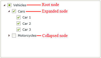
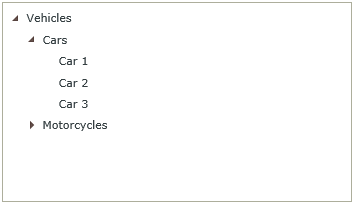
The following image shows a simple Tree control with a root node, an expanded node, and a collapsed node. The Multiple option has also been enabled for the selection type property of the control to allow multiple items to be selectable:
- Create a SmartObject with properties, and include a property required to be used as the Parent ID. (The Parent ID will be the value that "binds" a node to its parent). See the Creating SmartObjects section for information on creating SmartObjects.
- Create a View.
- Drag the Tree control onto the canvas. The control can be found in the Input section of the Controls.
- Configure the Selection Type property to indicate whether the control should allow single or multiple selections
- Configure the Data Source property and select the SmartObject created in Step 1.
- Configure the rest of the control properties as required.
- Create a rule or rules to interact with the Tree control at runtime.
- If required, add data to the SmartObject that is used as the data source for the tree view, taking care to populate the Parent ID property as needed.
- Run the View.
When creating a SmartObject or editing an existing SmartObject for use with the Tree control, the following need to be considered:
- A property is required for use as the node location identifier of the Tree control. This property is referred to as the Parent ID and determines where in the Tree View a specific value will appear.
- It is advised to use a unique name for the property used as the Parent ID for identification purposes. This property does not necessarily have to be called Parent ID.
- The Parent ID property can be added to existing SmartObjects. The hierarchical structure should be updated manually by adding the new property to a View and editing the data if data already exists to ensure the data is linked to the relevant parent node.
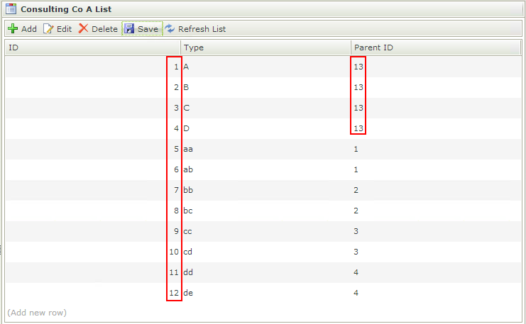
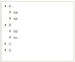
- When using a single data source, any record where the Parent ID value is not valid will be displayed as a root node. Consider the example below: suppose a data set has twelve records (with IDs 1-12). When using the value 13 (or any other number greater than 12) for the Parent ID property, those records will appear as root nodes because there is no record with an ID of 13 to act as the parent node. In the sample dataset Type A, B, C and D are all shown as root nodes, because there is no record with ID 13 that will act as a parent node for those items. In short, if the value of the property used for the Parent ID is 0 or the value does not match a valid parent record, that record will be shown as a root node in the tree control.
- When using multiple data sources, it is not required to define Associations between the SmartObjects but it can be useful. Association id's can be used in the category fields of the Categories and Items sections to ensure correct population of the tree control.
See the following sections for more detail on using single or multiple data sources:
How to use a single data source
How to use multiple data sources
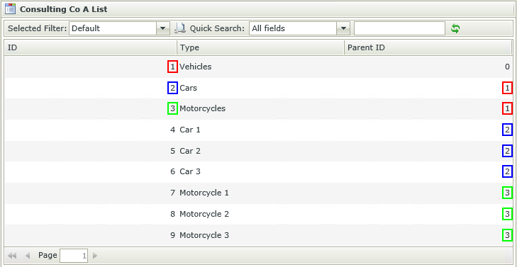
Below is an example of a SmartObject used with the Tree control, followed by a screenshot showing the behavior of the Tree at runtime based on the values entered for the SmartObject. This example is using a single data source. Note the color-coded links between the ID and Parent ID. Since Vehicles has a Parent ID of 0 and it is the only item with Parent ID 0, it is the Root Node of the Tree View. Cars and Motorcycles have a value of 1 for the Parent ID and therefore appear as sub-nodes under Vehicles. Car 1, Car 2 and Car 3 have 2 as the value of their Parent ID, and therefore they will appear under Cars in the tree view.

The Tree control can interact with other controls through rules. Depending on the control properties, there are certain actions where the control surfaces. Following are a few examples:
- Set a control’s properties: The control's settable properties can be configured using this action
- Show/Hide: The Visible property allows for the control to be shown or hidden through rules
- Enable/Disable: The Enabled property allows for the control to be enabled or disabled through rules
- Data Transfer: Data can be transferred from items listed in the Context Browser to the Tree control
- Execute a control's method: The control's methods can be configured using this action
- Specify edit state: This action allows for the control to be set as Read-Only or Editable
The following Rule events are available when using the Tree control:
- Changed: A rule condition and/or action can be executed when the control is changed, for example selecting an item or transferring a value to the control.
- Collapsed (Node): A rule condition and/or action can be executed when a node is collapsed.
- Expanded (Node): A rule condition and/or action can be executed when a node is expanded.
- Populating: A rule condition and/or action can be executed when the control is populating. The populated event fires when the control is populated on View initialize and also when a node is expanded (on a multi-source tree), except when the Load all Nodes property is enabled (in this case it will only fire on View initialize).
The following Rule methods are available when using the Tree control:
- Clear Selection: Clears the selection made in the control, i.e. all selected nodes are unselected.
- Collapse All: Collapses all nodes so that only first level parent nodes are visible.
- Collapse Node: Collapses the current node to show only its parent node.
- Expand All: Expands all nodes to the lowest level.
- Expand Node: Expands current node selected to the lowest level.
- Populate: Populates the Tree control with data from a SmartObject or SmartObjects.
- Values can be transferred to the Tree control by using the Transfer Data action mappings screen.
-
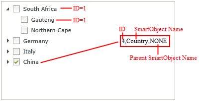
On a multi-source tree, it is possible that records from different SmartObjects can have the same value for the ID property. To overcome this, transferred values can be tiered. Consider the image below:
In the above image two items on the tree (South Africa and Gauteng) have the same ID value of 1. If an ID is common between multiple items, only the first level with that value will be transferred. In this example, if 1 was transferred, only South Africa would have been selected. For this reason transferred values can be tiered as can be seen in the Text Box: The first value is the ID value, the second is the SmartObject name and the third is the name of the parent SmartObject (labeled NONE if not applicable). If we wanted to select Gauteng in the tree control, the value would be: 1,Province,Country because 1 is the ID of Gauteng, Province is the name of the SmartObject containing the record Gauteng and Country is the name of the parent SmartObject that provinces are bound to. If we wanted to select China, the value would be 4,Country,NONEbecause 4 is the ID value for China, Country is the name of the SmartObject and since Country does not have a parent SmartObject, NONE is specified as the parent SmartObject name.
- The data is a delimited list of values that the control saves and loads. It is important to always have a delimiter specified, preferably a semi-colon (;).
- The Tree control cannot be used on Forms, it can only be used on Views.
- The populate list control with data rule action is not supported in the Tree control as the Tree uses more than one source to load its data, and the populate list control action only supports controls with one data source.
- When using multiple data sources, data associations are not required between the SmartObjects used but can be useful. Association id's can be used in the category fields of the Categories and Items sections to ensure correct population of the tree control. See the How to use multiple data sources section.
- The Expanded property is not selected by default. This means that the lowest level nodes will show the expander (icon) until the user has clicked the expander, then it will disappear.
- When selecting the Expanded property option, data to populate the tree control will be retrieved once the control loads. This may cause a delay and is not recommended when large data sets are used to populate the control.
- When a parent/root node is expanded to expose child nodes, selecting a parent or root node selects child nodes as well. However, if root/parent nodes remains collapsed, selecting that node will NOT select child nodes.
- The Load All Nodes property is not selected by default. This means that data will be loaded on demand when expanding a node.
- When using the Single option in the Selection Type property, the control contains the value for the selected node and only a single selection can be made.
- When using the Multiple option in the Selection Type property, the category node does not contain the value and selecting a category by default selects all its respective items. This is useful to transfer values for further action. If a parent is collapsed, you can select it as a value.
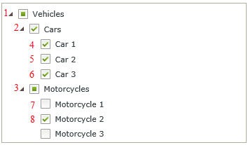
- When using the Multiple option in the Selection Type property, the Value property can be set to indicate which value should be selected by default at runtime. Multiple values can be set by using a semi-colon as the delimiter. An example where Multiple has been selected and the Value property is set to 2;8 is shown below. Note the hierarchical order of the nodes.
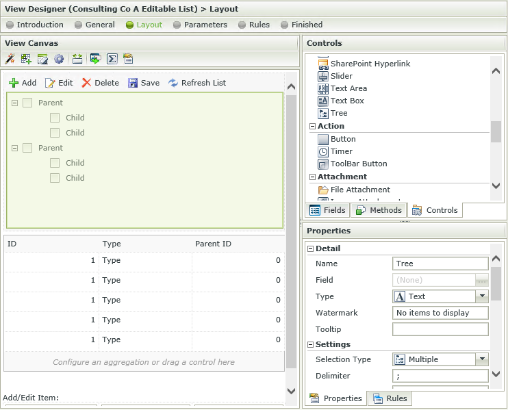
The Tree control is available in the Input section of the Controls toolbox.
| Property | Description | Can be set at runtime using Rules |
|---|---|---|
| Detail | ||
| Name | A unique identifier for the selected control. This property is required. | No |
| Field | The field that is bound to the selected control. | No |
| Type | A drop-down list containing the types of values that the control can accept. | No |
| Watermark | The text to display when the control is not populated. | Yes, see Control Properties Actions for more information |
| Tooltip | The value to be displayed when the cursor is hovered over the control during runtime. | Yes, see Control Properties Actions for more information |
| Settings | ||
| Selection Type | The type of selection allowed at runtime. Single or Multiple items can be selected. | No |
| Delimiter | The type of delimiter to be used when saving the values. The default is ";". | Yes, see Control Properties Actions for more information |
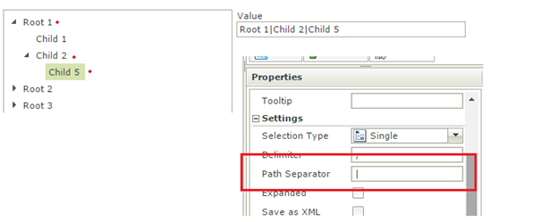
| Path Separator | The Path Separator property is used to separate each value node concatenated from the root to the selected node. This is called the Value Path. | Yes, see Control Properties Actions for more information |
| Expanded | When the View is opened at runtime the tree will be expanded. | Yes, see Control Properties Actions for more information |
| Save as XML | Saves the tree information in XML format. | No |
| Data Source | ||
| Data Source | The selected SmartObject that has been bound to the control. See Configure Data Source section. | No |
| Icon Source | The selected SmartObject that contains the image used for the icon. See the Using a custom icon section. | No |
| Icon ID | The property used to identify the ID of the icon contained in the SmartObject. See the Using a custom icon section. | No |
| Icon Image | The property used to identify the image of the icon contained in the SmartObject. See the Using a custom icon section. | No |
| Icon Name | The property representing the name of the image. See the Using a custom icon section. | No |
| General | ||
| Height | Adjusts the height of the control. Any whole number or pixel value up to 32767px. When set to zero, it will automatically change the size to fit the content of the page. Type the dimension to be used. | Yes, see Control Properties Actions for more information |
| Width | Adjusts the width of the control. Any whole percentage up to 100%, whole number or pixel value to a maximum of 32767px can be entered. Type the dimension to be used. | Yes, see Control Properties Actions for more information |
| Visible | Shows or hides the control at runtime. | Yes, see Control Properties Actions for more information |
| Enabled | Enables or disables the control at runtime. | Yes, see Control Properties Actions for more information |
| Read-Only | Used to establish whether the control is read-only during runtime. | Yes, see Control Properties Actions for more information |
| Styles | Opens the Style Builder enabling the user to specify style features like Format, Font, Borders, Padding and Margins. See the Style Builder topic for more information on styling options | No |
| Conditional Styles | Opens the Conditional Formatting Designer. This is used to design styles that will apply only when certain conditions are met. See the Conditional Styles section for more information. Click on the ellipsis to open the Conditional Formatting screen. | No |
When clicking on the ellipsis next to Data Source, the Configure Data Source screen opens. Configure the data source to be used for the control. A single or multi-source can be configured. When clicking on the ellipsis next to Method on the Configure Data Source screen, the Populate Tree List Control with Data screen opens. The Tree control's input properties can be set by using fields or parameters. Filters and sorting can also be applied to the results that will populate the Tree control. It is advised that a very strict filter is set up to limit the number of items used to populate the Tree control. See the Filter and Sort sections for a detailed description and items that need to be considered when applying these.
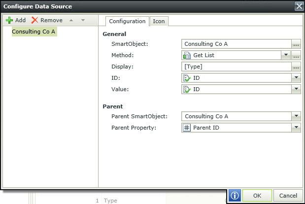

A single SmartObject can be used to populate the Tree control. An image can be used as an icon to differentiate between the different categories and items. Images can be contained within the SmartObject used as the data source or it can be a separate SmartObject. When using a single SmartObject, it is important to have the data set up correctly for it to display as expected in the Tree control. See the Creating SmartObjects section for specific requirements and an example of what the data should look like.
- Create one SmartObject to be used as the data source. Following is an example of a SmartObject:
Consulting Co A (Consulting company):
ID: Autonumber type property used to identify the type property.
Type: Text type property used for the name of the item.
ParentID: Number type property used to identify the property as a root or secondary level category. - Create an Item and List View of the SmartObject.
- Create data using the Item View.
- View the data with the List View.
- Ensure the data is captured correctly so it will be displayed in the Tree control as expected. Following is an example of how data can be linked to create different levels of data. Note how the value of the ID property is used in the Parent ID property to link the data. The item listed with a zero in the Parent ID field will be used as the root level node, see Creating SmartObjects for more information.

- Create a Item View.
- On the Layout screen drag the Tree control onto the canvas.
- Open the Data Source property.
- In the Configuration tab, select the Consulting Co A SmartObject and the ParentID property in the Parent Property field.

- Click OK.
- Finish and Run the View.
- Expand the nodes to view the data you previously created.
| Field | Description |
|---|---|
| SmartObject | The SmartObject to be used to populate the control. Click the ellipsis next to SmartObject to select the SmartObject. |
| Method | The method to be used to populate the control. This can only be a list type method. |
| Display | The display value for the tree node. The display can be customized by clicking on the ellipsis and dragging fields across from the Context Browser. |
| ID | The identifier of the SmartObject. One can also transfer the Path (which is recorded as ID,SmartObject) to or from the Tree control and the configured ID and SmartObject name would then be used. The ID is by default the Autonumber ID but can be changed to any field in the SmartObject. |
| Value | The SmartObject property to be used as the value for the control. The Value of the node when selected, will be the value returned from the property selected in the Data Source screen. |
| Parent SmartObject | The parent SmartObject to be used to build the relationship between the parent and child SmartObjects. |
| Parent Property | The parent property to be used when linking the child SmartObject to the parent SmartObject. |
| Field | Description |
|---|---|
| None | No icon applied. |
| Static | Static list of icons available. Select an icon from the list. |
| Dynamic | The property of type Image that provides the icon to be used. |
Multiple SmartObjects can be used to populate the Tree control. An image can be used as an icon to differentiate between the different categories and items. Images can be contained within the SmartObject used as the data source or it can be a separate SmartObject. When using multiple SmartObjects as the data source, associations between the SmartObjects can be useful to populate the Tree control. If associations are not used, the subsequent SmartObjects will need a field linking them to their parents (as with cascading controls).
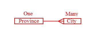
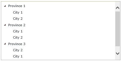
Following is an example of how the associations will be created for this specific scenario and how it will be displayed in the tree.
- Create two SmartObjects to be used as the data sources. Following is an example of two SmartObjects:
Province:
ID: Autonumber type property used to identify the Province .
Province: Text type property used for the name of the Province.
City:
ID: Autonumber type property used to identify the City.
Province FK: Number type property used to associate the Province and City SmartObjects.
City: Text type property used for the name of the City. - Create an Association between the two SmartObjects that looks like the image below. Although Associations are not required for linking multiple data sources, they are very useful. If Associations are not used, the subsequent SmartObjects will need a field linking them to their parents (as with cascading controls). In this scenario we are using associations for this purpose.
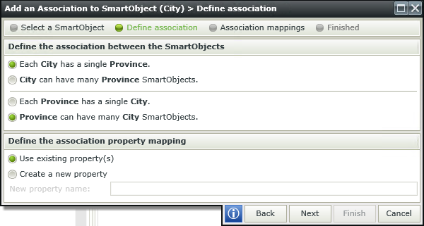
- Perform the mapping as follows:
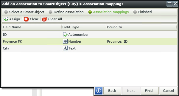
- Create data for the two SmartObjects.
- Create an Item View.
- On the Layout screen drag the Tree control onto the canvas.
- Open the Data Source property.
- Click Add.
- Select the Province SmartObject in the General section.
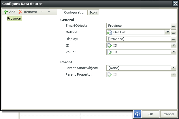
- Click Add.
- Select the City SmartObject in the General section and the Province SmartObject in the Parent section. Select the Province FK property next to the Parent Property field.
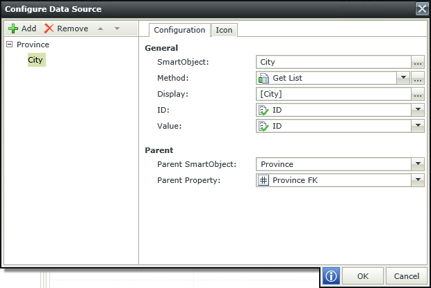
- Click OK.
- Finish and Run the View.
- Expand the nodes to view the data you entered.

| Field | Description |
|---|---|
| SmartObject | The SmartObject to be used to populate the control. Click the ellipsis next to SmartObject to select the SmartObject. |
| Method | The method to be used to populate the control. This should be a list type method. |
| Display | The display value for the tree node. The display can be customized by clicking on the ellipsis and dragging fields across from the Context Browser. |
| ID | The identifier of the SmartObject. One can also transfer the Path (which is recorded as ID,SmartObject) to or from the Tree control and the configured ID and SmartObject name would then be used. The ID is by default the Autonumber ID but can be changed to any field in the SmartObject. |
| Value | The SmartObject property to be used as the value for the control. The Value of the node when selected, will be the value returned from the property selected in the Data Source screen. |
| Parent SmartObject | The parent SmartObject to be used to build the relationship between the parent and child SmartObjects. |
| Parent Property | The parent property to be used when linking the child SmartObject to the parent SmartObject. |
| Field | Description |
|---|---|
| None | No icon applied. |
| Static | Static list of icons available. Select an icon from the list. Per SmartObject, you will only have one icon. A specifically chosen image will be used to display at runtime. (In the background the static icon selected will still be retrieved via selected Icon ID property in the properties grid of the control) |
| Dynamic | The property of type Image that provides the icon to be used. This contains the properties of the current source. At runtime, the selected property source will be used as lookup value against the Icon ID property that was chosen. |
When you drop a Tree control for the first time, the Tree control will attempt to bind to a system defined SmartObject called Tree Icons. (System Name: SourceCode_Forms_SFTreeIcons)
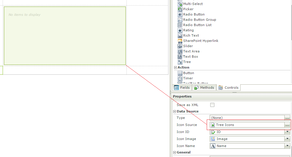
This SmartObject contains the following icons:
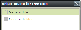
Auto-binding will happen when the Tree control is dropped for the first time. If the icon source is removed, the View is closed and opened again, it will not auto-bind the SmartObject again.
Icon Options
None - No icon is displayed.
Static - A specifically chosen image will be used to display at runtime. (In the background the static icon selected will still be retrieved via selected Icon ID property in the properties grid of the control).
Dynamic - This contains the properties of the current source. At runtime, the selected property source will be used as lookup value against the Icon ID property that was chosen.

Icon Selection behavior
- When a user configures a Source with Static as the Icon option, and removes/changes the Icon Source, the Static value will be invalid for a cleared source and unknown for a new source, so the options are RESET to None.
- When a user configures a Source with Dynamic as the Icon option, and removes the Icon Source, no source exist, no link can occur, and the propery is RESET to None.
- When a user configures a Source with Dynamic as the Icon option, and changes the Icon Source, the link is dynamic, and the properties presented in the Dynamic option is the Data Source’s properties, so the option will remain as Dynamic
- When a user changes an already configured data source as shown below
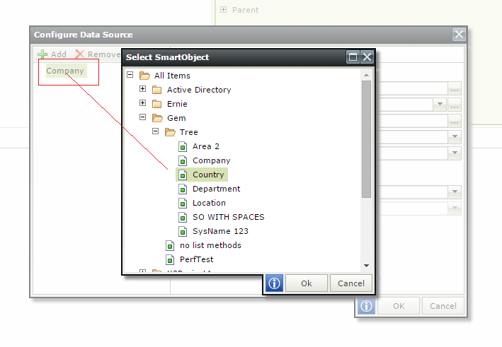
- If Static or Dynamic options were selected, they will be RESET to None.
Icons can be applied on the various levels of the categories and items. To do this, open the data source, navigate to the Icon tab and select one of the options. The icon will be applied on the level that is selected on the left hand side of the screen. So if the City is selected in the example below, the icon will be applied on City level.
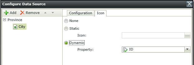
A custom icon can be used for the different nodes in a Tree control. An image can be used to differentiate between the different categories and items. Images can be contained within the SmartObject used as the data source or it can be a separate SmartObject.
- Create a SmartObject (for example Custom Icon) with an Image property.

- Create an Item View of the SmartObject and add an image record.
- Create an Item View with a Tree control.
- Specify a data source for the Tree control, then complete the rest of the data source settings as shown below.
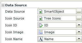
Properties Description Icon Source SmartObject containing the image. Icon ID The property used to identify the ID of the icon contained in the SmartObject. Icon Image The property used to load the image contained in the SmartObject. Icon Name The property representing the name of the image. - Finish and Run the View.
When using a rule action to set the properties of the Tree control, the following should be noted:
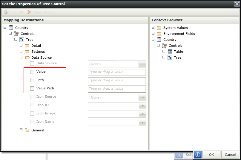
- Value - The Value of the node when selected in the tree, will be the value returned from the property selected in the Data Source screen. The property can be used to set a node. Setting the tree with a Value however cannot guarantee the correct selection.


- Path - The Path property contains the exact path for each selected node. When setting the same tree with a Path value, nodes will be guaranteed to be selected.

For each node, the Path contains the ID property value, and then the system name of the corresponding source.
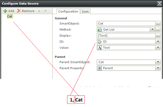
- Value Path - The Value Path property is each value node concatenated from the root to the selected node using the control property Path Separator.
Setting the tree with a Value Path however cannot guarantee the correct selection.
