Report Header
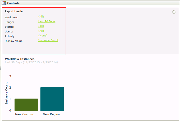
The Report Header control is essentially an interactive reporting dashboard allowing a user to view different types of workflow reports. The Report Header contains common properties that can be used to filter Charts or Grids added to the View. Rules can be configured to Run a Chart or Grid, once changes have been made to the Report Header in runtime. In addition, the Report Header can be used as a header indicating which filters have been applied to the reporting controls, by setting the properties of the Report Header to Read-Only. The user can then view the criteria applied, but is not able to apply any changes to the filters.
Security is applied to the controls to ensure that the data is seen by authorized individuals within an organization. Permissions are based on the process rights assigned to the process in Management Console:
- Users with Admin or View permissions will have access to the Report controls.
- Users with View Participate permissions will be permitted to view the Report controls from the point where the user has been part of the workflow.
It is important to note that these permissions need to be assigned for each separate workflow. If rights to view report controls are assigned to a Group, these will not apply to the users in that Group with regard to viewing the Report controls. Rights need to be assigned at user level in order for the user to view the Report controls.
- Create a View
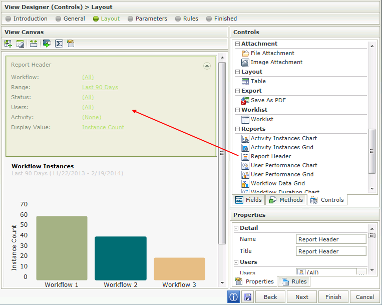
- Drag the Report Header control onto the canvas. The control can be found in the Reports section of the Controls found in the View Designer, see the Properties section below
- Configure the properties of the Report Header control as required, see the Properties section below
- Add another Report control such as a Chart or Grid to display the information and configure the properties of that control

- Add a rule to Run the Chart or Grid when the View is Initialized. For example:
Event: When a control on the View raises and event (When the View is Initialized)
Action: Execute a control's method (Execute the Run Chart or Grid method)
- Add a rule to Run the Chart or Grid when the Report Header is changed and configure properties if required. The criteria used in the Report Header will filter the Chart or Grid

- Always remember to create a rule to Run the Chart or Grid when the View Initializes. This must be done for all report controls used on a View
- Not all properties of the Report Header apply to all the Report controls. For example, the Activity filter is not applicable on the Workflow Instances Chart or Grid. The Activity filter only applies to the User Performance Chart and Grid.
- When using Custom Themes, be sure to specify the CSS classes for the elements
- The data of K2 workflows or processes created by any workflow designer such as K2 Studio, K2 Designer for Visual Studio, K2 Designer and K2 Designer for SharePoint can be made available using the reporting controls
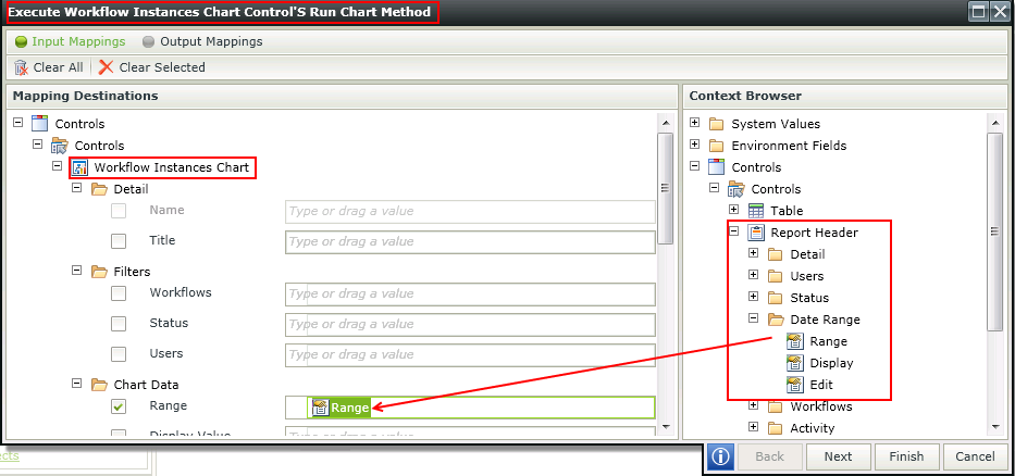
The Report Header interacts with other Report controls through rules. As an example, by binding the Date Range of the Report Header to each reporting control, the Date Range filter can be used to apply the same Date Range to all reporting controls on the View in runtime.
The rule would use the following:
Event: When a control on a View executes a method (Report Header is changed)
Action: Execute a control's method (Workflow Instances Chart)
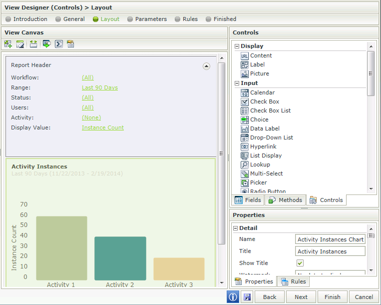
Action: Execute a control's method (Activity Instances Chart)
Configure the properties of each Action as below:

The Report Header control is available in the Reports section of the Controls found in the View Designer.

| Property | Description | Can be set in runtime using Rules |
|---|---|---|
| Detail | ||
| Name | A unique identifier for the selected control. This property is required. | No |
| Title | The Title of the Report to be shown in runtime | Yes, see Control Properties Actions for more information |
| Users | ||
| Users | Includes users who started or participated in a workflow instance. See the Generic Picker Screens topic for more information. Click on the ellipsis and search for the user(s) on which to filter the data | Yes, see Control Properties Actions for more information |
| Display | Enables the Users filter to be displayed on the Report Header in runtime. Deselect the option if the Users filter should not be displayed in runtime | Yes, see Control Properties Actions for more information |
| Edit | Enables the Users filter to be edited in runtime. Deselect the option if the Users filter should not be edited in runtime | Yes, see Control Properties Actions for more information |
| Status | ||
| Status | The Status of the specific instance. Depending on which type of report control is used, the status will be applicable to an activity or a workflow instance. See the Generic Picker Screens topic for more information. Click on the ellipsis and select a specific Status if required | Yes, see Control Properties Actions for more information |
| Display | Enables the Status filter to be displayed on the Report Header in runtime. Deselect the option if the Status filter should not be displayed in runtime | Yes, see Control Properties Actions for more information |
| Edit | Enables the Status filter to be edited in runtime. Deselect the option if the Status filter should not be edited in runtime | Yes, see Control Properties Actions for more information |
| Range | ||
| Range | The Date Range to be used to filter the data. The data returned would typically be executed according to the date a workflow instance or activity instance was started. See the Generic Picker Screens topic for more information. Select a Date Range from the pre-defined drop-down list to filter on | Yes, see Control Properties Actions for more information |
| Display | Enables the Date Range filter to be displayed on the Report Header in runtime. Deselect the option if the Date Range filter should not be displayed in runtime | Yes, see Control Properties Actions for more information |
| Edit | Enables the Date Range filter to be edited in runtime. Deselect the option if the Date Range filter should not be edited in runtime | Yes, see Control Properties Actions for more information |
| Workflows | ||
| Workflow Names | The workflow on which to filter when returning the data in runtime. If All is selected, all workflows will be shown. See the Generic Picker Screens topic for more information. Click on the ellipsis, expand the Workflows node and select a specific workflow(s) if required. More than one workflow can be added to the list | Yes, see Control Properties Actions for more information |
| Display | Enables the Workflows filter to be displayed on the Report Header in runtime. Deselect the option if the Workflows filter should not be displayed in runtime | Yes, see Control Properties Actions for more information |
| Edit | Enables the Workflows filter to be edited in runtime. Deselect the option if the Workflows filter should not be edited in runtime | Yes, see Control Properties Actions for more information |
| Activity | ||
| Activity Name | The Activity on which to filter. This setting is only applicable to the User Performance Chart and Grid and will have no effect when selected on any other reporting control. See the Generic Picker Screens topic for more information. Click on the ellipsis, select the workflow then select a specific activity if required. | Yes, see Control Properties Actions for more information |
| Display | Enables the Activity filter to be displayed on the Report Header in runtime. Deselect the option if the Activity filter should not be displayed in runtime | Yes, see Control Properties Actions for more information |
| Edit | Enables the Activity filter to be edited in runtime. Deselect the option if the Activity filter should not be edited in runtime | Yes, see Control Properties Actions for more information |
| Display Value | ||
| Display Value | The value to be used when displaying the data in the Chart or Grid. Duration or Instance Count can be used to display the data returned. Select the value required | Yes, see Control Properties Actions for more information |
| Display | Enables the Display Value filter to be displayed on the Report Header in runtime. Deselect the option if the Display Value filter should not be displayed in runtime | Yes, see Control Properties Actions for more information |
| Edit | Enables the Display Value filter to be edited in runtime. Deselect the option if the Display Value filter should not be edited in runtime | Yes, see Control Properties Actions for more information |
| Chart Type | ||
| Chart Type | A Chart can be displayed as a Column, Pie or Bar Chart Column Chart- A column chart displays values as sets of vertical columns that are grouped by category Pie Chart - Is a circular chart divided into sectors, each sector shows the relative size of each value Bar Chart - Is a chart with rectangular bars with lengths proportional to the values that they represent Select the option to be applied to the control |
Yes, see Control Properties Actions for more information |
| Grid Lines | ||
| Grid Lines | Network of intersecting parallel lines used as a reference for locating points. Disabled by default. Select the option if Grid Lines should be shown in runtime | Yes, see Control Properties Actions for more information |
| General | ||
| Height | Adjusts the height of the control. Any whole number or pixel value up to 32767px. When set to zero, it will automatically change the size to fit the content of the page. Type the dimension to be used | Yes, see Control Properties Actions for more information |
| Expanded | Expands or collapses the header at runtime | Yes, see Control Properties Actions for more information |
| Visible | Shows or hides the control in runtime. Deselect the option if the control should not be visible | Yes, see Control Properties Actions for more information |
| Enabled | Enables or disables the control in runtime. Deselect the option if the control should not be enabled for use on SmartForms | Yes, see Control Properties Actions for more information |
| Read-Only | Enables the control to be read-only in runtime. Select the option if the control should be read-only | Yes, see Control Properties Actions for more information |
| Styles | Opens the Style Builder enabling the user to specify style features like Format, Font, Borders, Padding and Margins. See the Style Builder topic for more information on styling options. Click on the ellipsis to open the Style Builder | No |
| Conditional Styles | Opens the Conditional Formatting Designer. This is used to design styles that will apply only when certain conditions are met. See the Conditional Styles section for more information. Click on the ellipsis to open the Conditional formatting screen | No |
