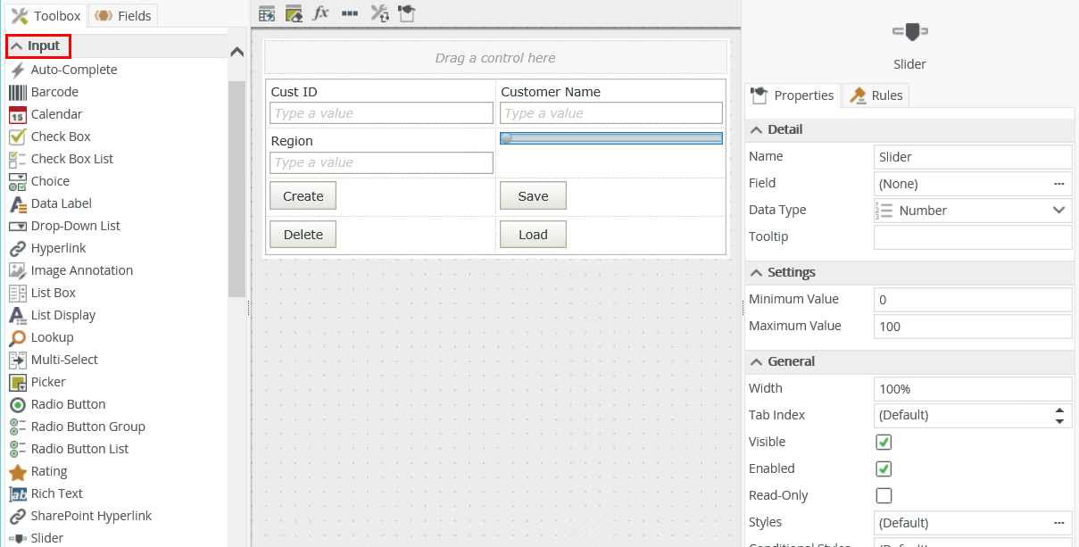
Slider Control
The Slider control allows you to select a numerical value by moving a thumb on a track using the mouse or Up and Down or Left and Right arrow keys. 
- Create a view.
- Drag the control onto the canvas. You can find the control in the Input section of the Toolbox.
- Configure the rest of the properties as necessary.
- Run the view.
You can find the control in the Input section of the Toolbox.
| Properties | Description | Can be set in runtime using rules? |
|---|---|---|
| Detail | ||
| Name | A unique identifier for the control. This property is required and defaults to the name of the control. | No |
| Field | The field bound to the control. See the Binding Fields to Controls section for more information on how to use it. | No |
| Data Type | A drop-down list containing the types of values that the control can accept. | No |
| Tooltip |
The value to display when the cursor hovers over the control. |
Yes, see Configure the Set a Control's Properties Action for more information. |
| Settings | ||
| Minimum Value | The start value of the control. The value of this property must be less than the value you specify for the Maximum Value. |
Yes, see Configure the Set a Control's Properties Action for more information. |
| Maximum Value |
The start value of the control. The value of this property must be more than the value you specify for the Minimum Value. |
Yes, see Configure the Set a Control's Properties Action for more information. |
| General | ||
| Width | Adjusts the width of the control. You can enter any whole percentage up to 100%, whole number or pixel value to a maximum of 32767px. Type the dimension. | Yes, see Configure the Set a Control's Properties Action for more information. |
| Tab Index | Defines a sequence that users follow when they use the Tab key to navigate through a page at runtime. | Yes, see Configure the Set a Control's Properties Action for more information. |
| Value Indicator | Shows the value of the control at runtime | Yes, see Configure the Set a Control's Properties Action for more information. |
| Visible | Shows or hides the control. | Yes, see Configure the Set a Control's Properties Action for more information. |
| Enabled | Enables or disables the control. | Yes, see Configure the Set a Control's Properties Action for more information. |
| Read-Only | Shows the control as read-only. | Yes, see Configure the Set a Control's Properties Action for more information. |
| Format | Opens the Format page where you can configure formatting and style features such as format, font, borders, padding and margins. See the Format topic for more information. | No |
| Conditional Format | Opens the Conditional Formatting page. You can add conditional formatting to apply a specific format or style when a condition you set is True. Use conditional format on its own or with the Format feature. See Conditional Format for more information. Click the ellipsis to open the Conditional Formatting page. | No |
The control interacts with other controls through rules. When you bind properties between different controls, you can use the data to populate properties or set values. Use the following examples for when to use the control with other controls through rules:
- Set a control’s properties: You can configure the settable properties of the control with this action
- Show/Hide: The Visible property allows you to show or hide the control through rules
- Enable/Disable: The Enabled property allows you to enable or disable the control through rules
- Data Transfer: You can transfer data from items listed in the context browser to the control
- Set Focus: You can use the Focus control method in the Rule Designer to set focus to the control in runtime
- The control is also available when designing forms
- You can change any Number field to a slider using the Change Control icon
- You can use conditional formatting to change the border color of the control according to the value
- You can use the control to display progress for a number of steps within a workflow by dividing the value of the control by the number of steps and using a Transfer Data action to pass the progress value to the control
- When you clear a view by using the execute the Clear method for example, the slider's Minimum Value and Maximum Value properties are reset to the default values of 0 and 100.